Do you ever wonder how traders seem to know when a chart is about to start trending?
Is there some dark magic in play…?
Not at all!
Experienced traders often use indicators to help them predict what might happen.
Two of the most important for trends are the Golden Cross and the Death Cross.
Now, even though these names might sound mystical at first, don’t worry!
I’ve designed this guide to explain these crucial indicators to you as simply as possible.
You’ll soon get the hang of them… and discover how valuable they can be.
In this article, you’ll delve into key aspects like:
- What the Golden Cross and the Death Cross are
- Why using the 50 and 200 moving averages is essential
- Using complementary indicators
- Real trading setups and examples
- Recognizing the limitations of the Golden Cross and Death Cross
Ready to enhance your trading strategy?
Let’s dive in!
What is a Golden Cross vs. a Death Cross?
First, there are some differences between the Golden Cross and the Death Cross.
A Golden Cross occurs when a short-term moving average crosses above a long-term moving average, signaling a potential bullish market trend.
Because it’s often found at the bottom of a downtrend, this crossover suggests the market’s short-term momentum is outpacing its longer-term momentum…
…indicating the beginning of an upward trend!
Typically, traders look for the 50-day moving average to cross above the 200-day moving average as a strong bullish signal.
So, what does this look like?…
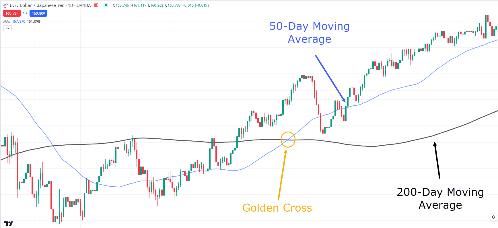
USD/JPY Daily Chart Golden Cross:
In this chart, can you see how the short-term daily average crossed above the longer 200-day moving average?
This is a classic example of a Golden Cross.
Look what happened afterwards; the price continued its momentum, signaling the start of a new uptrend.
So… what about the Death Cross?
Even the name sounds daunting, right?
But all it’s saying is that an uptrend may be coming to an end.
In contrast to the Golden Cross, the Death Cross appears at the top of an uptrend.
It happens when a short-term moving average crosses below a long-term moving average, signaling a potential bearish trend.
This crossover suggests that the market’s short-term momentum is weaker than its longer-term momentum…
…indicating that a downtrend may be imminent!
Take a look…
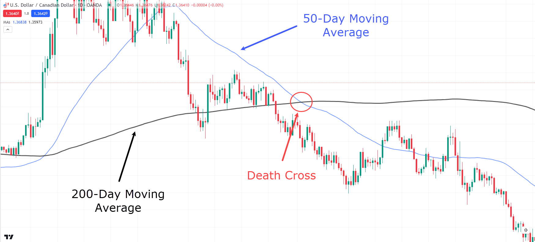
USD/CAD Daily Chart Death Cross:
As with the Golden Cross, the 50-day and 200-day moving averages are used to find the Death Cross.
Both patterns are widely used because they create clear signals, and offer a broader view of the market.
They’re an easy-to-understand way to tell whether the market is in an uptrend or downtrend.
Make sense?
Great!
Let’s move on!
What about different Moving Averages?
50-Day and 200-Day Moving Averages
One of the biggest questions I often get is:
“Why use only the 50-day and 200-day moving averages?”
“Why not use the 20 and 100, or the 5 and 20?”
Well, the reason is that the 50- and 200-day capture short-term and long-term momentum really well!
Any other combination results in a moving average crossover, which can’t live up to the Golden and Death Crosses.
It’s all about finding a balance between sensitivity and reliability.
Using the 50-day and 200-day moving averages creates plenty of trading opportunities while being able to track market momentum shifts that favor your trade.
Now, your next question might be:
“What if I don’t trade the daily timeframe?”
Read on to find out!
Moving Averages on different timeframes
The good news is that these moving averages can be adjusted for any timeframe.
For example, if you’re using the 1-hour timeframe, employing the 50- and 200-day moving averages will generate more frequent trading opportunities.
However, always remember that more frequent trading opportunities don’t necessarily mean better quality trades!
Lower timeframe setups generally carry less weight and value compared to those on higher timeframes.
Keep this in mind when considering trading the Golden and Death Cross on different timeframes.
Now, these indicators don’t have to work alone.
Let’s look at some that can complement the Golden and Death crosses…
Using Complementary Indicators
Relative Strength Index (RSI)
The Relative Strength Index (RSI) is a momentum oscillator that measures the speed and change of price movements.
It ranges from 0 to 100 and is typically used to identify overbought or oversold conditions in the market.
An RSI above 70 means a security may be overbought, while an RSI below 30 suggests it may be oversold.
When used alongside Golden and Death crosses, the RSI can help confirm the strength of a trend.
So, what might this look like when using it with a Golden Cross?
Let’s take a look…
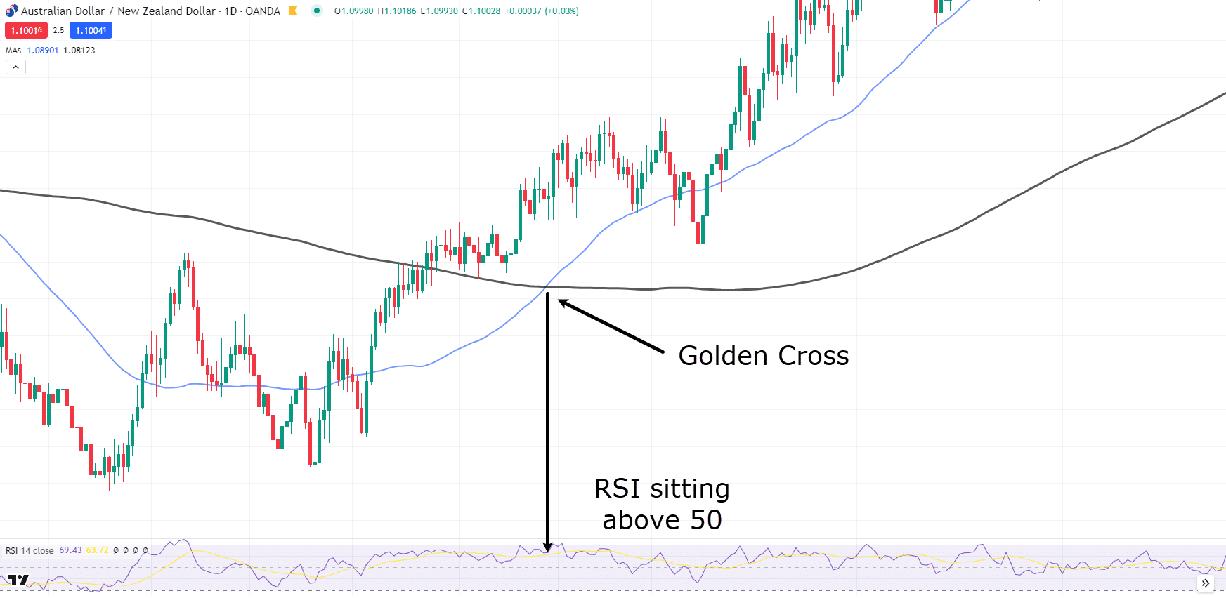
AUD/NZD Daily Chart RSI Example:
In the chart above, the moving averages have crossed over, representing a Golden Cross.
If you follow the Golden Cross point down to the RSI, you’ll notice that the RSI is above the 50-level.
This gives extra confirmation that momentum is in the buyers’ favor, alongside the Golden Cross signal.
It’s not the only indicator that can help, either!
Let’s take a look at the MACD next…
Moving Average Convergence Divergence (MACD)
The Moving Average Convergence Divergence (MACD) is another popular momentum indicator that shows the relationship between two moving averages of a security’s price.
Remember, the MACD is calculated by subtracting the 26-period EMA from the 12-period EMA.
The result of this calculation is called the MACD line.
A nine-day EMA of the MACD, called the “signal line,” is then plotted on top of the MACD line, which can be a trigger for buy and sell signals.
Traders often look for crossovers of the MACD line and the signal line and divergences from the price movement to confirm trends they find through Golden and Death crosses.
Lets take a look a look at another Golden Cross example…
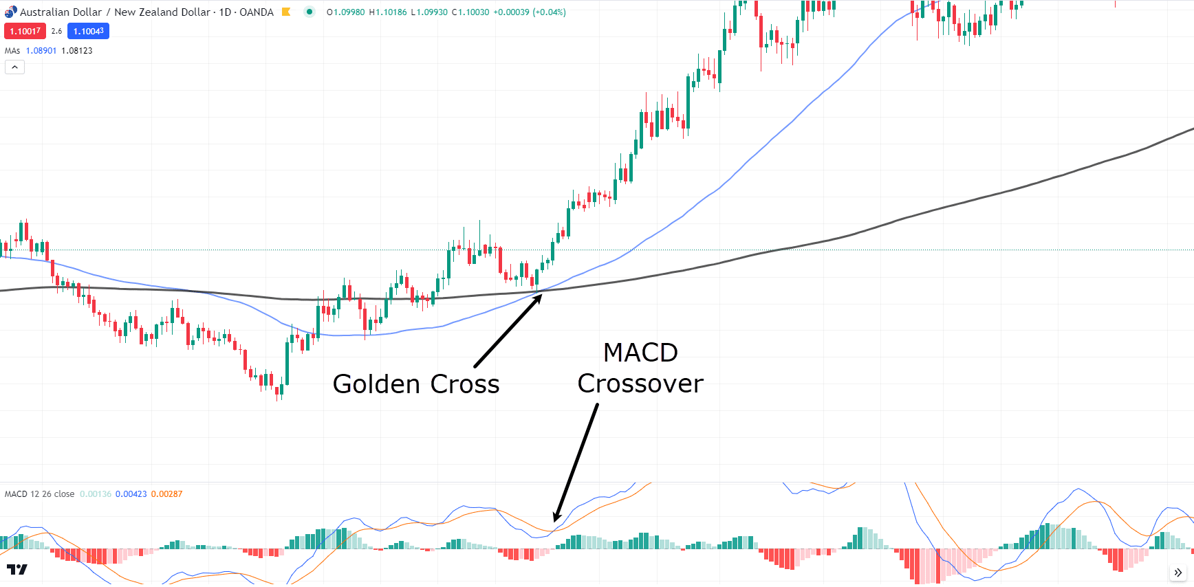
AUD/NZD Daily Chart MACD Crossover:
In the chart above, can you see how a few bars after the Golden Cross, the MACD also crosses over?
This means momentum is clearly in the bulls’ favor.
OK, so, you’ve seen a lot about identifying Golden and Death Crosses, but what about taking profits and managing trades after entry?
Let’s look at some real trading examples!
Death Cross Examples
First, let’s look at the Death Cross…
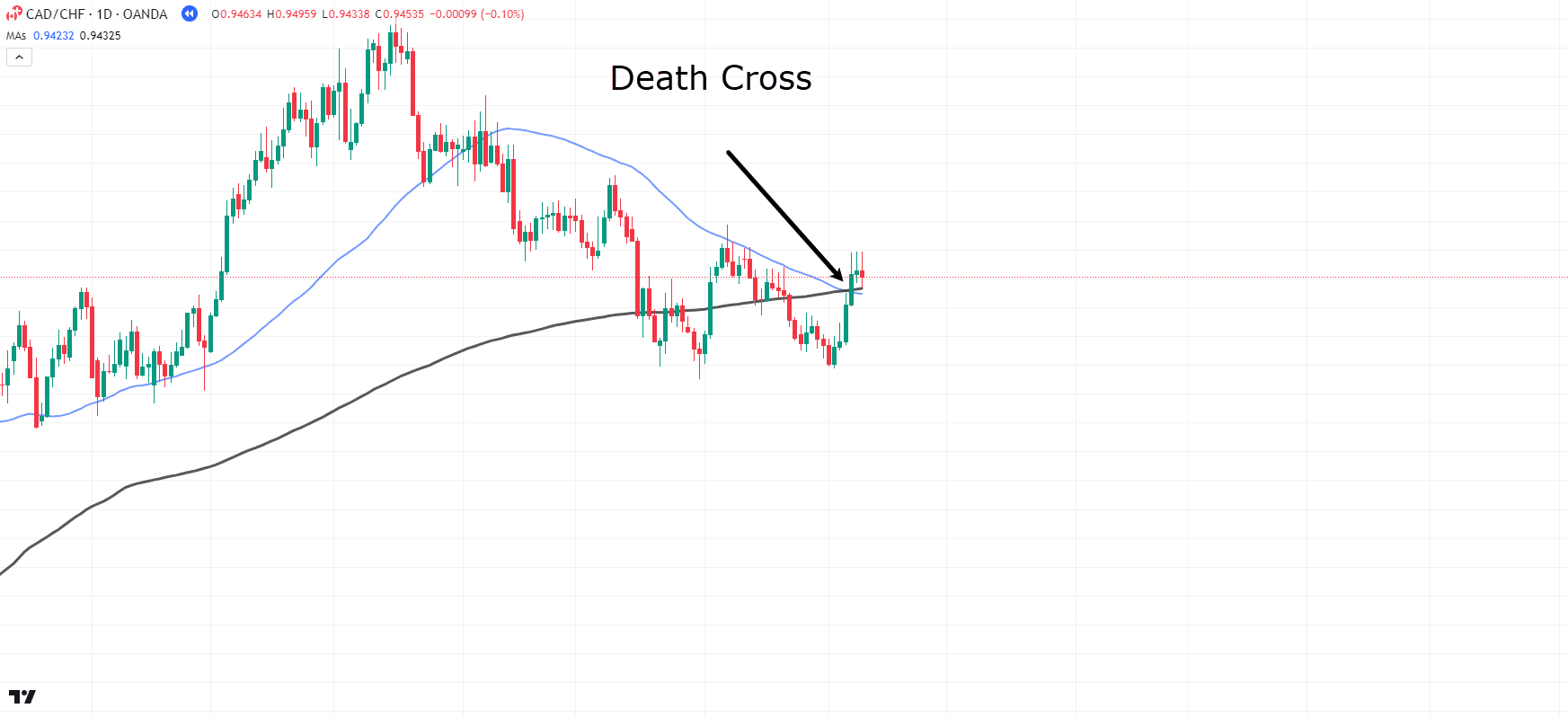
CAD/CHF Daily Chart Death Cross:
In this CAD/CHF daily chart, the price has started forming lower highs and lower lows.
The moving averages have also crossed to create the Death Cross!
However, even though the Death Cross has occurred, it is always recommended to wait for the price to reject the current level and show some sort of bearish candlestick.
Let’s look for a candle that indicates bearish rejection…
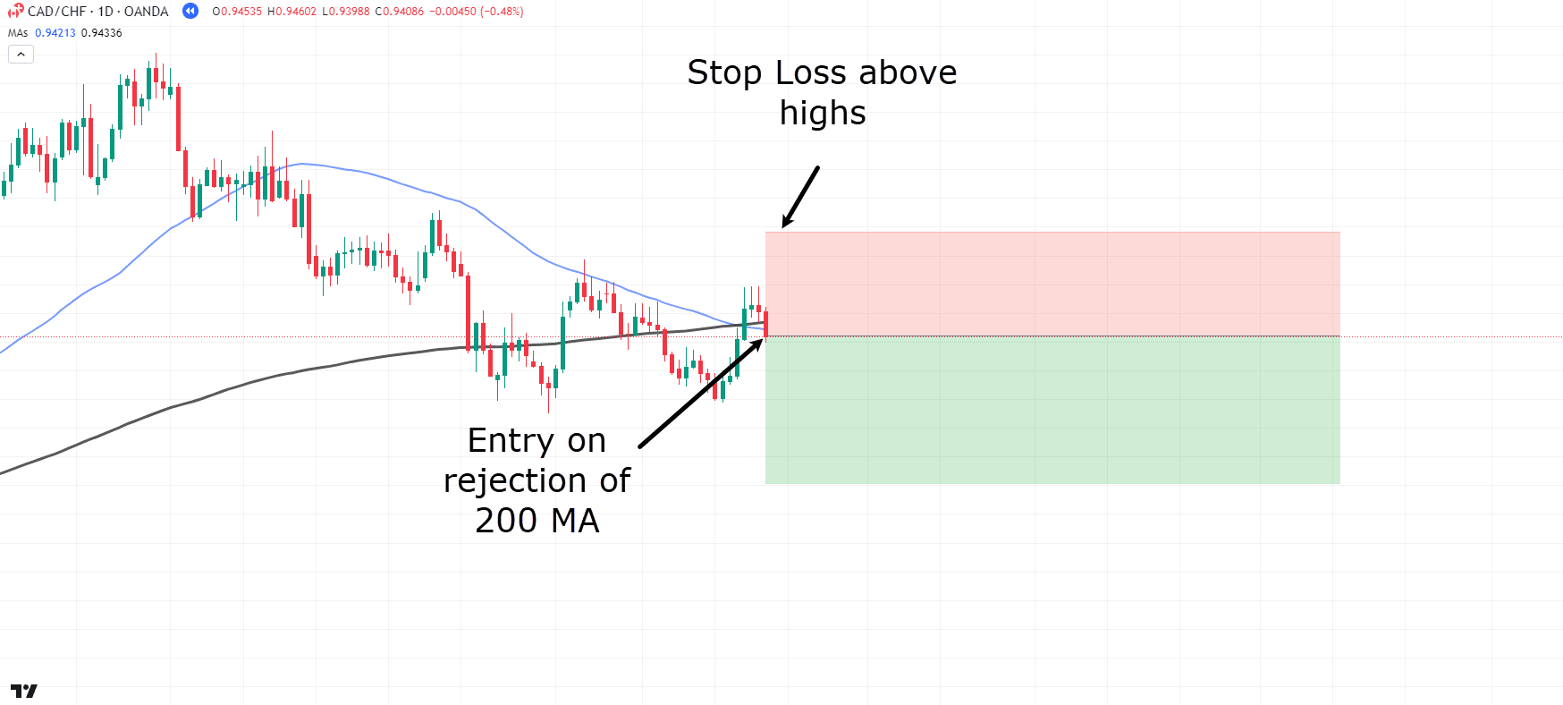
CAD/CHF Daily Chart Death Cross Entry:
Great! Notice how the price has fallen below the moving averages and seems to have formed a high of the lower high?
Your stop-loss placement depends on your risk tolerance, but for this example, let’s position it safely above the previous highs…
In this scenario, aim to exit the trade if the moving averages cross back over, signaling the potential end of the downtrend…
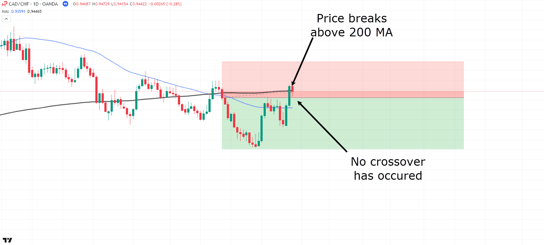
CAD/CHF Daily Chart Death Cross Trade Management:
Oh no! Price has formed what looks like a higher low and is now breaching the highs.
However, have you noticed that the crossover hasn’t occurred yet?
So, let’s stick with the trade and see what happens…
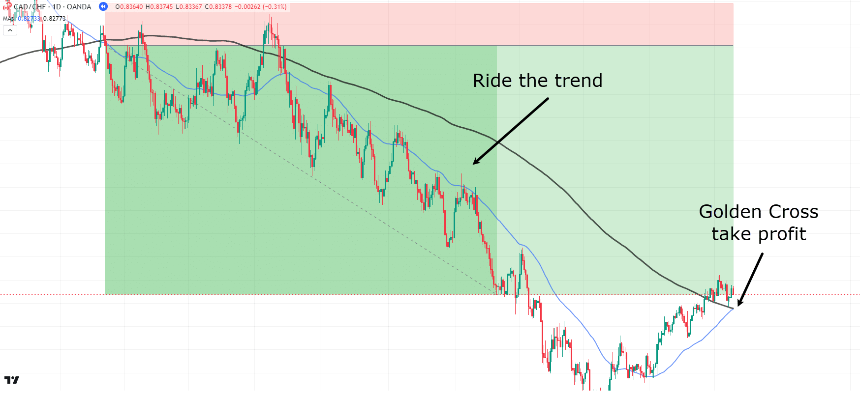
CAD/CHF Daily Chart Death Cross Take Profit:
Wow!
Look at that!
Price continued to respect the Death Cross downtrend, and you secured some serious profits after the crossover occurred again.
See how there were multiple opportunities to overcomplicate the trade and exit too early?
It’s crucial to have a clear understanding of what will trigger an early exit or what conditions you want to see for taking profit.
Let’s take a look at another example!…
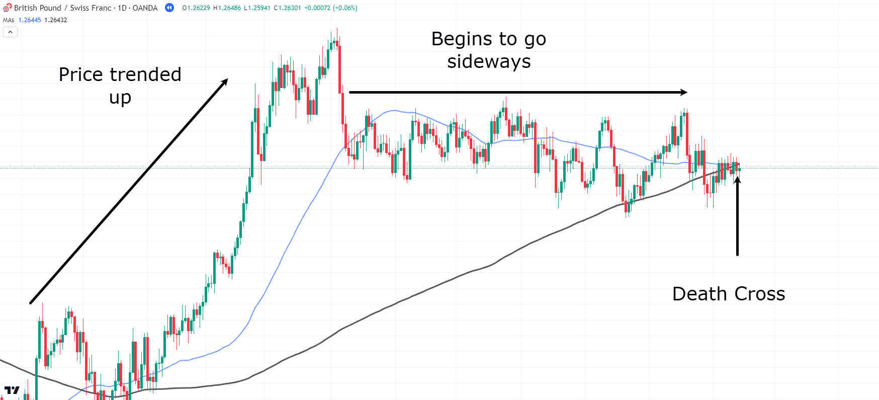
GBP/CHF Daily Chart Death Cross:
Here is another example of the Death Cross playing out…
Price is trending up but then begins to move sideways, losing its bullish momentum.
It’s a great indication that the price may be shifting from an uptrend to a downtrend…
So, let’s take the trade, right?
But wait – not so fast!
Remember to wait for a clear rejection of the area…
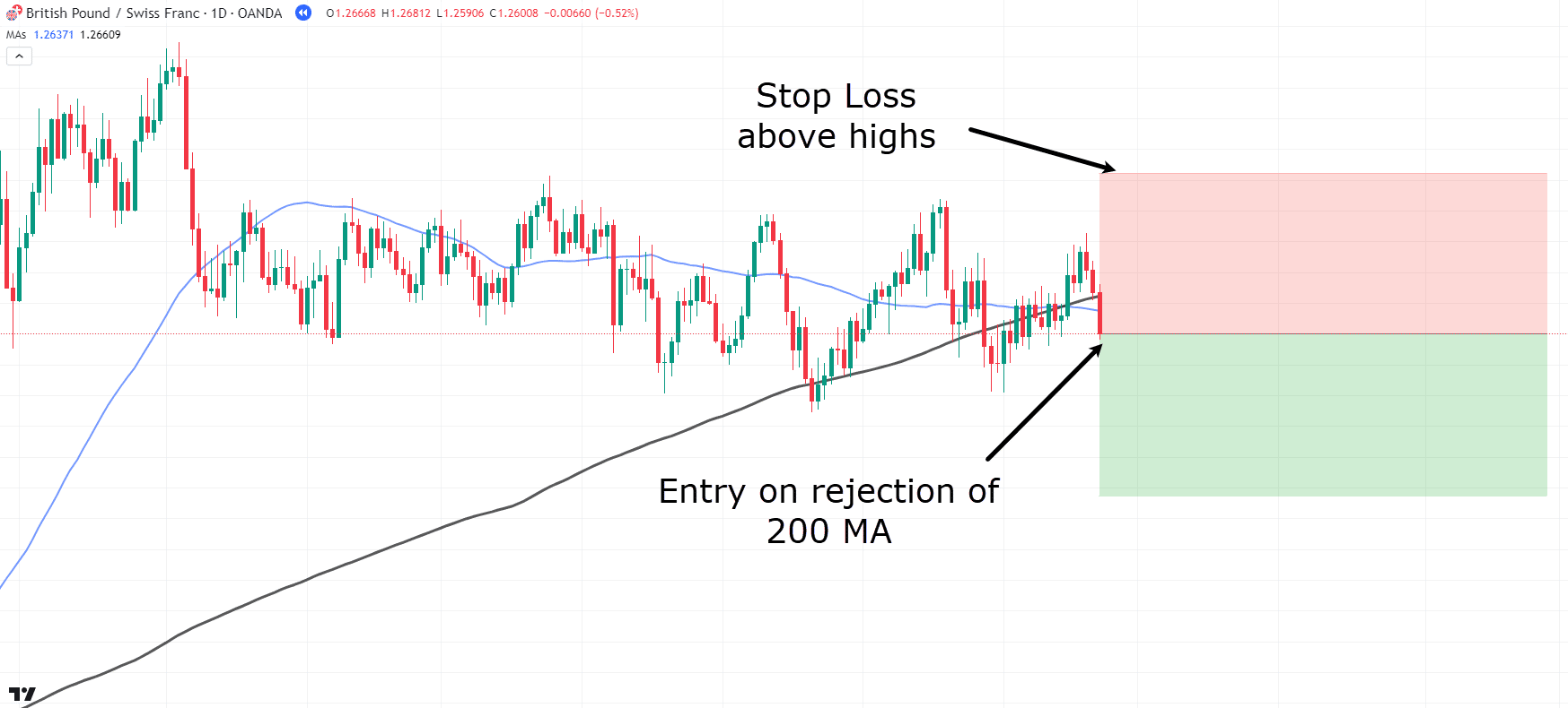
GBP/CHF Daily Chart Death Cross Entry:
Alright!
Now that you have a clear rejection in the area of value, it’s time to take that trade.
This time, place the stop loss above the highs.
“But what’s the plan for exiting the market on this trade?” I hear you ask…
Well, you can also use the moving averages as indicators of whether or not to hold the trade.
For a different approach, let’s trigger the take profit on a close above the 200 Moving Average (black line)…
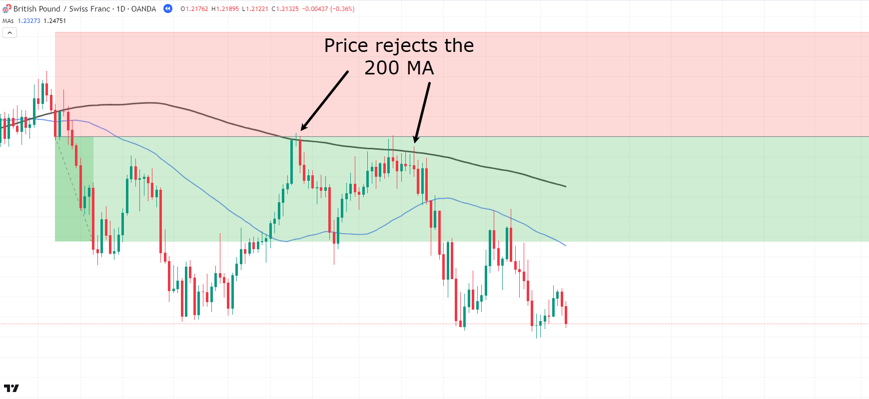
GBP/CHF Daily Chart Death Cross Trade Management:
See how the price has started its downtrend and never closed above the 200 MA?
Instead, it seems like the price is using the 200 MA as a resistance level and consistently rejecting it.
Let’s continue with this trade and see what happens…
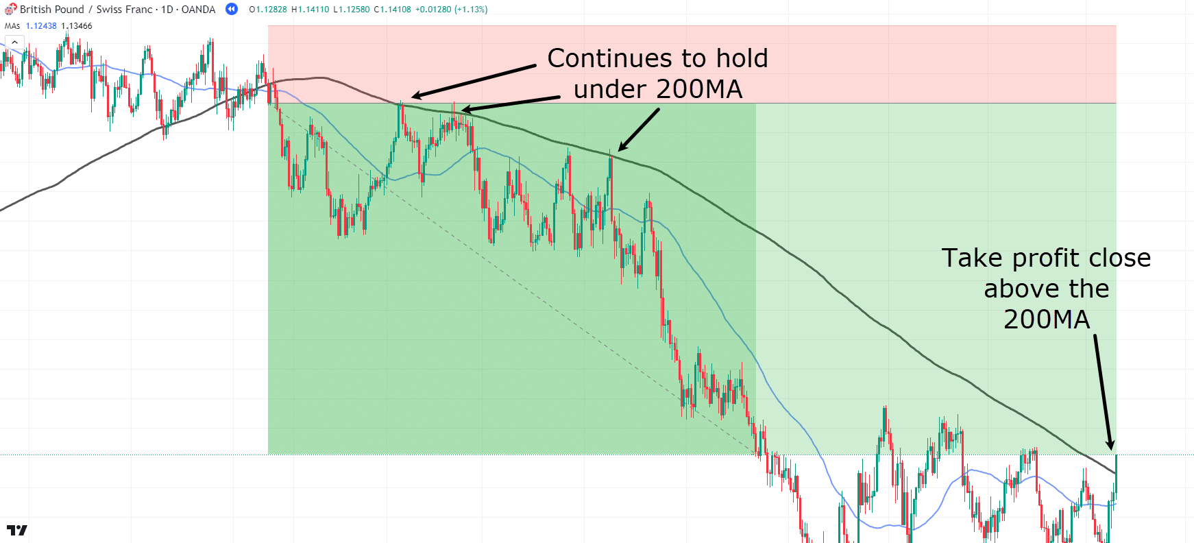
GBP/CHF Daily Chart Death Cross Take Profit:
Wow! Congratulations on another successful trade!
This approach demonstrates how you can use the moving average as a resistance indicator for potential profit-taking.
Alright, one last example!…
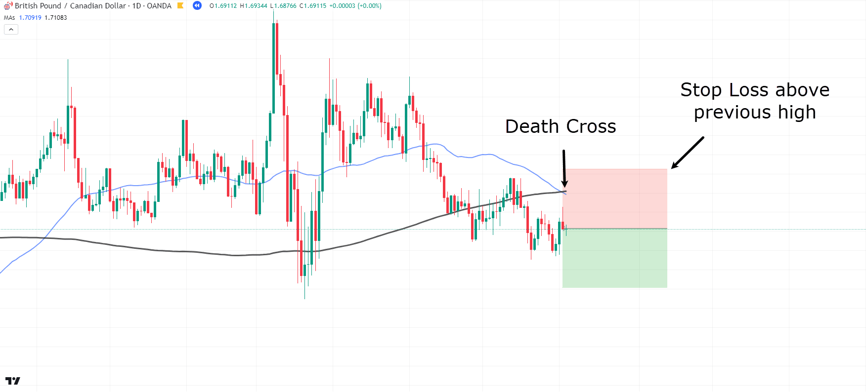
GBP/CAD Daily Chart Death Cross:
Here, you can see another Death Cross occurring…
In this example, let’s place the stop loss above the previous highs.
Now, I know what you’re expecting: price to continue into profit like our previous examples, right?
But take a closer look!…
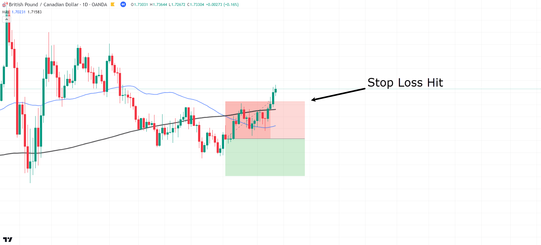
GBP/CAD Daily Chart Death Cross Stop Loss Hit:
Stop loss hit??
That wasn’t supposed to happen!
What’s the lesson here?
Well, the Death Cross doesn’t always play out as expected.
But there’s some good news!
There were early signals indicating that this trade might not unfold the way initially anticipated…
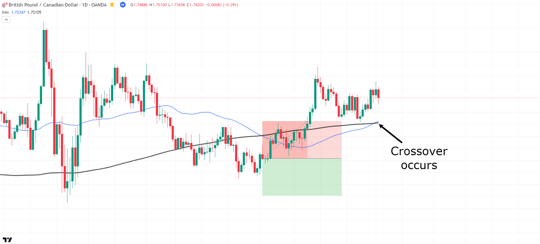
GBP/CAD Daily Chart Crossover:
See how the price quickly crossed back over after the stop loss was hit?
Let’s examine the previous price data before the trade was taken and ask: Is this a good trade to make?…
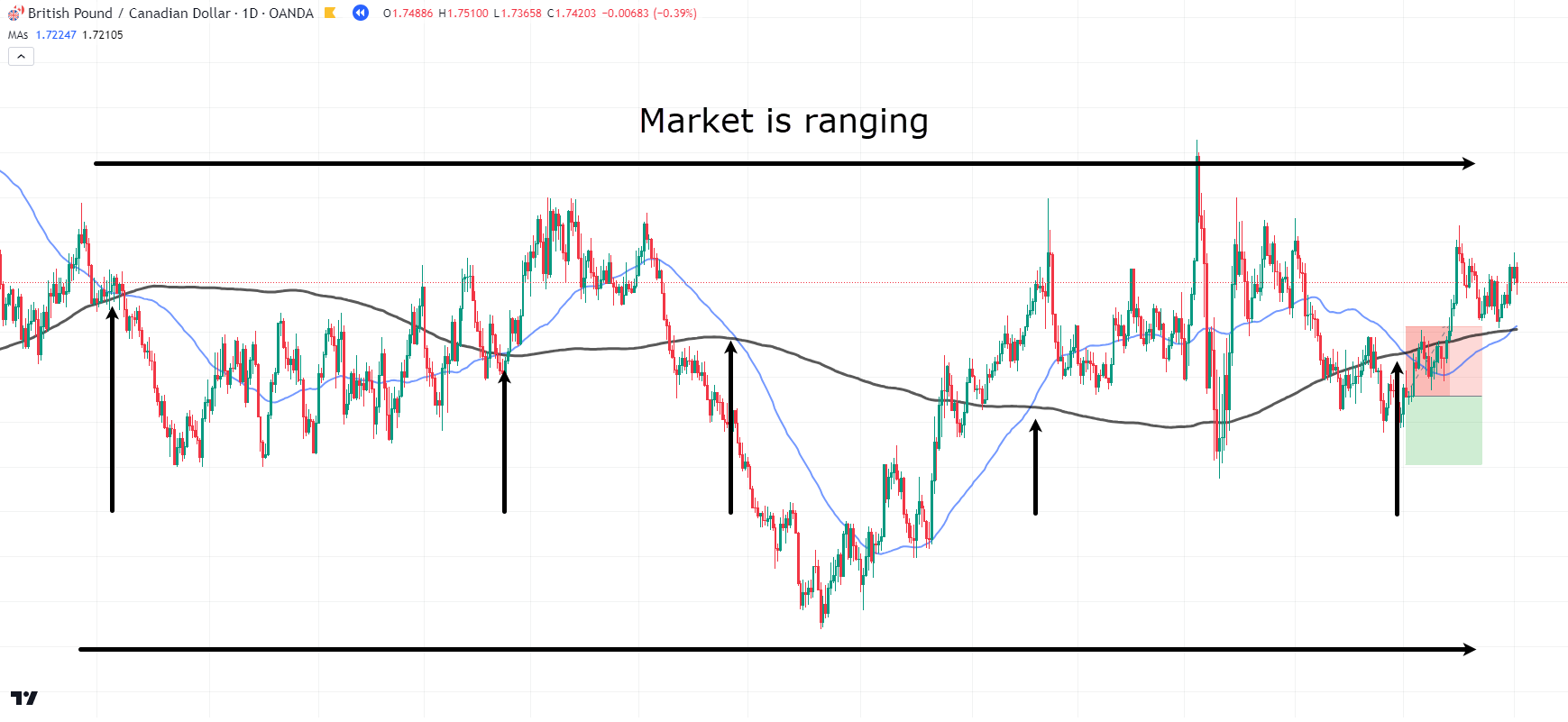
GBP/CAD Daily Chart Range:
See how this market has been in a massive range for an extended period?
The most recent Death Cross is similar to the many Golden Crosses and Death Crosses that occurred before it.
So – this is a careful reminder to look at the context of the overall market.
A ranging market is not ideal for executing the Death Cross strategy.
This is different from price briefly moving sideways after an uptrend.
I mean, the example shows price in a sustained large range for about a year!
Alright, now it’s time to look at some Golden Cross examples!…
Golden Cross Examples
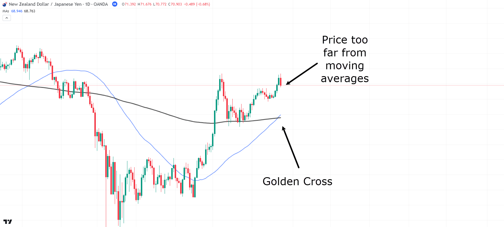
NZD/JPY Daily Chart Golden Cross:
Here, we have a solid daily Golden Cross, but there’s a problem…
If you were to enter at this crossover, your stop loss would need to be placed quite far from the entry, making it challenging to secure a decent profit.
So in these situations, it’s best practice to wait for a pullback.
Let’s see what happens…
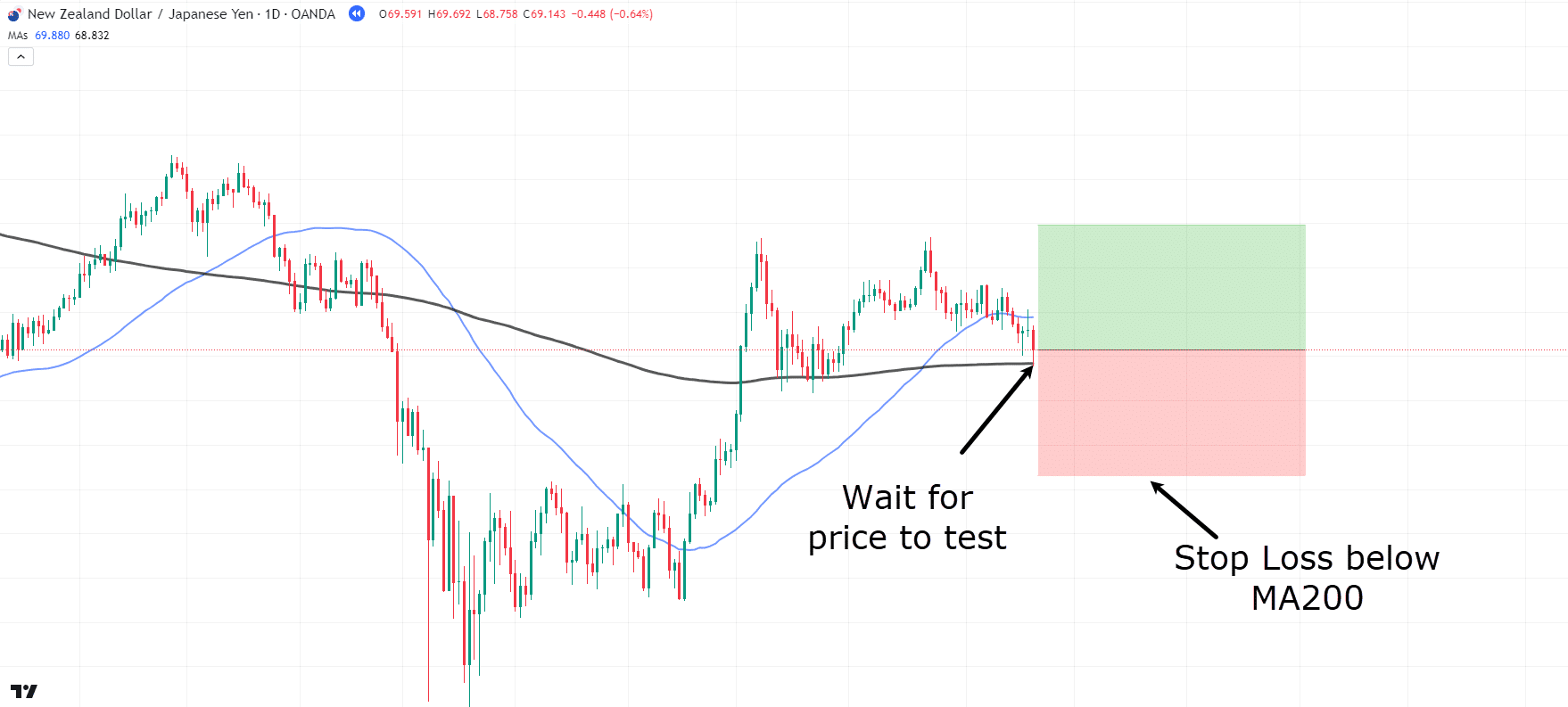
NZD/JPY Daily Chart Golden Cross Entry:
Perfect! Price has now retested the moving averages, and our stop loss and entry points make much more sense.
Let’s see how this trade unfolds!…
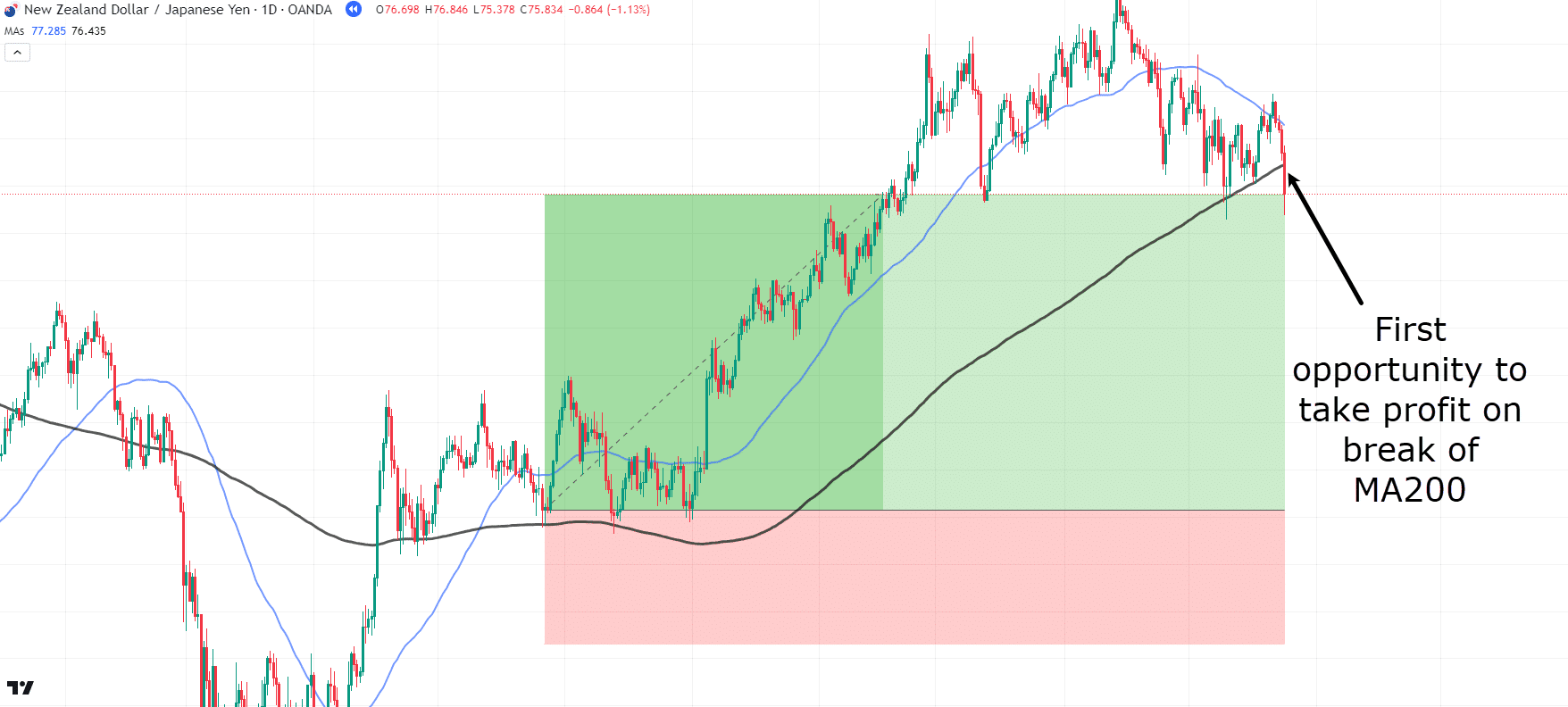
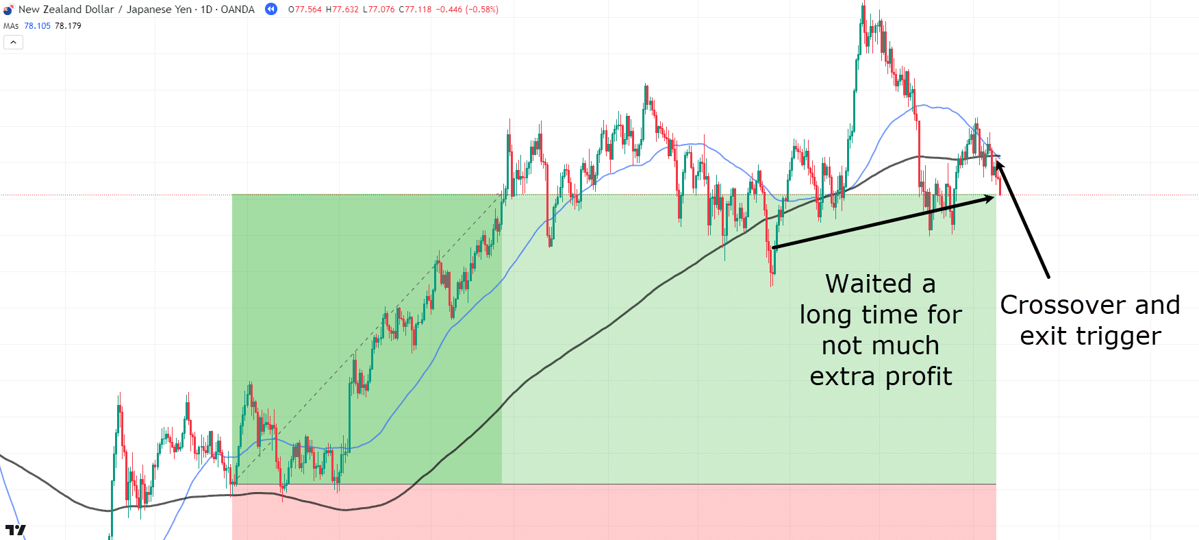
NZD/JPY Daily Chart Golden Cross Potential Exit:
Wow, what a nice move!
But here’s the question: should you exit on the break of the 200 MA, or should you wait for the crossover to signal the end of the uptrend?
The truth is, there’s no right or wrong answer!
Take a look at each scenario…
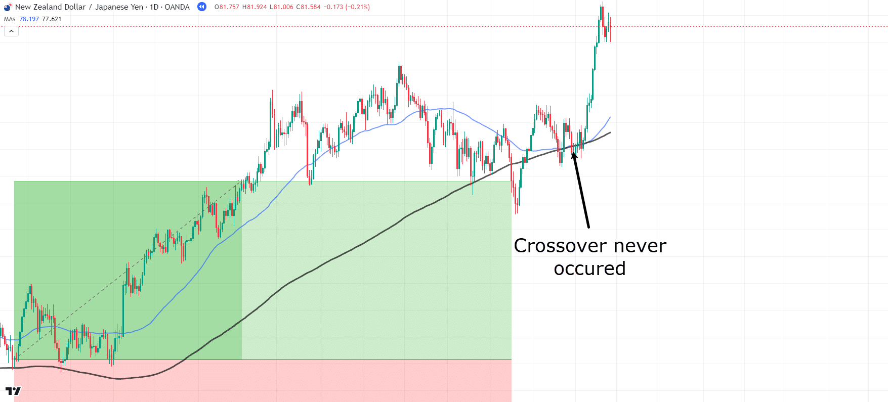
NZD/JPY Daily Chart Golden Cross Trade Management:
As price continues, the moving averages get very close to crossing over; however, the crossover never actually occurs, so let’s continue with this trade…
NZD/JPY Daily Chart Golden Cross Exit:
Finally, the moving averages crossed back over.
You might think it was worth waiting for the crossover rather than exiting earlier.
However, as shown above, the distance between the two potential exits and the amount of profit generated was low.
You should consider whether taking profits sooner rather than later might be a better approach.
As discussed earlier, neither option is right nor wrong, but how you manage the trade will depend on your personal risk tolerance and which moving averages or areas on the charts you believe the price is respecting.
Now, as for whether the Golden Cross and Death Cross can be used on lower timeframes…
…the answer is, Yes it can be!
Let’s look at another Golden Cross example, but this time on a lower timeframe, and see if it translates as well…
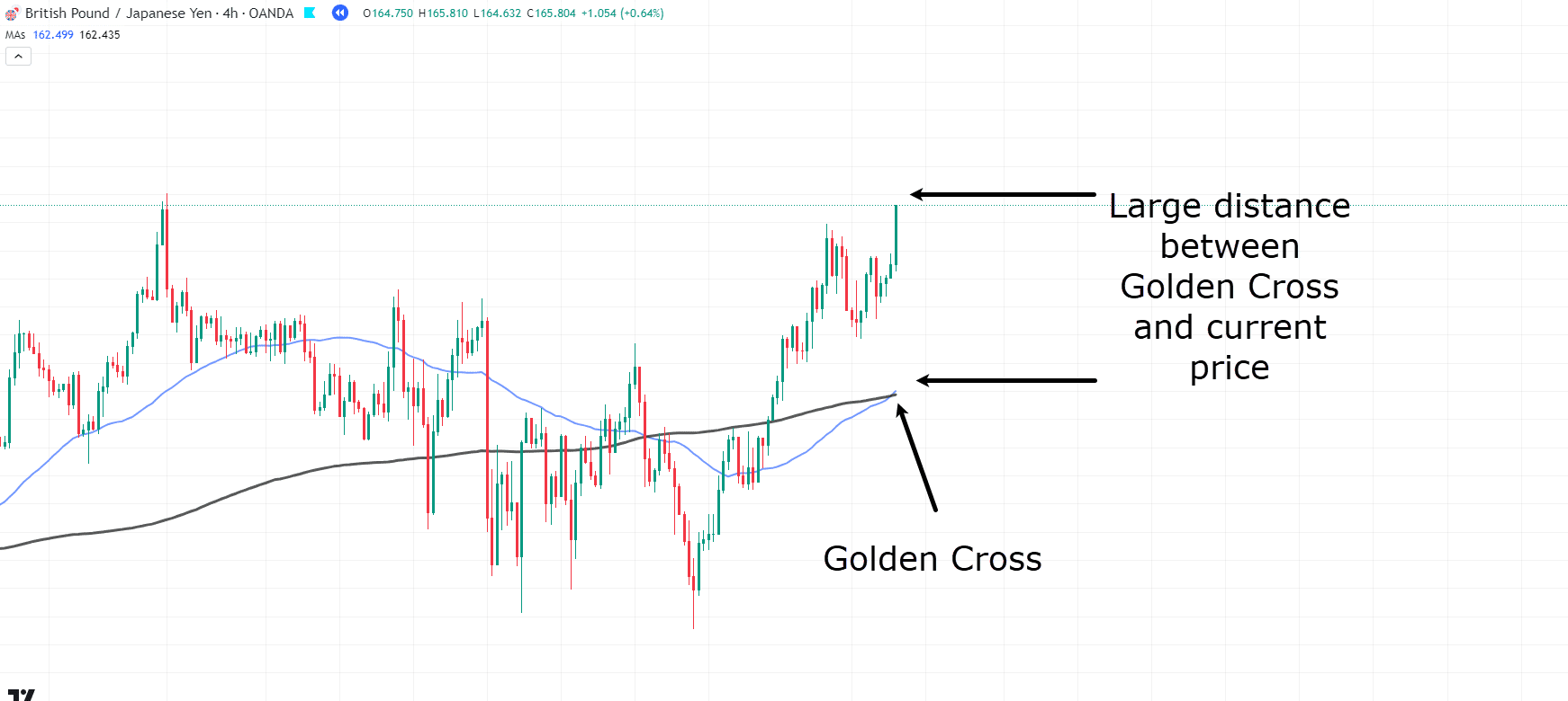
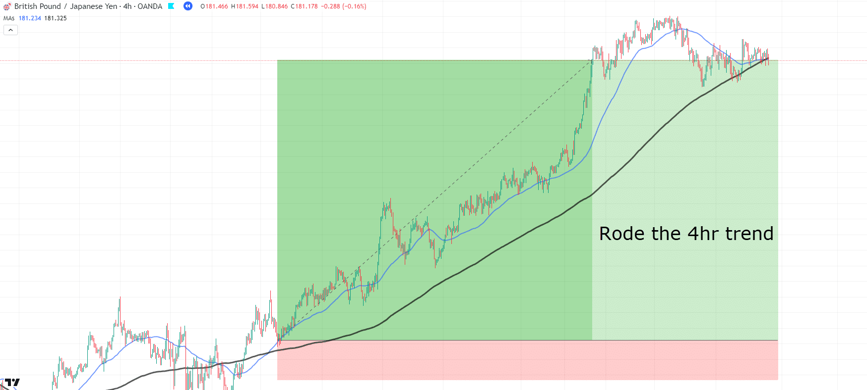
GBP/JPY 4-Hour Chart Golden Cross:
Just like in the previous example, a Golden Cross has occurred.
However, the price is a large distance from any acceptable entry.
In these scenarios, you have no choice but to wait for a pullback.
Let’s be patient and wait…
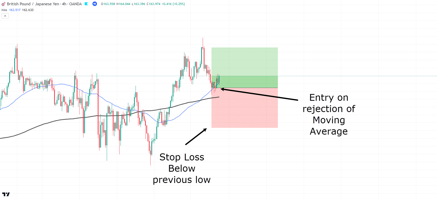
GBP/JPY 4-Hour Chart Golden Cross Entry:
Great! Price has come back down to the moving averages and started to show signs of rejection.
So let’s take the trade, placing our stop loss below the previous low.
For this example, simply wait for the crossover to occur again…
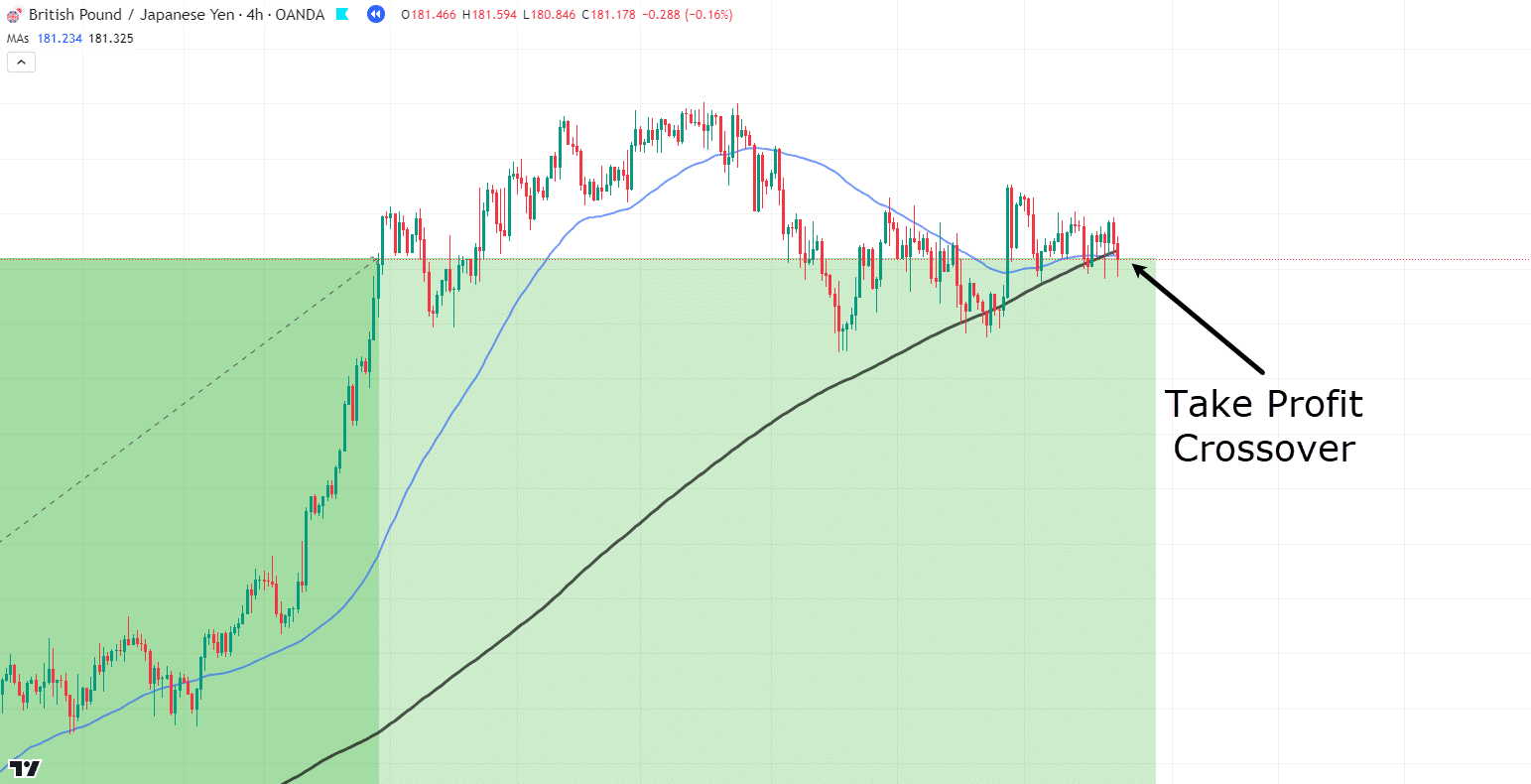
GBP/JPY 4-Hour Chart Golden Cross Take Profit:
Wow! That’s a significant move!
This shows how the principles work out consistently, even on lower timeframes…
GBP/JPY 4-Hour Chart Golden Cross Trade Overview:
The 4-hour timeframe allows for a tighter stop loss while generating larger profits.
However, there’s always a trade-off between risk and reward…
Lower timeframe charts can often lead to false signals.
Remember, when using Golden and Death Crosses across different timeframes, the lower the timeframe, the less weight these signals carry in the overall market context!
Let’s take a look at one last example to really get the idea…
EUR/CHF 4-Hour Chart Golden Cross Entry:
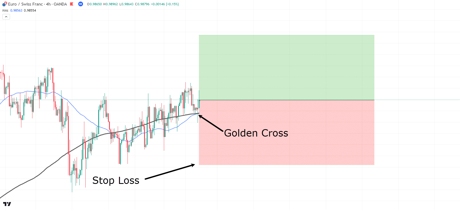
Like the previous example, the moving averages have formed a Golden Cross on the 4-hour timeframe!
Price is at the crossover area and is showing signs of rejection…
Let’s take the trade and place the stop loss well below the previous lows and the moving averages…
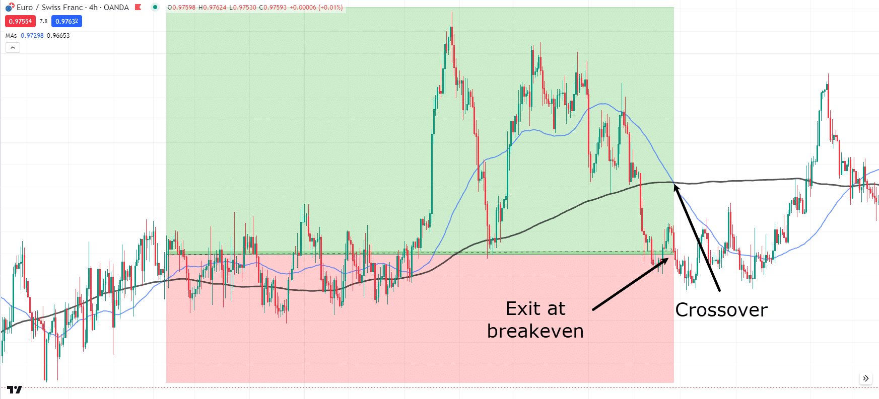
EUR/CHF 4-Hour Chart Golden Cross Trade Overview:
OK, so what happened?
While price did move in your favor, by the time the crossover returned, it had reached a breakeven level.
I know this can be frustrating – especially when the price initially went into profit!
But remember, it’s simply part of trading.
Now, how you manage trades and capture profits is entirely up to you.
I encourage you to experiment with different take-profit techniques.
There is no right or wrong answer when it comes to profit-taking.
And remember, even if the trade didn’t yield a profit, breaking even can be a win in itself!
Limitations of Golden Cross and Death Cross
Lagging Indicators
Both the Golden Cross and the Death Cross are lagging indicators.
They are based on historical price data and may signal a trend change after the new trend has actually begun.
This lag can result in traders entering positions later than optimal, potentially missing a significant portion of the trend.
For example, by the time a Golden Cross is identified, much of the upward move may have already happened.
Similarly, a Death Cross may signal a bearish trend after a substantial decline has already taken place.
This principle also applies for taking profit.
As shown in some of the examples, due to the crossover being a lagging indicator, some of your profits may already have been eaten by the time the exit crossover shows itself.
This is why I recommend playing around with some take profit rules that allow you to try and capture the best profits along the way.
False Signals
Another limitation of these indicators is their risk of false signals, especially in volatile or ranging markets.
A false signal occurs when a Golden or Death Cross shows a trend change that… never shows up!
This can happen when short-term price fluctuations cause the moving averages to cross but do not result in a sustained trend.
In such cases, traders may enter positions based on these signals and incur losses when the market reverses or remains range-bound.
Let me show you an example…
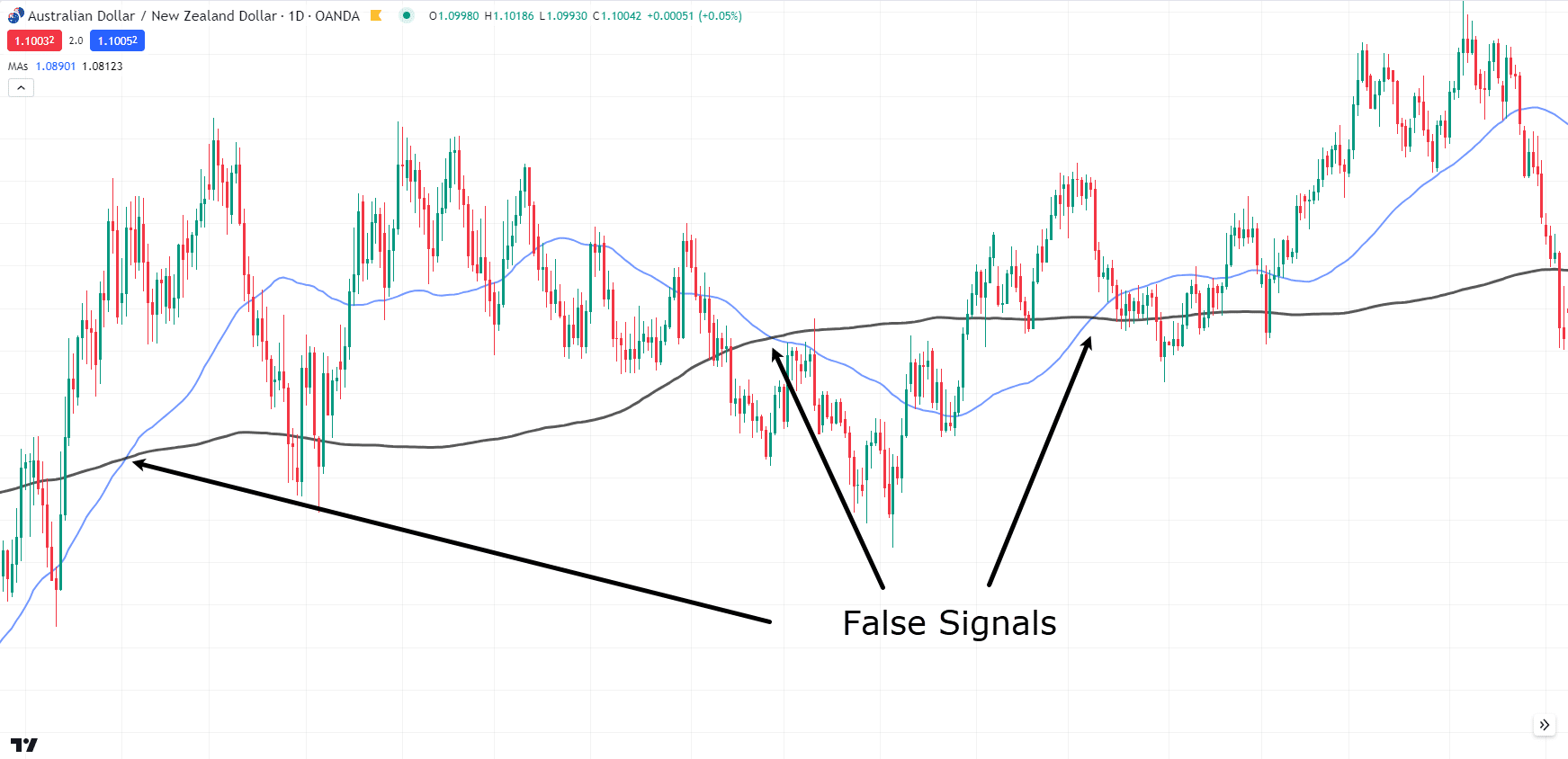
AUD/NZD Daily Chart False Signals:
As price begins to range, you can see multiple crossovers…
…but it becomes very unclear when the Death Cross or Golden Cross will carry through!
Using indicators can assist with this flaw, but it’s important to remember that false signals will happen from time to time.
Conclusion
In conclusion, understanding the Golden Cross and Death Cross is essential for finding new market trends and making informed trading decisions.
These crossovers, which rely on the 50 and 200 moving averages, offer clear signals for potential upward or downward trends, helping you confidently navigate the market.
To recap what you’ve learned:
- The differences between the Death Cross and a Golden Cross
- The specific moving averages to use
- How complementary indicators can boost your trading strategies
- Real trading examples showcasing various take-profit approaches
- The limitations of using lagging indicators like the Golden and Death Cross
Great!
Now that you have a deeper understanding of these powerful indicators, it’s time to put them into practice!
Do you have any questions or personal experiences with the Golden Cross and Death Cross?
What timeframe do you think you want to use the Crossovers on?
Share your thoughts in the comments below!


Thank you very much Sir, I have been looking for something very simple and concise such as this, I have tried price action it didn’t work for me because of over trading now these can help to always sit and wait for the cross. Since I started trading 7months ago I have never made any withdrawal able profit because the market use to take it back from me after one or two successful trade, why because of not having an edge I hope from today this will be my edge over the market
Thank you for sharing, Joseph.
Wishing you good luck and good trades!
Doet it make sense to use GC & DC for 1m timeframe?
Hi, Onul!
Lower timeframe charts can often lead to false signals. Remember, when using Golden and Death Crosses across different timeframes, the lower the timeframe, the less weight these signals carry in the overall market context.
Hope this clarifies!
Please I want to know, if the analysis is being done on a higher timeframe like daily timeframe can you use 1hr timeframe as your entry timeframe or you use the daily timeframe?
Hi, Stephen!
You can use the lower time frame for your entry. You might find the factor of 4 to 6 helpful.
You can learn it here:
https://www.tradingwithrayner.com/multiple-timeframe-cheat-sheet/
Hope this helps!