Have you ever looked for candlestick patterns before…
…and wondered how to read them effectively?
Maybe even tried to figure out what these candlesticks are trying to say…
…only to find yourself lost by their narrative?
In the world of trading, candlestick patterns are more than just visual patterns on a chart.
They live and breathe the market and traders’ emotions!
These patterns can describe extraordinary tales…
…of strong, bullish pressure…
…or intense battles between buyers and sellers…
…and crucial moments when price reversals can lead to significant profits!
In this article, you’ll discover:
- Gain a clear understanding of what candlestick patterns are and what drives their formation.
- Explore the intriguing stories that candlestick patterns have to tell, providing valuable insights into the battle between bull and bear!
- Witness real trading examples that highlight the practical power of understanding reversal patterns.
- Recognize that, like any trading tool, candlestick reversal patterns come with their own set of limitations that require your awareness.
Sound good?
Let’s dive into this exciting story of Candlestick Reversal Patterns, and the stories they tell!
What are Candlestick Reversal Patterns?
Candlestick chart types have become popular among traders because they tell smaller stories within the larger market story.
Certain candlestick patterns tell a story of strong bullish pressure, with little resistance from the selling side.
Others depict buyers and sellers engaged in intense battles and tug-of-war scenarios.
Sometimes, a candlestick might reveal the narrative of price approaching an area, only to be met with a sudden surge of selling pressure that pushes it rapidly away!
All of these narratives help to improve your understanding of current market dynamics.
As a trader, your objective is to decipher these candlestick stories and capitalize on them – to profit!
Now, the setting for these tales is just as important as the stories themselves…
How do candlesticks tell stories?
Candlesticks tell stories by visually representing price action.
To fully grasp the narrative conveyed by candlesticks, it’s essential to understand what each component does.
Let’s delve into the details of candlestick anatomy…
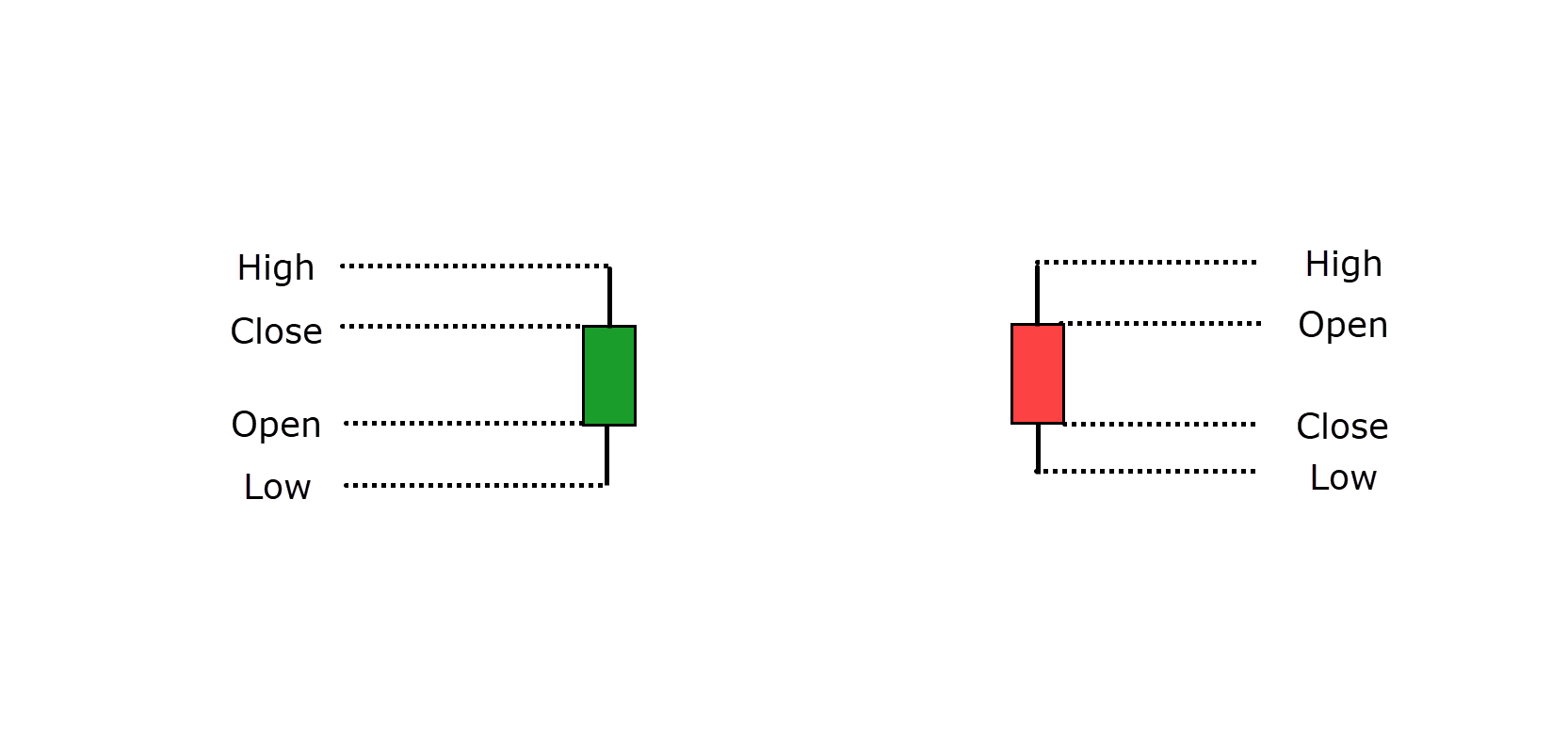
Open and Close Levels: A candlestick starts at the open price and changes color depending on whether the price closes above or below the open (often green for bullish and red for bearish).
The space between the open and close is called the body:
- For green candles where the price closes higher than the open, it suggests bullish dominance during that session.
- For red candles where the price closes lower than the open, it suggests bearish dominance during that session.
Wicks (Highs and Lows): The highs and lows of the candle, represented by the wicks, indicate the price levels where attempts were made to push the price but failed.
- A tall upper wick signifies that buyers initially pushed the price higher, but sellers ultimately prevailed, causing the price to close lower.
- A battle between bulls and bears plays out within the wicks, while the body represents who gained more ground during this struggle.
Wick rejection is a valuable tool, offering more insight than just the session’s highs and lows…
It shows how strong the buying or selling pressure was when the price attempted to move in either direction.
In essence, candlesticks tell a story of market dynamics and the struggle for control between buyers and sellers…
They provide a much richer narrative than merely stating the price at a specific moment in time.
So, understanding these stories can enable you to make better-informed decisions in the market.
Let’s now take a look at some of the major reversal candlestick patterns!
Reversal Patterns
Finding reversal candlestick patterns can lead to some of the biggest trading gains.
Now that you’ve learned how to read the anatomy of a candle, these reversal patterns will make more sense, especially when observed in critical areas of value.
Alright, you might be saying…
“Rayner, these candlestick patterns occur all over the chart!”
“How am I meant to know which ones are important?”
Well, first and foremost, you want to see a candlestick formation appear at a key area of value.
This area could be defined by various factors, such as a moving average, simple support and resistance, a supply and demand zone, or a trendline.
In essence, any region that provides a compelling reason to anticipate a reversal can be considered a key area of value.
“Okay, Rayner! But what is occurring at these zones?”
It’s another great question!
The majority of reversal patterns depict a struggle for dominance…
…between one side of the market and the opposing side – with the latter exerting stronger and more convincing pressure.
Consider it a battle between bulls and bears!
Now, the beauty of these narratives is that they leave their footprints all over the chart for you to see.
Most of the reversal patterns I discuss in this article focus on what I refer to as “rejection.”
When price encounters these areas of value and displays signs of rejection, they serve as reliable indicators for a potential reversal in price…
So let’s begin by exploring bullish reversal patterns!
Bullish Candlestick reversal patterns
The Hammer Reversal Pattern
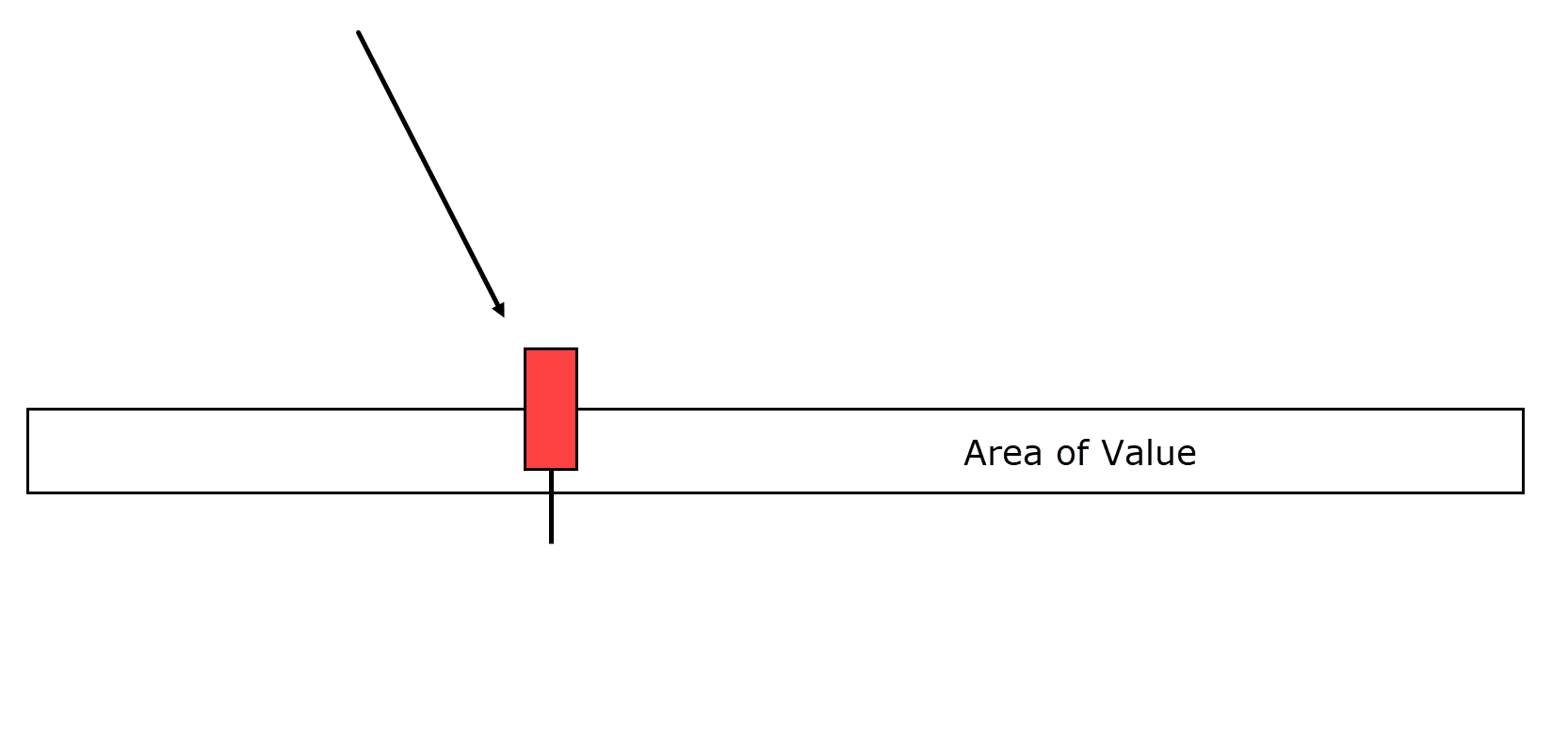
As you’ve learned earlier in this article, long wicks on candlesticks reveal a struggle between bulls and bears, with one emerging as the dominant force.
Now, when I talk about “Hammers,” I want you to recognize not only the hammer-shaped candle but also the significance of what that hammer represents.
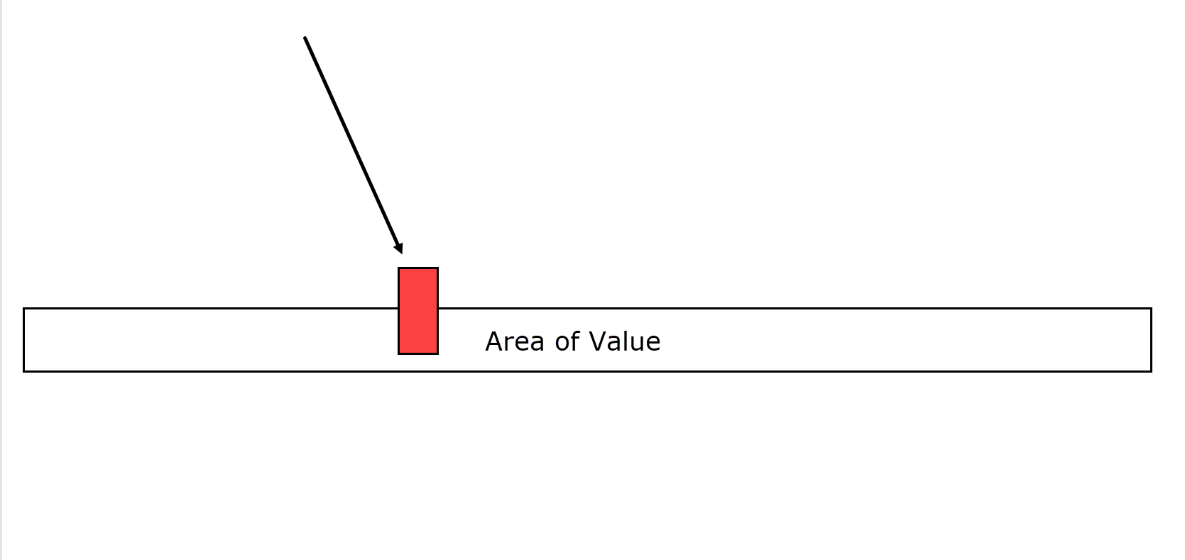
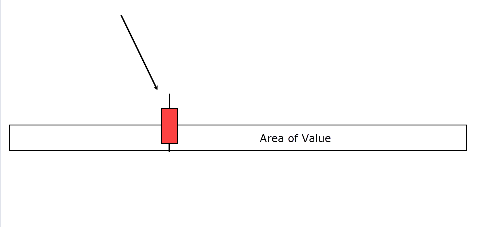
Imagine you’re analyzing a 4-hour chart…
Price has descended to your identified area of value.
Three hours into the candle, the chart looks similar to the example above.
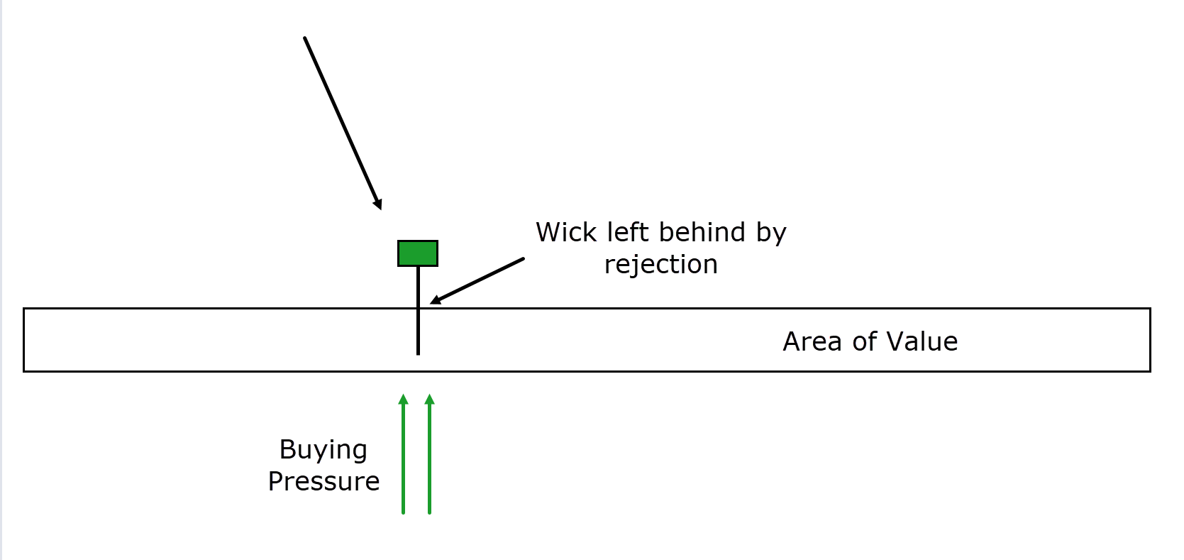
However, during the final hour of the 4-hour candle, the price attempts to extend below the area of value but encounters a significant influx of buying pressure…
The buyers push the price back up, resulting in a candlestick formation that resembles a hammer.
Notice how the long wick represents a clear footprint…
…of sellers striving to gain control…
…but ultimately succumbing to a robust bullish force – propelling the price upward!
This is why wicks are so crucial to watch for; they convey a distinct story of the battle that took place and reveal who emerged victorious in that trading session!
Bullish Engulfing Reversal Pattern
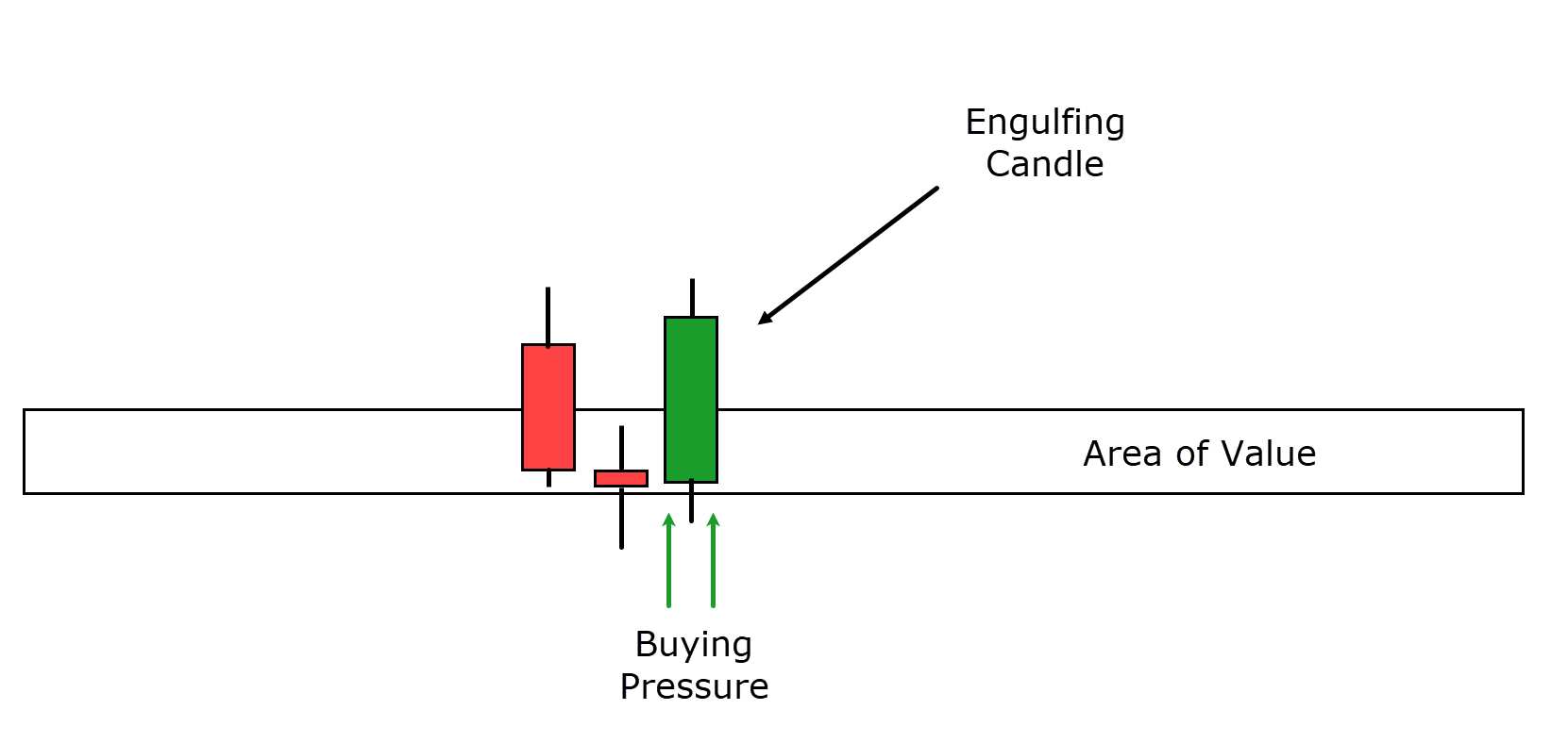
The Bullish Engulfing pattern is a two-candlestick pattern that you should be on the lookout for, particularly in areas of value.
Here’s how it typically unfolds…
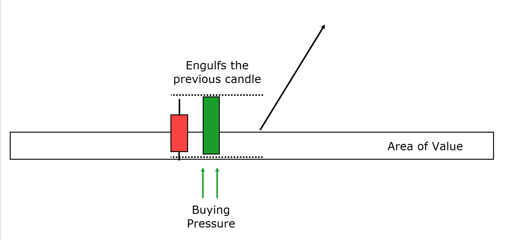
Price enters a defined zone of value, and you may initially observe a bearish candle.
The specific appearance of this initial candle is of lesser significance in this pattern…
The most crucial aspect of the Bullish Engulfing pattern is the second candle.
You can see that the second candle entirely engulfs the previous one!
Put simply, the body of the second candle must be larger than the body of the preceding bearish candle to qualify.
It’s worth noting that if the Bullish Engulfing candle engulfs not just one but multiple preceding candles, it’s a stronger indication of robust buying pressure.
Now, the underlying idea behind this candlestick pattern is that the subsequent candle completely wipes out any bearish sentiment that caused the price to move into the area of value.
It shows that the bulls had no trouble wresting control when it seemed the bears were dominating the market within that zone.
Therefore, the Bullish Engulfing pattern represents a clear shift in market sentiment from bearish to bullish.
Morning Star Reversal Pattern
The Morning Star reversal pattern is a three-candlestick reversal pattern that provides valuable insights into market dynamics.
Here’s how it typically unfolds:
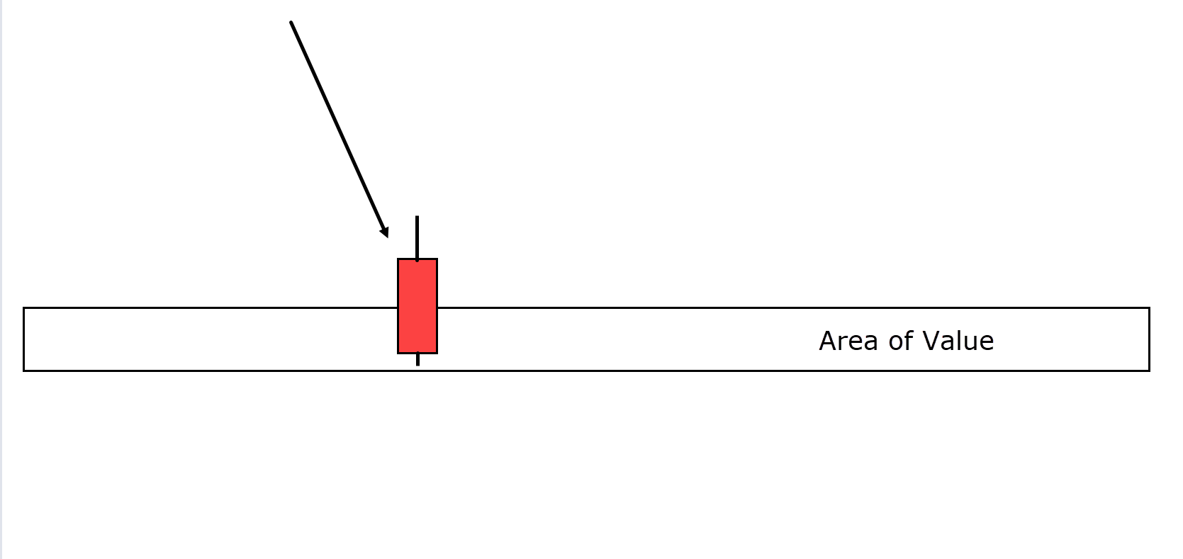
Price enters an area of value, indicating that bears have been driving the price down to this level…
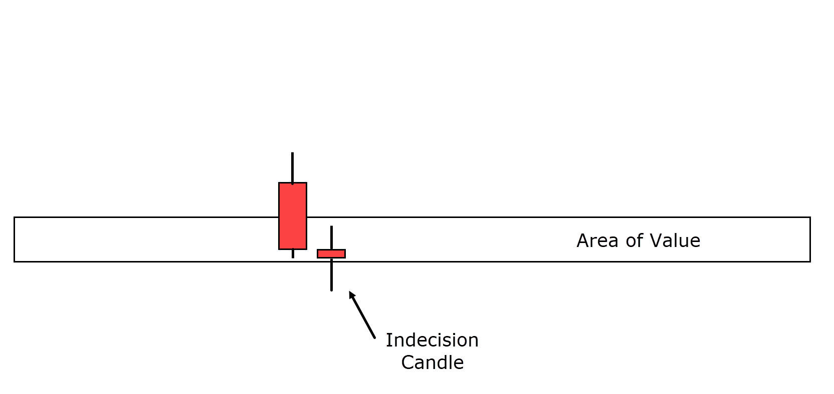
The second candle in the pattern resembles a doji, with a small body.
Whether it closes bullish or bearish is less important than its appearance, which indicates a pause in price movement.
This doji reflects the idea that price has tried to move lower and failed, but it has also struggled to move higher.
It’s like a tug-of-war between bears and bulls at a critical area of value on the chart…
In the third candle, the victors are declared, as the bulls seize control of the market and drive the price above both the previous candles.
This is where the real reversal takes place…
The Morning Star reversal pattern is a hybrid of previous bullish candlestick examples.
The engulfing candle, as discussed earlier, plays a crucial role in this pattern, indicating a shift in momentum from bearish selling pressure to a period of indecision in the market, and ultimately, the emergence of strong bullish sentiment to reverse the price.
It’s a compelling sign of a change in market dynamics.
Tweezer bottom
To conclude this discussion on bullish reversal patterns, I give you the Tweezer Bottom.
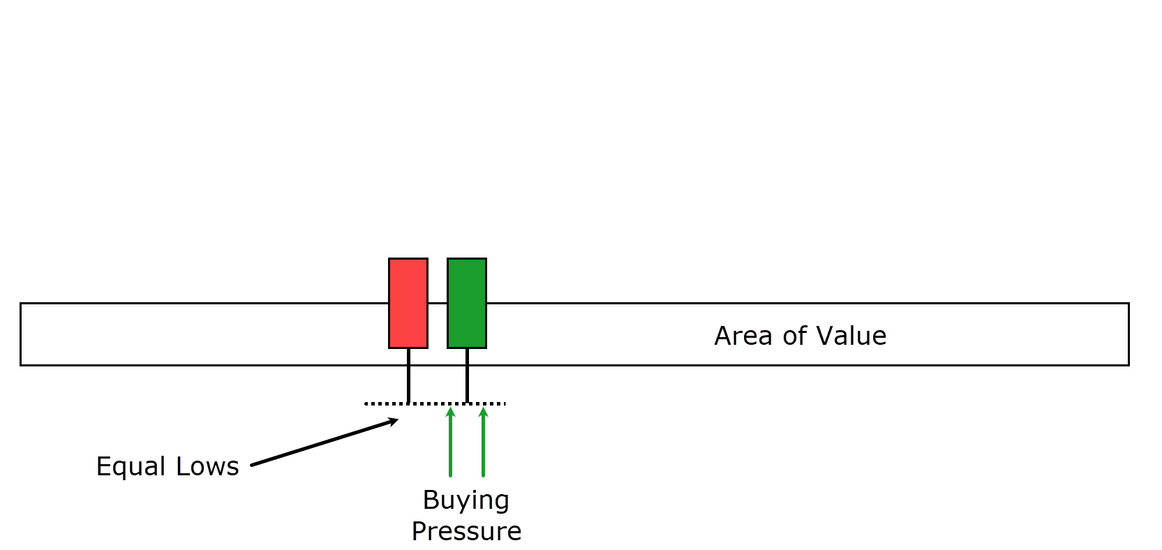
The Tweezer Bottom is a two-candlestick pattern, and it shares some common features with the patterns explored so far.
Here’s how it typically unfolds:
Price once again approaches an area of value, indicating a potential reversal…
Price makes nearly the same low on the next candle, and it’s preferable if this candle closes with a bullish bias…
Now, although a bullish close is not a strict requirement for the Tweezer Bottom, it’s generally more favorable…
In this example, you can see how the price revisits the same level before ultimately closing with a bullish bias.
The Tweezer Bottom reversal pattern is noteworthy because the two identical lows signify the formation of support on a lower timeframe.
Price attempts to break the same price level but fails, and the second candle closes with a bullish tone, reflecting a shift in momentum from sellers to buyers.
This pattern highlights a possible reversal from bearish to bullish sentiment in the market.
OK, so that is a nice set of patterns for when prices are going up.
But you and I both know prices don’t always do that, do they?
So let’s take a look at the bearish reversal patterns!
Bearish Candlestick reversal patterns
Inverse Hammer/ Shooting Star Reversal Pattern
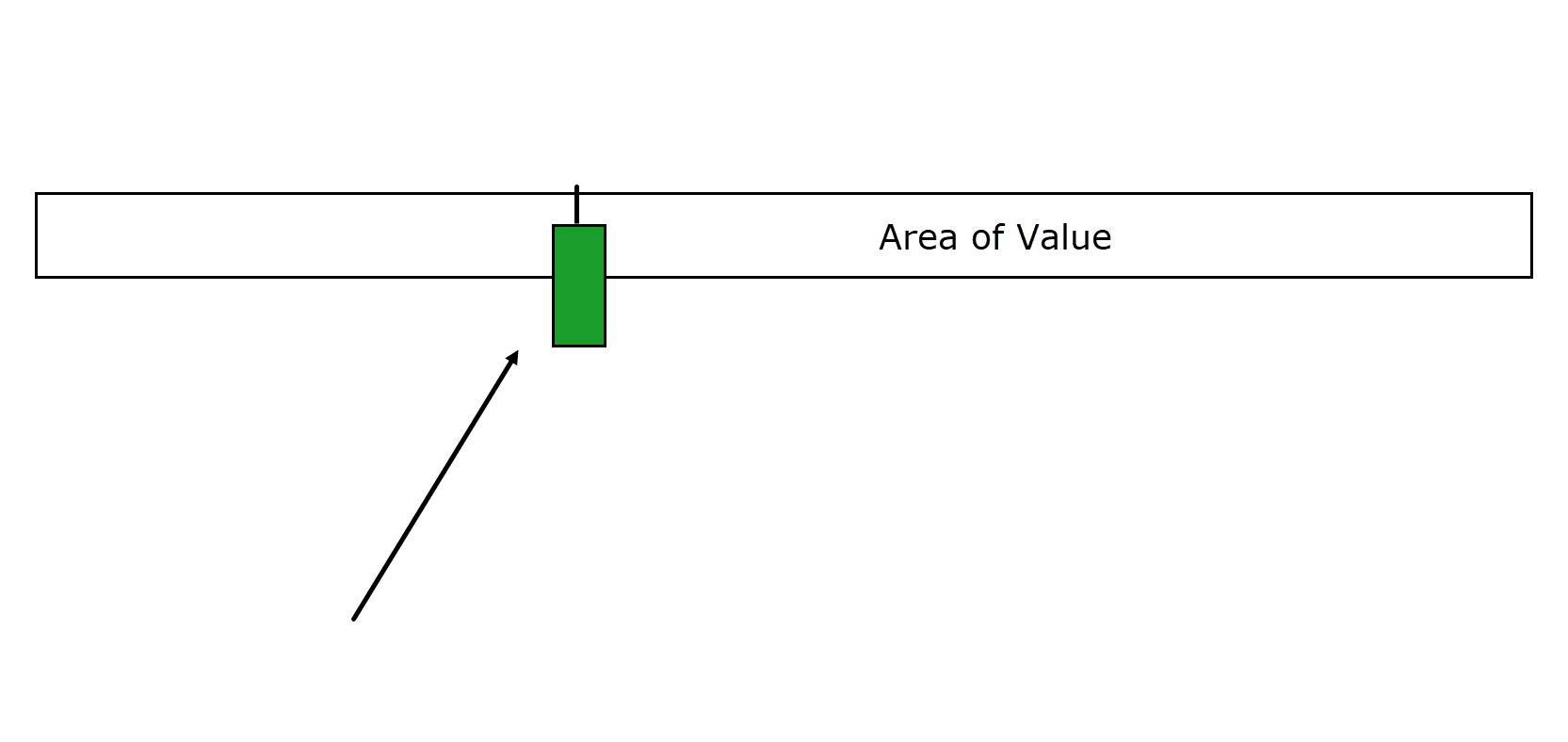
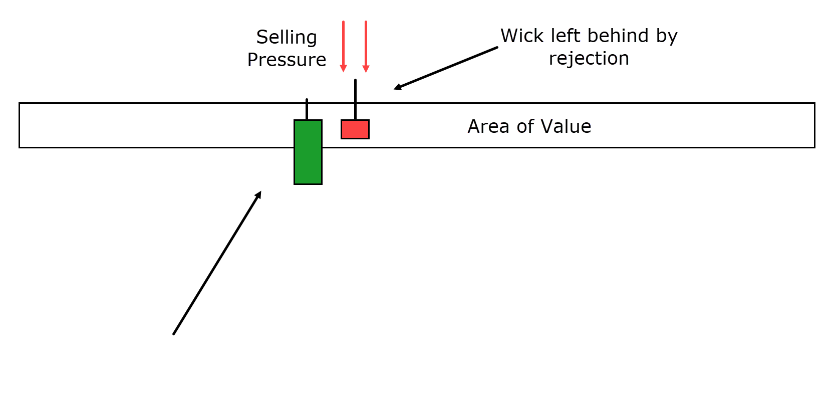
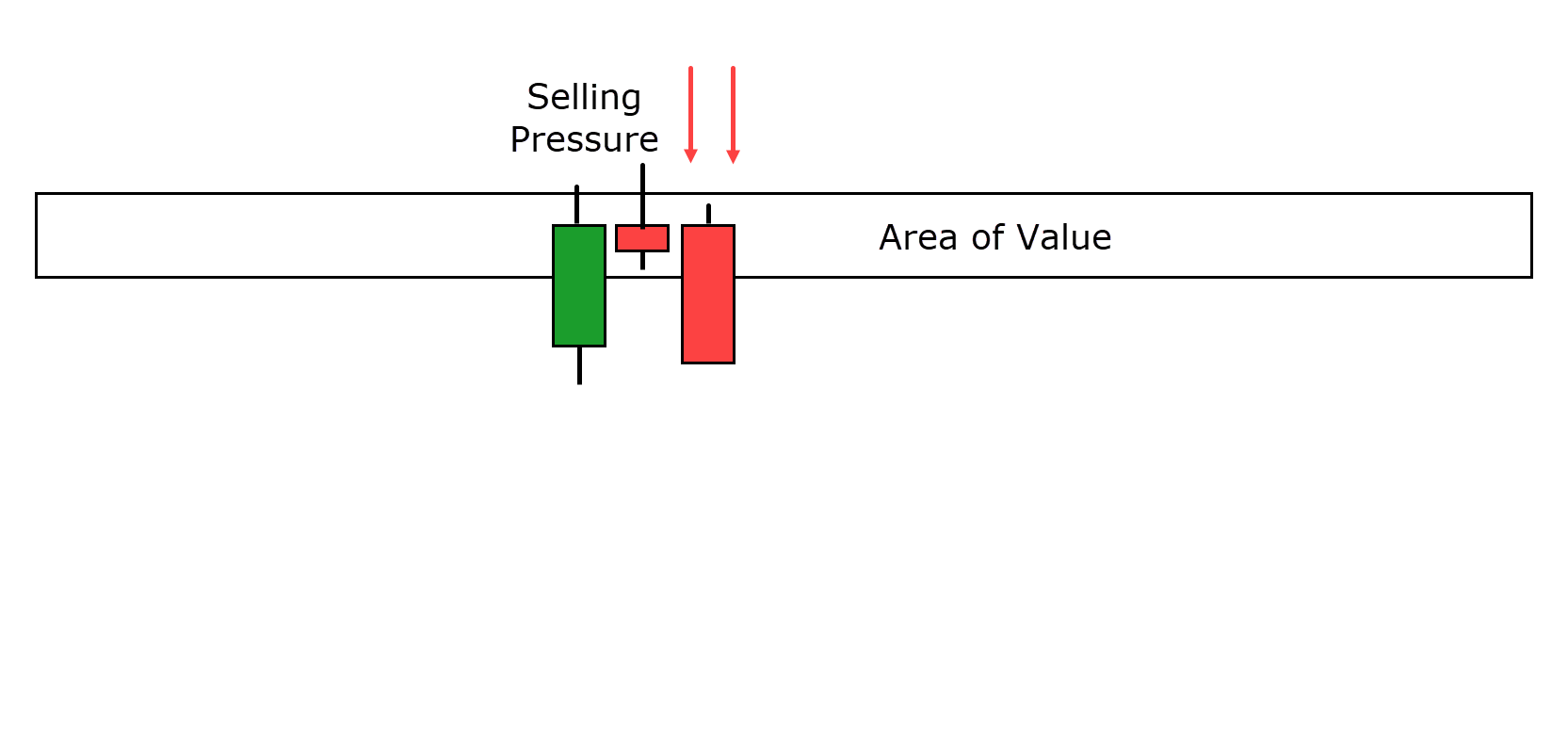
Much like the Hammer pattern for bullish reversals, the Inverse Hammer is a single candlestick reversal pattern used to identify potential bearish reversals.
Here’s how it typically unfolds:
Price needs to rise to a specific area of value and treat it as resistance.
When price encounters resistance, buyers attempt to push it beyond the resistance level…
However, selling pressure steps in and prevents the candle from closing above the resistance zone…
This scenario results in the candlestick pattern shown above.
Similar to the Hammer, the long wick symbolizes the battle between buyers and sellers…
In this case, the sellers prevail, indicating a potential shift toward bearish sentiment!
Bearish engulfing Reversal Pattern
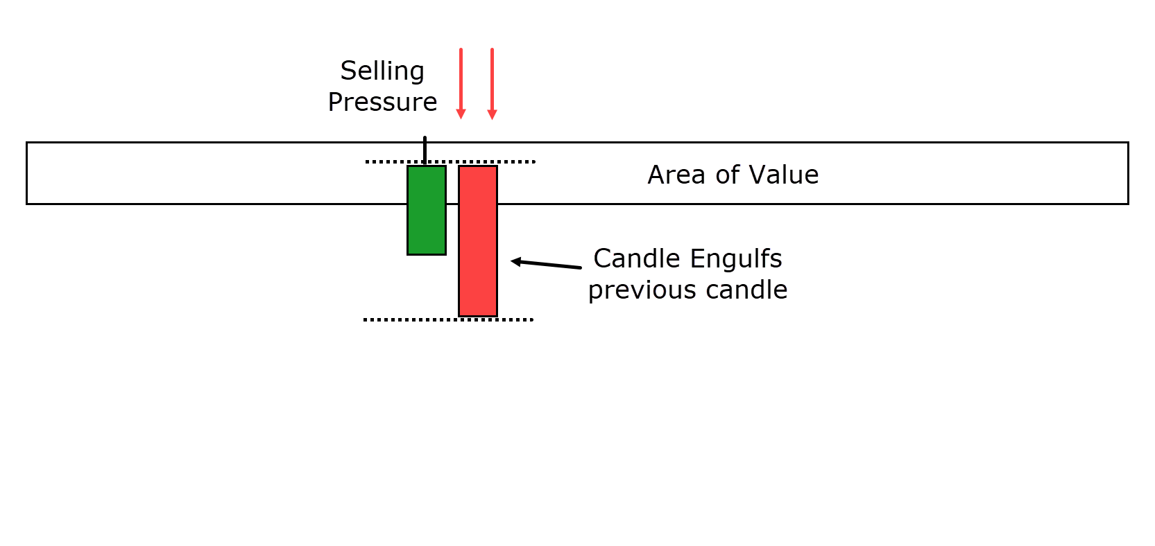
Similar to the bullish engulfing candlestick pattern, the bearish engulfing pattern is also a two-candlestick pattern used to identify potential bearish reversals.
Here’s how it works:
As with other reversal patterns, this pattern typically occurs when price approaches a specific area of value.
However, in this case, that area of value is regarded as resistance…
The second candle in the pattern entirely engulfs the body of the previous bullish candle.
This indicates a significant shift in sentiment as selling pressure…
The resistance level adds weight to the bearish argument by allowing the bears to take control and drive the price down away from the resistance.
It’s a clear sign of potential bearish dominance in the market!
Evening Star Reversal Pattern
The Evening Star reversal pattern is essentially the counterpart to the Morning Star reversal for sellers.
It’s a three-candlestick reversal pattern that unfolds at the peak of an uptrend.
Here’s how it works:
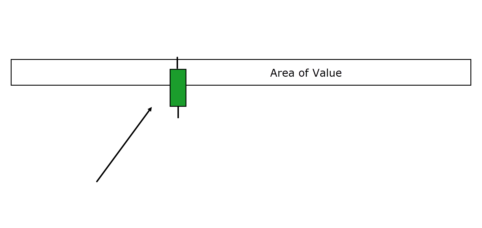
Price follows an uptrend and eventually reaches a significant area of value…
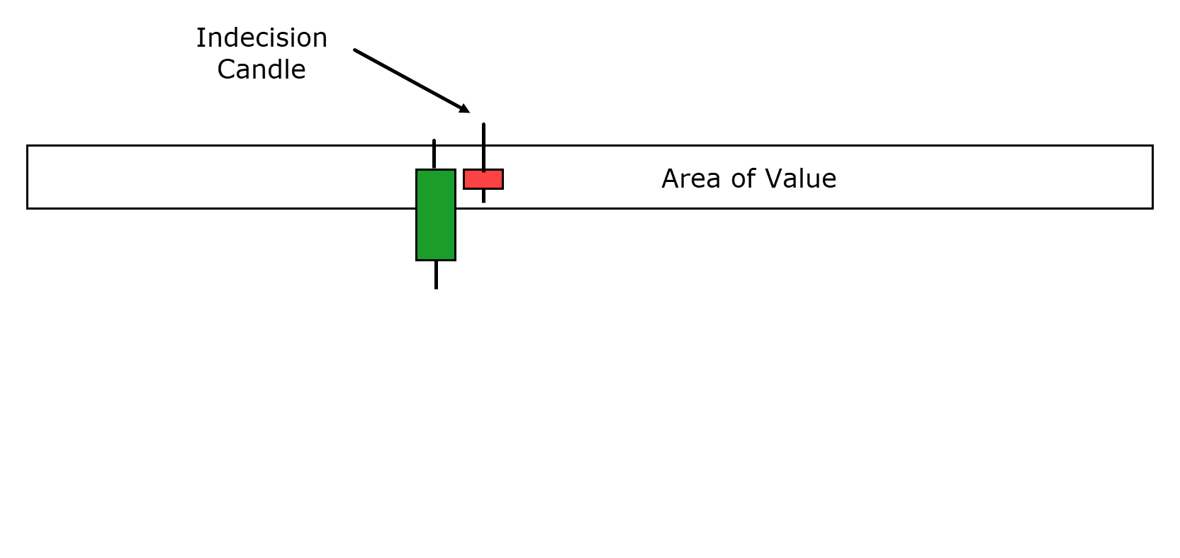
As the price arrives at this area of value, a doji candle is printed.
Now, this doji shows that the battle is still undecided at the resistance level.
This candle may have a long wick pointing upwards, or it might be relatively neutral.
The key is to look for a candle that signals a slowdown in market momentum, or a level of uncertainty…
The Evening Star reversal pattern is finalized when the last candle engulfs the previous two candles.
This engulfing candle demonstrates strong selling pressure that drives the price back below the resistance level.
It indicates a possible shift from bullish to bearish sentiment in the market…
Tweezer Top Reversal Pattern
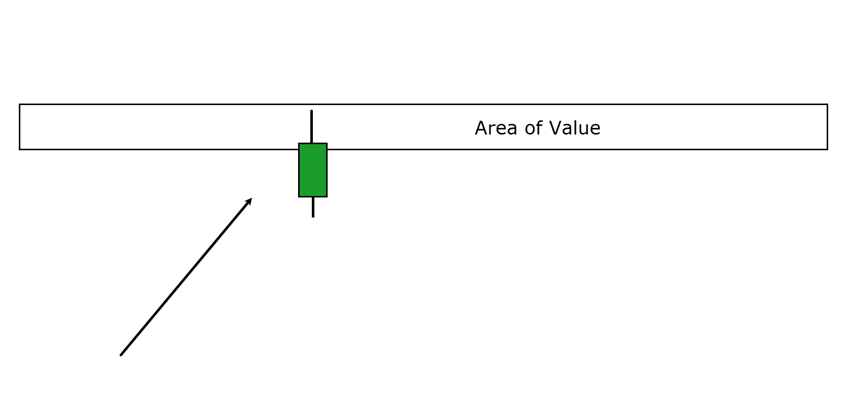
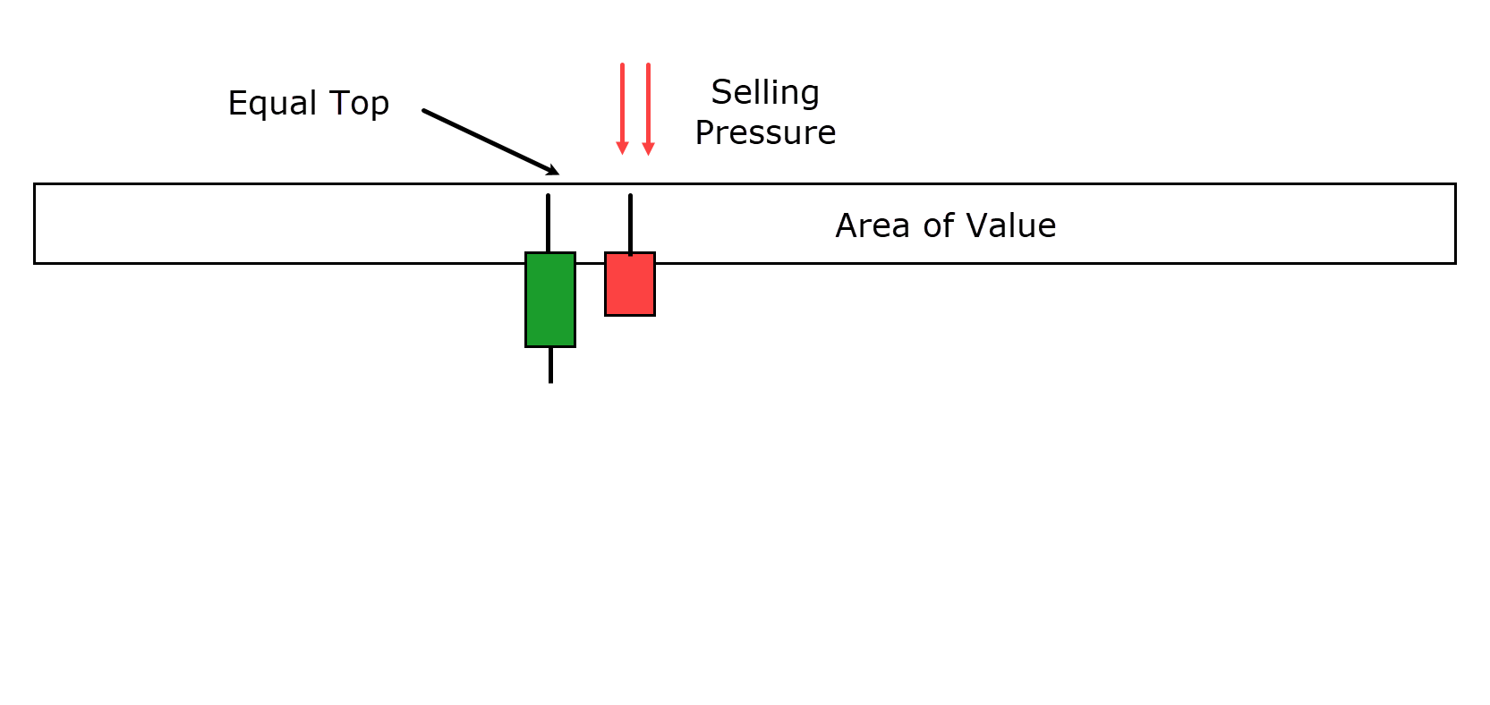
The Tweezer Top pattern is a bearish reversal pattern that is essentially identical to the Tweezer Bottom but… you guessed it… is found at the top of an uptrend rather than at the bottom!
Here’s how it works:
Price ascends to a significant resistance level at the top of an uptrend and establishes a high point.
In the first candlestick, this high is met with selling pressure, indicating that buyers’ attempts to push the price even higher are unsuccessful…
In the second candlestick, the price makes another attempt to go higher…
…but can only reach the high point of the previous candle before retracing back down, moving out of the resistance zone…
This pattern signals a potential reversal of the prior bullish trend, as it suggests the sellers are gaining control and pushing the price lower from the resistance level.
Now that you’ve seen how each reversal pattern is formed, let’s examine some real-world trading examples – to see these patterns in action!
Trading Examples
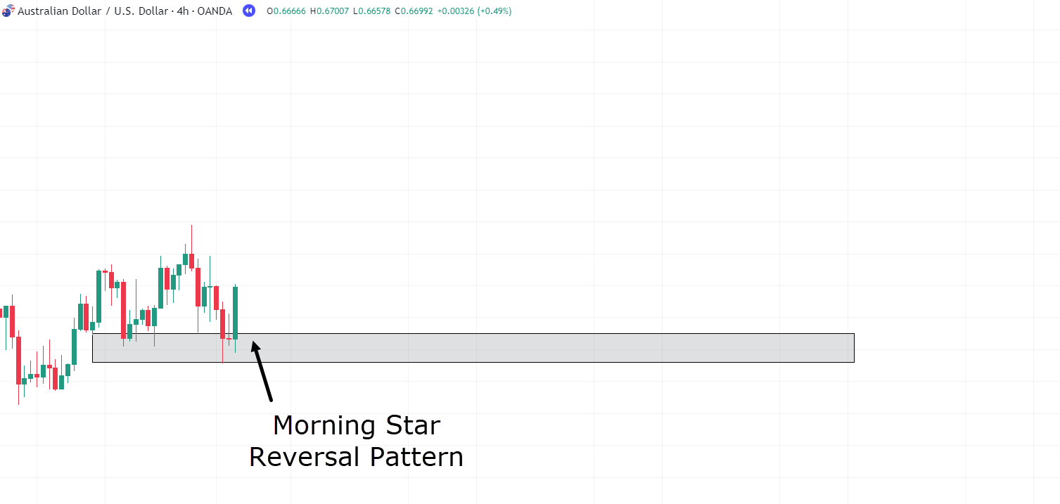
In this chart, you can observe the formation of a solid base and support level on the 4-hour timeframe…
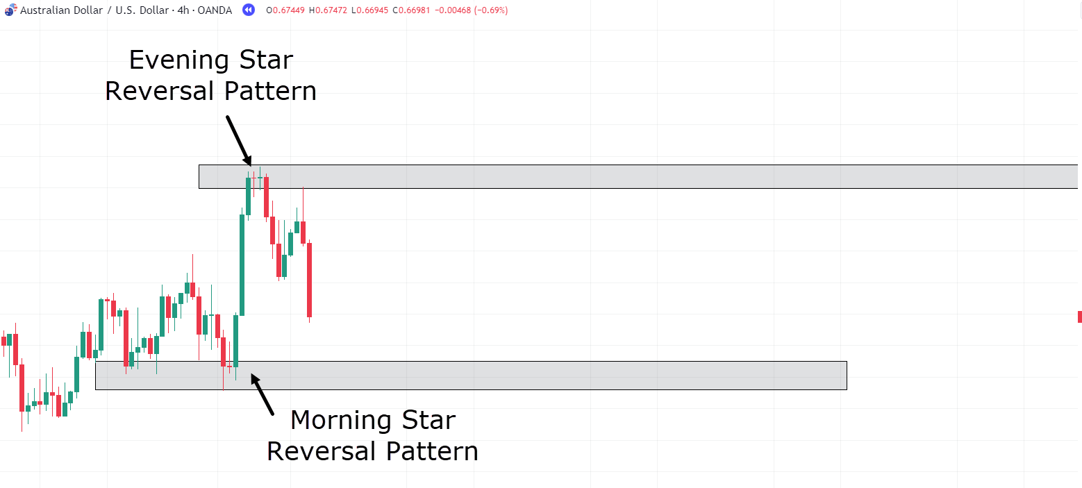
AUD/USD 4-Hour Timeframe Chart Morning Star Reversal:
Price returns to this area after a brief move away.
Take a closer look… Can you see a pattern in this area of value (without reading the label)?
Indeed! It’s the Morning Star Reversal pattern!
This pattern indicates a shift in momentum, favoring the bulls.
But there’s something even more favorable in this scenario…
Can you spot it?
It’s the first candlestick in the pattern, which is a bearish candle but also shows rejection in an almost hammer-like formation.
So, the price reaches an area of value…
…forms a rejection candle (similar to a hammer)…
…and then follows up with the Morning Star reversal pattern in the next two candles!
It’s a strong signal of potential bullish momentum!
Now, let’s continue analyzing this same chart to see how the story unfolds…
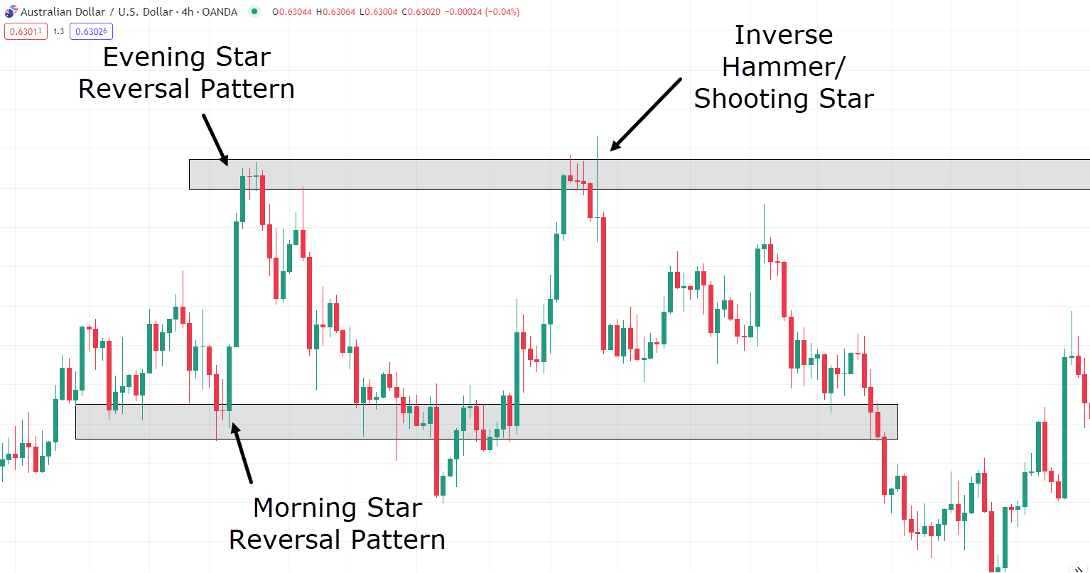
AUD/USD 4-Hour Timeframe Chart Evening Star Reversal:
Following the strong bullish move after the Morning Star Reversal pattern, the price continues upward.
However, a significant development occurs as an initial high is formed, which acts as a potential future resistance level.
At this point, there isn’t a clear area of value suggesting a price reversal, making it challenging to consider a short trade.
But it’s crucial to pay attention to the pattern that forms…
…it’s none other than the Evening Star Reversal pattern!
Now, I understand you might be thinking…
“Rayner, this isn’t the Evening Star Reversal Pattern; it has four candlesticks, not three!”
But, it’s essential to grasp that the essence of the candlestick pattern is more significant than its exact appearance.
So, let me ask you, what happens at this reversal point?
Price ascends and then stalls with two small doji-like candles, right?
Take another look to check.
Following this, a bearish candle emerges and engulfs not only the two preceding indecision candles but the entire bullish candle into the zone, too!
This is why I still consider it the Evening Star Reversal Pattern, as its underlying story fits perfectly with the three-candlestick pattern.
The only difference is that the indecision phase lasted a bit longer.
Alright, let’s continue tracking this currency pair to see how the story unfolds…
AUD/USD 4-Hour Timeframe Chart Inverse Hammer:
Observing the price movement further, you can see that it eventually returned to the support zone and began forming hammers within it.
This suggests a trade setup, as the price has returned to an area of value and is demonstrating rejection.
However, as shown in the chart, the price did not follow through on this setup and caused a fakeout before climbing back above the zone.
This illustrates the dynamic and sometimes unpredictable nature of the market!
Now, what I want to draw your attention to is what unfolded when the price returned to the resistance level…
Can you see the three or four Inverse Hammers forming at resistance?
This signifies that price made repeated attempts to breach the newly established resistance but failed.
By looking at the types of candles that emerge at resistance, you can tell when there’s a shift in market momentum.
While the price was robust as it approached the zone, with three large bullish candles driving the price higher…
…the moment it reached the area of value, the candles became smaller, and rejections started occurring!
This presents an excellent opportunity to consider a short trade!
Let’s explore one last example to reinforce your understanding of reversal patterns…
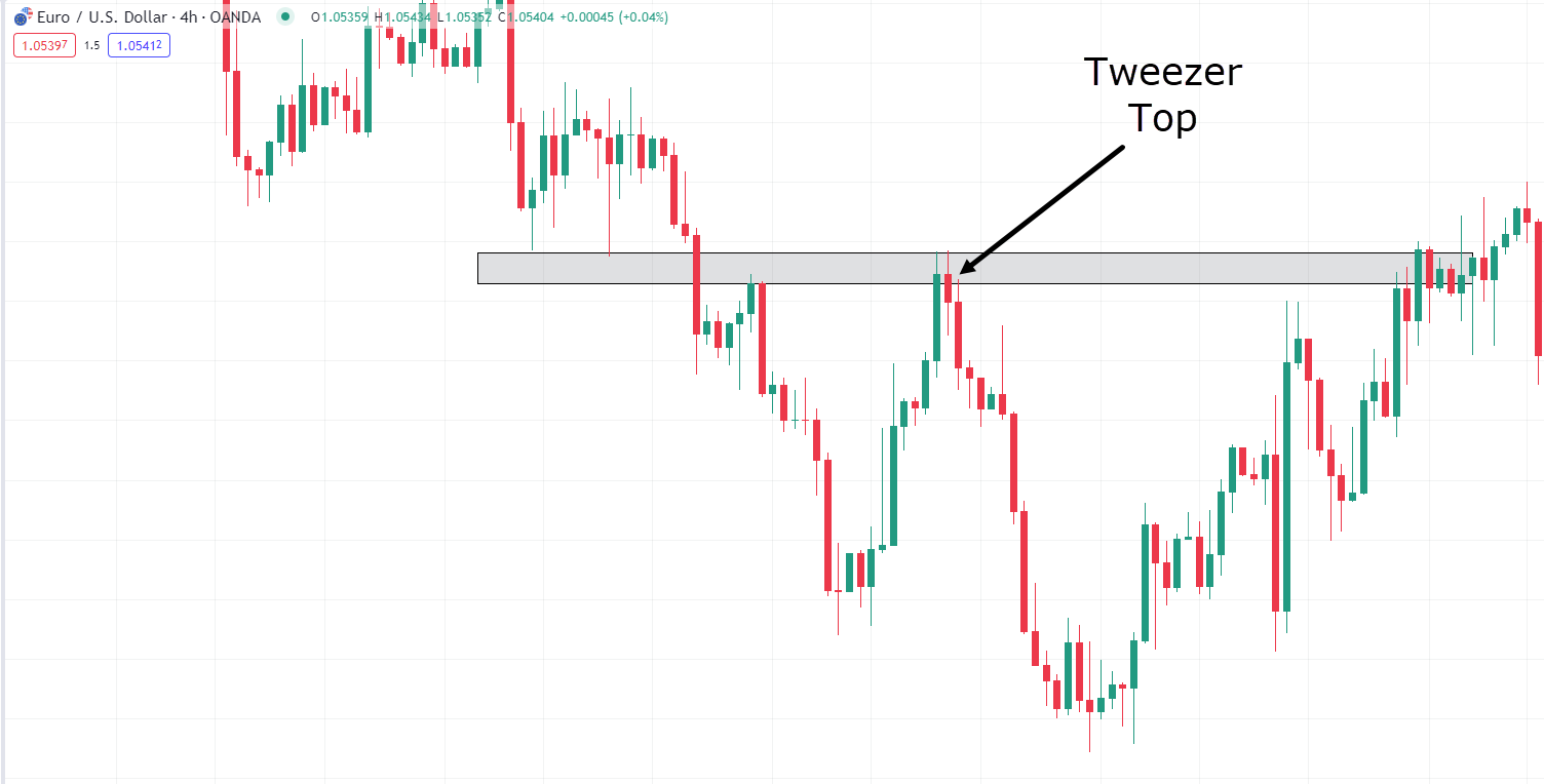
EUR/USD 4-Hour Timeframe Chart Tweezer Top:
In this final example, you have a clear illustration of the Tweezer Top reversal pattern in action.
The sequence of events unfolds as follows:
Price declines below a support level and initially retests it before moving away…
However, when the price eventually returns to this area of value, the Tweezer Top candlestick pattern materializes, featuring two nearly identical candle highs…
The confirmation of the reversal occurs in the next candlestick, where the price swiftly moves away from the zone!
The Tweezer Top pattern offers the advantage of allowing for tight stop-loss placement and presents favorable risk-reward ratios for trades.
This example emphasizes how closely observing these candlestick patterns in key areas can enhance your understanding of the story the market is conveying.
Ultimately, it empowers you to make more informed trading decisions.
But of course, before you embark on trading based on these patterns, it’s essential to discuss the limitations of candlestick patterns…
As with any system, accepting both its strengths and weaknesses is crucial for effective trading!
Limitations of Candlestick Patterns
Indeed, candlestick patterns, like any trading tool, come with their limitations.
It’s important to understand these limitations to use them effectively in your trading strategy.
Use in Conjunction with Other Indicators
While candlestick patterns are valuable, their performance is typically enhanced when used alongside other indicators and trading tools.
RSI, MACD, Moving Averages, and other tools can provide additional insights that complement candlestick analysis.
Key Support and Resistance Levels
Candlestick patterns are most effective when applied at significant support and resistance levels, as well as trendlines.
These areas of value are crucial for forming successful trades.
No Guarantee of Success
I say again, candlestick patterns, like all trading tools, are not foolproof!
They won’t work 100% of the time….
The market is dynamic and can sometimes overpower these patterns.
So it’s essential not to be disheartened when trades don’t always go as planned.
Take a deep breath and maintain trust in your trading process.
Understanding these limitations and integrating candlestick patterns within a broader trading strategy can help you make more informed and well-rounded trading decisions.
Conclusion
So, you’ve seen that candlestick reversal patterns are often the cornerstone of a successful trade!
Gaining a solid understanding of what these patterns are saying is crucial to the success of any trader.
The stories they tell offer a far more detailed insight into market sentiment than many typically consider.
Here is a breakdown of what you have discovered in this article:
- Gained a new understanding of the driving forces behind candlestick reversal patterns and how they take shape.
- Explored the hidden narratives that lie within each candlestick pattern, providing valuable information on whether bulls or bears hold the momentum.
- Delved into real-life trading examples that empower you to recognize how these patterns manifest in the actual market.
- Finally, you’ve acknowledged that, like any trading tool, candlestick reversal patterns have their limitations and should be used within the context of the overall market.
Now equipped with a solid understanding of Candlestick Reversal Patterns…
…it’s time to seek out the stories at key areas of value, and make trades with confidence!
So how about it?
What are your thoughts on candlestick reversal patterns?
Have you come to realize how candlesticks tell a more profound story than just high, low, open, and close?
Do you already incorporate other reversal patterns into your trading strategy?
Share your insights in the comments below!

Very well explained I now have a better understanding of the trading patterns
Happy to know that, Sam!
Cheers!
Yet again a great description of candlestick patterns explained and reinforced simply and effectively, its a great gift you have.
Thank you for your kind words, Jj!
Good explanation with example, thanks
You are most welcome!
Thanks alot , I wish I can get a copy ..what is the price of the book?
Feel free to email us at support@tradingwithrayner.com so we can send the Monster Guide to candlestick Pattern pdf copy.
Cheers!
There are still few major ones in the like of COD OF WOOD (cow) bullish example. Equal bullish candle, bearish candle, bullish candle and another bulish candle of all equal hights. Anyways, Rayner thanks for the info.
You are most welcome!
Thank you so much Rayner. You’ve been my distant coach and your lessons have improved my trading than any other material or video I have bought and chanced on.
I recommend to every trader from beginner to pro, to follow Rayner through to be a consistently profitable trader
Thank you for your kind words, Sarfo!
You are most welcome.
Why can’t I download this
Hi, Milez!
Feel free to email us at support@tradingwithrayner.com if you need the candle stick pattern eBook!
Cheers!
TOPNOTCH…
Thanks, Rawlings!
Thank you so much
You are most welcome, Aminu!