In this video, you’ll discover how to use chart patterns to better time your entries and exits- and even “predict” market turning points.
So watch it now…
Video Transcription
Hey, hey! what’s up, my friend!
Welcome to the ultimate chart patterns trading course.
Who is this course for?
This course is for you if you’re a beginner trader or an advanced trader here’s how it works…
This course is built in a step-by-step manner so even if you’re a new trader, you can follow this course every step of the way.
Towards the end, we’ll build up on what you’ve learned and share with you advanced strategies and techniques, and this will be useful, especially for those of you who have some trading experience.
It doesn’t matter whether you’re a stock trader, forex Trader, or a crypto trader.
Because the strategies, techniques, and concepts can be applied across these different markets.
The goal for you from this course is straightforward…
- How to use chart patterns to better time your entries and exits.
- How to use chart patterns to “predict” market turning points.
- Chart pattern strategies to profit in bull & bear markets.
Sounds good?
Then let’s get started…
The Reversal Chart Patterns
First up, we have the…
Double Top Pattern
This is in essence a bearish reversal chart pattern.
How does this work?
Let me explain…
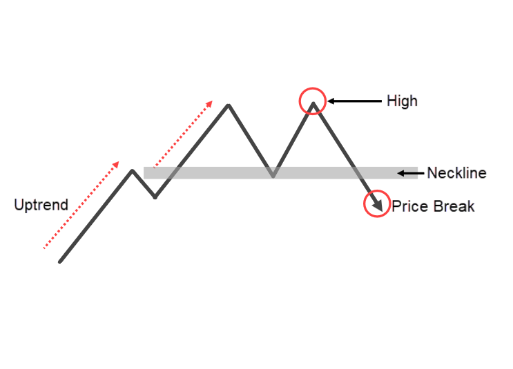
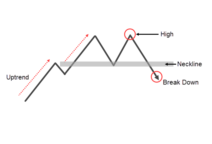
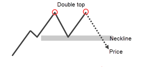
When you spot a double top, you will see that the market is initially in an uptrend, and then it makes a pullback.
Then it re-tests the highs once again and then makes another pullback.
At this point, and the market is still bullish, there’s nothing bearish about this chart.
But where things start to get suspicious is when you have this neckline over here:
If the price breaks below this neckline, we will say that the double top is sort of confirmed and the market is likely to head down from here:
This is a double top bottom. It tested once and rejected down lower, tested twice, and got rejected down lower.
At this point is where it broke below this neckline, otherwise also known as an area of support.
How not to trade the double top pattern?
A mistake that many traders make is that when they see a breakdown of this neckline, this is what I mean:
The short the market.
The problem with this is that if you have been trading long enough, you would know that the market could come down and then quickly reverse back higher otherwise known as a false breakout.
If you are short because the market broke below the neckline, you are going to be disappointed.
What else can you do?
A better approach is you wait for the break and retest, this is what I mean:
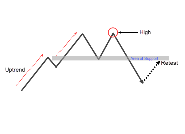
Let the price break down lower first and then re-test this support area.
This could retest and give you an entry trigger like a shooting star pattern.
This tells you that…
“Hey, sellers are stepping in”
Your stop is a distance above the highs and possible target before this recent swing low.
Double Bottom Pattern
This is a bullish reversal chart pattern.
The market is in a downtrend then it hits the low and makes a pullback up higher, then it retests back the low and bounces up higher. This is what I mean:
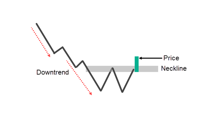
At this point, this market is still in a downtrend.
There’s nothing bearish about it because if you look at it, the lower high is still intact.
This is where you can also draw your neckline otherwise known as resistance.
If the price breaks above the neckline, this is where we say that the double bottom is confirmed.
But as you know by now, you shouldn’t trust this breakout just because the price closed above it.
What could also happen is the market could just easily reverse down lower forming a false breakout below resistance.
How do you trade the double bottom pattern?
Simply wait for the break and retest.
Let the market break out and retest the previous resistance which could become support.
Once you have a retest, you can look for a bullish entry trigger like a hammer.
This tells you that…
“Hey, buyers are stepping in and about to push the price higher”
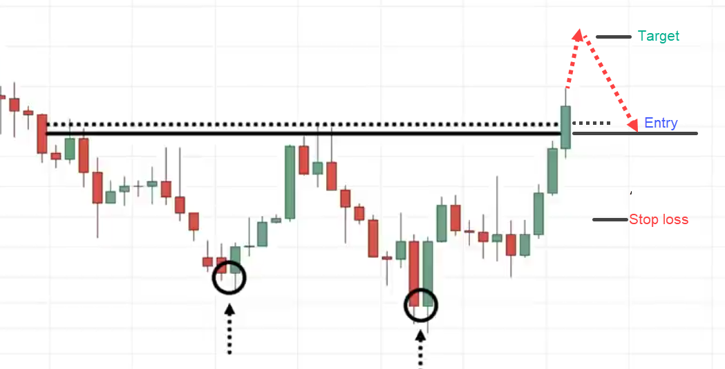
This is a sign of strength, and this is where buyers could come in.
Stops a distance below the lows, the target could be just before the recent highs.
Head Shoulders Pattern
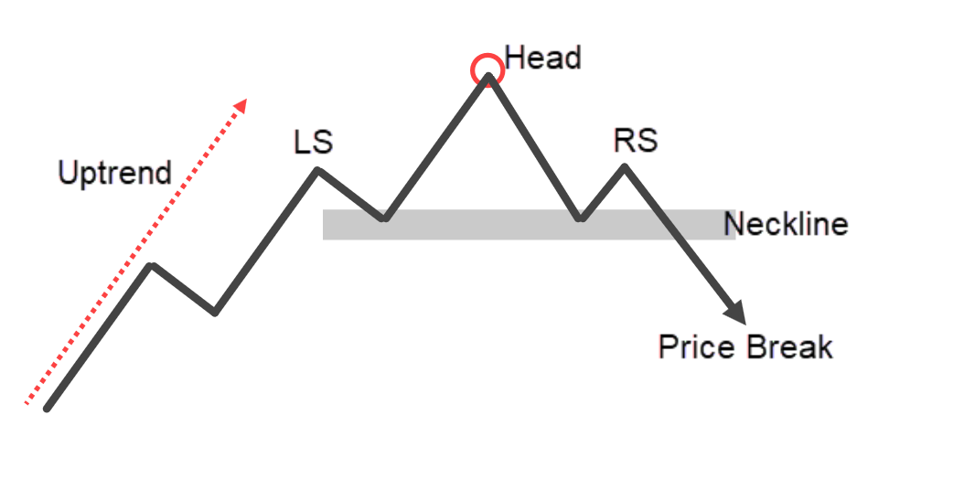
The Head and Shoulders chart pattern is a bearish reversal chart pattern.
Let me explain how this works…
The market is in an uptrend, it makes a pullback and goes higher. Then it comes back down lower retesting the lows.
At this point, the market is still bullish.
Where do things start to take a turn?
Price hits up higher and then starts to come down lower
The buyers have difficulty in pushing the price higher. This is a sign of weakness.
But it doesn’t mean that the market is going to collapse.
At this point, you can identify the neckline.
Some people call it support or neckline.
The Head and Shoulders pattern is only confirmed when the price breaks and close below this neckline.
When that happens, we will say that the head and shoulders pattern is complete. The market could hit down lower
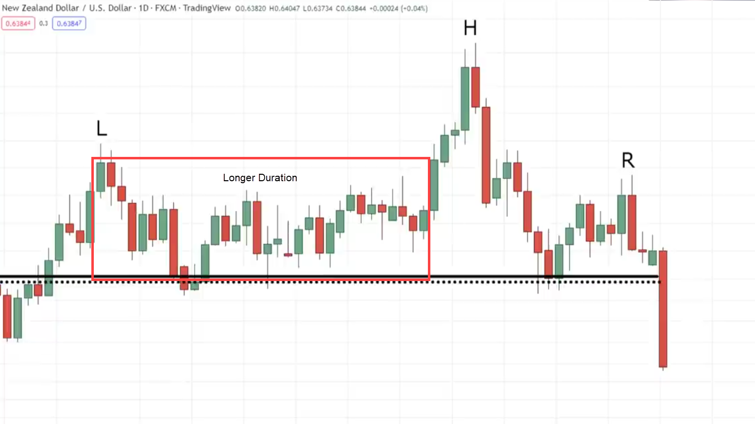
Let me show you that this head and shoulders pattern is a little bit different. It’s not as symmetrical as what you’ve seen earlier.
We have the left shoulder, the head, and the one sticking out is the right shoulder.
What you’ll notice is that the duration is a lot longer on the left compared to the right.
It’s still a valid Head and Shoulder pattern.
The reason why I share this with you is because in trading sometimes the pattern is not as symmetrical.
It’s not like what’s shown in the textbook.
How can you trade the head and shoulders pattern?
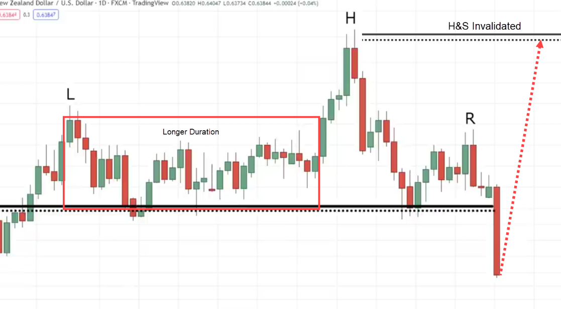
What I don’t recommend doing is that if you see the price breaks below the neckline, you go short.
The problem is where are you going to set your stop loss?
Some traders might set it above the head, because if the price goes all the way up and hits the breaking of the head, then of course this pattern is invalidated.
The problem with this is that your stop loss is so wide.
It’s like a 1:1 risk reward and it’s going to take time.
A better approach that you can consider is the break and retest method that I shared with you earlier.
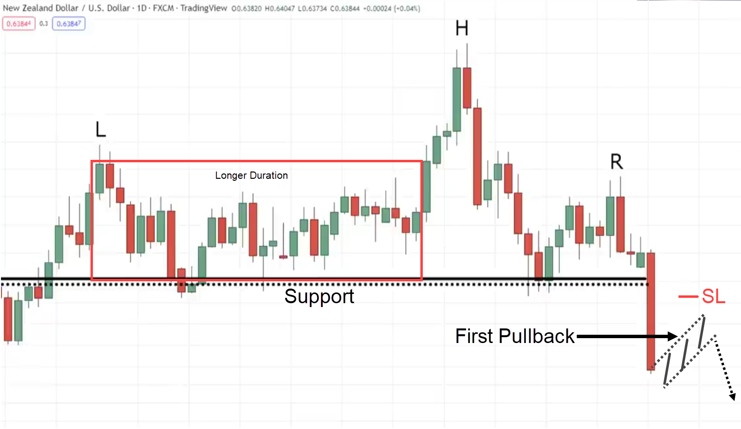
I will share with you a new one called the First Pullback
Why do I call this the first pullback?
Because at this price point, you notice how the price breaks below support:
If it makes a pullback now, this is what I call the first pullback.
This is the first pullback the market has made
This way you can go short.
What’s the difference between shorting at this price point and shorting earlier?
The main difference is that now you can reference these highs of the flag pattern to set your stop loss to be tighter.
When you have a tighter stop loss you get a more favorable risk to reward.
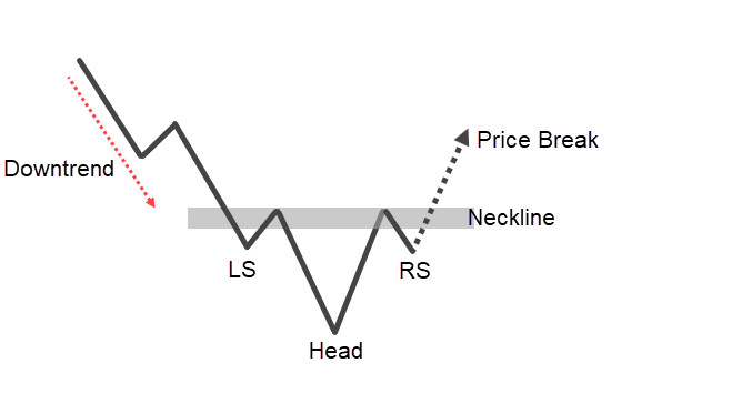
Inverse Head Shoulders
This is just the inverse or the opposite of what I shared with you earlier.
It’s a bullish reversal chart pattern.
When the market is in a downtrend, then it makes a pullback up higher, steps down lower then make a pullback up higher
At this point again, the market is still bearish.
There’s nothing bullish about the market.
Where do things start to take a turn?
Pay attention to this price action.
The market hits down lower and this time around to continue this downtrend (Right Shoulder), it has to break below the previous low.
But guess what?
It couldn’t break below the low because buyers are coming in to push the price higher.
At this point, this is where you have your left shoulder, the head, and the right shoulder.
Nothing is confirmed yet until the price breaks above the neckline.
This is where we can say the head and shoulder pattern is completed and the market could head up higher.
How to trade the Inverse Head and Shoulder
You can reference this low this swing low to set your stop loss and have a tighter stop loss.
That’s one thing in your favor.
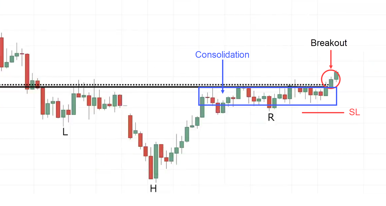
You can notice how the market is consolidating just before the area of resistance.
This consolidation is what I call a build-up.
This is a sign of strength.
It is telling you that…
“Hey, the market has difficulty heading down lower”.
The fact that it’s still consolidating, tells you one thing, buyers are stepping in and could push the price higher.
One way you can go about trading the inverse head and shoulders pattern is only if you have this consolidation.
A build-up formed at the neckline.
If not, you can go about trading the first pullback or the break and retest strategy which I’ve just shared with you earlier.
Triple Top Chart Pattern
This is a bearish reversal pattern and it’s a variation of the Head and Shoulder pattern that you have seen earlier.
It can also be a variation of the double-top pattern.
Let me explain how this works…
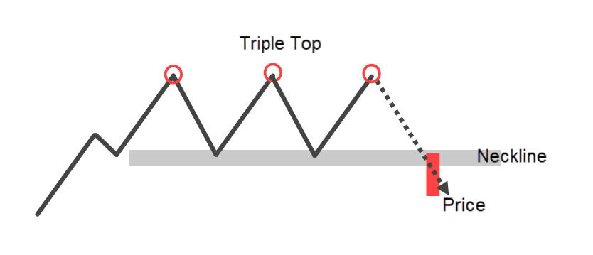
The market is in an uptrend, it tests the high then makes a pullback then retests the highs, and makes a pullback.
We will see that there’s a double top pattern and it’s confirmed if the price breaks below the neckline.
But what if the market re-tests the highs once again?
We have a triple top.
If it comes down, to retest the low then we have a neckline.
If the price breaks and closes below the neckline, we will say that the triple pattern is completed.
The market could head lower and the price projection I shared with you just a few moments ago can be applied to the triple-top pattern.
I won’t say the market is bearish because it’s contained in a range.
If you look at the previous existing trend the overall market previously is in an uptrend.
I will lean more towards looking for buying opportunities but the game changer happens when the price breaks and close below the neckline.
This is where I will shift my buyers from bullish to bearish.
How to trade the triple top chart pattern
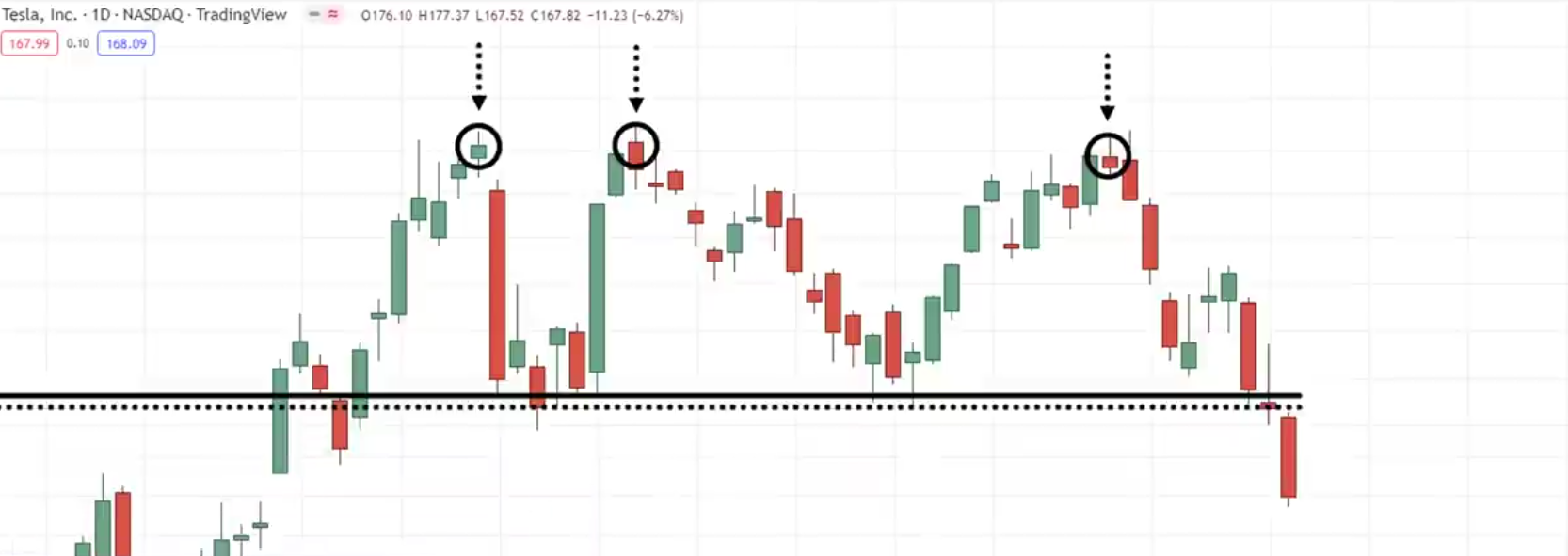
Using the break and retest method, you can look for something like the shooting star pattern.
This would tell you that…
“Hey, the selling pressure is coming in and the market could reverse lower”
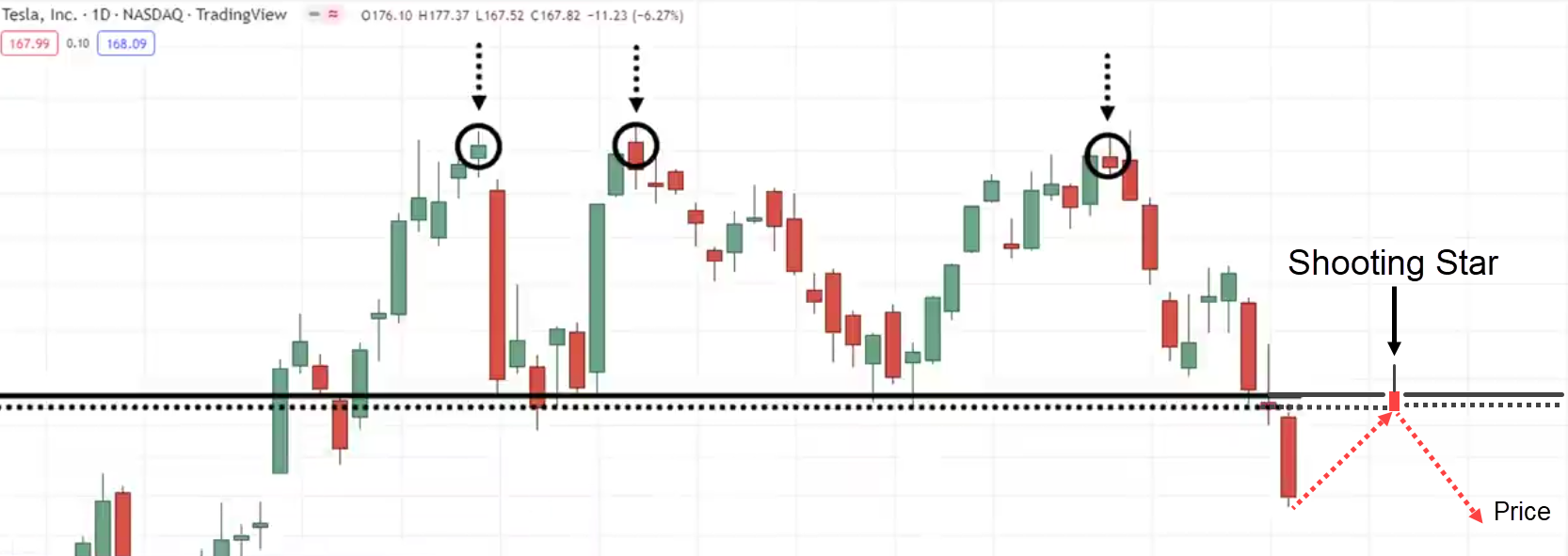
This is one setup you can look to trade the triple top pattern.
Triple Bottom Chart Pattern
You should know what to expect…
This is a bullish reversal pattern.
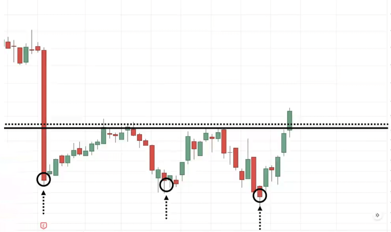
The market is in a downtrend then it makes a low, bounces up higher, comes down and retests the lows, bounces up higher retests the lows once again.
Thinking it would break.
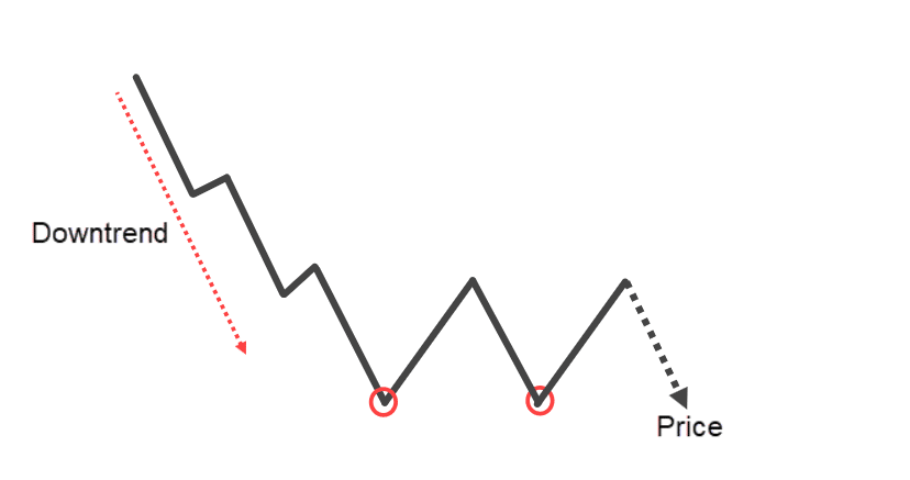
The sellers thought…
“Hey, this is our time, It’s victory”
Guess what?
The market bounces up higher and then they fail to take the price lower.
At this point, you have to wait for what we call the neckline.
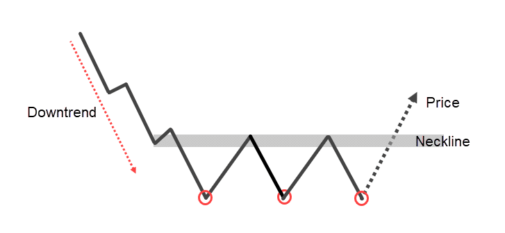
If the price breaks above the neckline, this is where we say the triple bottom pattern is confirmed and the market could head up higher.
Chart Example:
You notice how cute these three bounces are. The three attempts to drive the price down but the market refused.
What is that telling you?
If it can’t go down then it probably should go up higher.
How can you trade the triple bottom pattern?
You can use the break and retest, the first pullback.
Cup and Handle Chart Pattern
This is a bullish trend continuation pattern.
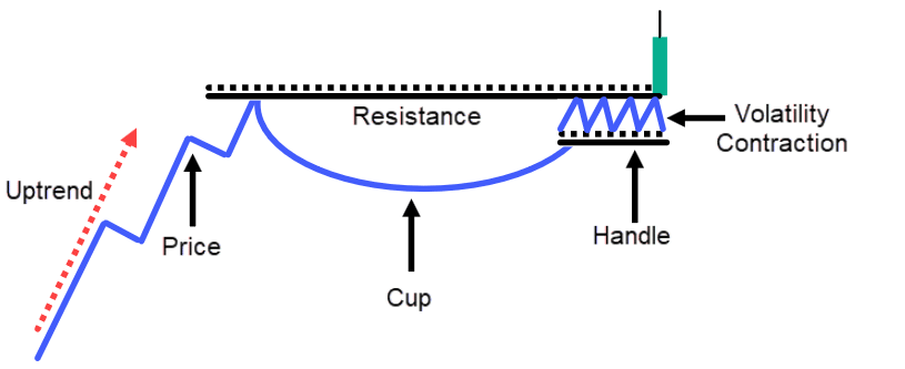
The market is in an uptrend. goes up higher makes a pullback, goes up higher makes a pullback goes up higher.
This time, when you see a cup and handle pattern forming, you will notice that the pullback is much longer in terms of duration compared to the earlier pullback.
Then it starts to consolidate slightly.
The market is still bullish.
Sellers couldn’t push the price any lower. It has difficulty breaking the swing low
This tells you that the overall market is still bullish and then at this point you can draw the area of resistance or the neckline.
When the market breaks above the area of resistance, we will say that the cup and handle pattern is formed, and the market is likely to continue up higher.
Chart Example:
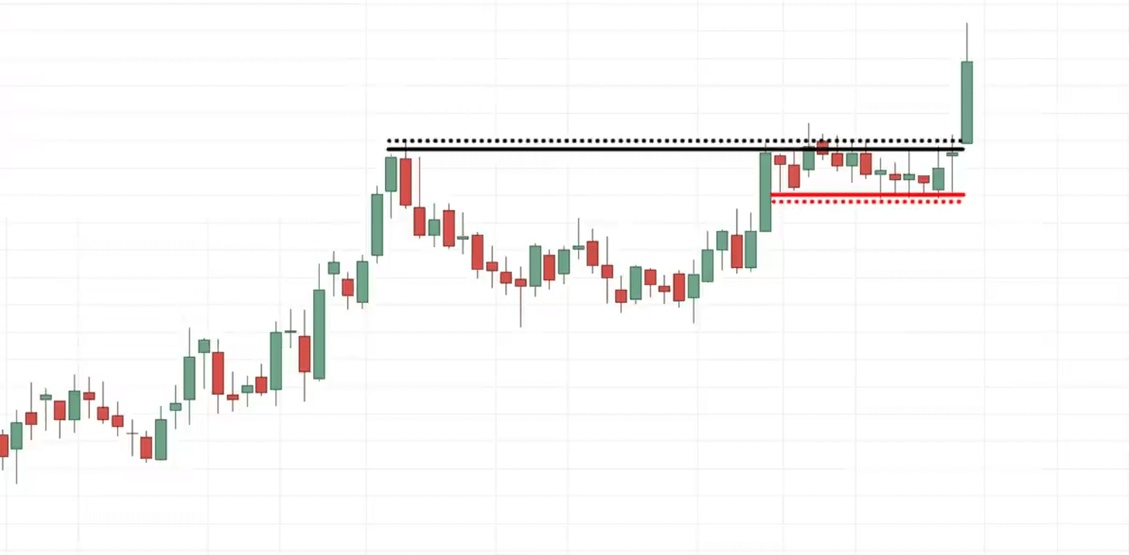
You notice how the market is in an uptrend, makes a pullback, and goes up.
This time you notice the duration is much longer compared to the previous pullback, then it tried to break out of the high but couldn’t.
Instead, it formed a consolidation, and when the price breaks above the high, this is where we say the cup and handle patterns are complete and the market could go up higher.
How do you trade the cup and handle pattern?
You can trade this by using the break and retest or the first pullback.
But another way you can trade it is…
Notice how tight the consolidation is for this cup and handle pattern.
What you can do is that when you notice the handle is very nice and tight. This is what we call a volatility contraction.
It’s also known as build-up.
Where the buyers and sellers are in equilibrium storing potential energy to make the next move.
Since you know the direction of the trend you probably want to be in the direction of the trend.
Inverted cup and handle pattern
This is a bearish trend continuation chart pattern.
The market is in a downtrend. It hits lower and then makes a pullback, this time around the pullback is longer than the preceding pullback.
It makes another pullback, it’s so weak that it couldn’t even take out this previous swing high
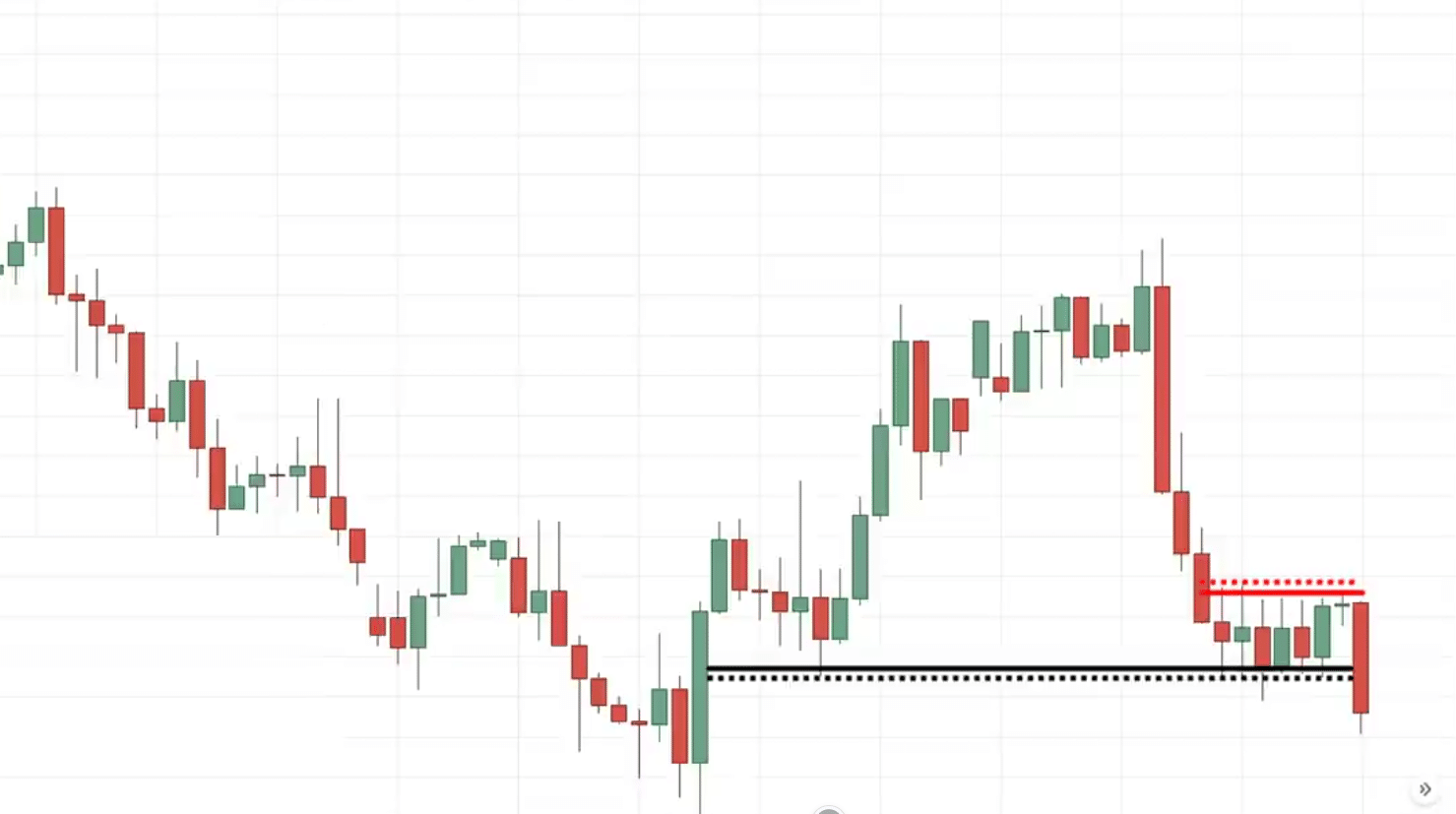
At this point, you have what we call a neckline or an area of support.
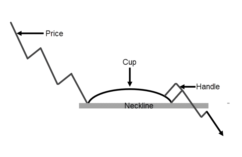
If the market comes down lower and breaks below these lows of support, you can expect the price to hit lower.
Chart Example:
Imagine a cup and handle without consolidation, the next logical place to set your stop loss would be at the swing high which is going to be large.
But a consolidation gives you a relevant place to set a tight stop loss, which offers you a favorable risk to reward on the trade.
Ascending Triangle Pattern
This is one of my favorite chart patterns to trade because it’s a bullish trend continuation chart pattern.
I find that it’s one of the most powerful ones to trade.
The psychology behind this pattern is just so significant.
How the Ascending Triangle Pattern works
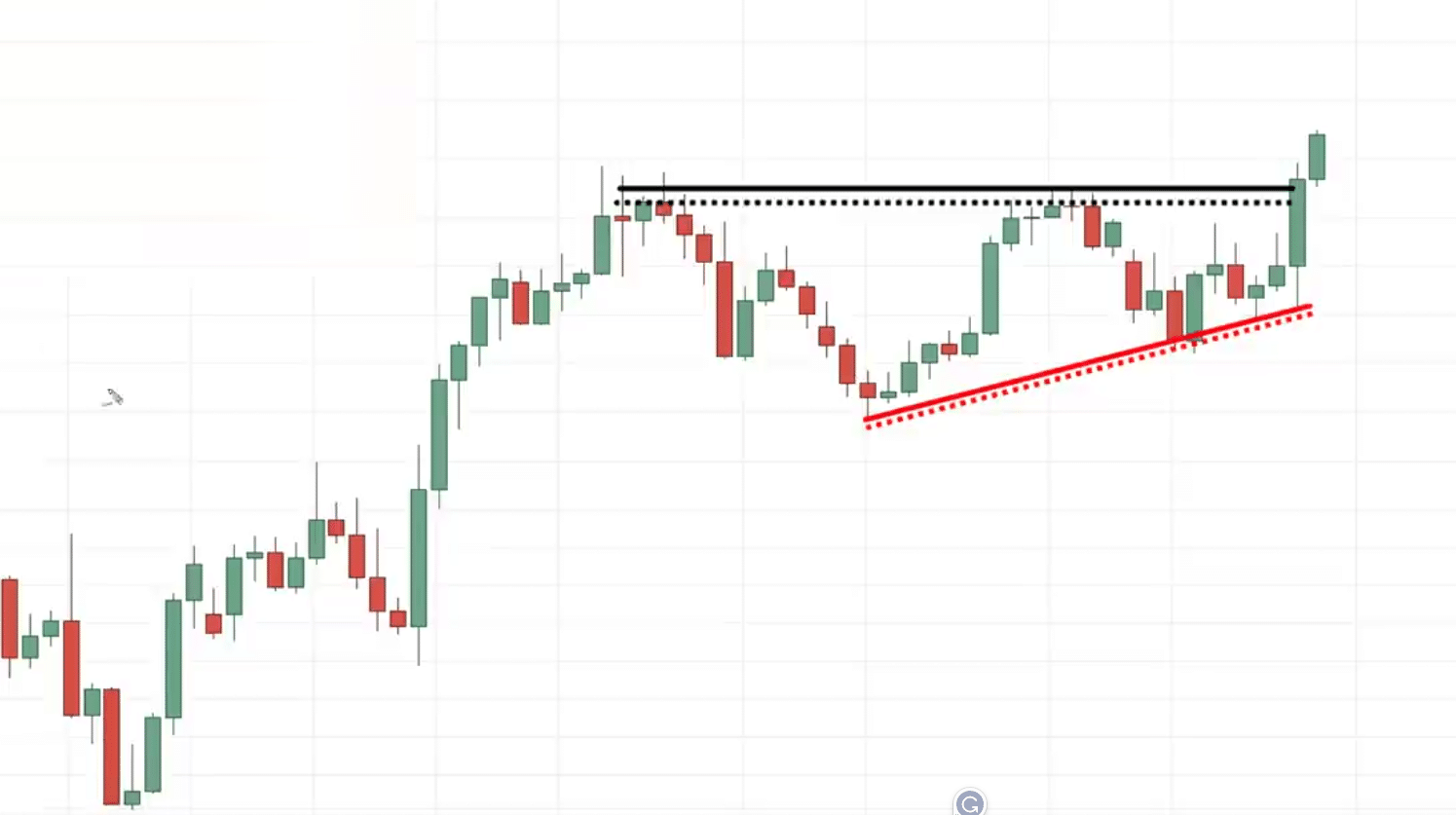
The market is in an uptrend, goes up higher makes a pullback, then it starts to go up higher again but fails to do so then makes another pullback.
What’s interesting is that this pullback, now did not take out these lows.
At this point, you have what we call an area of resistance and sometimes we might have another smaller pullback before the price breaks out higher.
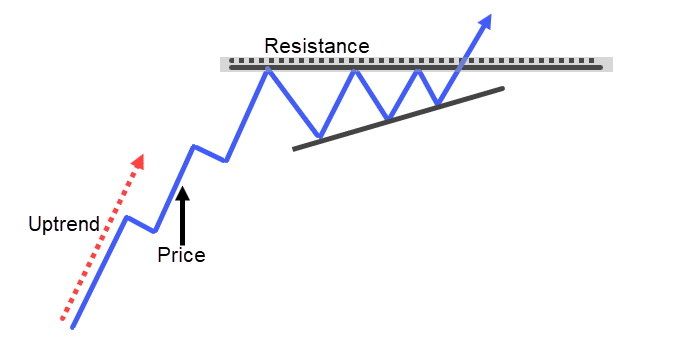
When it breaks out, this is what we call an ascending triangle chart.
To me is a sign of strength because it tells you that…
“The buyers are willing to fight to final for every inch trying to push the market up higher”
You can see the buyer is trying to push the price up higher even in front of resistance, they’re still willing to buy at these higher prices.
Why would people want to buy in front of resistance?
Probably because they expect higher prices to come, that’s why you’re willing to buy in front of resistance because you think that the market is likely to break out.
Before it breaks out, you quickly get on board.
This is a sign of strength.
Imagine someone shorts at resistance, where will your stop loss be?
Probably your stop loss is going to be above the highest of resistance.
That’s what most gurus will tell you to put your stop loss above resistance. Imagine when the price breaks above the resistance, it’s going to hit this cluster of stop loss.
When it hits that cluster of stop loss, that is strong buying pressure to push the price further up.
This is why I love trading the ascending triangle chart pattern.
Chart Example:
How can you trade the ascending triangle chart pattern?
You can look to trade the retest the break and retest.
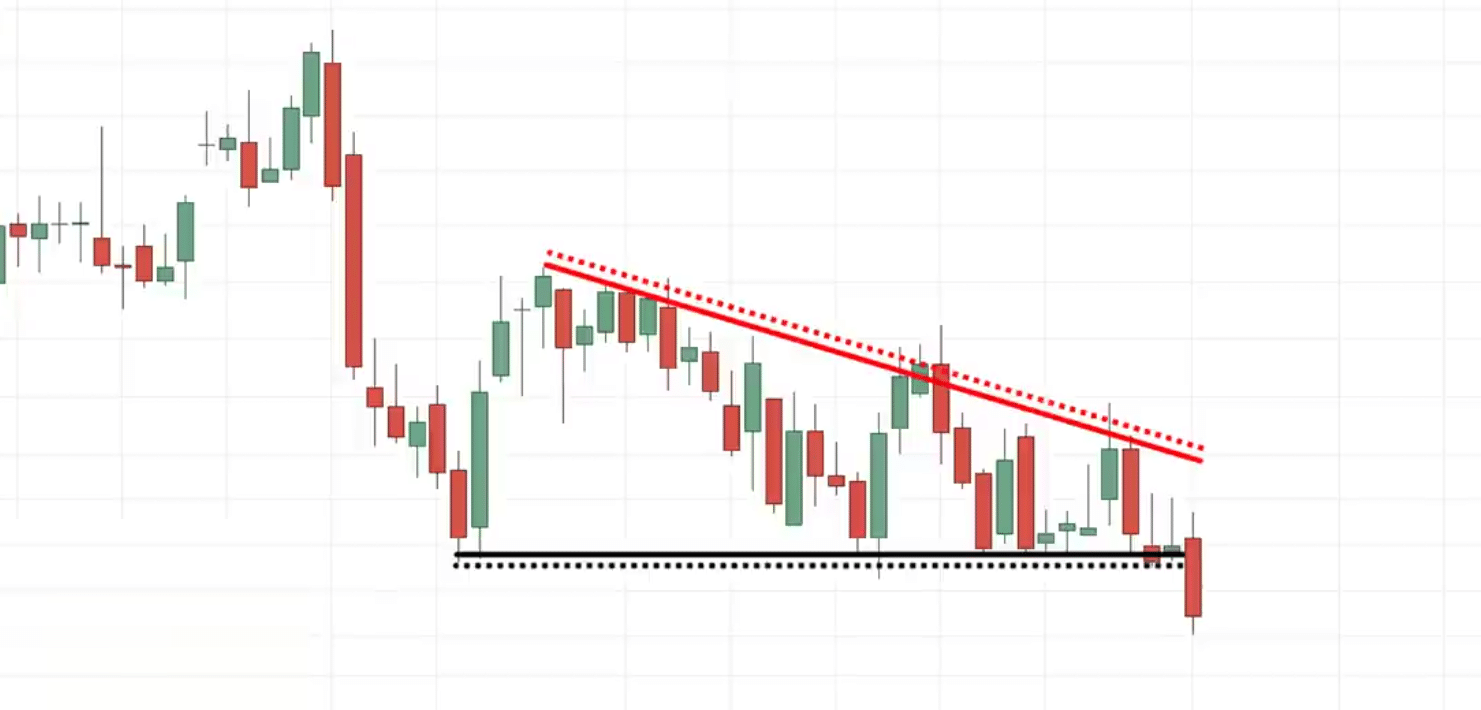
Descending Triangle Pattern
This is a bearish trend continuation chart pattern.
It’s just the inverse of the earlier one.
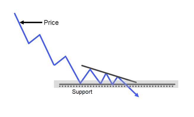
Chart Example
How can you trade the descending triangle chart pattern?
You can use the break and retest strategy as shared earlier or the first pullback strategy
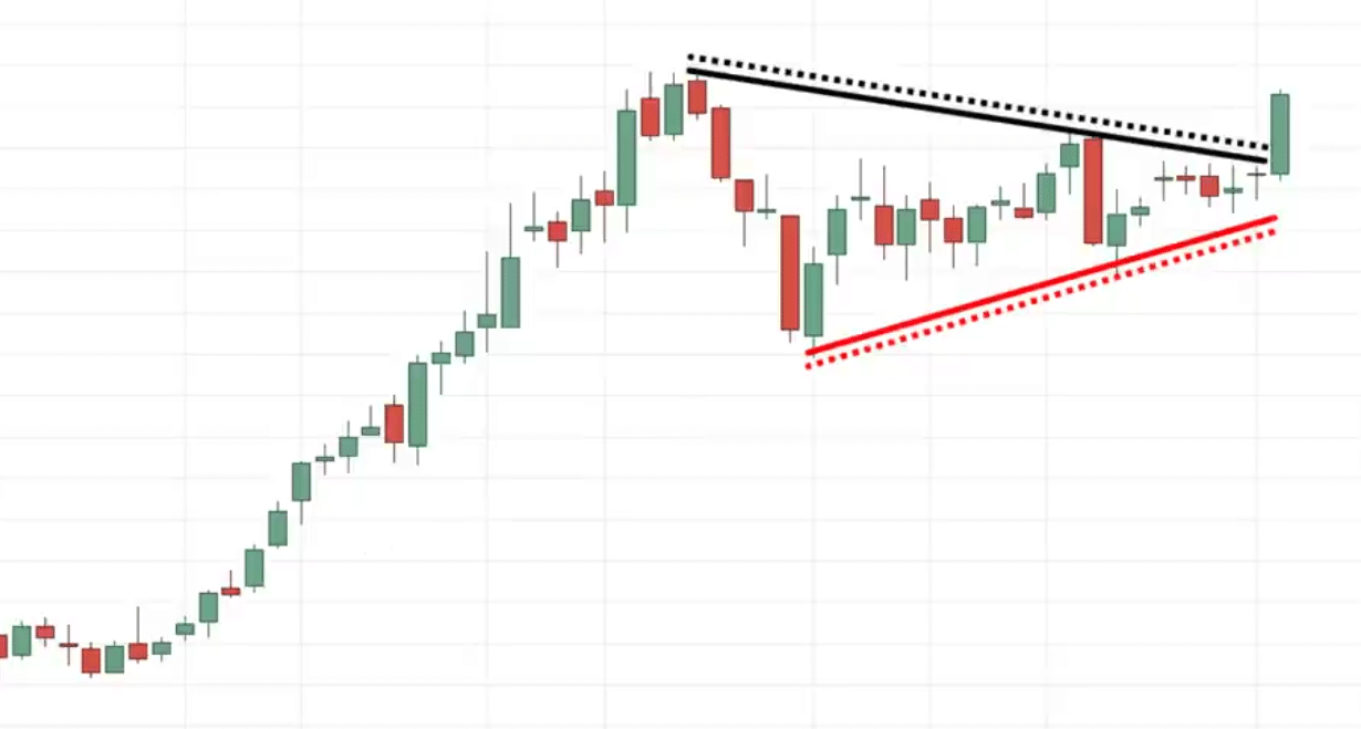
Bullish Pennant chart pattern
This is a bullish trend continuation pattern.
The market is in an uptrend, goes up makes a pullback but can’t break out of the highs. You can see that the volatility of the market is shrinking if you just connect the lines
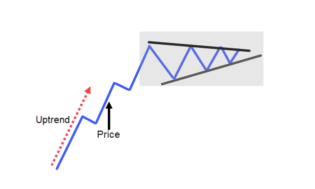
This looks like a smaller asymmetrical triangle pattern.
This type of price action tells you that the volatility of the market is getting smaller.
As you know the volatility in the market is never constant. It moves from a period of high to low and vice versa.
This is what we call it bullish pennant.
Chart Example:
Usually, when you trade such trend continuation chart patterns it’s useful to trail your stop loss. You can use things like a moving average to trail your stop loss
You can hold that position until the price breaks and close below your moving average so that’s one way to go about trailing your stop loss.
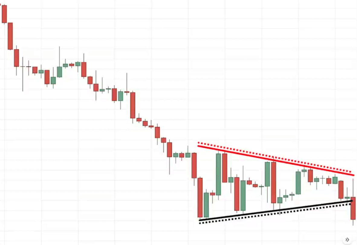
Bearish Pennant Chart Pattern
This is a bearish trend continuation chart pattern.
The market is in a downtrend, goes down lower makes a pullback tries to head down lower but can’t break below the lows then pulls back up higher but again fails to break out of the highs.
Then it hits down lower again and can’t take up the low before it makes a slight pullback which again fails to take out these highs and then goes down lower once again.
At this point, you can connect the highs and the lows.
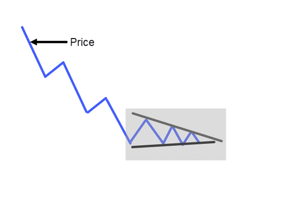
At this point, the volatility of the market is shrinking.
If the price breaks and closes below, we’ll say that the bearish pennant is confirmed and the market could go down.
Chart Example
You might hear me saying things like “could”
I’ll never say things like guaranteed, that doesn’t work in trading.
We are dealing with probabilities, never certainty.
Trading strategies for chart patterns
First on the strategy…
Double Top False Break
If you recall earlier, I talked about the double top chart pattern and there’s a technique that you can use to enter your trade with low risk even before the price breaks below the neckline.
How do you do it?
Let me explain in this example…
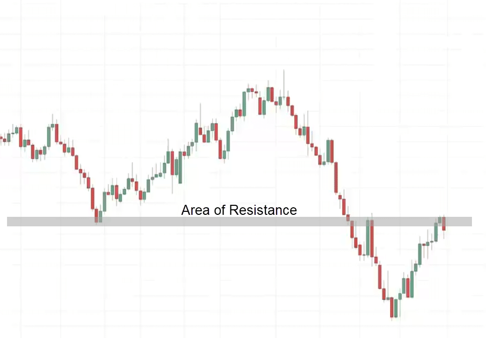
You can see that the overall trend of this market is in a downtrend and what’s interesting is that this market has come towards an area of value.
If you’re not familiar with that term, it simply means areas on the chart where buying or selling pressure could come in.
As you know resistance is an area where selling pressure could come in to push the price lower.
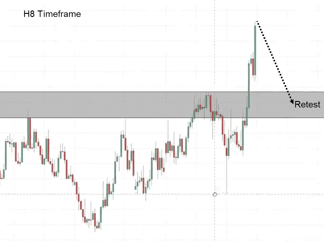
Once I see this on the daily time frame, I want to go down to a lower time frame like the 8-hour time frame, and look for this specific chart pattern.
You see that this market is respecting this area of resistance
8-Hour Timeframe:
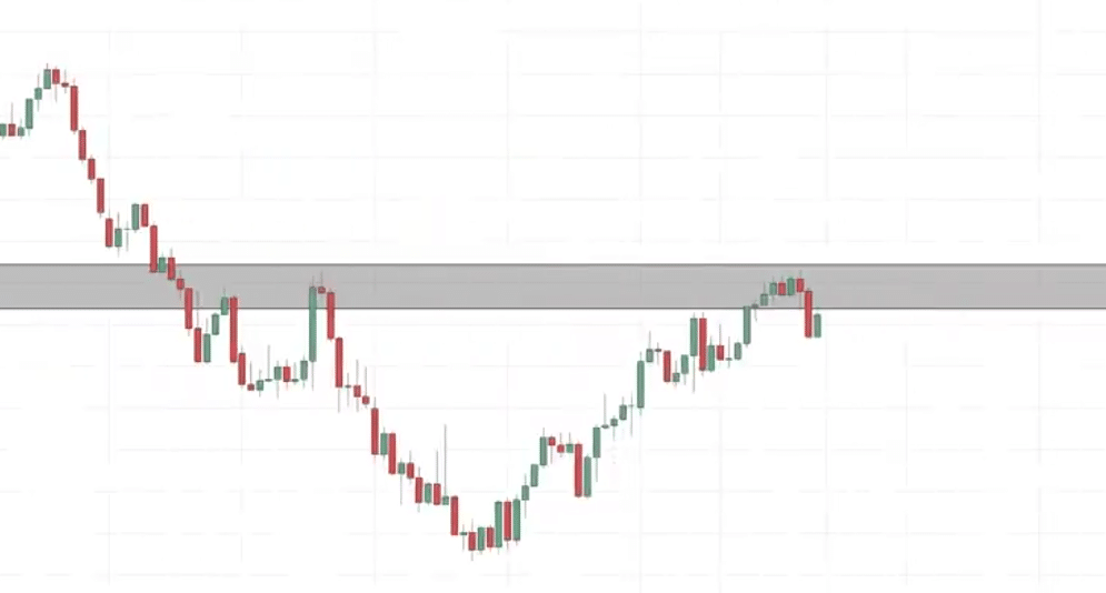
If you look at the most recent price action, what do you see?
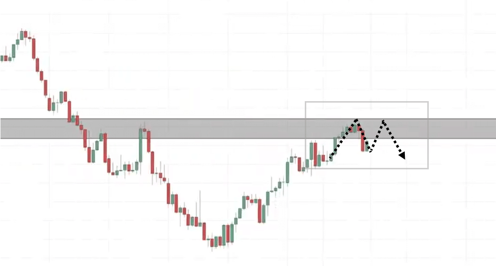
You will see that it is a bit too early. Half of the double-top pattern is already being formed.
We could get another one coming.
What we are looking for is the second portion to form to show us a bearish price rejection.
Let’s see what happens…
In this case, the market goes down and starts to rally higher.
We are back at the highs again.
The double-top pattern is near completion.
This is valid only if it breaks below the neckline. This is what I mean:
But since we have numerous factors working in our favor…
Is it possible to enter the trade before the price reaches the neckline?
Yes.
How do you do that?
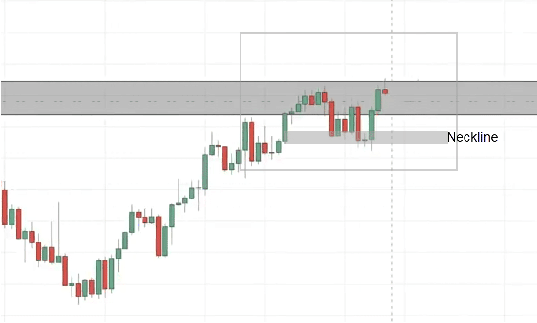
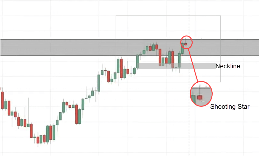
Looking at the overall market on the daily timeframe, it’s in a downtrend and this is an area of resistance that I have highlighted.
You can see we have an entry trigger known as the shooting star. Telling you that the sellers are stepping in and about to push the price lower.
This is an entry trigger to go short.
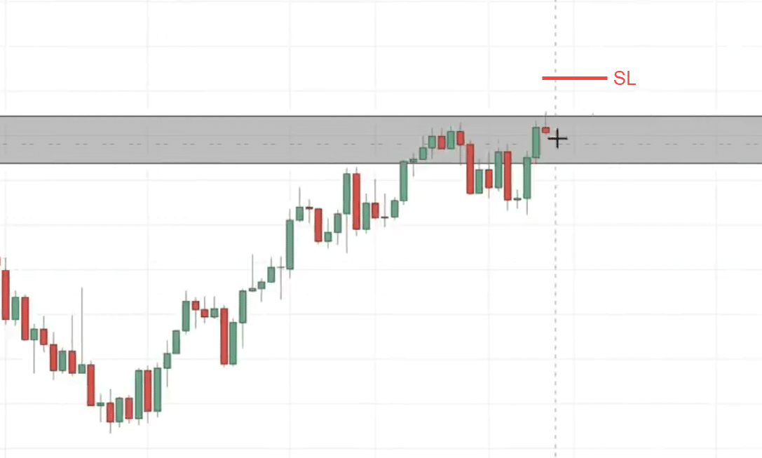
What you can do is go short on the next candle open.
I set my stop loss a distance away from the price structure. a distance away from the highs the distance away from resistance:
You can use an indicator called the average true range ATR
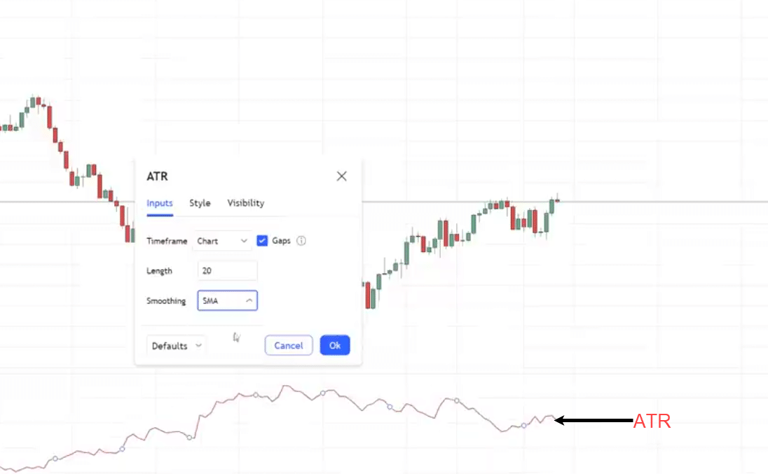
I like to use a 20-period SMA for the ATR.
What about our target?
Since you are now trading even before the double top pattern is completed, you can be in profit before the price breaks below the neckline.
Here’s the thing about the neckline…
Sometimes it’s not the best time to short the market because the price breaks below the neckline.
If you think about this logically, the neckline is an area of support.
The price would re-test the neckline and then bounce up higher and continue.
That could happen.
If you want to be a little conservative, you can have your target at the neckline where people are looking to short the market in an uptrend.
You can take profit and exit half of your position.
Hopefully, this illustrates the power of trading the double-top pattern.
Inverse Head and Shoulders pattern
EURCAD Daily
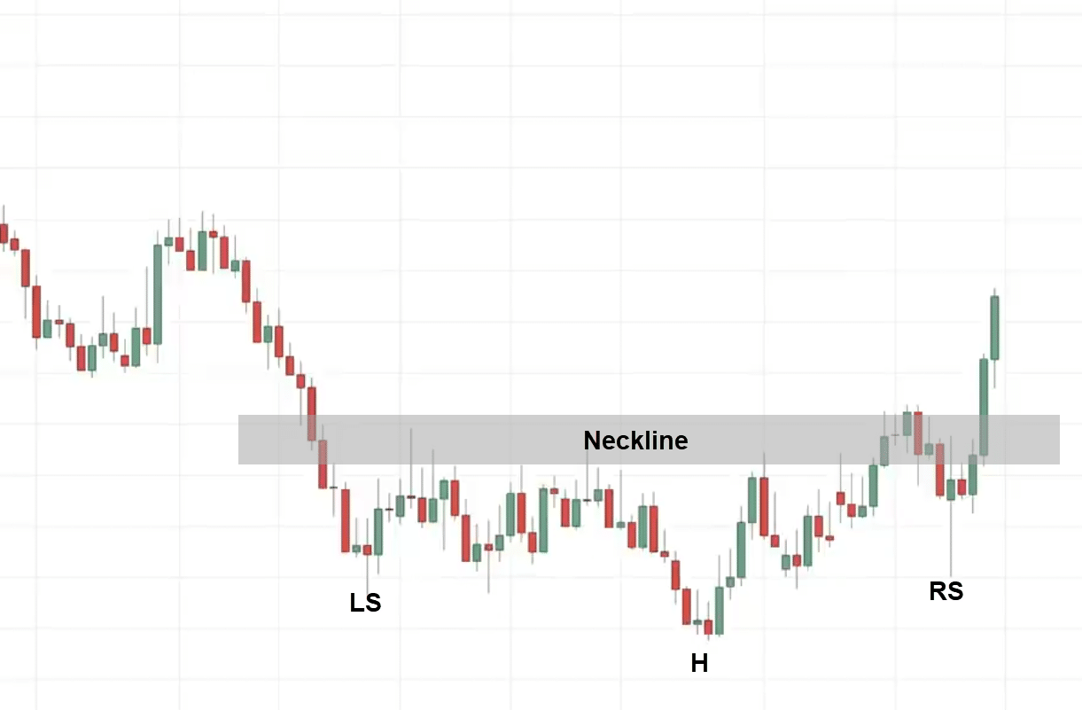
We have an inverse head and shoulder pattern, there’s a left and right shoulder and this would be the neckline.
One thing I want to highlight is that, to know whether the market is likely to reverse or not, you want to see where the reversal pattern has formed.
Is it leaning against any higher time frame price structure?
Example
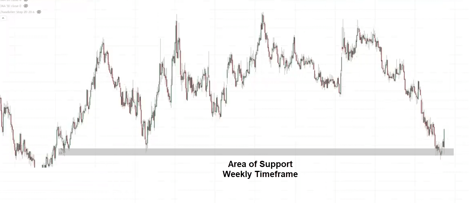
On the daily timeframe, if you look at the weekly timeframe you will notice that the inverse head and shoulder pattern leans on the areas of support on the weekly timeframe.
This is significant and could be the long-term reversal on a higher time frame.
Let’s find out how can we get on board a trade with low risk to trade this reversal chart pattern.
Going back to the daily time frame.
The next thing that you can do is if you want to find a low-risk entry, you can go down to a lower time frame like the 8-hour time frame, and look for an entry trigger to go long.
My game plan over here is that since I know this is an area of value, The neckline could become previous resistance which could become support.
I’m looking for trading opportunities around the neckline.
What I’m thinking of is for the market to do a retest into this area, come back in, and then close back above it giving me an entry trigger to go long
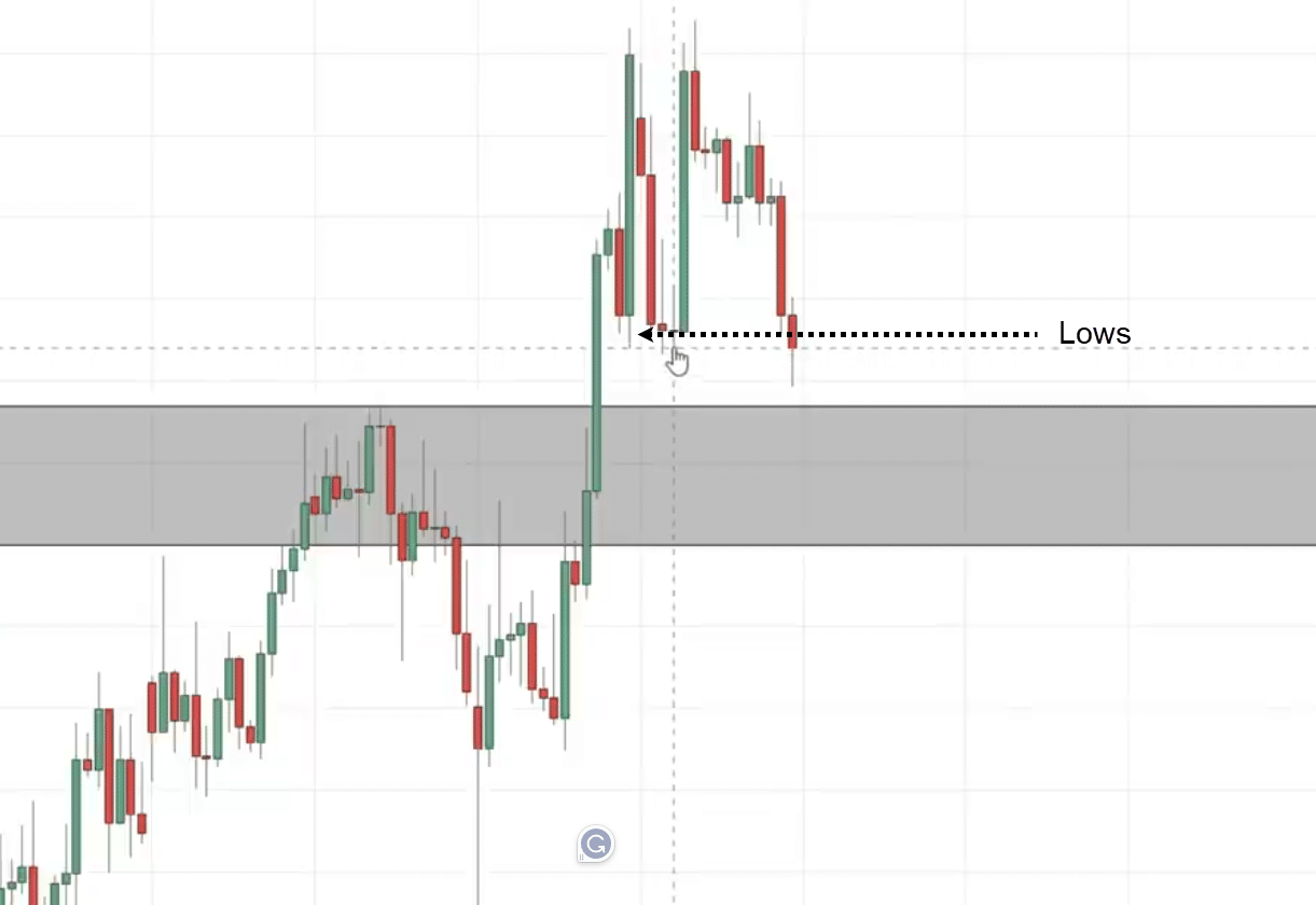
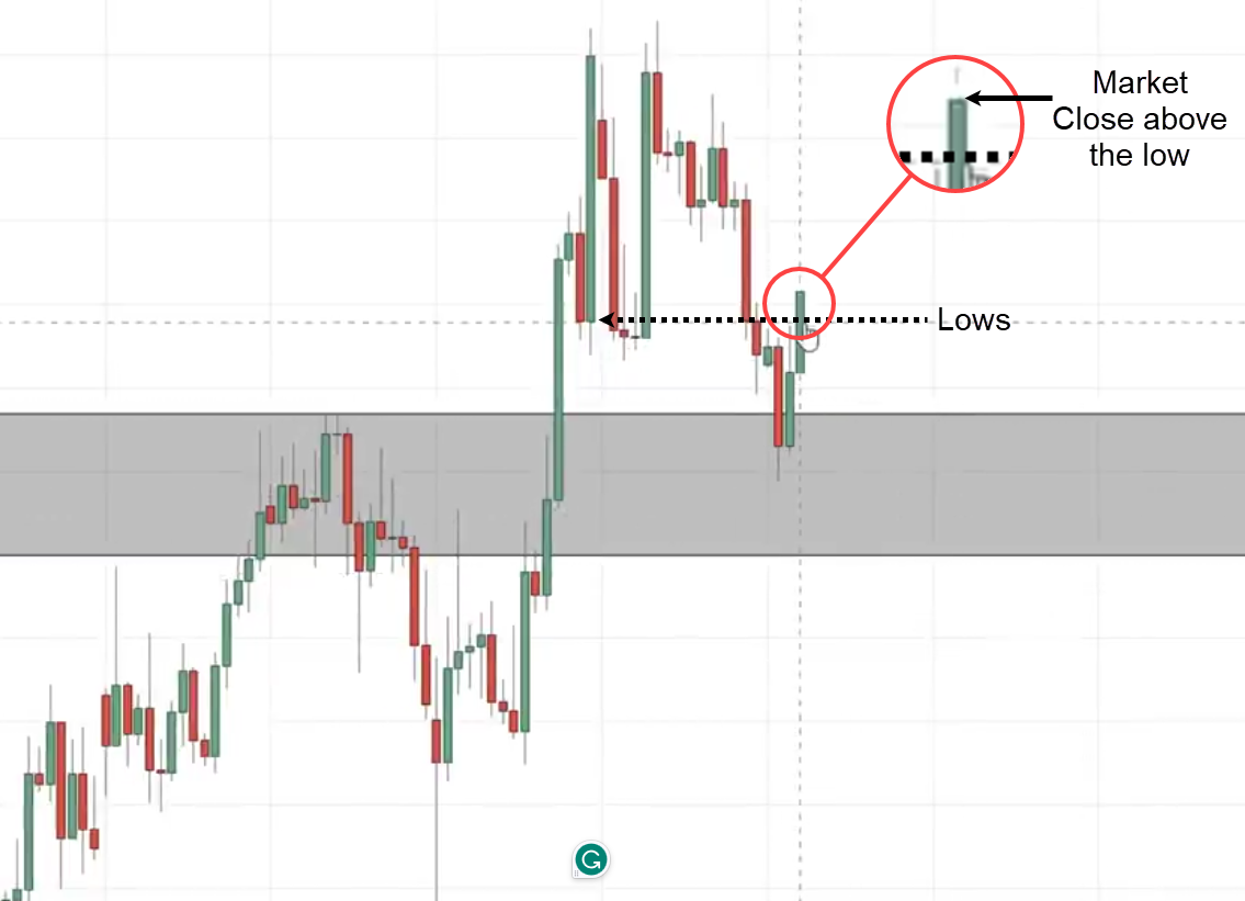
The market seems to be breaking down, it retests the lows.
You want to be paying attention to this level because this is a swing low and buyers could come in to push the price higher.
What we are looking for is a rejection for the price to close bullishly above the lows signaling buying pressure is coming in and the market could go up higher but it failed.
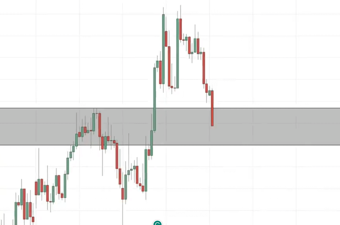
The market broke lower:
Let’s see what happens next:
This is what I call a false break.
You can see that the market took out these lows making traders think that…
“This is going to be a breakdown”
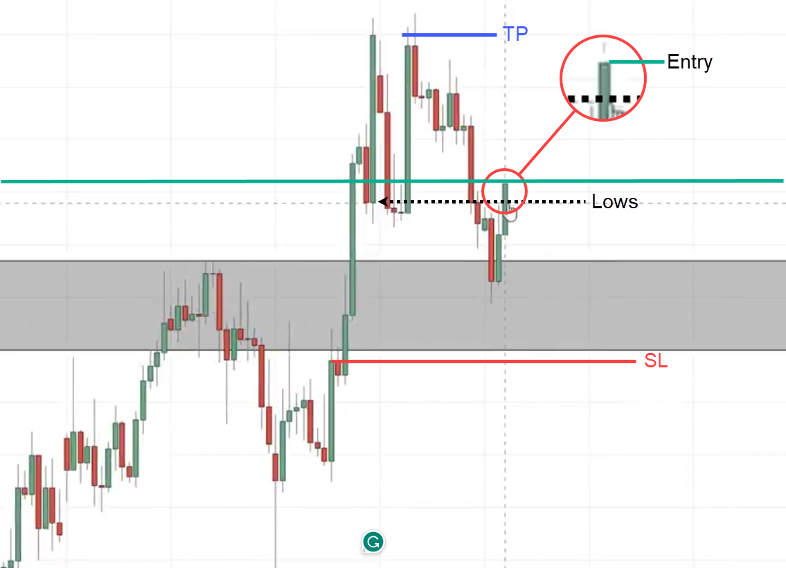
This to me is an entry trigger to go long.
Here’s what I’ll do…
Let’s put it in green that’s our entry price point
Then as for our stop loss, we set at a distance below the lows using the ATR method I shared with you.
We can have our first target just before the recent swing high.
What’s significant about this entry trigger is that when you trade this inverse head and shoulders pattern, you’re no longer just buying the breakout of this neckline.
Trend Reversal Breakout Trading Strategy
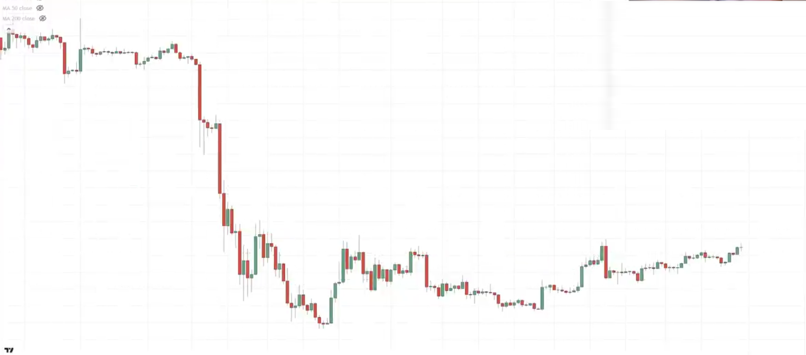
BTC
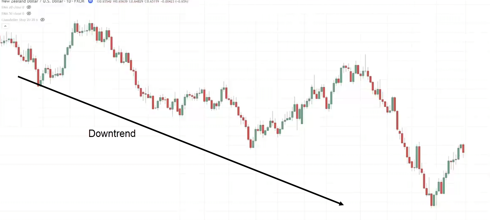
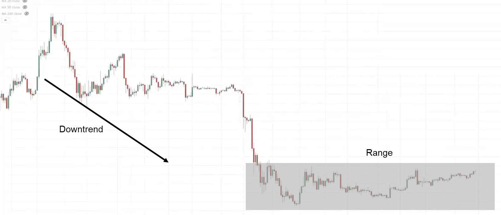
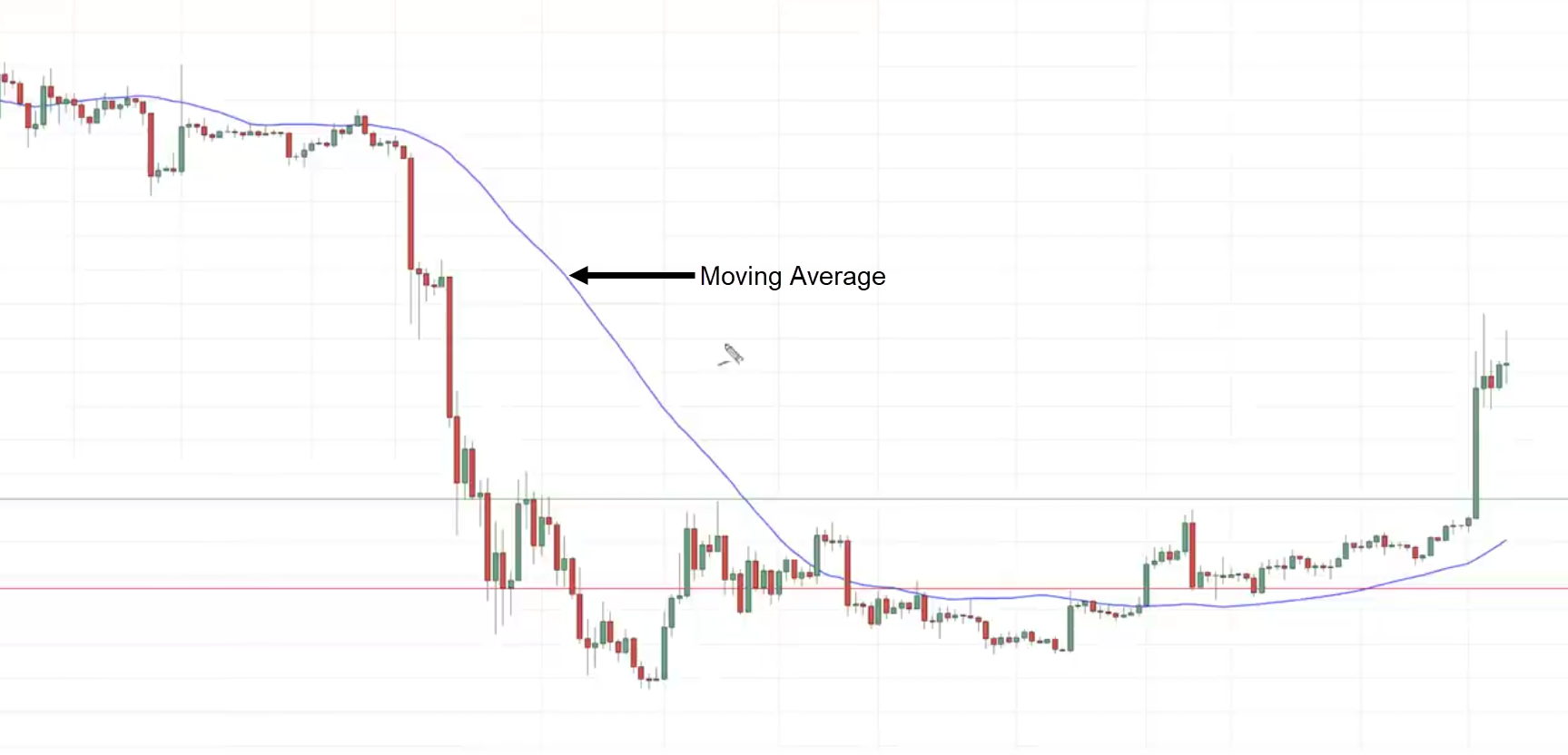
You can see that this market is in an overall downtrend then it starts to go into a range.
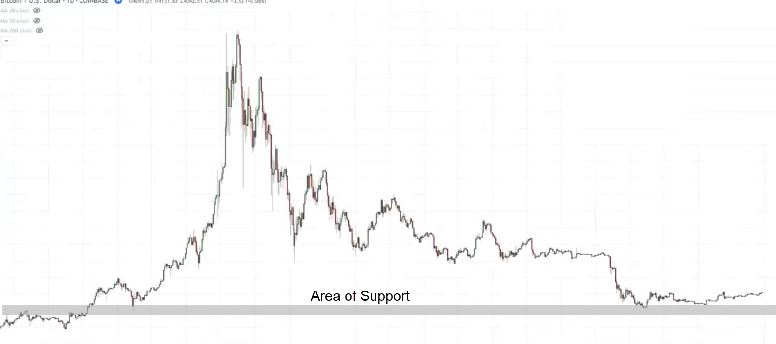
What’s significant about this range is that if you go up to the higher time frame or you just zoom out a little bit, you notice that the market is at this key area of support.
This makes this range more significant because this is what we call an accumulation stage.
This is where you know the sellers come in and sell but the price just doesn’t go any lower.
Why is that?
This is because the big boys or the smart money institutions are possibly accumulating at this lower price, so this is why we call it the accumulation stage.
One thing about the accumulation stage is that there’s no guarantee the market will reverse up high because, for all you know, it could just continue down low.
This is where we want to manage our risk and make sure that even though we’re wrong our losses are contained.
Moving on….
Let’s analyze this price action of this market.
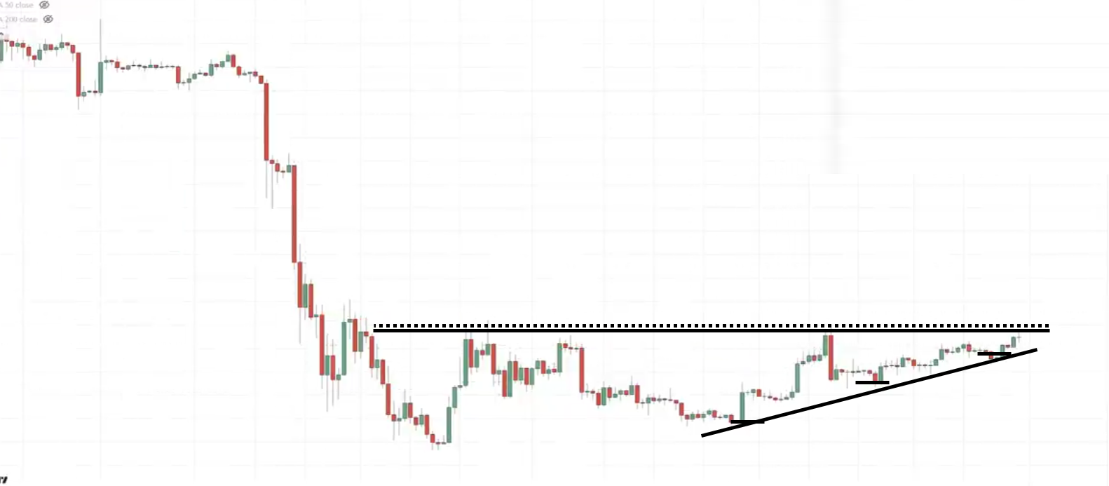
What chart pattern do you see over here?
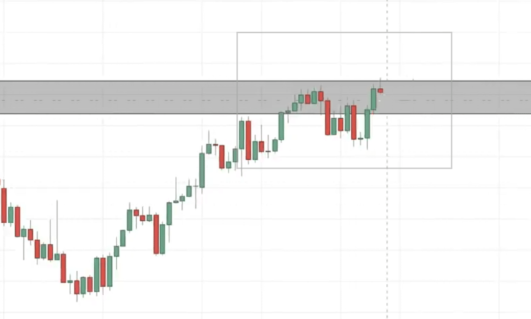
You can see an ascending triangle in the market.
Notice the series of lower highs or rather higher lows, coming into this area of resistance.
You might be wondering…
“Rayner, didn’t you say earlier that the ascending triangle chart method is a trend continuation pattern?”
You’re right.
Earlier I said that…
“The ascending triangle chart pattern is a trend continuation pattern”
However, I didn’t mention that the ascending triangle pattern can also be a reversal short pattern.
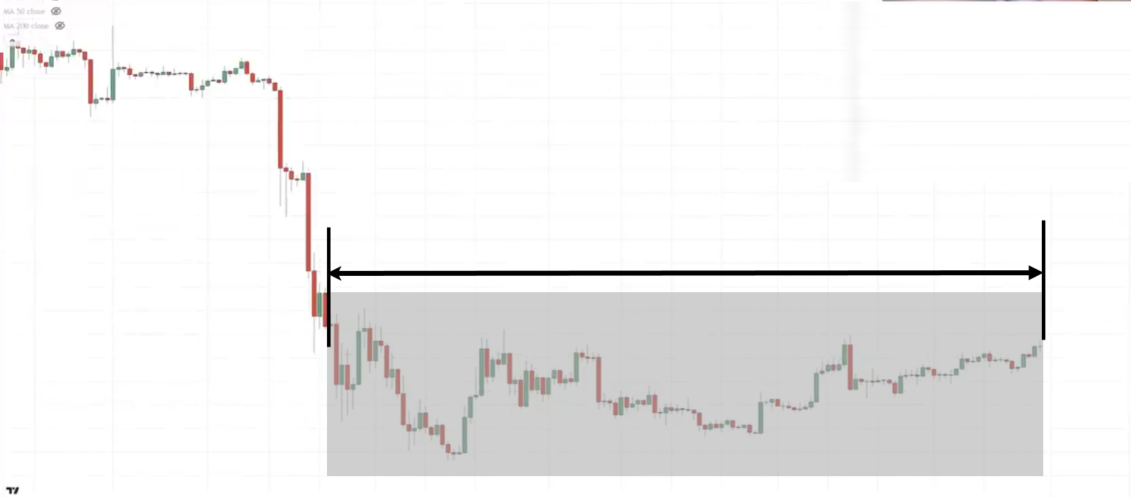
The key difference is that if you want to trade the ascending triangle chart pattern as a reversal pattern, you want to make sure that there are at least 80 candles formed in the candle.
How do I know it’s 80?
Just take the start of this chart pattern to the end and make sure there are at least 80 candles to trade this reversal chart pattern:
As you can see, we have about 129 bars.
One thing about chart patterns is that the longer it ranges the harder it breaks.
Why is that?
Because if you recall earlier, this area of resistance was tested possibly 4 times.
Then sellers will look at this…
“Oh, man! it’s time to short because the prices are in resistance”
Where do you set your stop loss when you short?
Your stop loss is probably above the highs of resistance.
How would you trade this particular pattern?
One way you can go about it is you can look through the breakout.
Why is that?
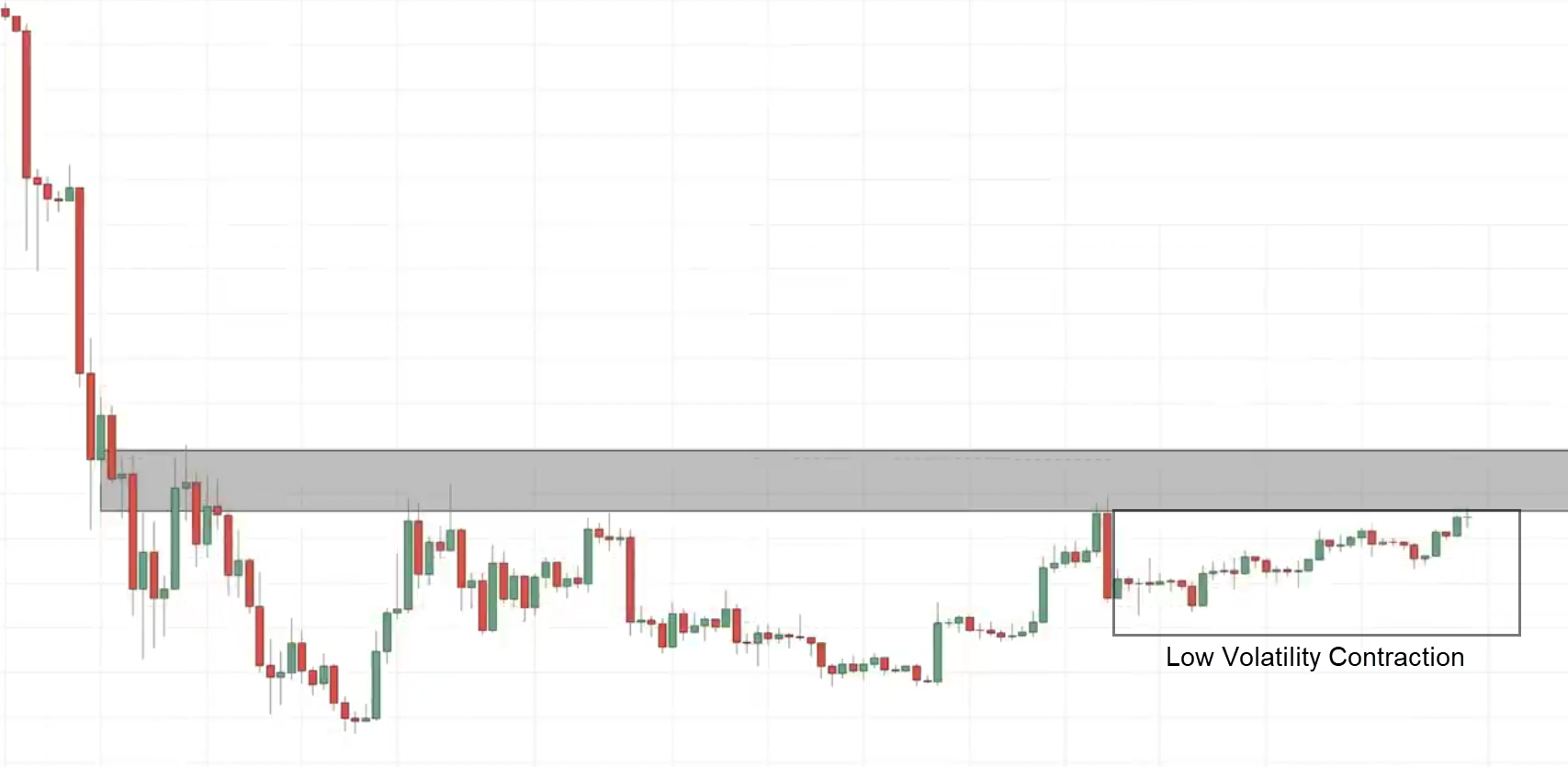
Notice at the end of the chart, you have this nice volatility contraction, the nice build-up:
The volatility is getting tighter. Remember the volatility of the market is not static.
When you see a market is in a low volatility environment, it’s a signal to you that…
“Hey, something big is about to happen”
You want to be trading the breakout up higher.
One way to go about is you can simply just go with a buy-stop order above the recent swing high.
Your stop loss a distance below the previous swing low.
Now you are long, let’s say the market continues to move in your favor.
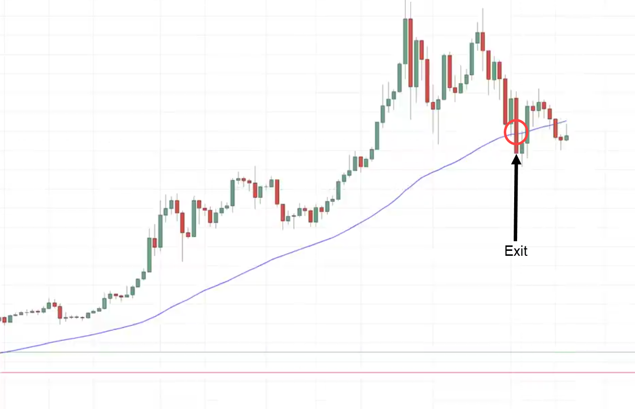
You can overlay the 50MA to trail your stop loss.
This means if the market breaks or rather reverses down lower and closes below the moving average only then you exit the trade.
If not, you hold that position and ride the trend higher.
The market breaks and close below the 50-period moving average and that’s where you exit the trade.
You can see that you have you know captured quite a bit of trend up higher.
This is how you trade the reversal trend reversal breakout in the markets.
Conclusion
Understanding chart patterns can be daunting at first.
But as you trade the markets…
You’ll start to realize how the chart patterns we’ve discussed today happen all the time.
The only difference is that the next time you see one…
You already have the knowledge to take advantage of them with pinpoint accuracy.
Nonetheless, here’s what you’ve learned today:
- Reversal chart patterns are one the most versatile ways for you to enter the markets by either entering at the break of their necklines or after the first pullback
- Using the “false break” technique is a proven and consistent method to hop into any chart patterns in the market
- A “secret” way to identify the strength of a chart pattern is to look at how long the pattern is; the longer the chart pattern is, the harder it breaks out
Over to you…
Do you often trade chart patterns in the market?
Or do you prefer to keep your charts clean?
Also, what are some of the chart patterns I’ve missed here that you want to talk about?
Let me know in the comments below!




Wonderful! Well explained using simple language and projections that every new learner can understand. Thank you Mr Rayner.
Rayner is happy to help, Moses!
This was very helpful I think this is a 100th time reading about chart patterns but going over this again gave me another perpective
Glad to hear that it helps you, Neo!
This was refreshing to read again.
Glad you liked it, Adetola!