In this video…
You’ll learn how support and resistance can help you better time your entries, and exits, and even “predict” market turning points.
Video Transcription
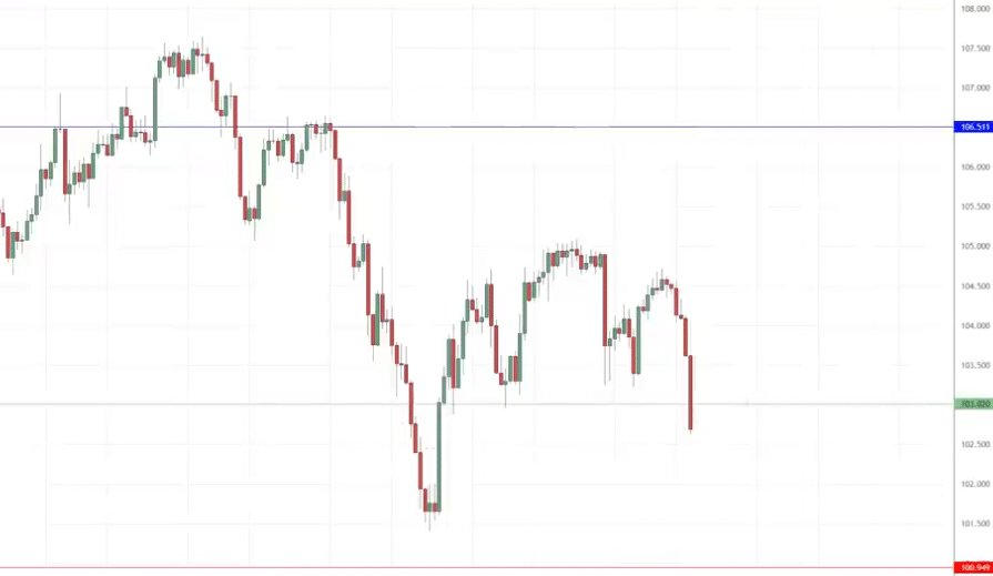
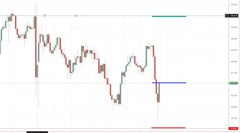
Have a look at this chart over here…
What is wrong with this chart.?
There are too many support and resistance levels on the chart and this leads to analysis paralysis.
This means you are going to get conflicting information that makes you feel at a loss for what to do.
Example
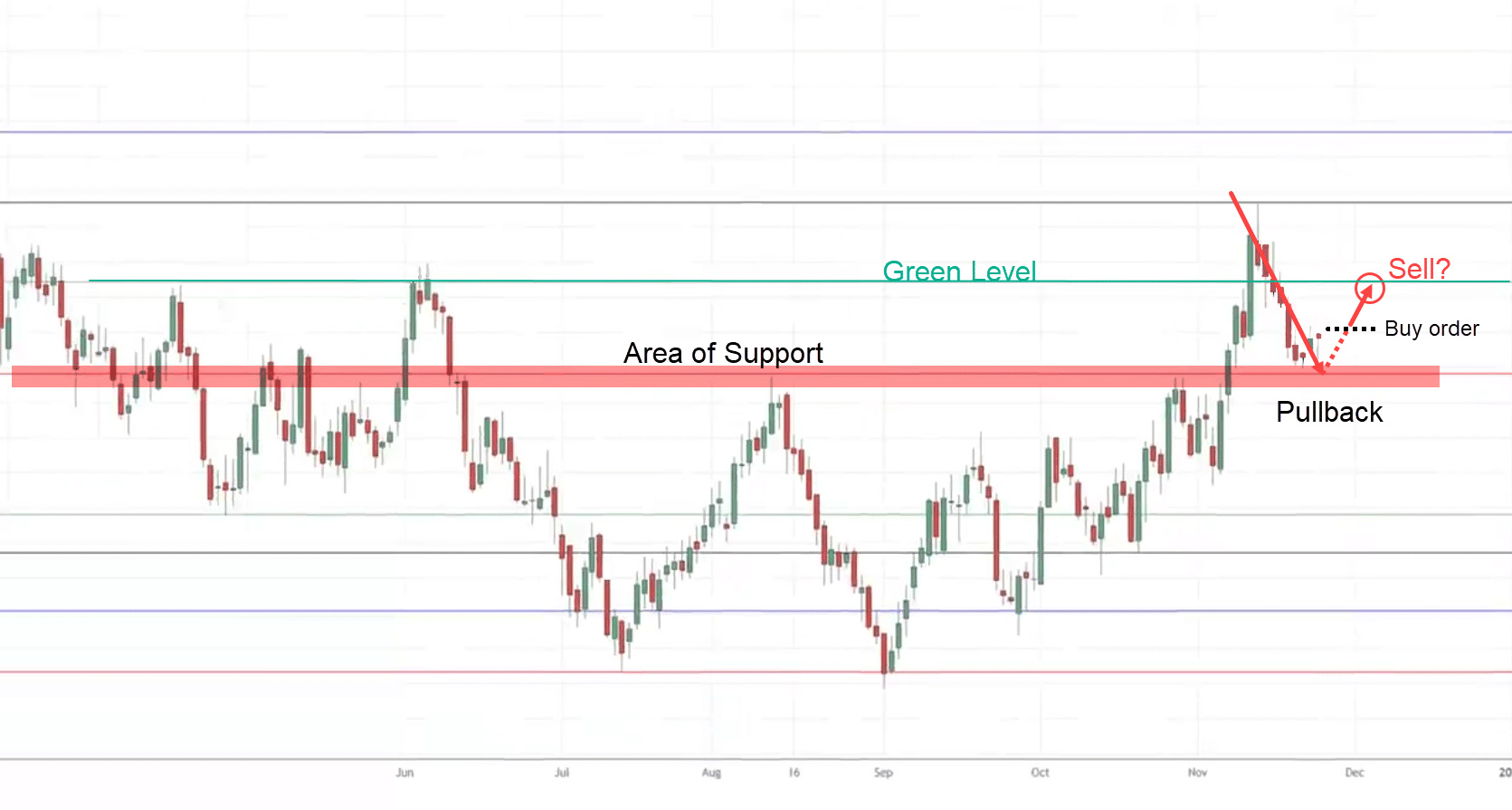
Let’s say the market is over here, and it makes a pullback.
You want to buy because look at this area of support…
Then the market goes up to this green level—the area of resistance.
Now do you sell at this price point?
If you sell then think about this, didn’t you buy a few moments ago and now you’re selling?
If you were to sell then how are you going to ride the trend?
Well, you can’t…
That’s the problem with having too many areas of support and resistance on the chart.
You are going to get analysis paralysis.
Every decision that you make somehow there’s another piece of evidence telling you that you are wrong and you always feel lost and confused.
If you feel any way along those lines, don’t worry because in today’s training, you will learn
- Why support and resistance are not equal.
- How to draw accurate support and resistance levels.
- When exactly should you buy when the price comes into support
- Support and resistance trading strategy to profit in bull and bear markets.
Why Support and Resistance are not equal
The first thing to understand is that support and resistance are not equal.
Why?
Because in certain market conditions, one is more powerful than the other.
Let me explain…
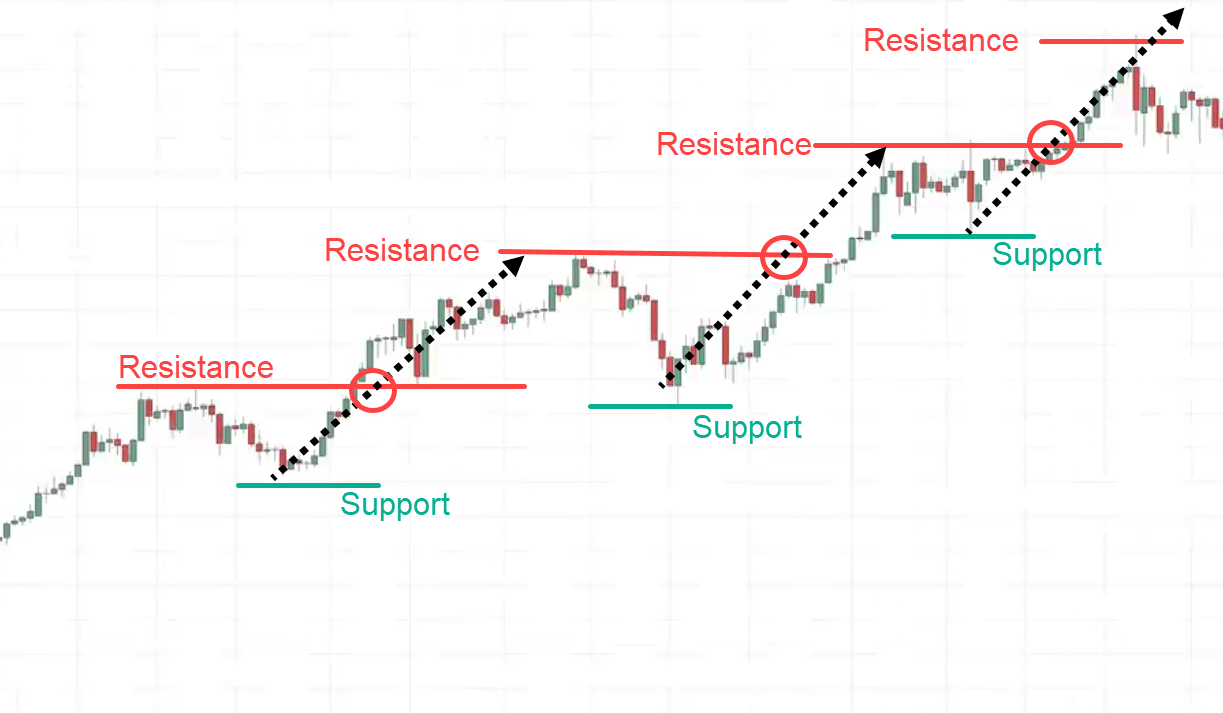
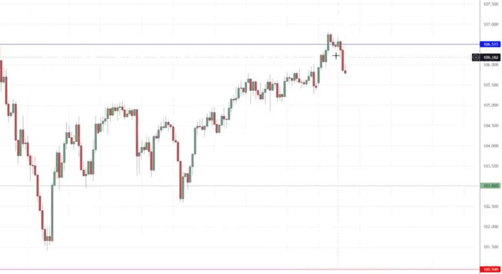
If you look at this chart over here. This is the USD/JPY and the market is in an uptrend.
If you were to draw resistance, this is not how I will draw but just follow along with me for now.
Let me ask you in this market condition…
Is support stronger or resistance?
Let’s analyze it step by step…
This is over here is the resistance you see the price breaks above resistance.
Now what about support?
Support prices didn’t break below it.
As you can see in an uptrend, resistance tends to get broken it’s logical because as you know, the market is in an uptrend.
It means a series of higher highs and higher lows.
This means resistance should be broken.
In an uptrend, support is more powerful than resistance because it tends not to get broken.
Yeah…
So, understand support and resistance are not equal.
Example:
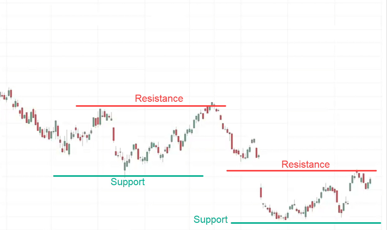
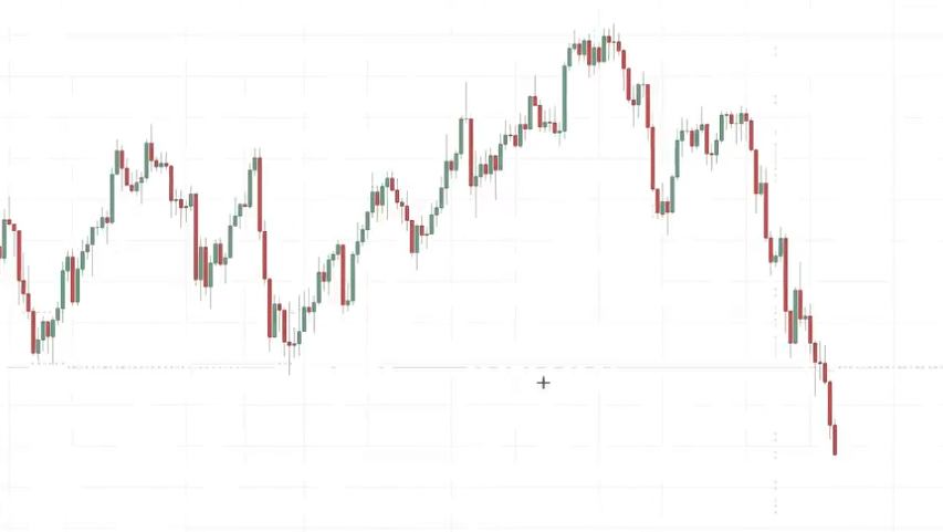
This is the chart of Adobe Stock.
The market is in a downtrend.
Let’s say you draw support and resistance.
Let me ask you…
Is support stronger or resistance stronger in this market structure?
The resistance is more powerful in a downtrend.
If you look at support it’s broken, the price then breaks down and breaks support.
When the market is in a downtrend, resistance is more powerful.
Understand this concept.
You might be thinking…
“Rayner, what about range markets, is support or resistance stronger?”
I’ll answer that in the later part of this training.
How To Draw Support and Resistance Levels Like a Pro
Have a look at this chart over…
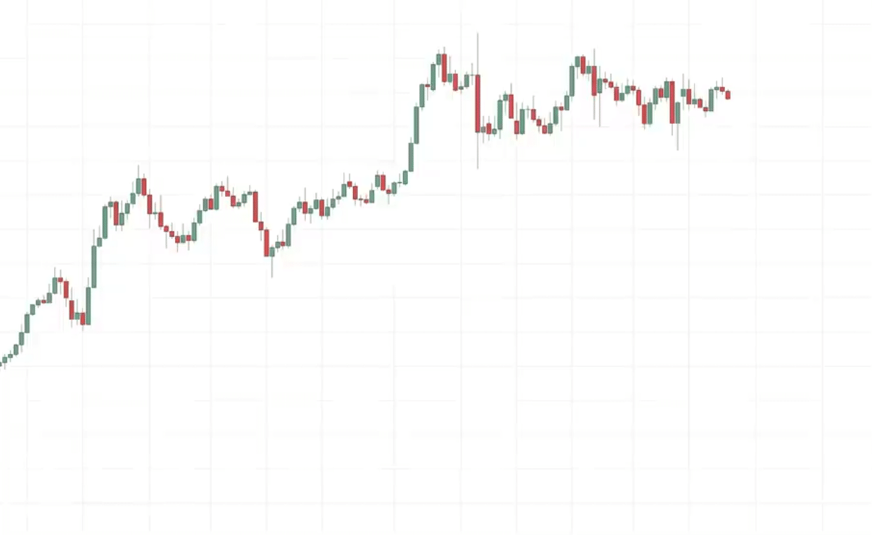
You can see that this market is in an uptrend.
In an uptrend support is stronger.
This is where we want to give it more attention.
Let’s learn how to draw support in an uptrend.
Why do we want to draw resistance in an uptrend?
Because as you’ve seen, resistance tends to get broken in an uptrend, so we’re not too concerned about it.
Let’s focus more on drawing support.
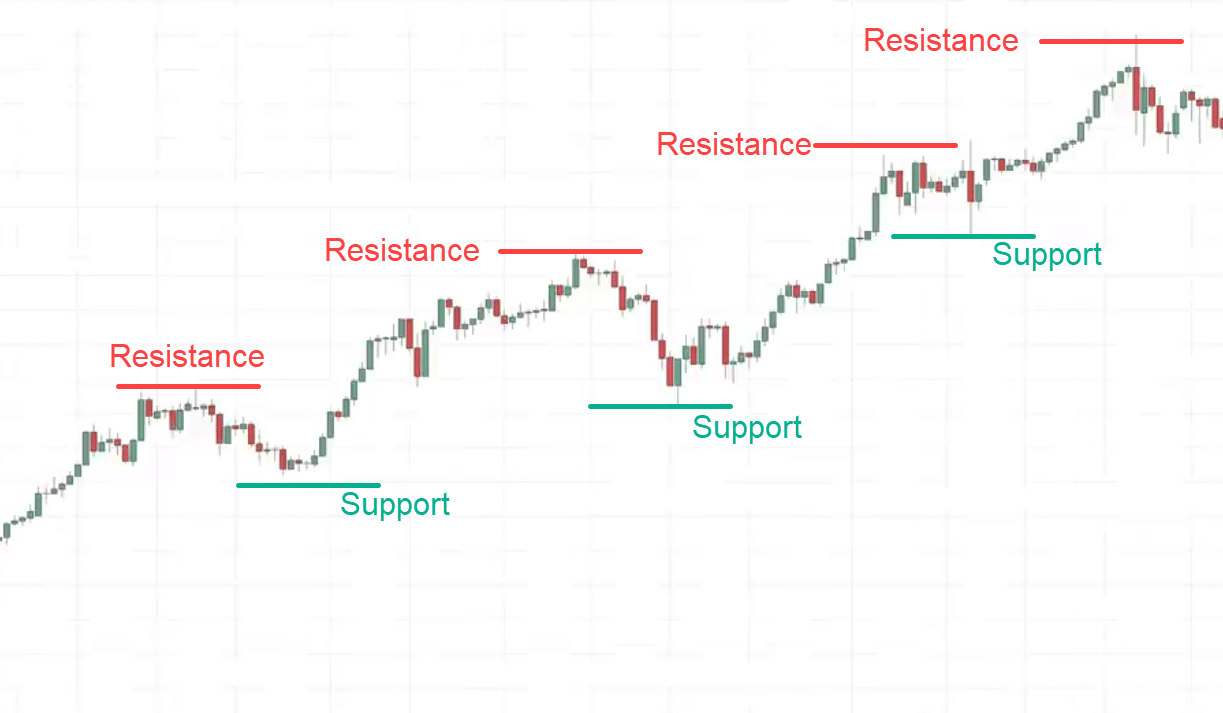
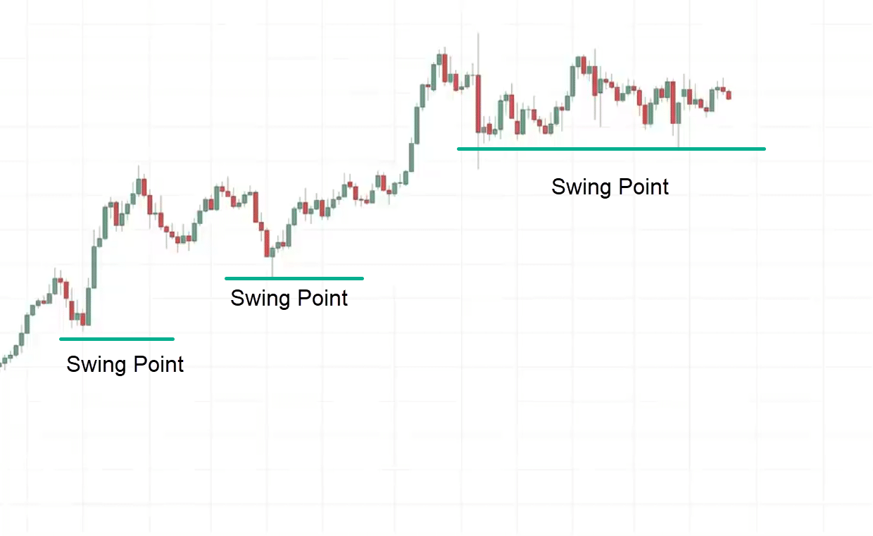
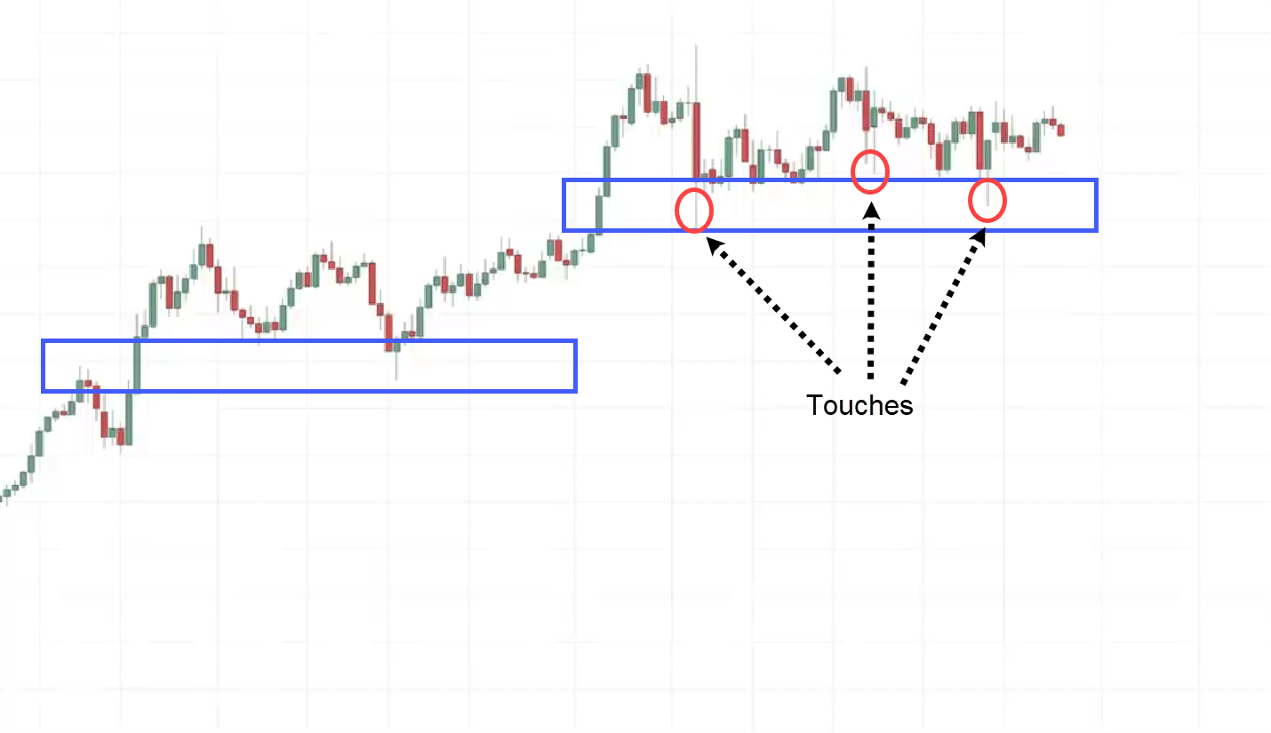
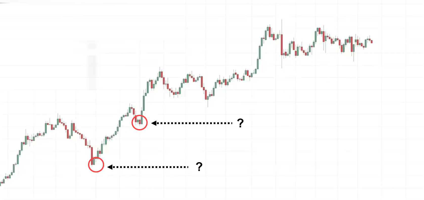
The way I will do it is that I’ll pay attention to the two most recent swing points.
What do I mean by this?
This is what I call a swing point. Here’s what I mean:
I will Pay attention to the two most recent swing points when the market is in an uptrend.
How do I draw support?
You can use the rectangle tool or a line if you prefer, but for those of you who are new, I recommend drawing it as a box.
Because support is an area on your chart.
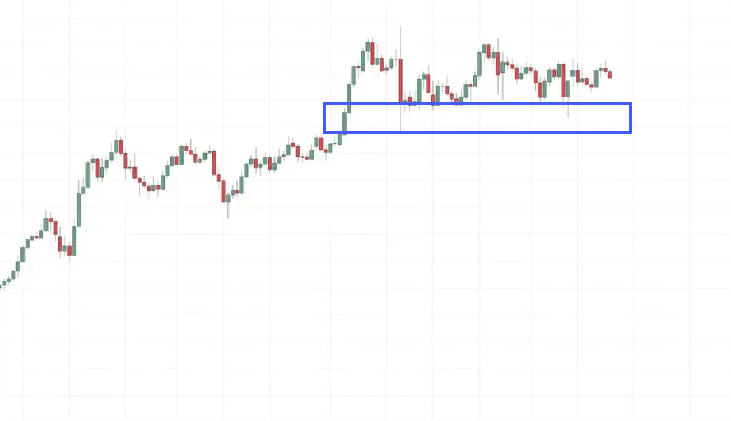
What I would like to do is to get as many touches as possible in my area of support. Here is what I mean:
Why do I draw this box in this manner? Because I got multiple touches.
I like to get as many touches into this area of support.
This is what I mean by drawing your support to get as many touches as possible into the box.
What about this level here?
Why are we not drawing support at that level?
Good question.
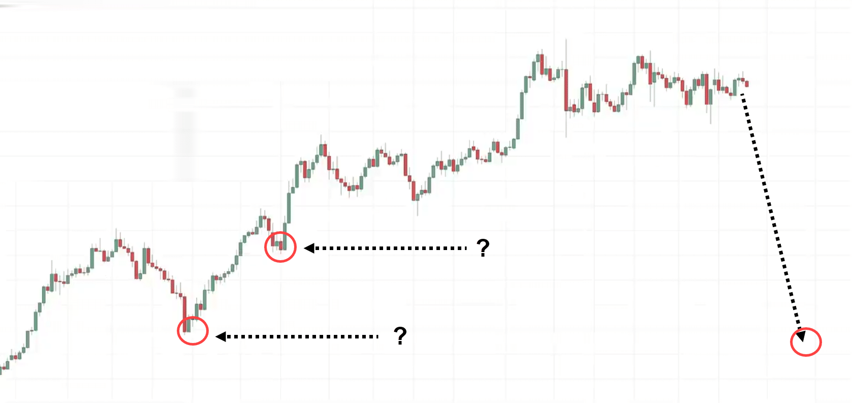
The reason why I don’t draw support at those levels is that if you think about this, let’s say the market comes down lower into this area of support.
At this point, I am not interested in buying.
Why?
The reason is simple…
If you visualize a chart, if the market were to reach this point, this market is no longer in an uptrend.
It’s probably in a downtrend.
I’m not interested in being a buyer in a downtrend.
I like to trade with the trend.
For those of you who are counter-trend traders, that argument might not be valid.
But for me, I like to trade with the trend.
My next question is this.
How do you trade support and resistance like a pro?
How to draw accurate support and resistance levels to better time your entries
Now we know how to draw support and resistance.
Example:
Looking at this chart…
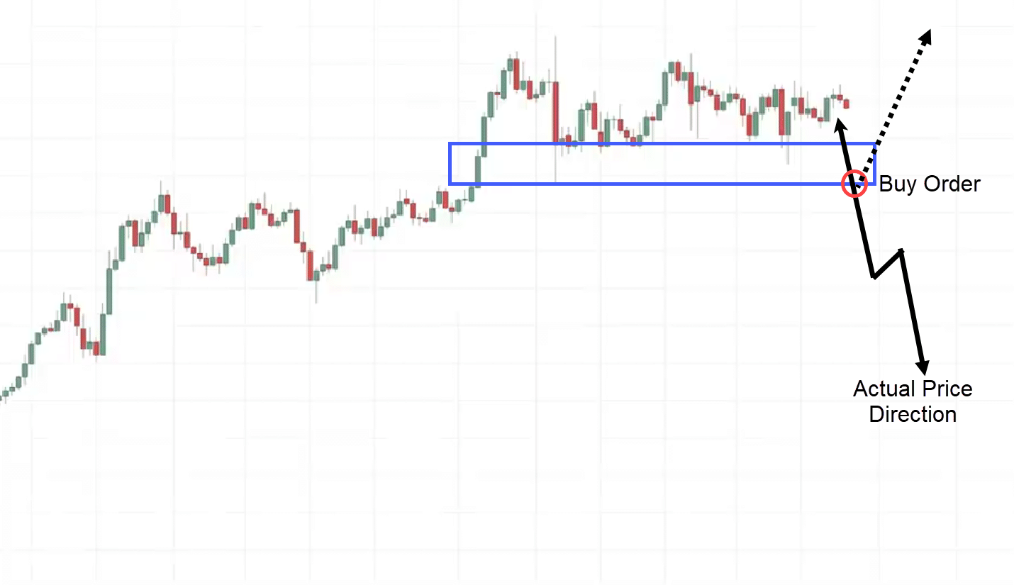
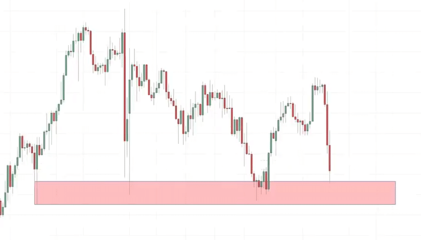
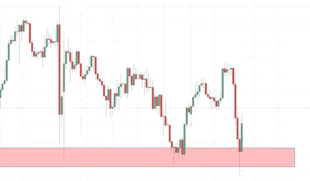
You can see that this is an area of support and traders might be tempted to let the price come into support and then just buy over here.
But for me, I don’t like to do that.
Because I’m sure you’ve experienced it before.
When the price comes into support you buy, and the next thing you know it collapses through support and goes down. Here’s an example:
What I’d like to do instead is to wait for some sort of confirmation.
Otherwise known as an entry trigger.
Entry Trigger
What is an entry trigger?
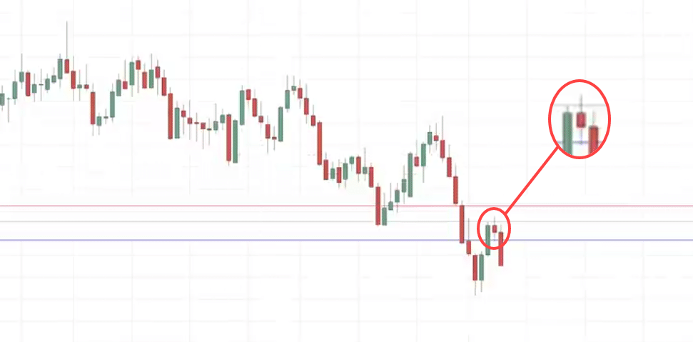
An entry trigger is simply a specific price pattern to help you time your entry.
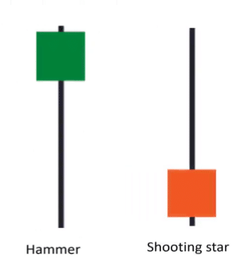
A few common ones I want to share with you are called the hammer and the shooting star.
Example:
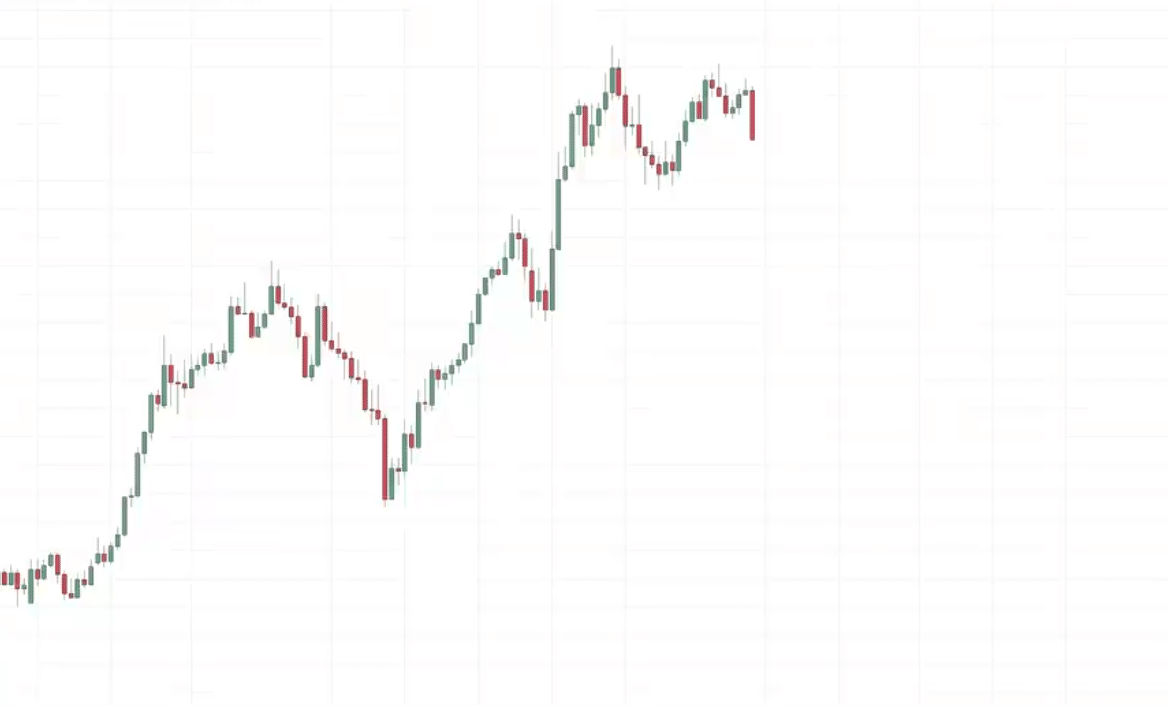
What is this market structure?
You can see this market is in an uptrend.
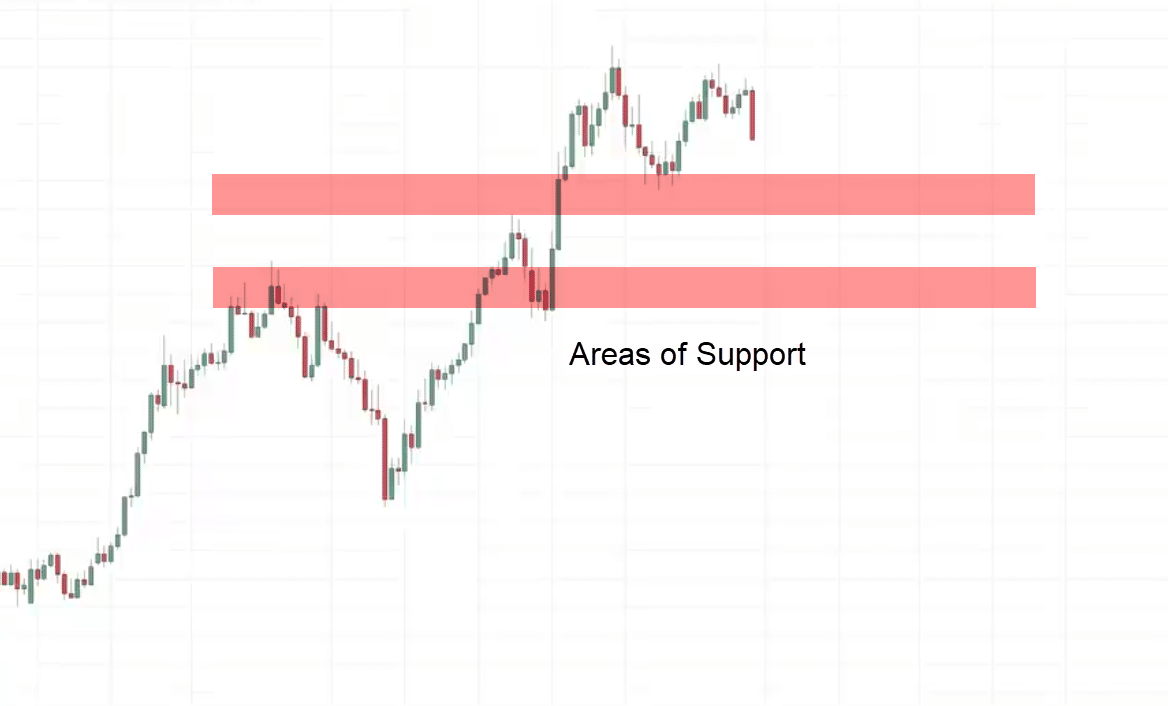
When a market is in an uptrend, we want to be buying as much as possible at support.
Let’s identify our area of support on this chart.
These are the two most recent swing points on the chart.
I will be looking for buying opportunities in the area of support
Let’s see what happens next…
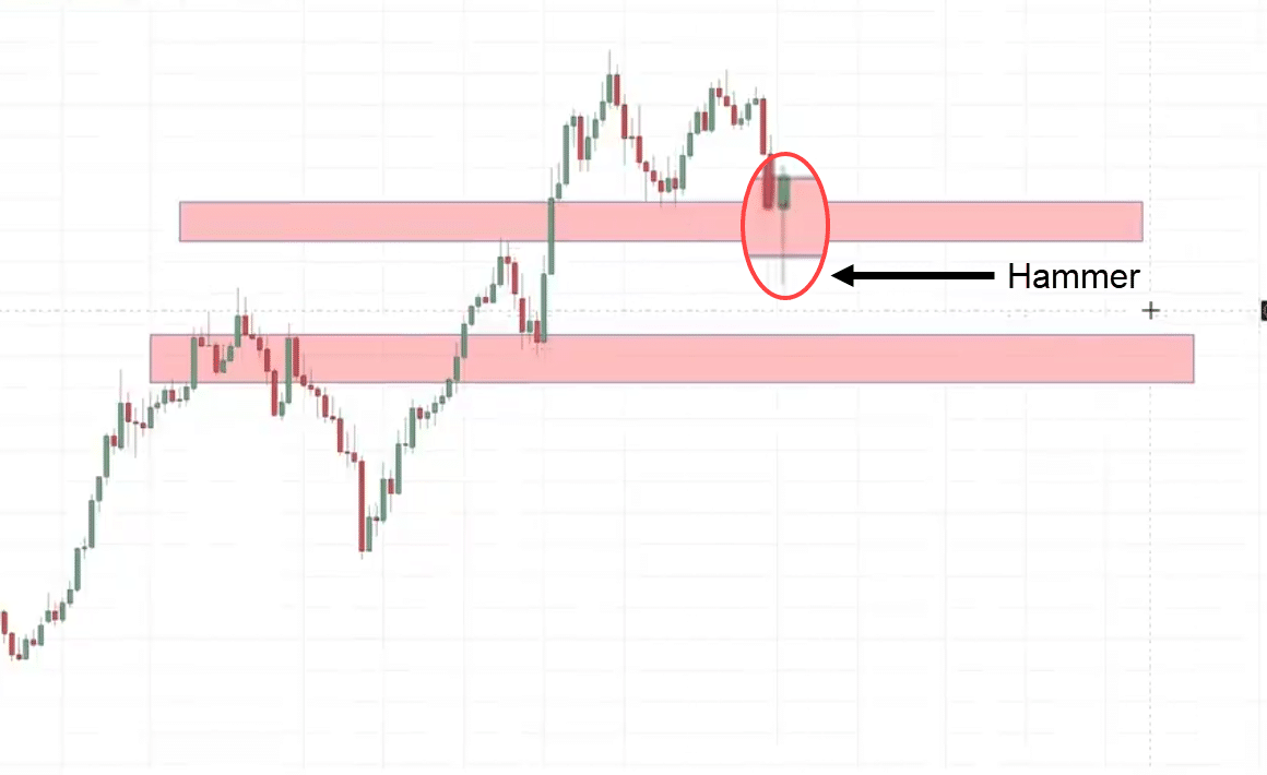
The market comes down
We have a hammer.
If you remember, a hammer tells us that the buyers are temporarily in control as they have managed to push the price and close near the highs of the day.
This is a valid entry trigger to go long.
We go long on the next candle open.
Generally, when I set my stop loss, I like to have it a distance below the area of support.
The ATR indicator can help us with that.
What about targets?
There are many ways to go about setting your target, but for simplicity’s sake, we can set our target just before the recent swing high.
This will be a potential level to set your target.
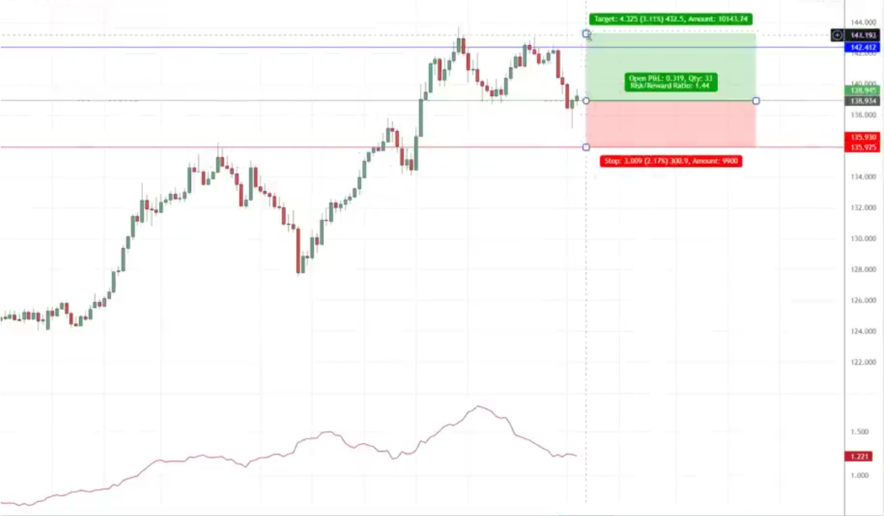
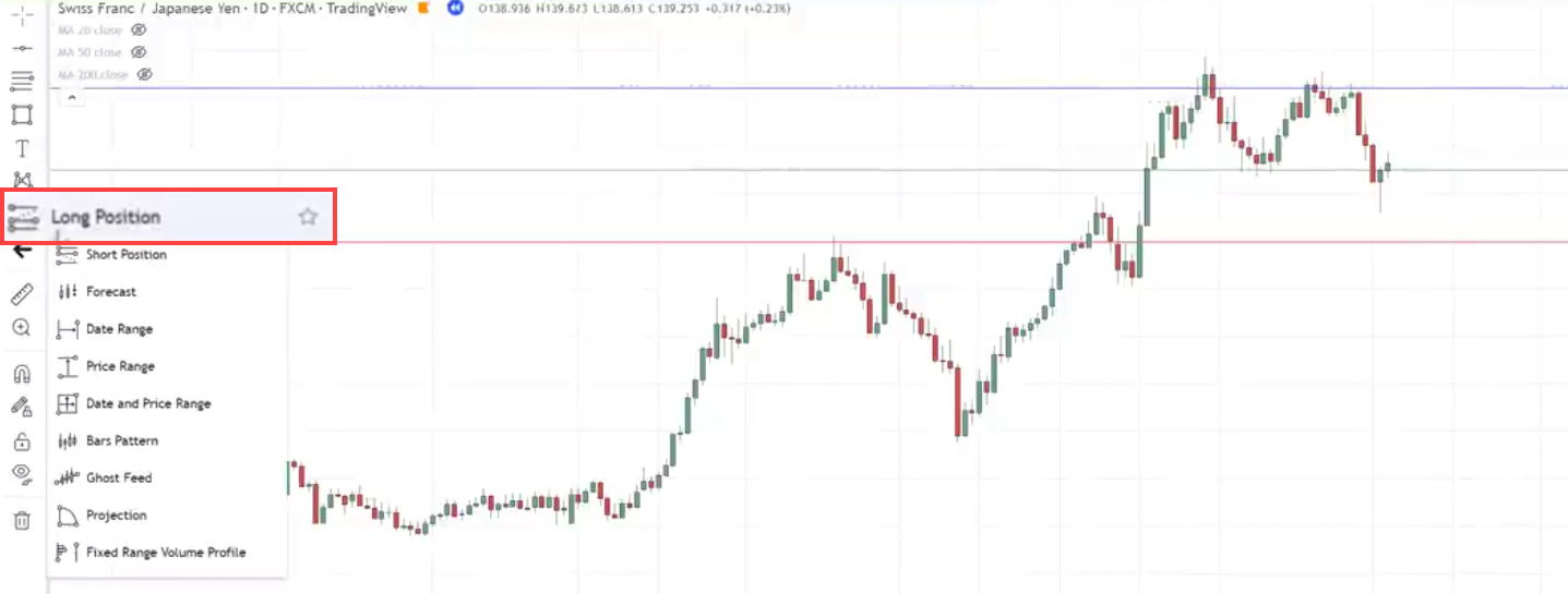
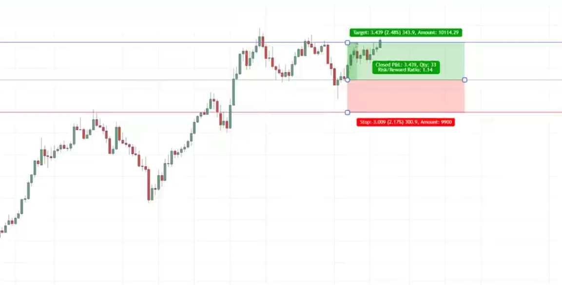
If you want to assess this from a risk-to-reward standpoint, you use this particular tool over here, click long position.
This means you’re risking $1 to potentially make $1.14 for this particular trade, and just to walk you through this particular trade.
Let’s see…
Eventually, the market did hit our target over here on this candle giving us a profit.
How To Maximize Your Profits
CHK:
This market is in an uptrend.
We want to look for buying opportunities near support.
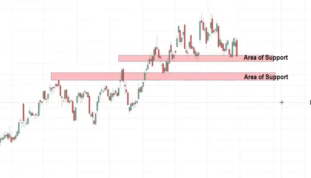
If I were to draw support, what’s interesting is that over here I’m seeing this is an area of support:
I’m seeing another area of support.
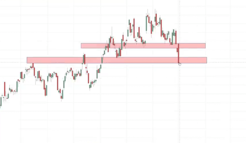
In this case the market broke below our first area of support. Then retest our second area of support:
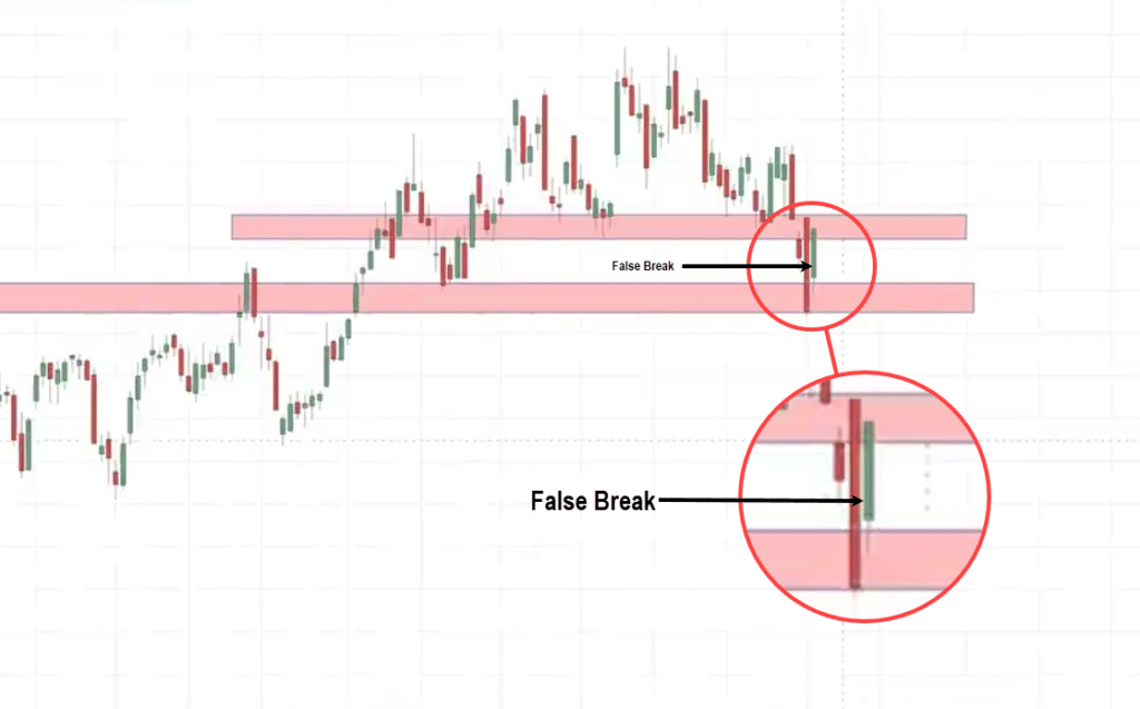
Then we have a very strong bullish price rejection:
This is what I would call a false break setup.
Why do I say this is a false break?
Because you can see the market took out the lows, broke above the area of support.
At this point, many traders will think that the market is going to collapse, it’s a bear Market.
But what happens next is that the next day, the market reverses strongly and close back above the high.
If you think about the story behind this price pattern it’s similar to a hammer where at a point of extreme pessimism the buyers you know step into control and push the price higher closing near the highs of the day on the last candle.
Although this is not a hammer Candlestick pattern, this story behind it if you read the candlestick pattern, it’s very similar to a hammer.
This to me is a sign of strength.
Buyers are stepping in and about to push the price higher.
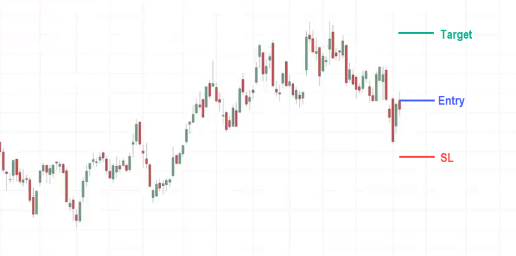
What I’ll do is again, I’ll look to enter on the next candle open:
This is going to be my entry point.
For stop loss, I will set it a distance below this extreme low
I’ll set it 1 ATR below it.
For target, I will say these highs over here.
Where it would be a relevant level to consider taking profits because this is where sellers could come in and push the price down lower.
One thing to add is that if you look at this chart:
We all can agree that this is in an uptrend.
If we were to take profits at the target,
We might be leaving profits on the table because the market could go up, break out higher before it reverses down on a pullback.
Now the question is…
How we can know where is this high that the market could reach to so we can kind of like maximize our profits?
How much more the market will exit these highs before it reverses or make the pullback?
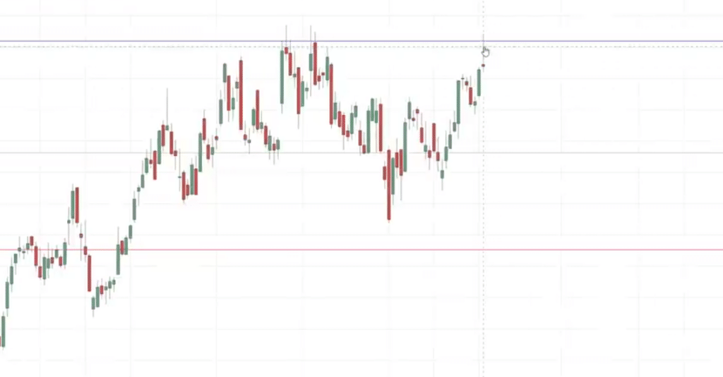
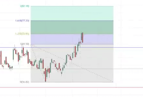
What you can do is to use what I call a Fibonacci extension.
You can look to take profit before the highs. maybe if you have let’s say you bought 100 shares of CHK, you can sell 50 shares at the high.
Let’s see what happens…
In this case, you can see that the market did pull back a little bit still pulling back now seems to be going higher, pulling back a little bit over here:
Eventually, you know reach our first target.
At this point, we have sold 50 shares of CHK Energy.
What about the remaining shares?
How can we kind of predict how much further the market can move in our favor to maximize our profits.
This is where the Fibonacci extension comes into play.
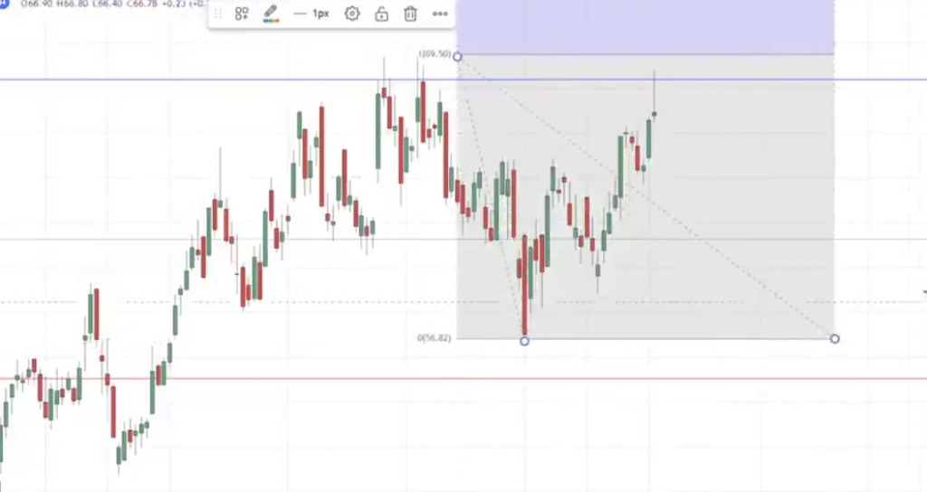
You look for your Fibonacci extension tool.
Draw it from these lows to these highs and down again.
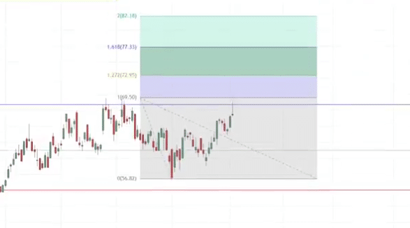
If you look at the chart, you can see that we have a few levels popping up:
We have the 1.27 extension, 1.618, and 2.0.
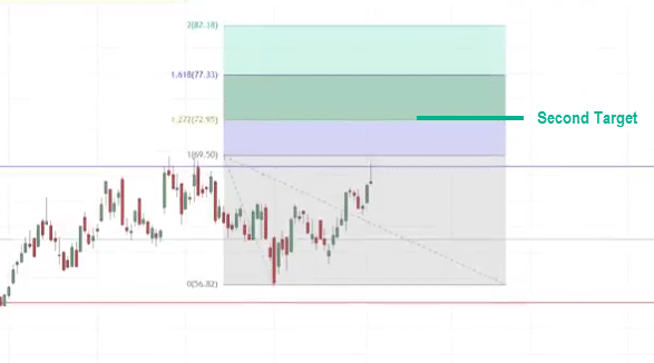
To be conservative, you can look to take your remaining shares of this stock CHK at this extension.
You can set your second target around this level over here:
In this case, the market eventually pulls back a little bit and eventually reaches our second target over here:
This way, you have 50 shares of this particular stock which is a CHK energy exiting at this swing high and the remaining 50 shares at this 1.27 extension.
This is how you can get the most bang for your buck where you have certain number of shares to take at a second target profit objective.
Range Market Secrets
If you recall earlier, I said that what about range markets?
Is support stronger or resistance stronger?
Example
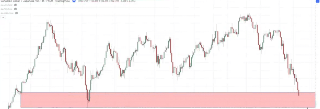
CADJPY/ 4H
You can see that this market is in a Range.
The question is
“Man, Rayner is support stronger or resistance stronger in this example?”
Here’s the tip for you…
You want to refer to the higher time frame and see what the market is doing.
If you know that the higher time frame is in an uptrend and this case in this range market condition I want to be as much as possible, buying at support.
If the higher time frame is in a downtrend, then as much as possible, I want to be selling at resistance.
This is how we gain additional insight to see what the higher time frame is doing to then determine whether in this range market condition, should we be looking to buy at support or sell at resistance.
As you can see this is the 4hour time frame.
Let’s go up to the daily time frame and see what this market is doing…
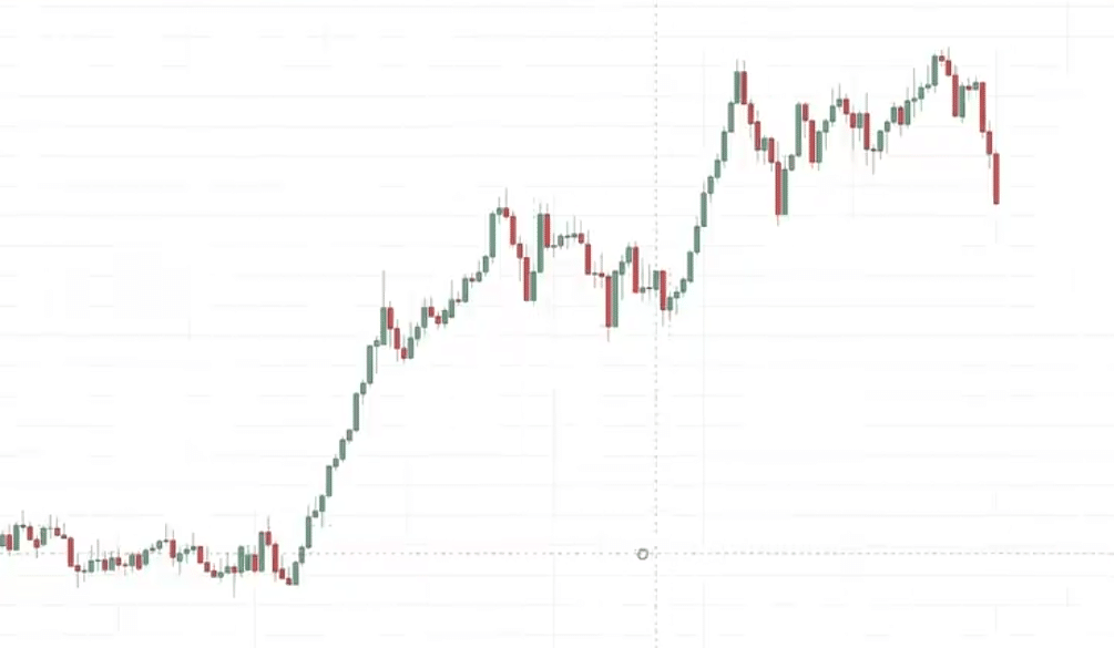
Daily timeframe:
You can see that this market is in an uptrend.
If you know the market is in an uptrend, guess what you want to look for buying opportunities at support.
This is where you can again go back to your 4-hour time frame, and you have identified that this over here is a range:
You can then look for buying opportunities in this area of support.
You can use your entry trigger your candlestick patterns that you are familiar with.
Let’s see what happens next…
In this case the market comes down into support, seems to break below support. but as you know when the price breaks below support, sometimes it could just quickly just reverse up higher so let’s see…
In this case, it starts to stall and closed lower for the day.
Slightly lower then over here with a strong bullish reversal pattern.
This is what we call a bullish engulfing pattern.
This pretty much means that the buyers are temporarily in control as they have managed to push the recent down move.
As the sellers are trying to push the prices lower, in one candle the buyer stepped in reverse all the losses and close near the highs of this 4-hour candle:
Let’s say you enter on the next candle open;
For stop loss, usually a distance below the low.
As you know, I can use the ATR indicator to help you determine your stop loss.
What about target?
This is a range market. there are numerous areas on the chart where you can look to take profit.
This swing high and possibly another one over here:
Let’s walk through and see what happens next…
You can see that the market now starts to reverse back to our entry point.
At this point, many traders would panic…
“Now, the market is reversing, let me exit the trade now before I know this trade turns into a loser”.
But you must understand that the market doesn’t usually go up in one straight line.
It could you know immediately reach your target and of course that’s easy trade, easy to hold great but there are many other times where the market goes up and pulls back and you know toils with your feelings so you have to be prepared for that.
In this case, this is one example of how the market seems to be moving in your favor.
Then suddenly make a pullback back to your entry point and now you get freaked out.
A lot of traders will just exit this trade to break even and…
“Phew relief! Oh I didn’t this trade didn’t turn into a loss!”
But if you look at that isn’t respect the market price structure because you know that the market doesn’t go in one straight line goes up makes a pullback etc.
Let’s say…
You are a mature trader you didn’t just quickly exit your trade.
Let’s see what happens next…
You can see the market then starts to retest these highs:
At this point, I would say it is not wrong if you look to exit a portion of your trade at the high.
Why is that?
Because you now know that when the market hits down lower, and then it retests back the highs, this could be an area of resistance where sellers could come in and push the price lower.
This is a swing high.
Let’s say you long 1 lot of Canadian Yen.
You can sell 0.5 lot at this high.
Let’s see what happens next…
In this case, once you exit half a position, you’re going to be psychologically easier on you because let’s say…
If the market does reverse back lower and hit your stop loss, it’s not going to be a loss for you because you already book some profits.
If the market hit your stop loss in the second half of your position you probably end up break even on this trade.
So psychologically it’s going to be easier to hold once you exit a portion of your position.
In this case the market as you can see again it collapse down lower back near to your entry point:
But again, you wouldn’t be too shaken out.
Infact, you feel a bit relieved because you’ve already exited a partial profit.
Let’s see what happens next…
You can see that the market starts to flirt with your emotions going in your favor.
Now then it starts to collapse back lower.
Now below your entry point price:
At this point, you know you’re prepared to get stopped out if you do you probably end up with the overall break-even trade.
Let’s see what happens…
In this case the market then respects this area of support starts to show signs of reversal back up again eventually reaches your target over here:
At this point you can see the trading is simple but not easy because at this price point many Traders will think…
“Oh man this market is consolidating what if it breaks down lower?”.
That could happen. this is up to you to actively manage your trade.
If you think that…
“Man, if the price reaches back above These highs, I want to exit the remaining half of my position.”
I won’t say it’s wrong. because you kind of like respecting the current price structure and then managing your trades accordingly.
But again, if you are the type of trader that is very disciplined…
“I already book some profits on the first half of the position”
“I want to ride the second half to my second target over here again”
That is fine as well.
You’ve got a journal on your trade, so I have to find out what works best for you.
Hopefully, in this example, I know it’s a little bit detailed I want to walk you through in this example to show you the different type of active trade management strategies that you can take to trade the markets.
Because trading is simple but not easy.
Multiple Timeframe Secrets
Now pay attention because what I’m about to share with you is advanced stuff that I believe about 99% of traders don’t even about it.
We’re going to deal with a multiple time frame.
If you don’t understand what I’ve covered so far then have to review back this section because we are going to use what we’ve learned so far and pick things a step further.
How do you actually fine tune your entry to raise a dollar to make you know three, four or even five dollars or more.
Thereby you can see improving the risk to reward on your trade.
First thing first, we are going to go down to the weekly timeframe. in this case we’re going to use multiple time frames to help us time our entry.
But again, we are using the same principles that you’ve learned earlier.
Look at this chart:
NZDUSD Weekly Chart
This market is in a downtrend.
In the downtrend, you know that you want to identify your area of resistance.
The recent area of resistance that I’m seeing is possibly this one over here:
Why this one?
Because if you look at this is where previous support break below support which could now become resistance.
What I want to do is to let the market come in towards this area of resistance:
Now it’s inside, then I want to go down to a lower time frame to help me fine tune my entry.
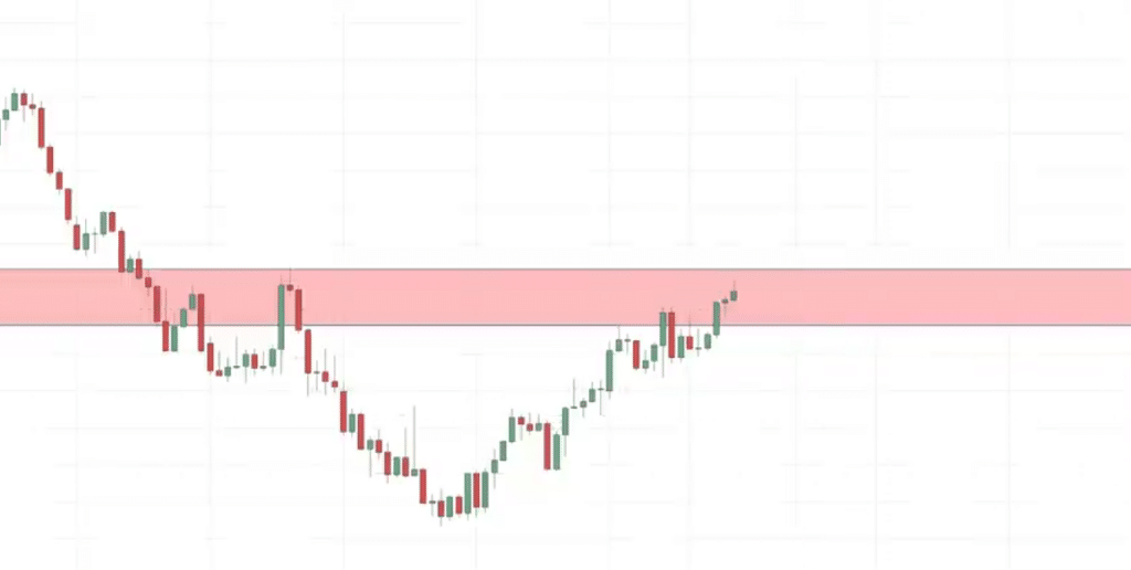
Instead of what most Traders will do is that they let the price comes into resistance, then maybe give them a shooting star pattern then they go short, stop loss above the highs, target maybe at the recent low.
You can see that if you were to do that at best you get this 1:1 risk reward ratio.
But how can you use this same analysis and instead of getting a 1:1 risk reward ratio, you get maybe a 1:3 or a 1:5 e risk reward ratio.
Here’s the magic…
What you want to do is to go down to a lower time frame like the 8-hour time frame, this is what you’re seeing on the 8H time frame:
You can see that this market is approaching this area of resistance.
What you’re looking for is possibly getting a bearish price rejected to help you time your entry.
Let’s see what happens next…
In this case, the market hits down lower:
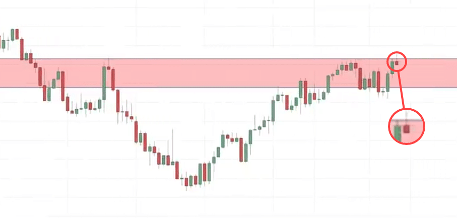
What we’re looking for is to see if the market can hit up higher and then get rejected close back below this area of resistance because when that happens, we can then use this as an entry trigger to go long and taking clues from the weekly time frame bearish direction.
In this case, notice this candle over here:
It’s small but still it’s a bearish price rejection, the price tried to break out higher of these highs this candle try to break out higher only to close near the lows of this 8 hour time frame.
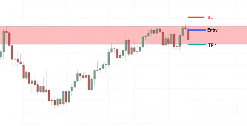
This is an entry trigger to go short, what you can do is let’s say you go short on next candle open.
Our stop loss it’s a distance above the high:
What about Target?
Here’s the thing, as you’ve seen sometimes trade management is not the easiest thing as in our previous example.
The market can move in your favor, go against you, move in your favor, go against you, and if it does hit your stop loss…
“You go Argh…You get crazy, you want to kill yourself and jump down the building”
But please don’t do that.
You can see that trade management is critical and the market sometimes doesn’t just move in one straight line and reach your target profit.
It can mess with your emotions and make it go crazy.
What you want to do is that I suggest for new traders is to have two parts with regards to your take profit.
You can have a TP level 1 and a TP level 2. (TP stands for take profit).
To make your emotions easier to manage, you can have a first Target over here just before this recent swing low as your first target.
Let’s say you are short 1 lot, you can set this first Target and you know exit 0.5 lot at TP 1
What happens next?
In this case, the market is kind to us pretty much reached our first Target relatively quickly
At this price point, if the market let’s say it were to reverse and hit our stop loss, this trade would probably be just a break-even trade because the first half of your position has no book a profit.
At this point, let me just bring you back to the weekly time frame and see where you are.
If you look at a weekly time frame, this is the green level is where you shorted the market:
You’re short at the upper wick of the weekly candle and that’s the secret to entering at the wick of a candle.
You’ve got to use multiple time frame to help you better time your entry and I’m pretty sure that of 99% of traders do not know that this particular technique exists.
You can see that this on a weekly timeframe, the market is in a downtrend
A series of lower highs, lower lows and the market tends to break below the swing low.
If you ask me the market that’s a good chance it could break below this swing low and could give us a favorable risk to reward on the trade.
How can we maximize our profits in this instance?
One way to go about is that you can use the Fibonacci extension technique I shared with you earlier.
You can use the 1.27 extension and project where the extension and then use that as your second target profit.
Alternatively, you can also trail your stop loss and to ride the trend down lower and see how much further the market can go and this is something that I want to talk about since I’ve not discussed it yet.
On the 8H time frame, what you can do is you need to have a second target where you expect the market to move.
Once you reach your second target and then you can throw in a trailing stop loss to ride the move down lower.
Let’s say for example we see that this is an extreme low over here:
We expect the market to retest these lows.
Let’s say we want to see if the market will retest these lows first or hit our stop loss.
Let’s see what happens…
In this case, the market pretty much reached the lows over here:
But remember if we want to trail our stop loss, we cannot exit the trade at these lows.
Because if you were to exit then there’s no more trend to ride.
What you can do is you can add in a moving average like a 20 or 50-period moving average depending on the type of trend.
Let’s say we go with a 50-period moving average which is this blue line:
You can see that what happens is that for this trailing stop loss or you tell yourself if the market goes up higher and closes above the 50-period moving average only then will you exit the trade.
If not, you will continue holding this trade and see how much further the trend can move in your favor.
You can see that the market has a slight brief rally and a 50-period moving average is coming down lower as well.
You can see the market broke down below these lows.
But again, you’re not exiting your trade yet because you’re trailing using the 50-period moving average.
You only exit the trade if the price breaks and close above the 50-period moving average.
In this case, you can see that it still heading down lower nice and then almost at the 50-period moving average but has not closed above it yet.
We are still holding this short position you can see that’s quite a long wait and finally the market has broken and close above the 50-period moving average.
At this point, you’ll exit the second half of your position on NZDUSD
You can see that for this particular trade, you exit the first half at your first target.
The second one you exited at this portion over here.
If you assess it from a risk to reward standpoint, you’re possibly risking a $1 to make $3 or more.
One last example before I go…
A Live Trade
I’m really feeling it as I produce this content here today because you know it feels like you know
“Man, this just feels really good it feels really awesome.”
Because this is the best of the best that I can give out.
Moving on…
Example:
It is the 4-hour time frame in Swiss Franc, and it seems like the market is in a range.
As you know, if the market is in a range, do you buy it support or sell at resistance?
The clue is the higher time frame.
If you look at a higher time frame, the daily time frame Swiss franc against the Japanese yen is in an uptrend:
As much as possible, I want to be buying at support.
In a 4H time frame, this might seem like a range Market, but that support is likely to be more powerful.
Let me look for trading opportunities at support here:
Let’s see what happens next…
The market come into this area of support and then we have a strong bullish reversal pattern
This isn’t a hammer but if you look at the price action you can see that the story is very similar to hammer.
This to me is a valid entry trigger because this is what I call a false break where the price tried to break below the lows, only to reverse up higher telling me that there isn’t any more selling pressure.
That’s why the price has difficulty breaking down lower.
What I’ll do is that I will look to enter our next candle open.
This is a live trade that I took on my own trading account so I’m walking through you through the same process that I had when I took this trade.
My stop loss was below the low the entry.
For Target at the point in time, my target was actually at this recent swing high over here:
This most extreme high so that’s my first target.
I had two targets in mind.
The reason being is if you look at the daily time frame, you know that this market is pretty much in an uptrend.
I want to have my first target over here
My second target is that if the market breaks Above these highs and continue higher, I want to trail my stop loss and to ride the uptrend up higher.
That’s the way I was planning this particular trade.
Let’s see what happens next…
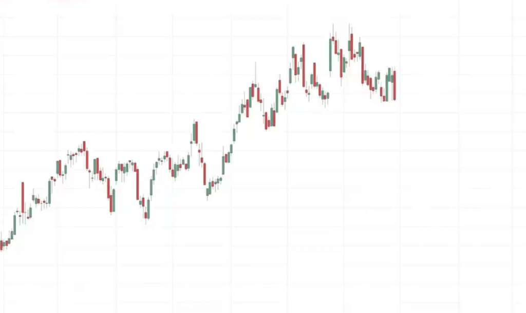
On the 4hour time frame is my entry and you can see that the market reverse against me at this candle and then immediately or relatively quickly hit my stop loss and then close back up higher so this is actually a losing trade for me:
As you can see, it did eventually continue higher, but I was already stopped out of the trade
The reason why I’m sharing this with you is that whatever I’m sharing with you here today is not the Holy Grail it’s not foolproof.
You will have losses along the way plenty of losses in fact so my hope is that you can take the strategies or concepts that I’ve shared with you.
Do your own validation to your own testing to make it, to mold it, to fit your own trading regardless of what markets you’re trading.
What time frames you’re trading do you know use these concepts and to develop it and tweak it for your own.
That’s kind of my hope over here and to let you be aware that you know there’s no 100% winning rate.
There will be winners, there will be losers along the way.
Conclusion
Support and resistance is probably the very first thing you learn in technical analysis.
While some traders “outgrow” this concept…
It is still by far one of the most powerful price action concepts out there.
Nonetheless, here’s what you’ve learned in today’s training…
- Support and resistance is much more relevant in a range than in an uptrend
- Drawing your support and resistance as a box instead of a line gives a complete picture of the area of value on your chart
- You can use candlestick reversal patterns as an effective entry trigger when trading support & resistance
- Waiting for the price to reach the area of value first allows you to have monster risk-to-reward ratios
Over to you…
How do you plot your support and resistance?
Using a box, or using a line?
Also, what kind of setups do you usually take when using support and resistance?
Let me know in the comments below!

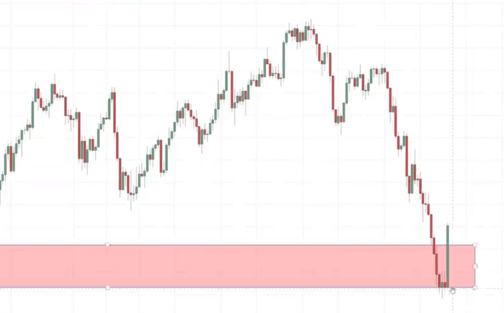
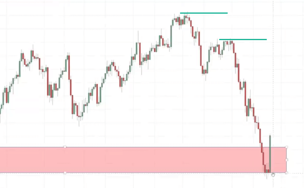
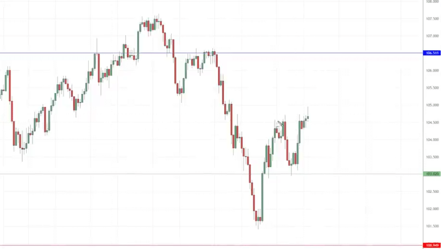
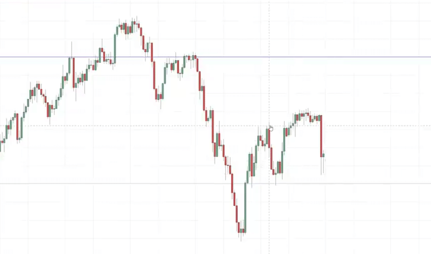
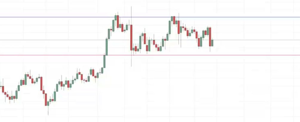
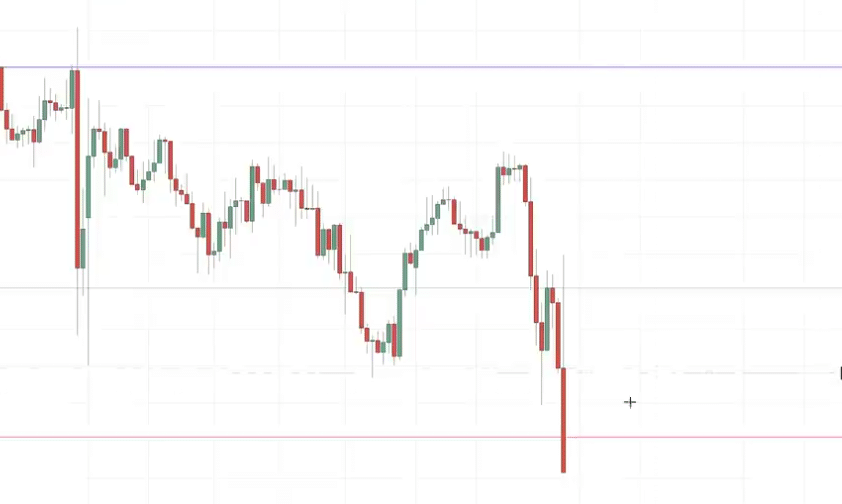
I want the bulls to make a 3rd higher high and I’ll draw support connecting the 1st higher high and the higher low. When the 3rd high pulls back to the higher low at support, that’s when I look for either hammer, bullish engulfing or mornings stat to go long. So I want the bulls to break resistance, pullback to resistance which is now support, goes high and exceed the 1st high and pullback again to support and reject strongly. In essence, I want the same support to be tested twice before I can be confident to go long. Hope that make sense!
Great!
Thanks for sharing, Mohammed!
Am usually using box to draw my S&R, because box give me chance to have multiple S&R.
And I really enjoy this course thanks you so much
Thank you for sharing, Sunusi!