#4: The Ultimate Technical Analysis Webinar
Lesson 4
Hey hey what's up, my friend!
Welcome to the…
Ultimate Technical Analysis Trading Course
Here's the thing…
Many traders use technical analysis in their trading but they are not getting the results they want.
In fact, they are losing money consistently by following “so-called” textbook trading setups.
Why is that?
Let's say you have the keys to a Ferrari and you give these keys to a 13-year-old kid.
Do you think the 13-year-old kid can drive the car and win an F1 championship?
No.
Why is that?
Even though the kid has the right tool…
He does not have the adequate knowledge to use the tool to get the results that you want!
It’s the same for trading.
You might have the tools in front of you such as:
- Indicators
- Chart Patterns
- Etc.
But if you do not know how to use it correctly, you're not going to find success in the financial markets.
That’s why in this course, I'm going to break down technical analysis such as what are these tools and how to use them correctly.
Also how to combine them and find success in the financial markets.
Let’s begin.
What is Technical Analysis
Generally, it can be broken down into a few categories:
- Drawing Tools
- Candlestick Patterns
- Chart Patterns
- Indicators
The first thing that you must understand when you're using technical analysis is that you must know the purpose of your tools.
What is it for?
Generally, technical analysis has these purposes:
- They help you understand the market condition
- They help you define Areas of Value on your chart
- It can serve as an entry trigger to enter a trade
- You can combine these tools and find high probability trading setups
This is the purpose of technical analysis.
It is to understand your tools and their purpose.
First things first...
What are Technical Drawing tools?
Drawing tools drawing can be stuff like…
- Trend Line
- Trend Channel
- Support and Resistance
These aren’t all drawing tools in technical analysis but I’m just listing out the three common ones.
But these tools are to help you find an area of value on the chart.
For example, you're going to buy low and sell high, how do you do that?\
You can refer to your drawing tools such as plotting Support and Resistance levels, as they will help you identify levels or areas on your chart where you can actually buy low and sell high.
Support and Resistance
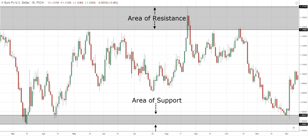
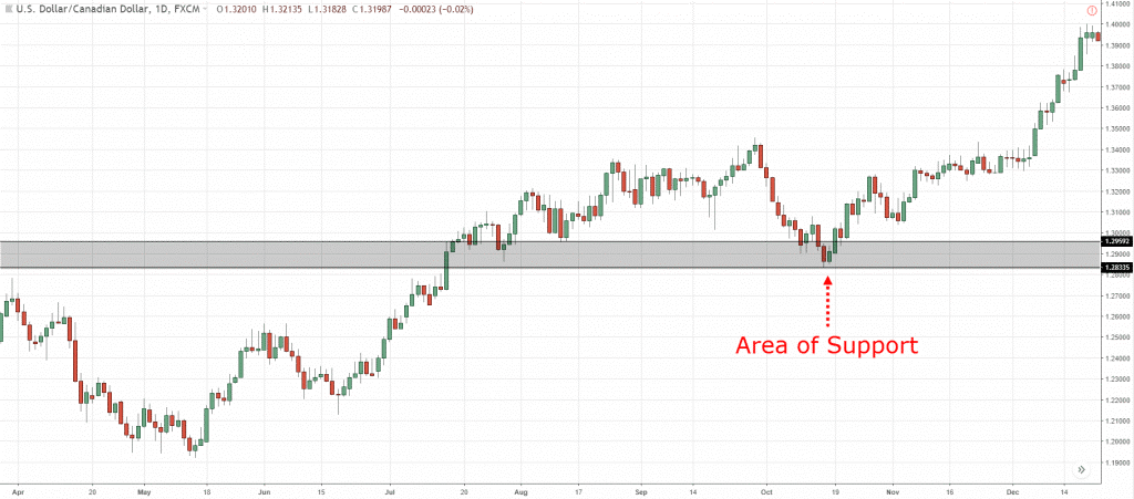
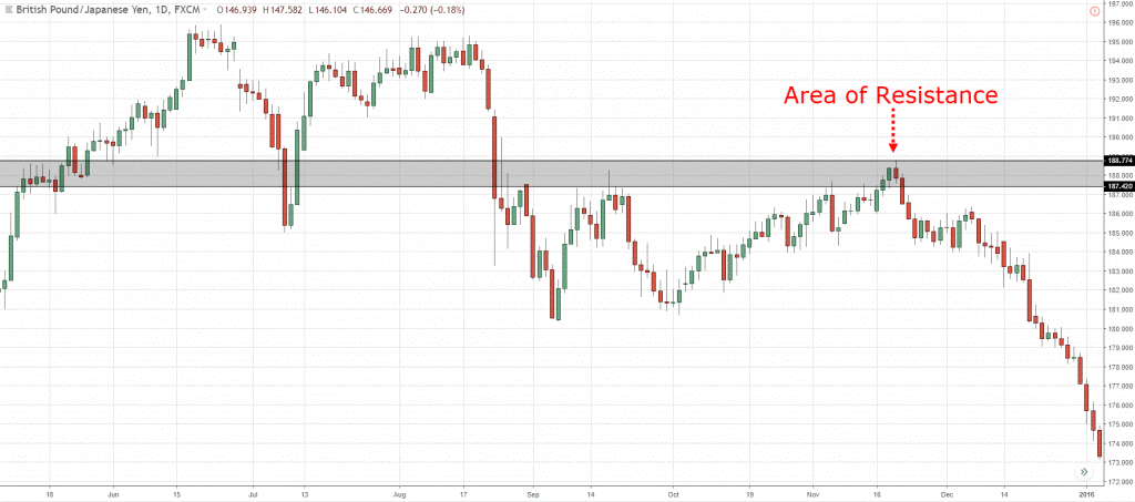
Here are several examples of Support and Resistance…
Support and Resistance on (EUR/USD):
Support on (USD/CAD):
Resistance on (GBP/JPY):
These are all Support and Resistance on your chart.
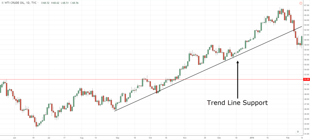
The other tool that I want to share with you is the Trend line...
Trend Line
A trend line is not a horizontal Support or Resistance but diagonal…
You can use it to identify areas of value and time entries.
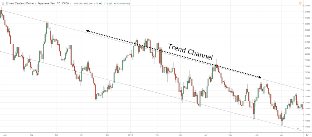
Trend Channel
A trend channel is just a slight variation of the trend line…
As you can see, it has 2 diagonal lines that act both as Support and Resistance
Now…
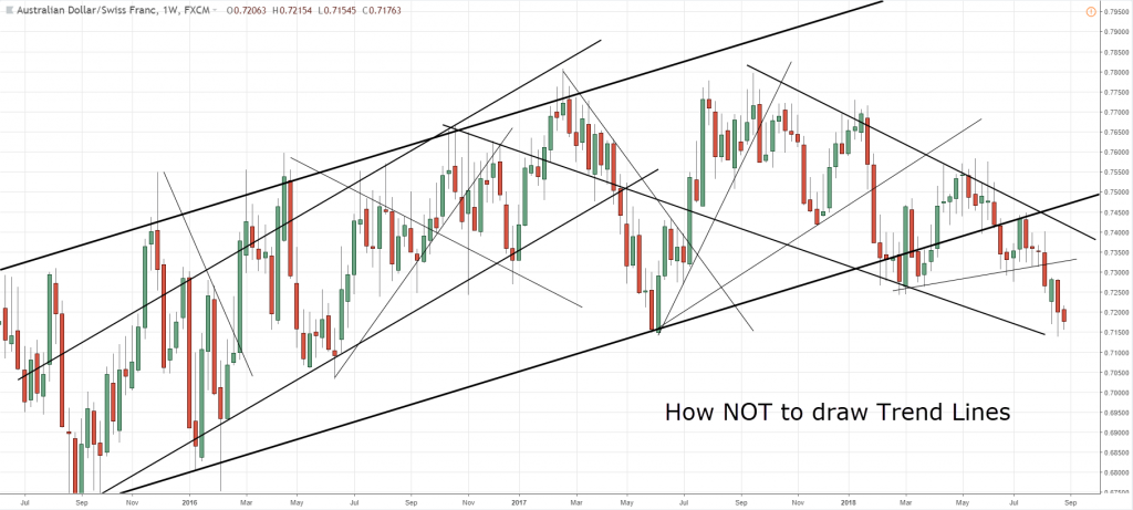
How do you draw these tools correctly?
How to Draw Technical Tools Correctly
If you think about this…
These tools are really important, it can help you with your trading in many ways.
So the important thing now is to know how you actually draw your levels correctly.
This is very, very important to pay attention to.
How I do it is that I use these three simple steps that I'm about to share with you:
- You want to zoom out your charts. You want to see the big picture, once you can see the big picture it's much more obvious to your eyes which key levels you should be paying attention to
- You want to draw the most obvious level. If the level sticks out, that level matters. If you're squinting your eyes asking if it is a level or not? Then ignore it
- You want to adjust your level to get the greatest number of touches.
Let me explain...
Zoom out your charts
Let's say, you're trading off the daily timeframe…
Zoom out your charts on the daily timeframe.
That's the first thing.
I typically have about 200 candles on my chart.
Number two…
Draw the most obvious levels
This clearly is a problem…
Because you're drawing all the minor, major, and intermediate levels, and it's analysis paralysis for you.
What you want to do is to draw only the most obvious levels.
Don't worry about the fear of missing out opportunities.
There are always more than enough opportunities in the financial market.
So, stick to the most obvious levels only.
The third thing is…
Adjust to get the most touches on your trendline
Let me share with you a few examples of what I mean by this...
You can see over here:
This is the trading view platform.
And usually, when I draw my levels trendline/support/resistance, whatever, I like to reset the chart first:
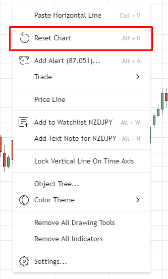
Okay?
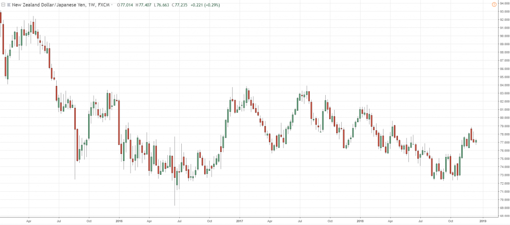
As I've said earlier, zoom out your chart and try to get as many candles.
But, try to keep the number of candles on your chart consistent.
Usually, I would use the mouse scroll and push I out five times to get a zoomed-out picture.
How many candles is this?
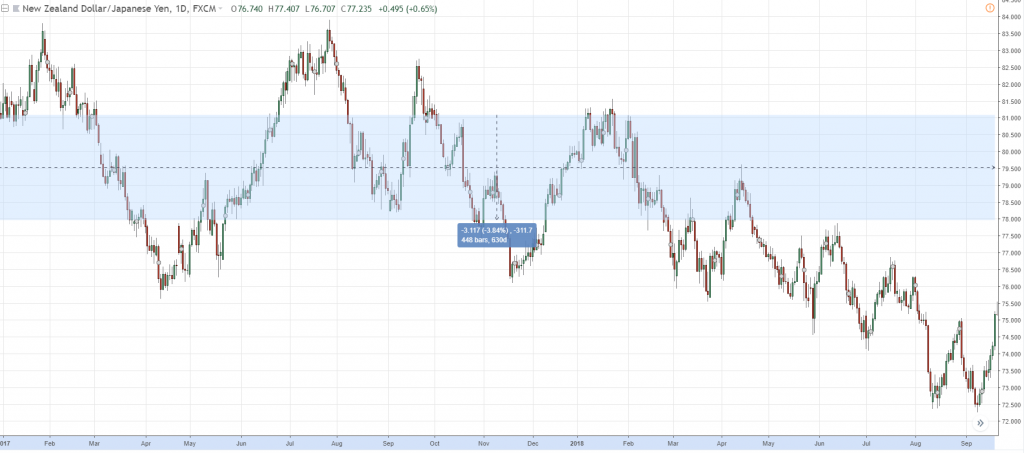
There are about 450 bars over here:
Now that I have about 450 candles on my chart, I've already done the first step, which is zoom out.
The second step, draw the most obvious levels.
Which are the most obvious levels on my chart?
Let me just start to identify the levels:
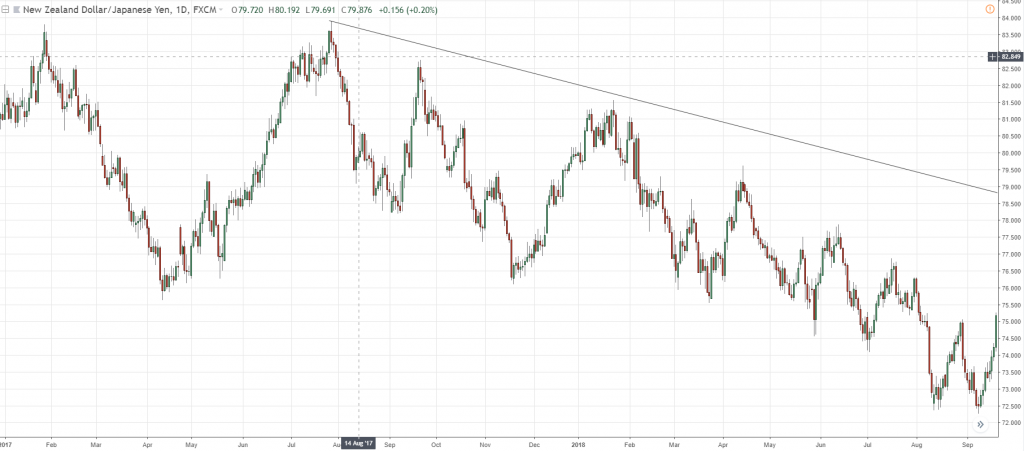
As you can see here, I have pretty much plotted the trendline.
The second thing I've done is that I've identified the most obvious level.
This one over here, this trendline is the most obvious!
So I'm going to adjust this and get as many touches as possible.
What do I mean by this, is that I’ll just draw a trendline and draw it and put it at the extreme.
Something like this:
If you plot the trendline at the extreme…
You would see that your trendline is not going to take into consideration the price action over here:
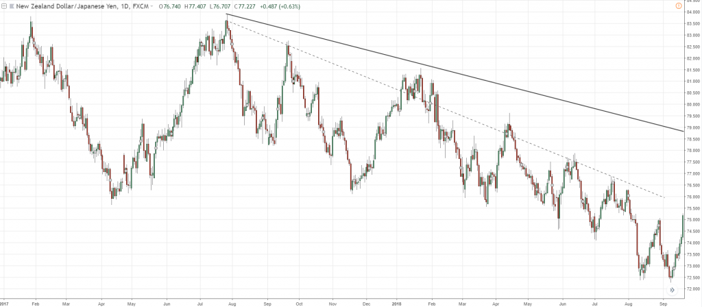
What I mean by adjusting it to get as many touches as possible is that I want to adjust my trendline so that it touches many points.
Or rather as many swing significant points on the chart as much as possible.
So, what I'm going to do is I'm going to adjust this lower, somewhat to about here:
At this point, you can see I have gotten so many more touches.
Initially, I only had two touches.
But right now, I've adjusted in such a way that I get seven touches.
I don't care whether it's going to touch the wick, whether it's going to touch the body.
All I want is that it hits any part of the candle, as long as it gives me one touch.
So, this is how I draw my trendline.
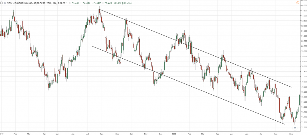
Similarly, we notice at the bottom of the chart, there are swing lows as well...
Just hit Ctrl+C and Ctrl+V and you can get another one out:
And then you adjust it:
Again, the same story, try to get as many touches as possible.
Traders might draw this one and get two touches only.
But what I'd like to do is to get more touches.
So, this is how I would draw my trendline using this three-step technique.
Let me share with you another example.
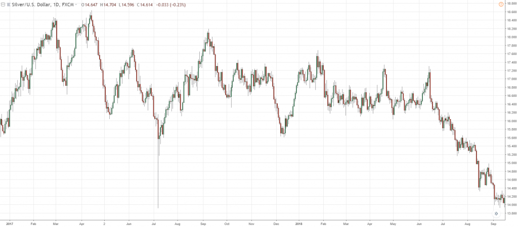
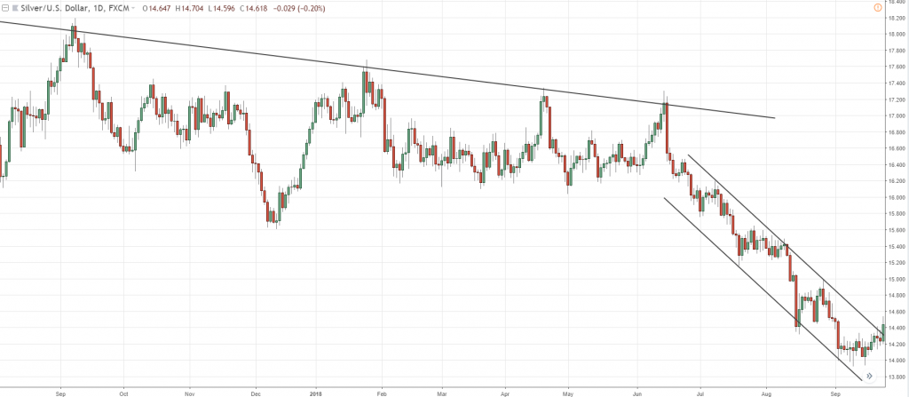
Looking at silver (XAGUSD), the same thing, right?
Let's repeat the three-step technique number one, zoom out:
I typically have about 450 candles, as you've seen earlier, I moved my mouse scroll mouse button out five times.
Now, the second step…
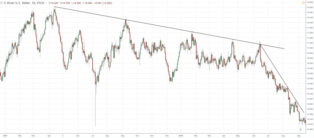
Highlight the most obvious level.
From what I'm seeing over here, these are the obvious levels:
Now, step three…
Adjust your levels to get as many touches as possible.
In fact, if you noticed earlier, the way I’ve drawn it is that I’ve already got most of the touches because that has been my habit.
Adjust the lower portion as well:
You can see that over here, there are six touches already.
This would be a much better adjustment for me, so this is how I would draw this trendline.
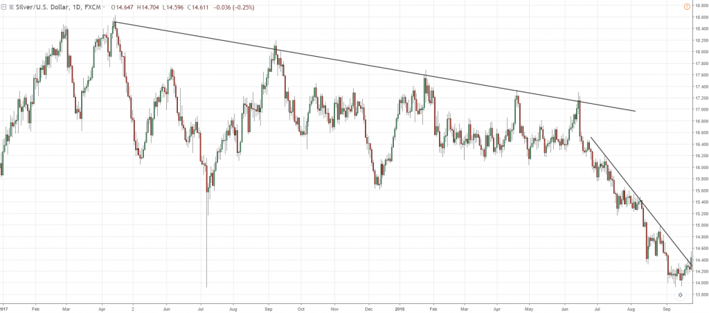
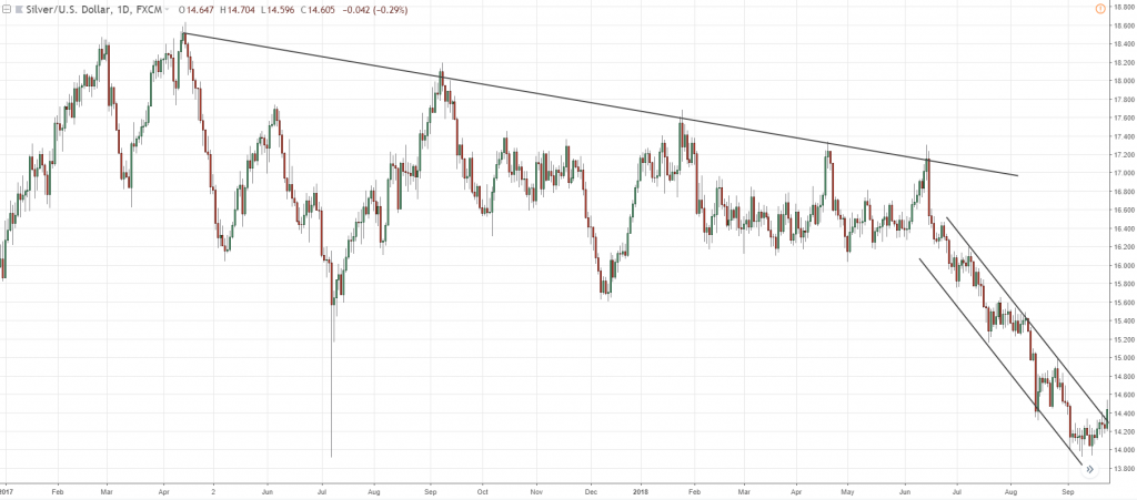
I also noticed that it can be drawn as a trend channel.
Just copy and paste the trendline and adjust it slightly lower to get the greatest number of touches:
As you can see, I take into consideration the recent price action and have four touches on the trendline.
So, this is how I would draw the lower portion of my trendline.
If I just reset the chart, you can see that, right now, this is the price action of the market and the way I draw my trendlines on it:
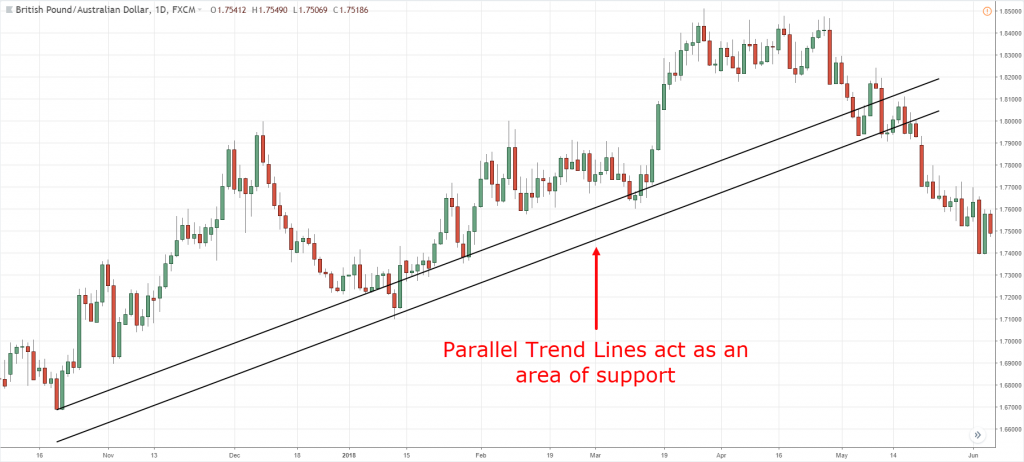
One thing to note again here is that trendline is an area...
Although there's the word line over there, you don't want to treat it as a strict line in the sand, black or white.
No…
It's an area.
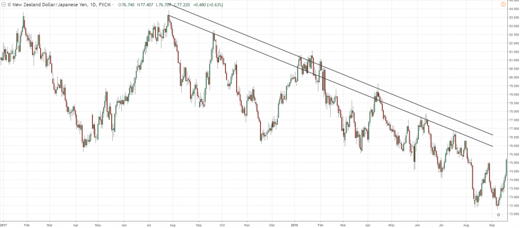
What you can do, you can treat it as such is that you can draw two parallel lines like this:
For example, you can go back to the earlier example that we have done:
What you can do is that, zoom out first again, copy and paste the trendlines, and treat the level as an area.
Now, you will treat this whole area as an area of resistance.
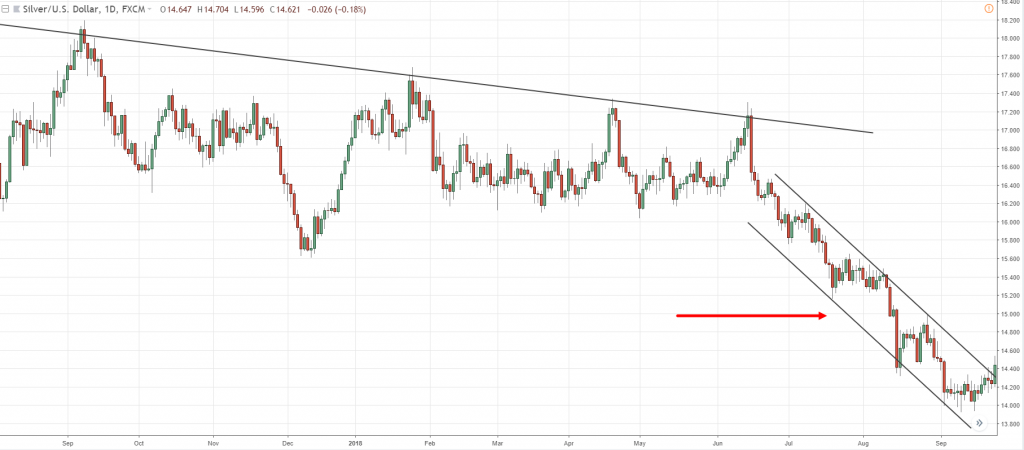
Similarly, for this trend channel, you can see that this area here is really quite congested:
If you edit another line, you might just make things more complex than it needs to be.
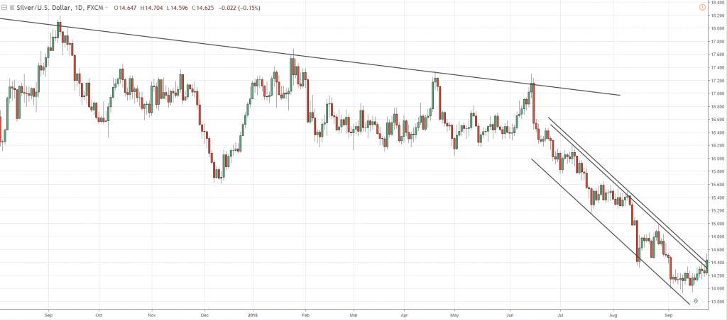
If the area is wide, you can have two parallel lines to judge the area.
But for this one over here, it's pretty tight, so, to me, I can see it as an area, I don't really need two lines.
But if you want to, make sure it's tighter:
If not, it's going to be very congested.
So, this is how you go about drawing correctly.
There's a little bit of discretion to it.
But if you follow the three steps I’ve shared with you…
You should be able to draw good levels on your chart whether you’re dealing with Support and Resistance, Trend Line, or Trend Channel.
With that said, let’s do quick summary…
Quick Summary
- Drawing Tools: Trend Line, Trend Channel, Support and Resistance
- Technical Tools helps you to buy low and sell high
- How to draw: Zoom out, Draw the most obvious levels, Adjust to get the most touches
Moving on, let's talk about candlestick patterns
What is a Candlestick Pattern
Here’s what it actually is…
- Candlestick is simply a method of reading a price chart
- It shows you the Open, High, Low, and Close of the session
- Candlesticks are very useful as an entry trigger
Remember, there are only four things: the open, the high, the low, and the close.
If you take a look at this:
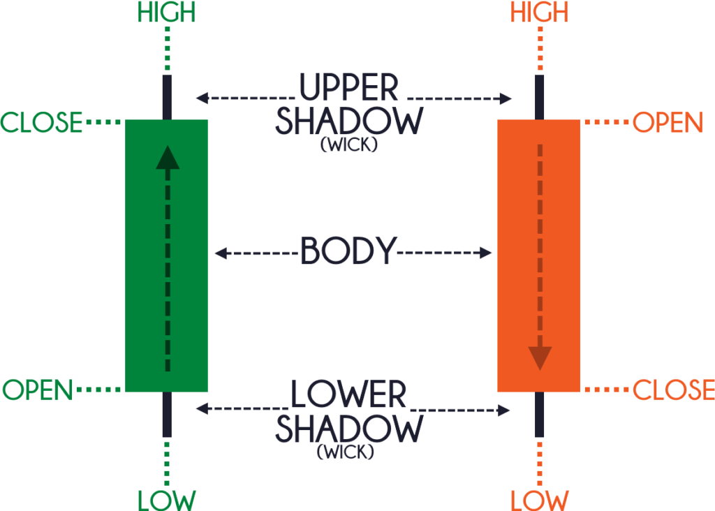
You can see that the candles are usually two colors, either green, red, or perhaps it can be black, white.
You can even change the color if you want, but, generally, the most common color is green and red.
When you see a green candlestick bar, it means that the price has closed higher for the session.
Likewise, when you see a red candlestick bar, on the other hand, it means that the price has closed lower for the session.
Now, let's try to understand these candlestick patterns more in-depth:
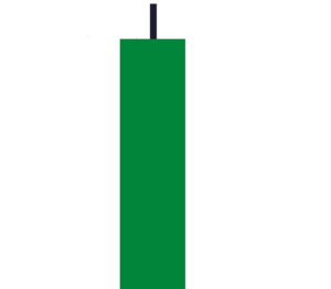
You'll notice that there are two main components to a candlestick pattern.
One is what we call the body, and the black shadow thing is what we call the wick.
The body pretty much tells you who's in control, so in this case...
You can see that the buyers pushed price up all the way up higher, and finally closing in these highs of the session:
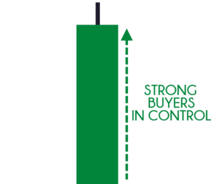
However...
You can't neglect this shadow as well because what is telling you is that there is price rejection:
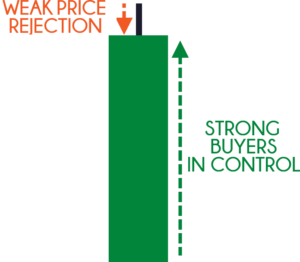
If you think about this, this was once the highs of the session.
What this tells you is that at one point in time the sellers actually pushed the price from these highs down lower until the price closed over here:
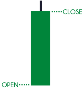
So, there are two components to a candlestick pattern: the body and the wick.
The third thing that I want you to know is this:
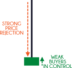
Again, you have a wick and a body, but this time around the message is completely different.
If you look at this candlestick pattern, it shows that the price did close higher:
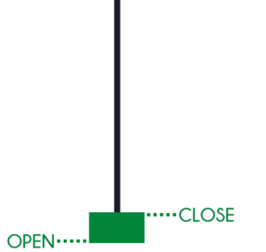
However, if you look at the wick, notice the price rejection.
Because at one point in time, the high of the session is over here:
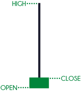
What does this tell you?
It tells you that there was an immense amount of selling pressure.
A strong price rejection that actually pushed the price lower during the session.
You can see that this isn't a very bullish pattern.
So, I also want you to pay attention to these three things:
- Body
- Wick
- The size of the body relative to the wick
Usually, if the wick is much longer than the body, it's a sign of price rejection.
With that said...
Let's have a look at the three popular candlestick patterns and the meaning behind.
They are usually reversal patterns and I think that they can help you serve as an entry trigger in your trading.
The first one is what we call the…
Engulfing Pattern
The first one is the Bullish Engulfing pattern, and what it looks like:

Let me explain to you the concept behind it.
You can see that when the first candle opens, the sellers came in and took control and pushed price all the way down lower, closing near the lows.
What happened next, is that the subsequent candle opened near the lows.
The buyers stepped in and pushed price all the way back higher.
Even higher than the previous day highs.
And then finally closing near the highs.
You can see that this a Bullish Engulfing pattern.
Because it has “engulfed” the previous candle.
This is a bullish reversal pattern, a bullish engulfing pattern.
One thing to note is that, the larger the bullish engulfing pattern, the more significant it is!
The second one over here is what you call a Bearish Engulfing Pattern:

In the first candle, you can see that price has opened near the lows.
The buyers stepped in and pushed prices all the way up and closed towards the highs.
Then, the subsequent candle that has opened where it closed previously...
The sellers came in and took price all the way down lower.
Finally closing near the lows!
This is a bearish engulfing pattern because the second candle has engulfed the previous green candle.
What it means is that it's a bearish reversal pattern.
The sellers are momentarily in control.
The key word is "momentarily," I didn't say permanently.
The larger it is the more significant the pattern is.
The next pattern that I want to share with you is…
Hammer and Shooting Star
A Hammer looks something like this:

Let me walk you through how it works.
Basically, for a Hammer candlestick pattern, the price opens at a high level.
Then the sellers quickly came in and took control and you can see that the price is being pushed all the way down lower.
What happens is that the buyers (the bulls) came in and has taken control back from the sellers, pushing price all the way back up higher.
And finally, closing near the highs of the day.
This candlestick pattern is essentially telling you that there is a tug of war between the bulls and the bears.
And eventually the bulls have won, right?
So, essentially this candlestick pattern is a bullish reversal pattern.
Buyers are momentarily in control.
Ideally, the length of the wick is at least two times the body!
The longer the wick, the greater the price rejection.
So, how you want to define Hammer is that the body is small.
One thing to clarify is that you might have come across in works or materials online that says that If you spot a Hammer in the uptrend...
It's a sign of weakness, that sellers are stepping in.
For this, I can't agree...
Because when you see a Hammer in an uptrend, to me that is a sign of strength.
Because it tells you that there are sellers coming in.
But, eventually the sellers are overrun by the buyers, and prices now close bullishly higher.
Next is the Shooting Star.
A Shooting Star looks something like this:

It's basically the opposite of a hammer.
You can see that the buyers came in and pushed price all the way up higher.
And then the sellers came in and reversed all the gains made by the buyers.
Eventually closing near the lows.
Based on the visualization that you've seen...
It's quite straightforward to know that this Candlestick pattern is a bearish reversal pattern.
Sellers are momentarily in control.
The length of the wick, ideally, is at least two times the length of the body.
And, the longer the wick, the greater the price rejection.
Moving on…
Morning and Evening Star
Again, it's another reversal pattern.
So, let's have a look at the Morning Star:

A morning star basically is a three-candle pattern.
Notice that there are three candles.
What you have is the first bearish candle where the sellers are in control and it pushed price all the way down closing near the lows.
What happened in the second candle is interesting, because usually when you get a strong-bodied candle, chances are the next candle tends to continue to move.
So, what happened is that the second candle didn't continue to the downside.
Instead, what you have is a Doji!
It tells you that both the buyers and the sellers are in equilibrium.
The third candle kind of seals the deal where the buyers step in and push price all the way higher and finally closing near the highs.
With that said, you should already have a good idea that it's actually a bullish reversal pattern.
Buyers are momentarily in control.
And the larger it is, the more significant the pattern is.
One thing I want to point out is that...
Whatever the candlestick pattern that you come across, you always have to be prepared that there are many variations to it.
What I've just shared with you in this candlestick series training video is the ideal textbook pattern.
But when it comes to the real world, it may not look like the textbook pattern.
So, it's important to understand what the candlestick patterns are telling you.
This is why I always go through this visual explanation of who's in control, what's happening, what's going on.
Similarly, the morning star tells you that sellers are in control.
They have a Doji, telling you that buyers and sellers are in equilibrium.
And then finally, the buyers took control and closed price near the highs of the candle.
As for the Evening Star, which is the opposite of the Morning Star…

Over here, you can see that the first candle is bullish.
Buyers push price all the way up high and close near the highs.
And the second candle is where things get interesting because instead of following through towards the upside.
You notice that you have an indecision candle.
Telling you that both the buyers and sellers are in equilibrium!
And the third candle kind of seals the deal as the sellers came in and took control, and finally now closing the price near the lows of this candle.
So, just quick trivia for you...
If you just look at the third candle in isolation, it is a bearish engulfing candle.
Because, if you look at the second and third candle in isolation, you notice that this is a bearish engulfing, as it has engulfed the body of the prior candle.
Now, let's do a quick summary about candlestick patterns that you've learned so far…
Quick Summary
- Candlestick is a method of reading a price chart (using OHLC)
- Candlestick is useful as an entry trigger
- Powerful candlestick patterns: Engulfing Pattern, Hammer & Shooting Star, and Morning & Evening Star
The main thing to take note is the body, the wick, and the body relative to the wick.
Once you master that concept, you don't have to memorize 101 different candlestick patterns.
Moving on, let's talk about chart patterns…
What is a Chart Pattern
If you think about this, candlestick patterns are an individual bar on your chart.
So a chart pattern encompasses more candlestick patterns to form a chart.
A chart pattern is a quick assessment of the strength, weakness, or equilibrium in the market.
This is what a chart pattern is used for!
Chart patterns can also be useful as an entry trigger and an understanding of the market condition.
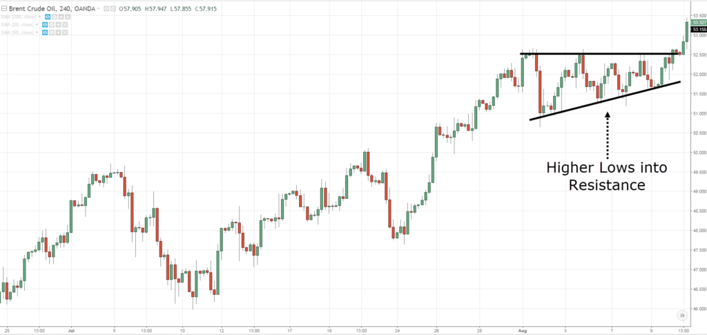
The first pattern I want to share with you is an ascending triangle pattern.
Ascending Triangle
This chart pattern is a sign of strength, and an ascending triangle looks like this…
Again, the way you draw an ascending triangle is a way you use your drawing tools as discussed a while ago.
You're simply drawing a resistance on your chart and an upward trendline for this particular pattern.
And this pattern is a sign of strength as it shows Higher Lows coming into an area of resistance.
This tells you that the buyers are willing to buy at higher prices which is a sign of strength.
We won't talk about the exact strategy on how to trade this, but I just want to share with you the idea behind the ascending triangle.
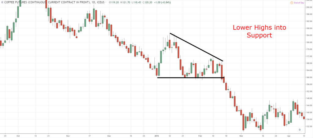
The opposite of the Ascending Triangle is (of course) the Descending Triangle.
Descending Triangle
This is a sign of weakness as it tells you that the sellers are able to sell at lower prices.
And that's why you have lower highs on your chart.
Now…
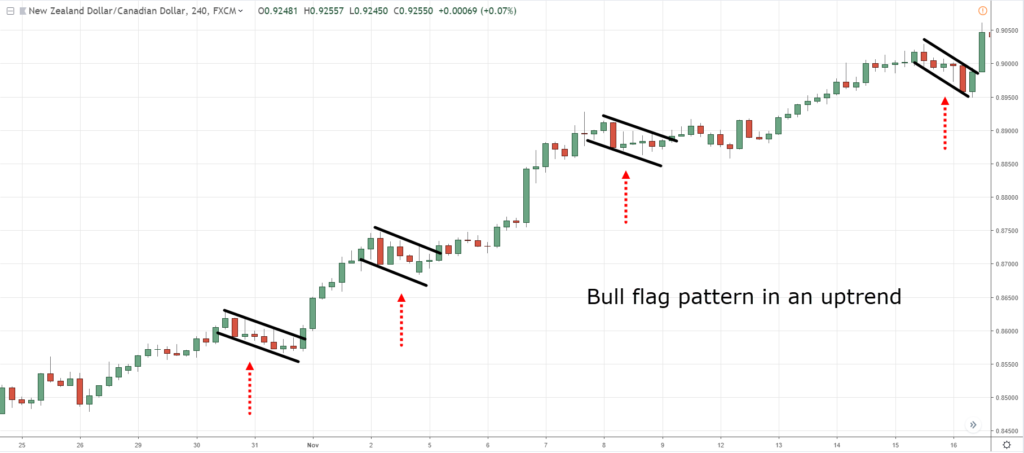
The next pattern is what I call the Flag pattern.
Bullish Flag Pattern
This is another useful pattern to know as a trend continuation trade.
A Flag pattern is pretty much this one over here…
The Flag pattern pretty much looks like the usual flag we see in the real world that’s waving left and right.
The key thing that you want to take note is the retracement.
You want to see small-bodied candle as the Flag pattern forms.
It tells you that the sellers are not able to push the price lower, that's why the range of the candles are
quite small.
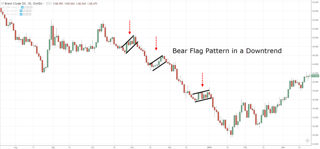
And the opposite is what we call a Bear Flag pattern.
Bearish Flag Pattern
If the price breaks down lower, there could be a possible set up to go short.
But again, we can talk about that later on.
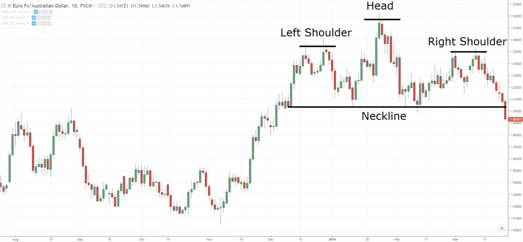
The next pattern is what we call the Head and Shoulders pattern…
Head and Shoulders Pattern
This is a sign of weakness in the market, because if you think about this…
The price headed higher, retraces back lower, made another move higher, and then retraces back lower again.
But the second high did not reach the previous high which shows a sign of weakness.
It tells you that the buyers weren't as strong compared to the previous high and it now leans toward the area of support, otherwise known as a neckline.
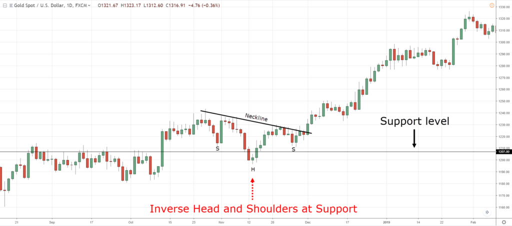
And the opposite of this pattern is what we call the Inverse Head and Shoulders pattern.
Inverse Head and Shoulders Pattern
This pattern shows that the buyers are overall in control.
This is what we mean by the Inverse Head and Shoulders pattern.
With that said…
Let’s do a quick Summary
Quick Summary
- Chart patterns are a quick assessment of the strength, weakness, or equilibrium in the market
- Chart patterns are useful as an entry trigger and understanding the market condition
- Common chart patterns: Ascending Triangle, Flag Pattern, and Head & Shoulders
Now, let’s move on and talk about Indicators…
What is an Indicator
This is something that I know many of you are interested in.
So let me share with you what an indicator is about and what it is for…
- Indicators are a tool that takes historical data and applies a formula to it
- Indicators “Summarize” the market price action
- Indicators are useful as an entry trigger as well, identifying the area of value, and understanding market condition.
The reason why traders don't find success with indicators is that they don’t understand the purpose of it and they are using it in the wrong way.
But don’t worry.
Because I'm going to share with you the different types of indicators out there so that you would see indicators in a different light.
The first one is the Moving Average…
Moving Average – What is it?
A Moving Average is pretty much an indicator that summarizes past prices.
Sometimes when the price action in the market is choppy...
What the Moving Average does is that it smooths out past prices.
Let me share with you how the numbers of the indicator are derived.
For example, a 20-Moving Average.
What it does is that it adds up the value of the last 20 candles.
Let’s say the total value of the last 20 candles is $200…
You divide it by 20 (the period of the Moving Average) and you’ll have a value of $10.
The value of $10 will be plotted in your chart as one dot.
Now let’s say the 21st candle is formed…
The Moving Average would recalculate and look back the average price of the last 20 candles.
So, let’s say the total of the last 20 candles this time is $240.
Divide it by 20, and you get $12.
Back on your chart, there should be another dot plotted higher than the last dot, which is $10.
That’s how the Moving Average is calculated.
There are different ways to calculate it such as:
- Simple
- Exponential
- Weighted
It doesn’t matter…
But this is the concept behind the Moving Average even if there are a lot of variations to it.
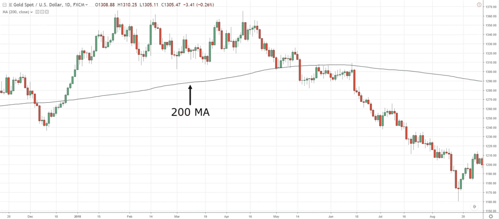
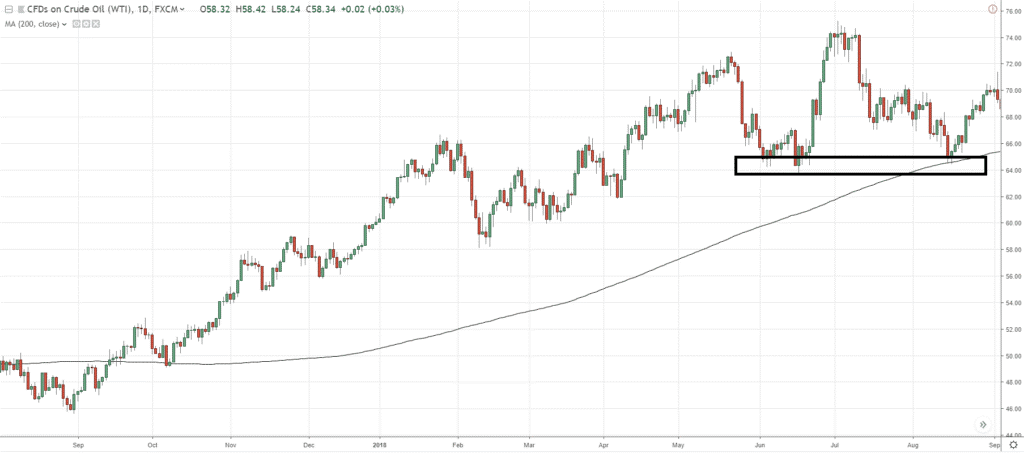
Moving on, you can see that the black line is the 200-period Moving Average:
Next…
Moving Average – Trend Filter
Often, I get traders asking me…
“Hey Rayner, should I be buying, or selling?”
What you can do is to use the Moving Average as a trend filter!
It tells you whether you should be buying or selling.
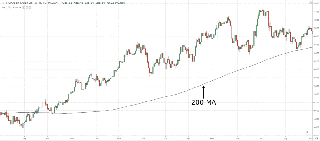
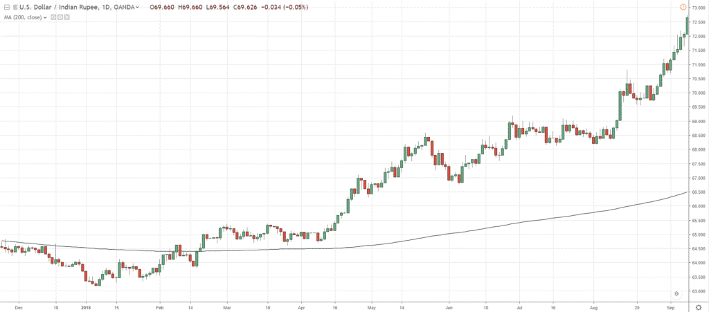
You can see that the black line over here is the 200-day Moving Average:
It doesn’t matter whether you are using exponential, simple, weighted – It doesn’t matter, the concept is what matters.
Right now, the price is above the 200-period Moving Average!
One general guideline is that…
When the price is above the 200-period Moving Average, stay in a long bias.
This means that the market is in a long-term uptrend and you want to be buying in this market condition.
Over here, I can identify a possible area of support where you can look to buy in this market condition:
You can see over here that the price is above the 200 MA:
What should you do?
You should only be looking for buying opportunities in this market condition.
Moving on…
Moving Average – Area of Value
For example, the market is in an uptrend: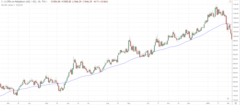
And you are wondering, “when is the good time to buy?”
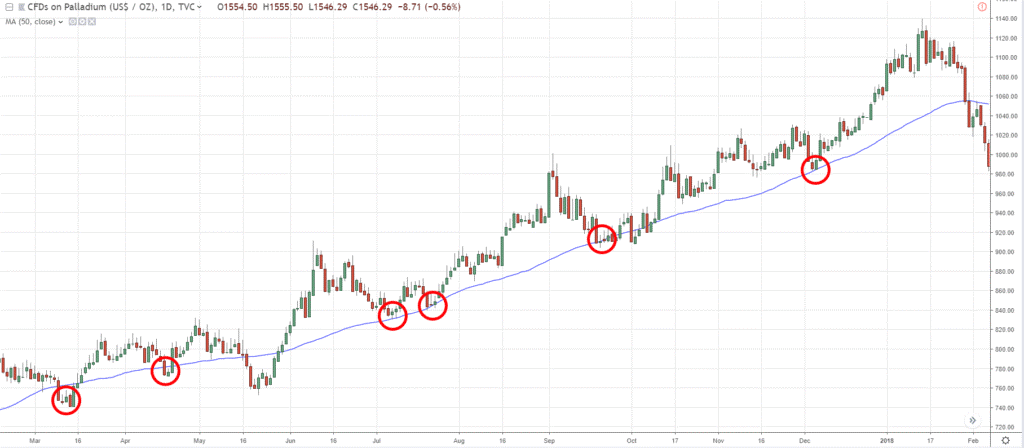
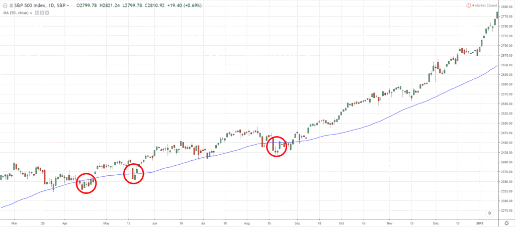
What you can do is to put on the 50-period Moving Average and see if the market tends to respect the Moving Average:
As you can see, the market clearly respects the 50-period Moving Average!
In the future, if the price comes back towards the 50-period Moving Average…
What you can do is, look to buy!
Because the price is in the area of value.
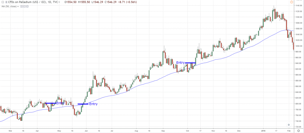
One simple way to enter the trade is that you can wait for the price closes back above the 50-period Moving Average.
Here are some previous entry triggers:
This is a very simple entry trigger to get on-board the trend if the Moving Average serves as an area of value.
Another example, the price tends to exceed the Moving Average and closes back above it:
The reason why I shared this is that there isn’t the best Moving Average out there.
You should expect that the price would come very close to it and reverse in your direction without you.
So, you have to handle the different situations that come along.
The next indicator that we’re going to talk about is the…
Average True Range – What is it?
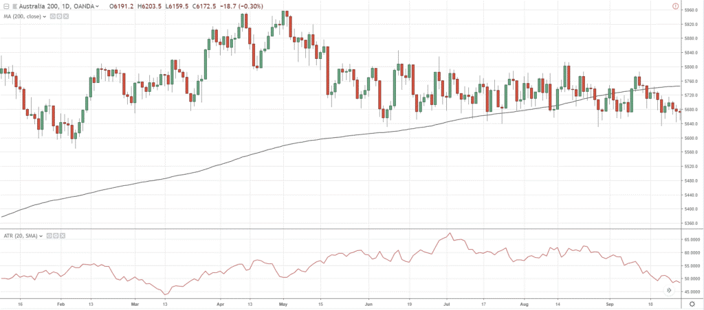
The Average True Range Indicator is an indicator that measures the volatility in the market.
I’m not going to go in-depth with the indicator’s calculation.
Because it can be a little bit complex.
But the core concept behind this Indicator and how the values go up and down is that it looks at the range of the candles on your chart.
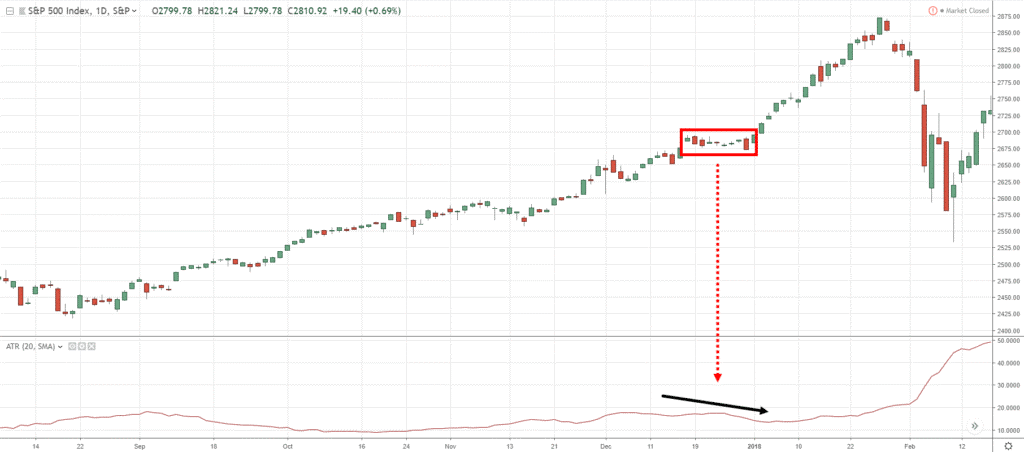
You can see that over here:
The range of the candles is pretty small.
This is why the ATR value is dipping slightly.
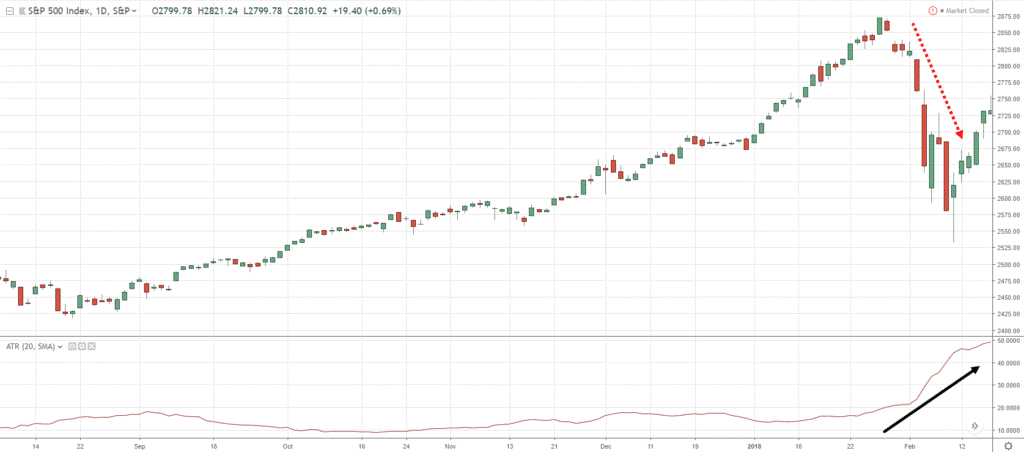
If the range of the candles is getting larger, the ATR value will increase!
As you can see over here:
You can see that the ATR value expands as the candles expand.
The ATR value does not measure the trend but measured the volatility in the markets.
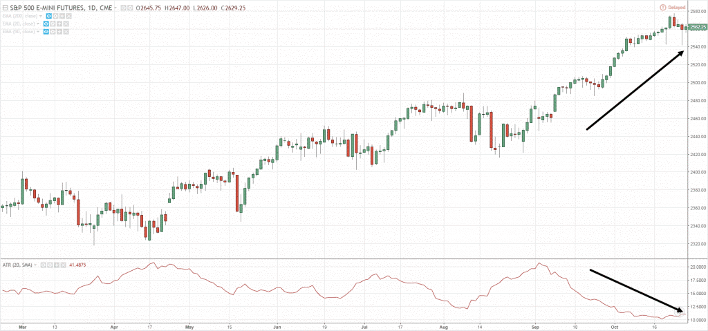
Another example:
The market is in an uptrend while the ATR value is decreasing.
Why is that?
It’s because the range of the candles is getting smaller and smaller, and that’s why your ATR value is decreasing.
Now that you understand the ATR indicator…
How can you use this to trade the markets?
Let me show you how...
Average True Range – Stop Loss
If you look at this chart:
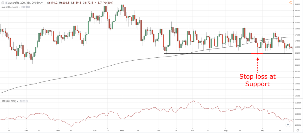
Traders would look at this and say, “Hey Rayner, it’s a range market!”
So, what they would do is that when the price is at Support…
They would go long and put their stop loss just below Support just like what the textbook says:
What happens is that the price retests support and get spiked out of the trade:
This makes it easy for the markets to trigger your stop loss and reverse back to your intended direction.
This is why you’ll always hear me say “Don’t set your stop loss just below support or just above resistance.”
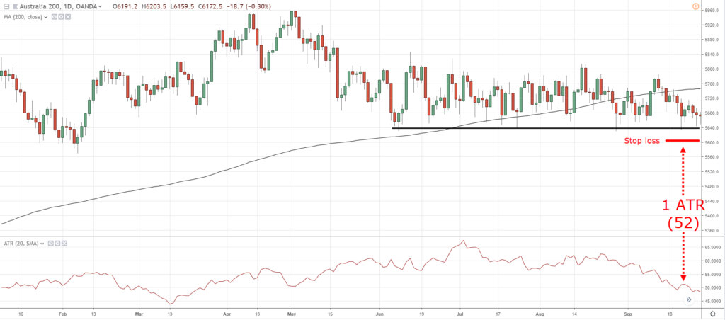
Give it some buffer, some room to breathe!
How can you give it some room to breathe?
What you can do is use the Average True Range Indicator.
As you can see the value of the ATR is 52.
What you’re going to do is to set your stop loss 52 points below Support so that you don’t get stopped out of your trade:
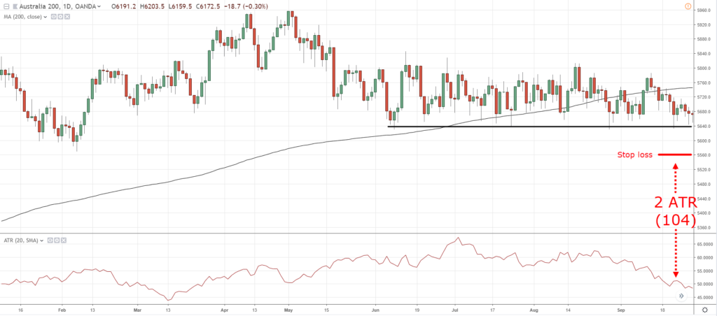
If you want to be more conservative, you can use 2ATR, meaning you would multiply 57 to 2 and your stop loss would be wider:
Another thing that the ATR indicator can do is what I call the…
Volatility Cycle
Here’s the thing…
Volatility in the markets is always changing.
The market moves from a period of low volatility to a period of high volatility.
Here’s an example:
You can see that EUR/USD made a multi-year low back in 2014.
When volatility is low, it’s a sign to you that something is brewing or something is coming your way.
True enough in this cherry-picked example, volatility has expanded.
In other words, if you see that volatility has shrunk in your chart…
It’s a huge clue to you that the market is ready to breakout either higher or lower, we have no idea.
That pretty much sums up the ATR indicator.
Later, we’ll look at this back again and teach you how you can surely use this as part of your trading strategy.
But for now, let's move on and talk about the Donchian Channel…
Donchian Channel – What is it
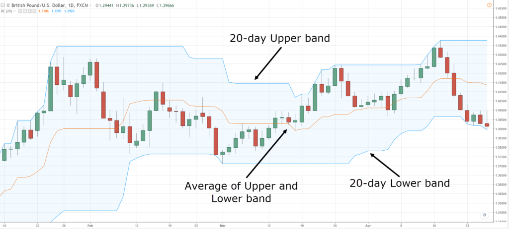
The Donchian Channel indicator is a trend-following indicator:
As you can see, it has three bands:
- Upper Band
- Middle Band
- Lower Band
What you see is pretty much the 20-day high and low, and the middle band represents the average of the upper and lower band.
Moving on…
Donchian Channel – Entry Trigger
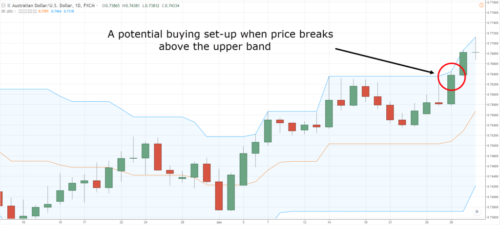
What you’re looking for is the price to hit the upper or lower band:
If the price hits the upper or lower band, it’s telling you that it has broken above/below the 20-day high/low.
And that could serve as an entry trigger to go long/short.
Also, you also have an option to change the 20-period Donchian Channel to 50, 100, or 200.
It really depends on you.
So, what else can the Donchian Channel do for you?
Well, it can also serve as a trend filter…
Donchian Channel – Trend Filter
Recall, the Moving Average can be used as a trend filter.
Now, the Donchian Channel can perform something similar as well.
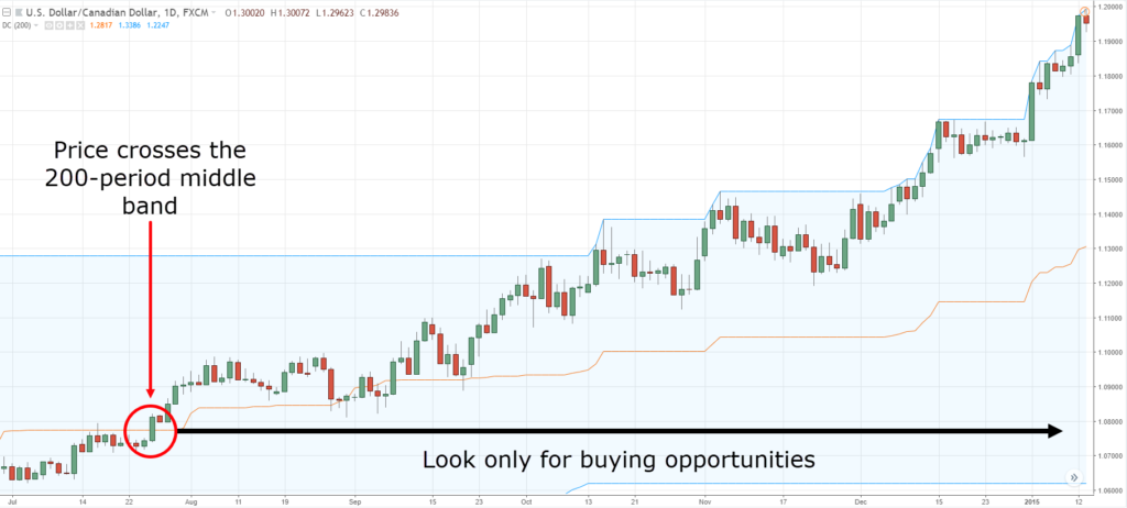
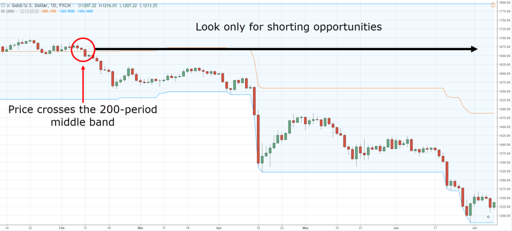
Looking at the 200-period Donchian Channel:
You want to reference the middle band if you want to be long or short.
In this case, if the price is above the middle band, you want to stay long.
This will put you on the side of the trend more often than not.
Likewise, if the price is below the middle band, you want to look for shorting opportunities only:
Moving on...
Donchian Channel – Trailing Stop Loss
Let me explain…
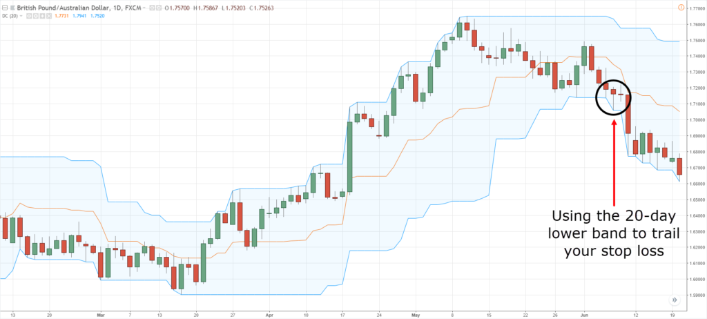
Let’s say you went long on the breakout over here:
How can you trail your stop loss?
If the price touches the 20-day lower band, you exit the trade.
Vice versa if you are short on a trade.
Likewise, just like the Moving Average, you can adjust the settings as well depending on goal whether you want to capture the short, medium, or long-term trend.
Now, let’s do a quick summary with what we’ve talked about regarding indicators in this section…
Quick Summary
- The Moving Average can help you trade with the trend and help you identify the Area of value
- The Average True Range can help you set a proper stop loss and identify the market’s volatility
- The Donchian Channel can help you time entries (entry trigger), identify trends (trend filter), and help you trail your stop loss
You can see that this is not comprehensive.
But the main thing that I'm trying to bring across here is to teach you the purpose of your indicators.
There are more purposes that I did not cover, but that’s just because I want you to explore on your own and think on your own.
So now…
We’ve talked about chart patterns, candlestick patterns, Indicators, and even drawing tools.
So how do you actually combine these different types of technical analysis to formulate trading strategies?
How to Use Technical Analysis Like a Pro
First, understand the purpose of your technical analysis.
Whether you are trying to:
- Define a market condition
- Define an Area of Value
- Define an Entry Trigger
So, a few concepts that I can share with you is how you can use Donchian Channel and the ATR together as a trading strategy…
Donchian Channel + ATR
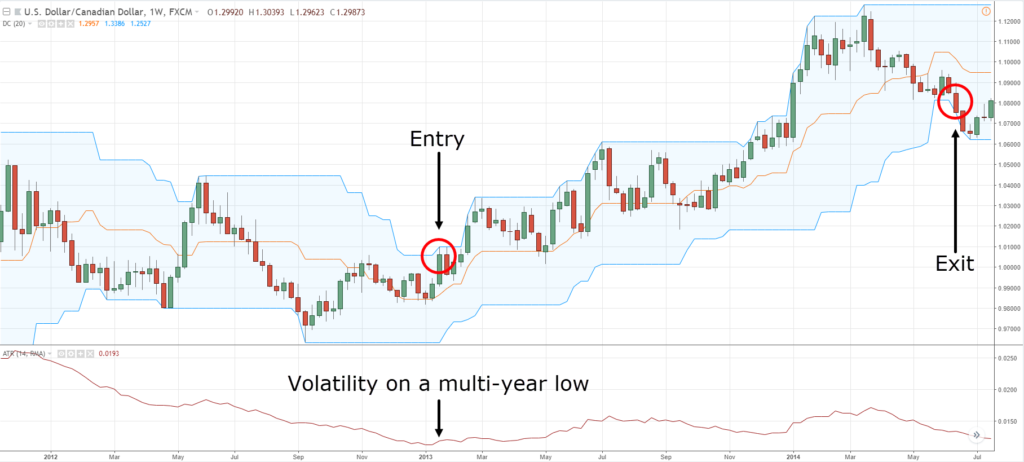
Recall, the Donchian Channel can serve as an entry trigger to buy breakouts and short break downs.
What about ATR?
If you recall, the ATR can help you identify the volatility cycles in the market.
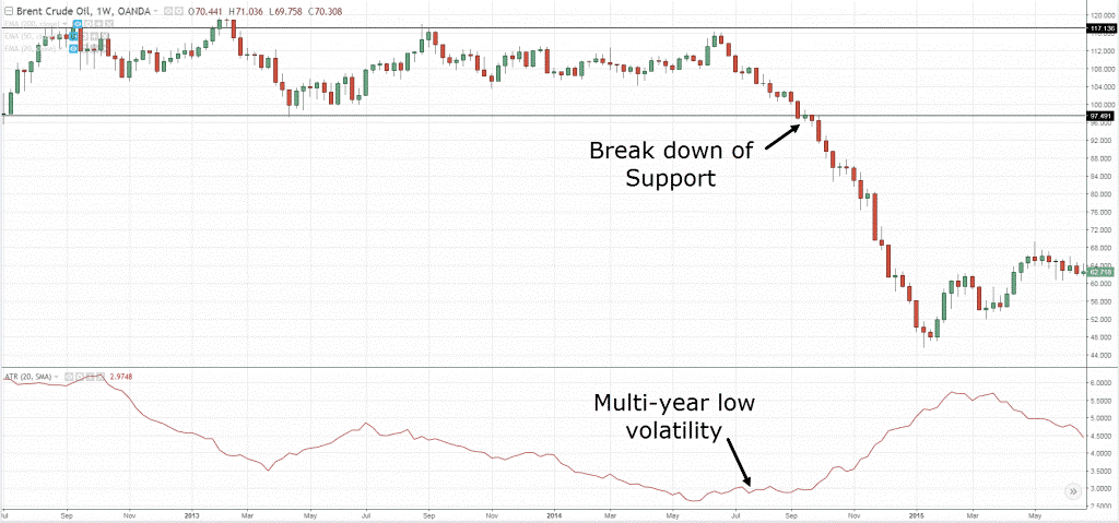
For example, volatility over here is at a multi-year low:
At the back of your mind, you should expect that volatility would pick-up and the market would break out higher or lower.
How you would enter a breakout or break down is by using the Donchian Channel as an entry trigger.
As you can see in the example, the price has hit the 20-week high.
And if you want to ride the trend, the Donchian Channel can help you trail your stop loss when it hits the lower band.
You can see how the Donchian Channel and the ATR indicator complement one another.
Additionally, you can use the ATR indicator to set your stop loss by subtracting the ATR value from the lows of the candle.
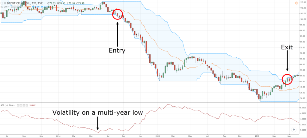
Another example…
You can see that the ATR value is already showing a multi-year low:
Again, you can go short and time your entries with the Donchian Channel and trail your stop loss with it as well.
Next one…
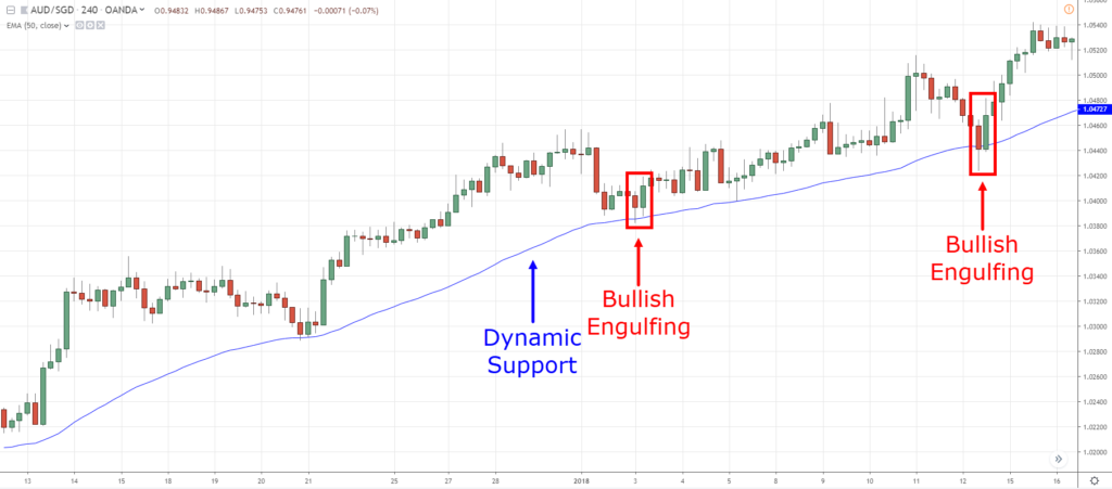
Moving Average + Candlestick
If you recall, a Moving average can do a number of things.
It can:
- Define the trend
- Define an Area of Value
You can see that the price has tested the 50 MA three times.
So we can see that the 50-Period Moving Average can clearly help you highlight the Area of Value
Also, if you recall…
Candlesticks can be useful as an entry trigger to get you into a trade.
So over here you have a Bullish Engulfing.
As you can see, it checks out all the criteria:
- You have the trend in your favor
- You’re trading from an Area of Value defined by the Moving Average
- You have a Bullish Engulfing pattern telling you that the buyers are in control and the market could possibly head higher
Another example of Technical analysis that you can combine is…
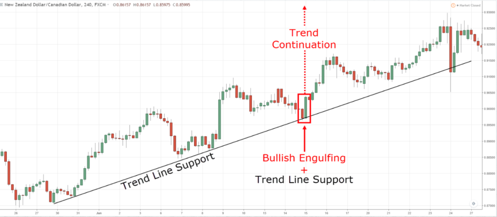
Trend Line + Candlestick
Again, the trend is up and the Trend Line is acting as an Area of Value.
The Bullish Engulfing pattern shown serves as an entry trigger to go long!
This is actually a framework that I have taught.
And this Framework is what I call the…
T.A.E. Framework
Here’s what this framework mean….
T = Identify the Trend
A = Identify the Area of Value
E = Identify your Entry Trigger
Whenever you want to trade with the trend, always reference to this framework and you really can’t go too far off.
Another example while using the T.A.E. framework is…
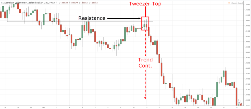
Resistance + Candlestick
You can see that the trend is down and you can also see that we are trading from an area of value as the price is leaning against the area of Resistance.
Finally, the tweezer top candlestick pattern serves as an entry trigger.
So it's telling that the market is rejecting higher prices in a downtrend at an area of value.
Can you see how these different indicators, tools, and concepts complement one another?
The last example that I want to give is the…
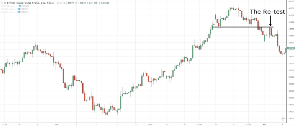
Head & Shoulders + Candlestick
The Head and Shoulders is telling you that there is a weakness in the market.
You can see that the market heads up higher, retraces, and collapsed lower from the neckline.
The neckline now acts as previous Support turned Resistance as the price made a re-test.
The re-test also shows a Bearish Engulfing pattern, and that pattern represents our entry trigger.
If you want to talk about trade management or you want to ride the trend…
You can use stuff like the Donchian Channel or the Moving Average to trail your stop loss.
I hope that by now…
You can see how all these different technical analysis tools come together to give you a more complete picture and to help you better time your entries and exits.
So with that said, let's do a Summary…
Summary
- Know the purpose of your Technical Analysis tools
- You can combine Technical Analysis tools to read the market and to develop a trading strategy

