#5: The Ultimate Candlestick Charts
Lesson 5
Hey hey, what's up my friend!
In today's video…
You'll discover how to read candlestick charts like a professional trader.
So who is this a trading video for?
If you're the type of trader that is completely new to candlesticks or you do not know how to read and what it means then hey, this video is for you.
If you're the trader who wants to know how candlestick charts can help you better time your entries and exits in the market then hey, this video is for you as well.
Finally, if you are a trader who simply wants to read the price action of the markets without relying on lagging indicators and stuff like that then hey…
This video is for you as well.
Sounds good?
Then let's get started…
What is a candlestick chart
A candlestick chart is simply a method of reading a price chart.
There are different ways to read a candlestick chart, you have…
- Renko Chart
- Bar Chart
- Line Chart
- Candlestick Chart
But based on what I’ve seen, a candlestick chart is the most popular approach to reading price on a chart.
If you don’t know what the difference between a candlestick pattern and a candlestick chart then let me explain…
A candlestick chart is made up of a series of candlestick patterns like this for example…
While a candlestick pattern is a single candlestick on your chart…

Basically, a collection of candlestick patterns is what we call a candlestick chart.
But before we can talk about the candlestick chart, we need to understand what is a candlestick pattern.
Candlestick patterns simply show you the open high low and close in the market.
If you are looking at the daily timeframe candlestick chart…
It shows you the high of the day, the low of the day, the opening price of the day, and the closing price of the day.
Also, candlestick patterns originated in Japan sometime in the 1700s by a rice trader call Munehisa Homma.
Then, it was introduced by Steve Nison to the Western world in recent times and pretty much transferred all this wealth of knowledge into a book called “Japanese candlestick charting techniques”
Moving on…
How do you actually read a candlestick pattern
If you look at a Japanese candlestick, you will only see two types of bars:
- Bullish Bar
- Bearish Bar
Let me explain…
Bullish Bar
If you look at a Japanese candlestick and you see a bullish bar:
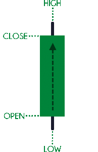
All you need to know is that the open is at the bottom.Then, the price moves up higher and eventually close at the top.
Above the close is the high of the candle referencing a particular point in time.
Below the open is the lowest point referencing a particular point in time.
What do I mean by a particular point in time?
This means that the high and low is determined by the type of candlestick you're looking at.
Let's say your candlestick is based on a daily chart, then the highs and lows represent one day.
If your candlestick is an hourly chart, then the highs and lows represent one hour.
This is how you read a bullish candlestick pattern!
Bearish Bar
A bearish one is just the opposite for the open and close, but the highs and lows remain the same.
A bearish one is just the opposite for the open and close:
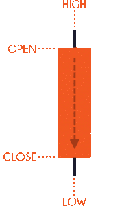
If you think about this, for a candle to bearish, it has to close lower.
For it to close lower, the open has to be at the top and then eventually close lower.
Again, the high and low depends on the timeframe you're looking at.
Moving on…
2 important questions with candlestick patterns
When traders see a Green candle = BUY BUY BUY
When traders see a Red candle = SELL SELL SELL
No, it doesn't work that way.
It's not as simple as just blindly buying based on the color you see on your charts.
So whenever you trade candlestick patterns or candlestick charts, there are two important questions you must always write ask yourself…
- Where did the price close relative to the range? (who’s in control)
- What’s the size of the pattern relative to the other candlestick patterns? (conviction of the move)
Let me explain…
Where did the price close relative to the range
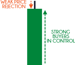
If you look at this…
You can see that for this particular candlestick pattern the price closed near the upper end of the range.
What is the range?
The range is simply the highs and the low of the candle
When you want to see who's in control, you want to see where the price closed relative to the range.
In this example, the price has closed near the highs of the range…
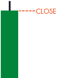
This tells you that buyers are in control temporarily.
Another example…
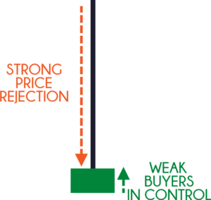
You can see that this time around, the market still closed bullishly.
But if you go back to the first question I mentioned earlier where the price closes relative to the range…
Notice that the price only closed near the lows of the range in this case...
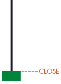
It's what we typically call a shooting star pattern as it closes near the lows of the range.
But what does this tell you?
It means that there is strong selling pressure in this market right now.
As you can see, these candlestick patterns are both green and bullish...
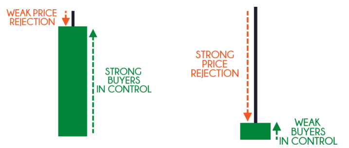
But it tells you where did the price close relative to the range and It tells you who's in control.
Okay?
And to take things further…
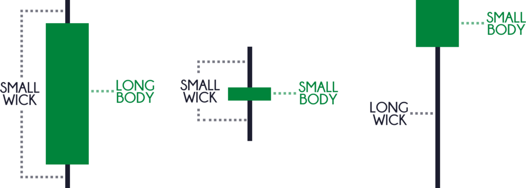
Who is in control?
Again, look at where the price closed relative to the range
This one close relatively near the highest of the range…
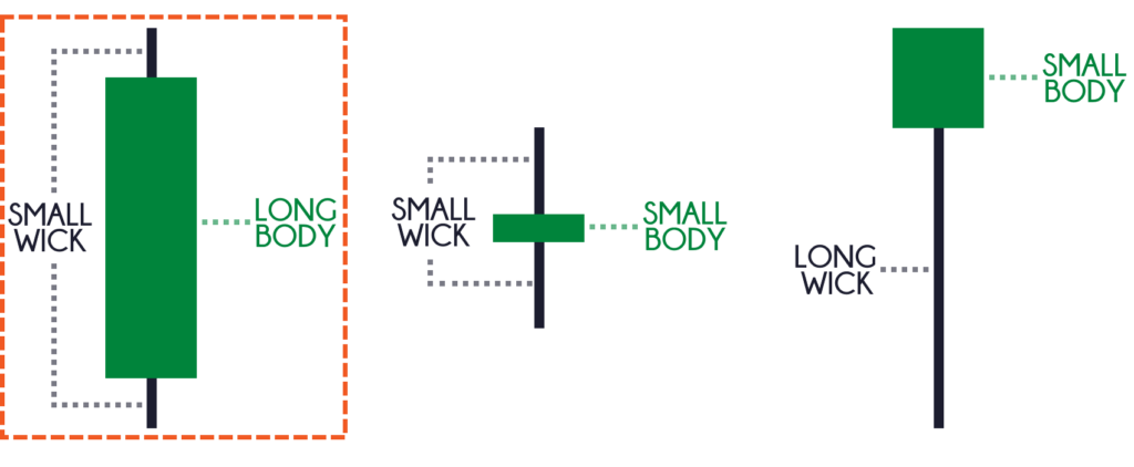
So the buyers are temporarily in control.
Second, the price closed somewhere in the middle of the range, this tells you that no one is in control…
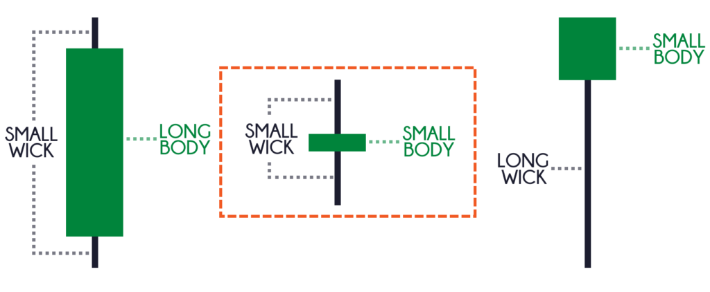
The sellers are not in control.
The buyers are not in control.
This is where we say that the market is in equilibrium!
Finally, the third one…
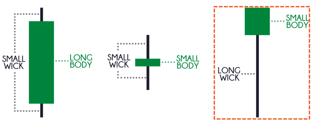
You can see that the body is quite small but the price closed at the highest of the range.
And if you look at the wick, it shows you a strong price rejection!
Who's in control?
The buyers!
The next thing that I want to talk about is…
What’s the size of the pattern relative to the other candlestick patterns? (conviction of the move)
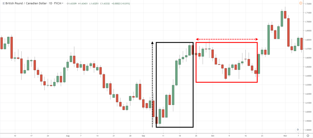
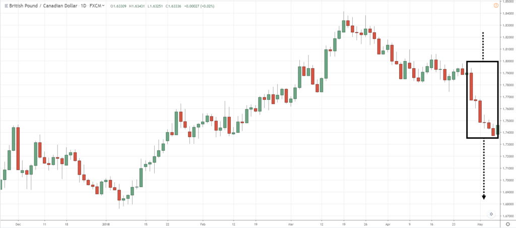
Let me share with you an example on GBP/CAD to show you what I mean by looking at the size of the candle relative to the other candlestick patterns…
If you look at this, the market made a strong move and made a consolidation.
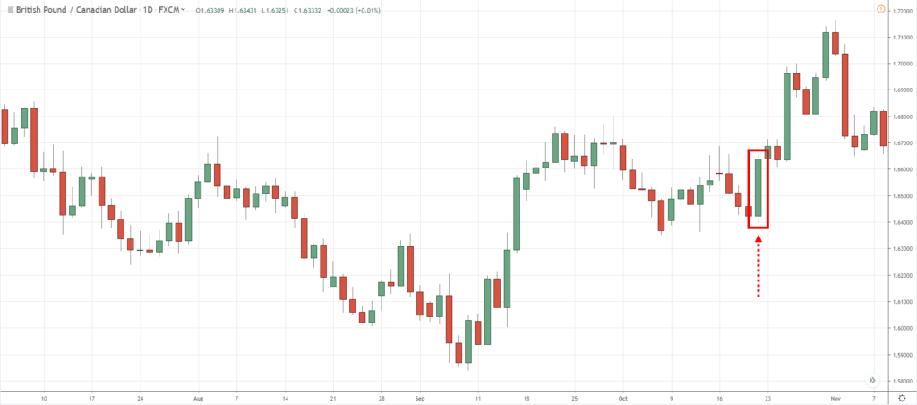
I want you to pay attention is this portion over here…
If you notice the earlier candles, they are all relatively small, not showing you much sign of conviction or strength.
But the candle highlighted actually shows you a sign of strength and conviction.
Notice this candle has covered the range of the previous candles.
This is what we call this a Bullish Engulfing pattern where the candle pretty much engulfs the previous candle.
This is what I mean by comparing the signs of the candlestick relative to the earlier candles to tell you what is the strong conviction behind the move.
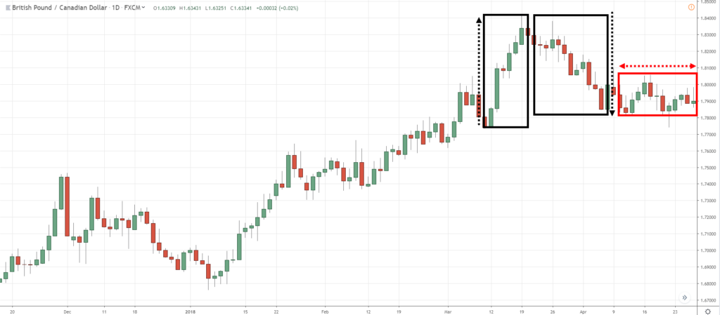
Another example…
The market made a strong rally, declined, and then starts to consolidate.
Now…
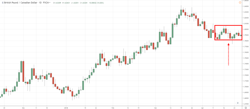
Notice the range of these candles over here is relatively small…
Then what happened?
The market has declined lower and made a large bearish body…
As you can see, there’s strength behind the move lower because the range of the candles is larger relative to the earlier candle.
Don't worry about how to identify trend reversal, we will cover that in the later part of this training video.
But for now, understand the two questions that I just shared with you.
This is something that most traders who trade candlestick never think about.
They just memorize patterns and think that green means buy and red means sell.
Then they wonder why they are losing consistently in the markets.
At this point in time, you don’t need to memorize candlestick patterns.
Once you understand this, you can read the candlestick patterns with ease.
We have covered candlestick patterns so now we can finally move on to…
How to Read Candlestick Chart
As mentioned earlier, the candlestick chart is simply a series of candlestick patterns…
But when you combine all of them together it becomes a candlestick chart! (duh)
I know it’s pretty basic, but still, I want to make it clear when it comes to reading a candlestick chart.
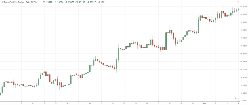
Now, a candlestick chart can be used to Identify the direction of the trend…
How to tell the Direction of the Trend
Here are a few things to bear in mind…
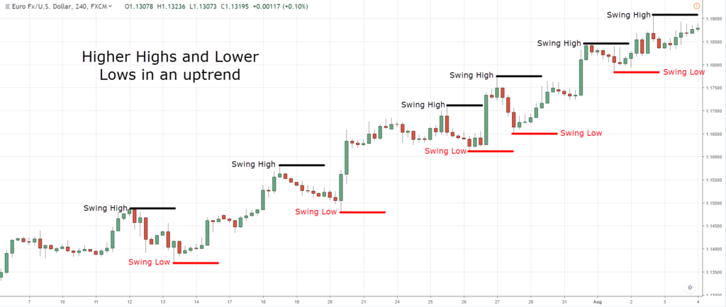
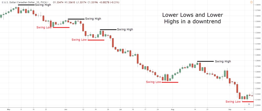
- Identify the swing highs and lows
- Uptrend (higher highs and lows)
- Downtrend (lower highs and lows)
- Range (similar highs and lows)
Let me explain…
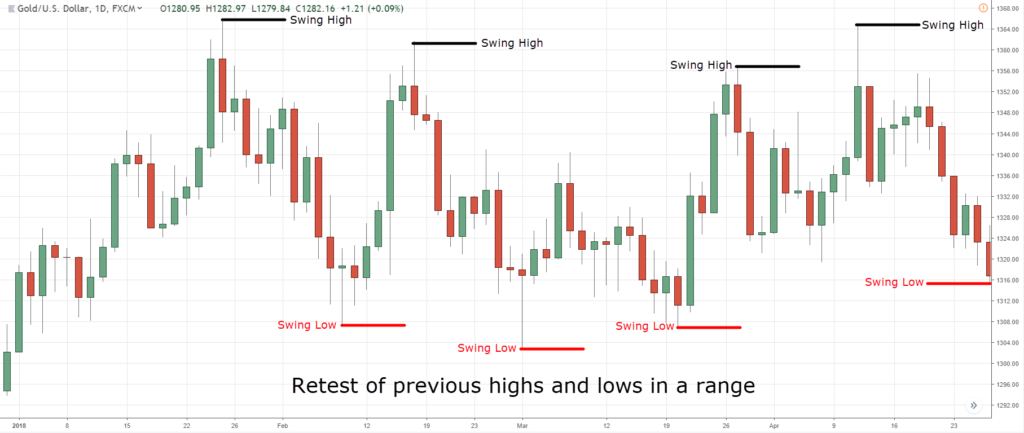
Identify the swing highs and lows
Defining swing highs and lows could have a little bit of subjectivity.
But I'm going to share with you a very simple technique.
So a swing high is a point on a chart where the price was at its peak or trough.
If you look at this illustration…
Where are the swing highs and lows?
I say the swing highs and lows are here…
When we are talking about swing highs and lows, those are the levels that should stick out in your chart and not the minor ones.
So once you've identified the swing highs and lows, the next thing is quite simple…
Uptrend (higher highs and lows)
An uptrend simply consists of higher highs and higher lows, or higher swing lows and higher swing highs…
On the other hand…
Downtrend (lower highs and lows)
A downtrend is just simply the opposite.
It consists of lower swing lows, and lower swing highs…
Finally…
Range (similar highs and lows)
A range is just where the swing highs and lows are all in an equal area…
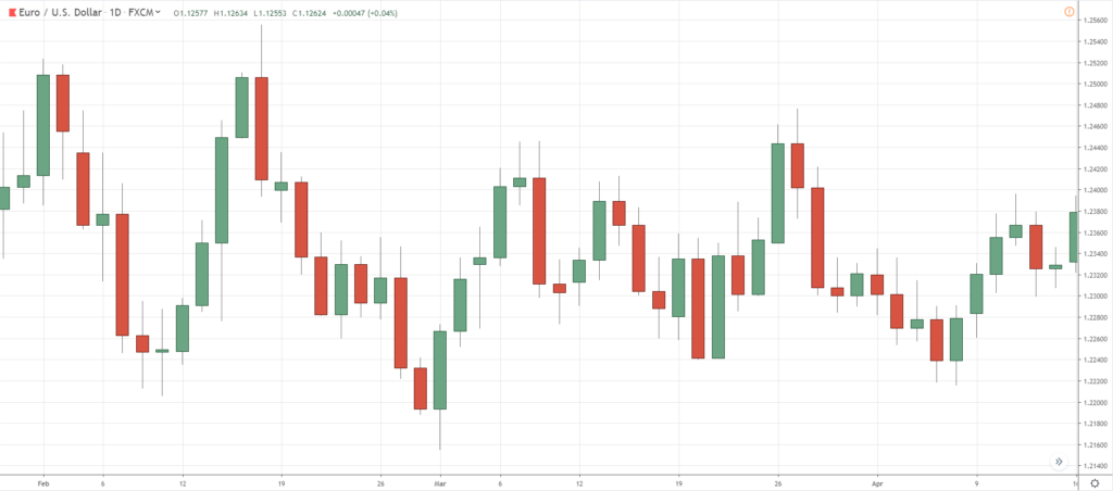
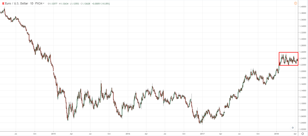
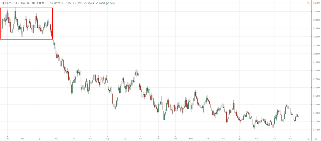
One thing to share is that the trend can be subjective depending on how many candles you look at the chart.
If you zoomed in like this…
You might think that this might be an uptrend because you have a series of higher lows.
On the other hand, if you zoom out some more…
You can see that this market might be in a long term range.
And if you just zoom in a little bit more, it might be in a downtrend…
Can you see my point?
So whenever you're trying to define the trend, not only your time frame is important…
You must have a consistent number of candlestick patterns or bars on your chart when analyzing.
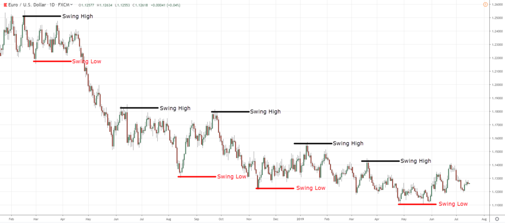
What is the trend of EUR/USD?
Using the concept that I’ve shared with you, let’s identify the swing highs and lows first…
From the looks of it, what I'm seeing is that the market is making lower swing highs and lower swing lows! (lower lows and lower highs)
From this…
I'll conclude that the trend is down.
Simple?
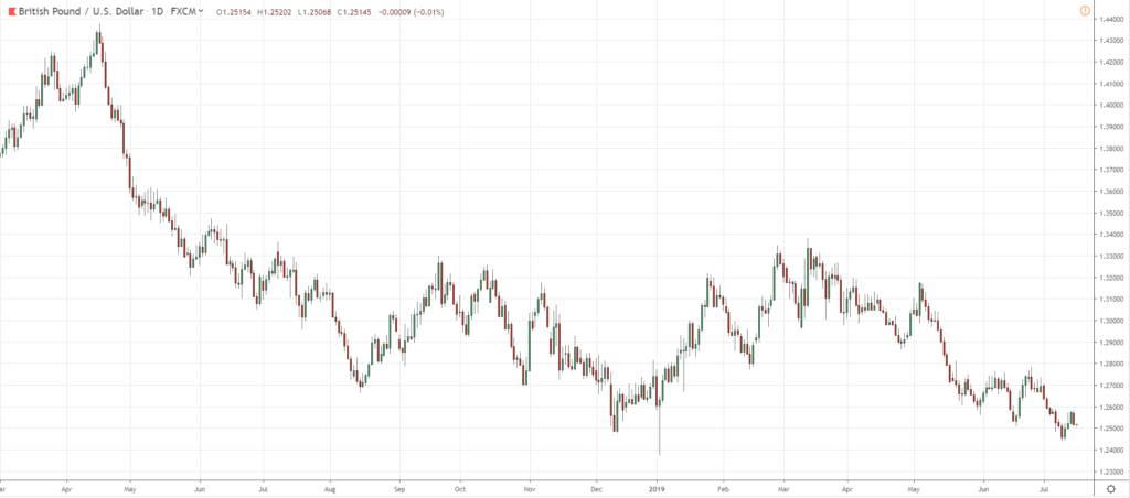
Another example, let’s have a look at GBP/USD…
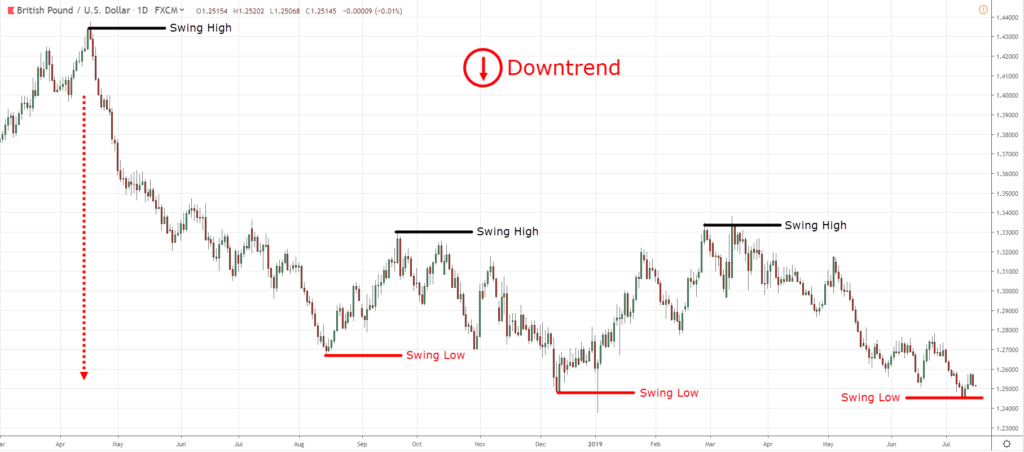
Next, identify the swing highs and lows…
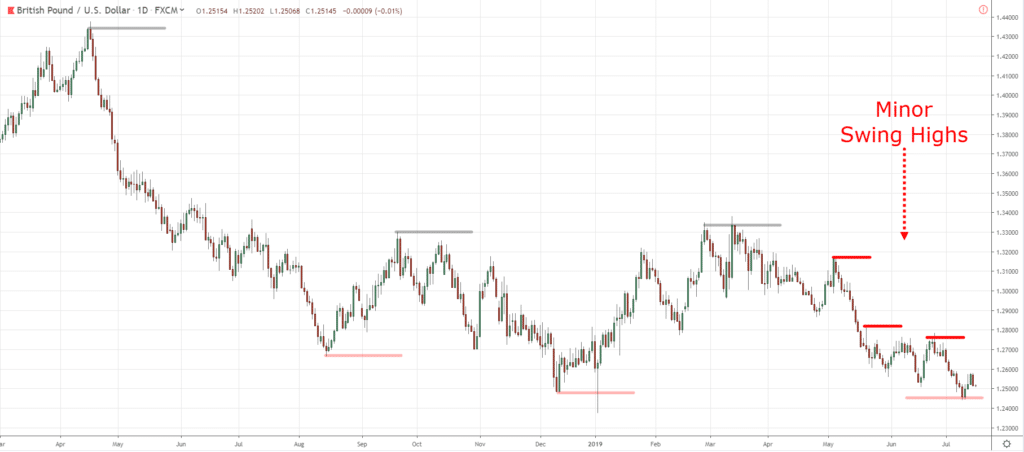
You can see that there are minor levels as well, but to me, these are all the more the most of this swing high.
As you can see, we have lower lows and lower highs.
Which means that the trend is towards the downside.
You see that there are definitely minor levels over here…
But they are not major swing highs and lows.
If you are taking too long to figure out if this is a swing high or low, then it is not a swing high or low.
If it’s there, it’s there.
If it's not there, it's not there.
Okay?
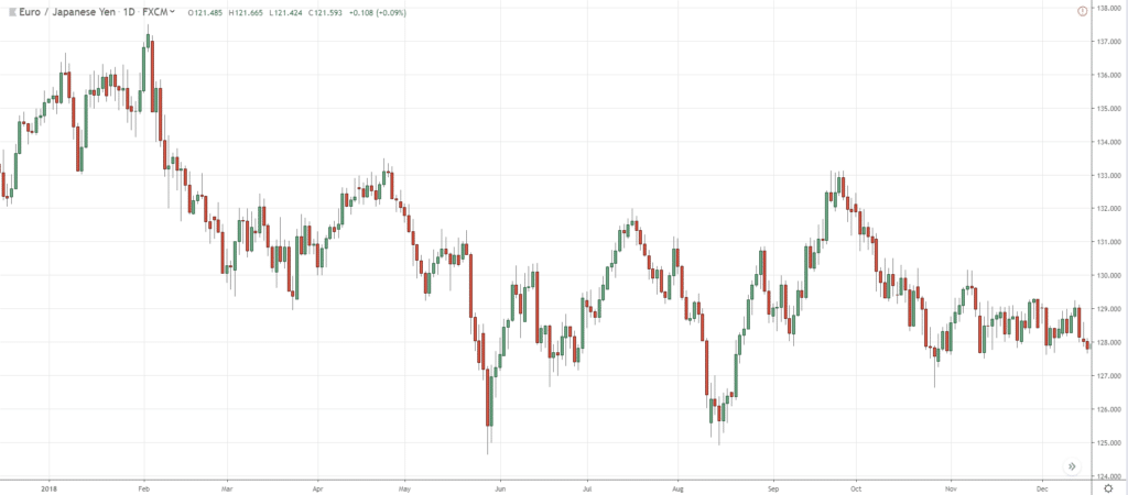
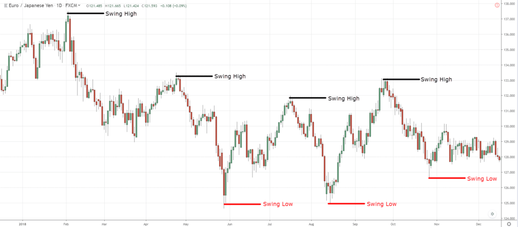
Now, let's have a look at EUR/JPY…
So here are the swing highs and lows that I’m seeing right now…
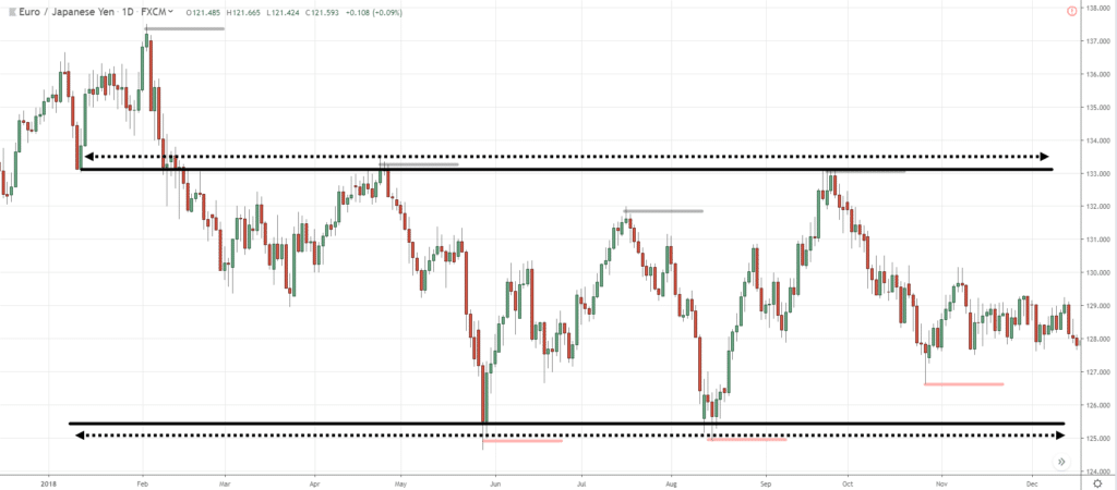
You can see that the market is still in a slight downtrend.
But if you look at the price action, you'll notice that the highs and the lows’ areas are almost equal…
This is where you start to conclude that this market is in a range where you have similar highs and lows.
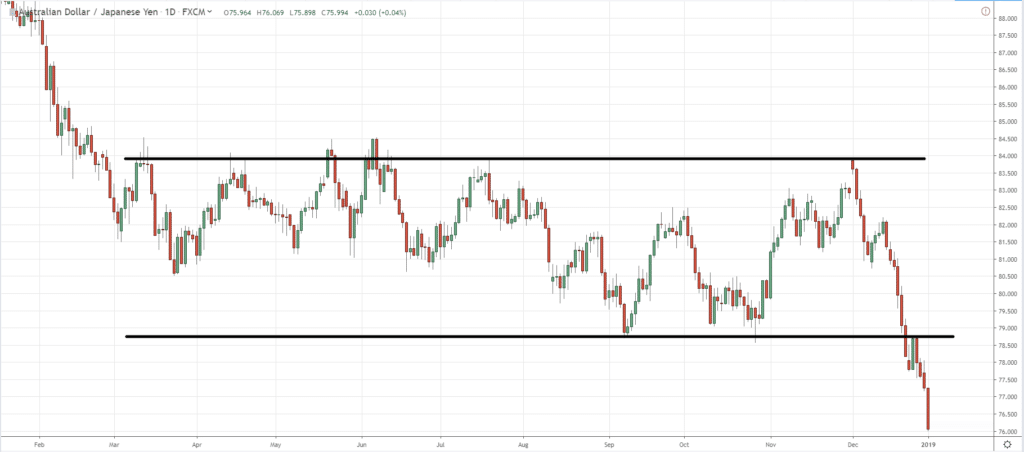
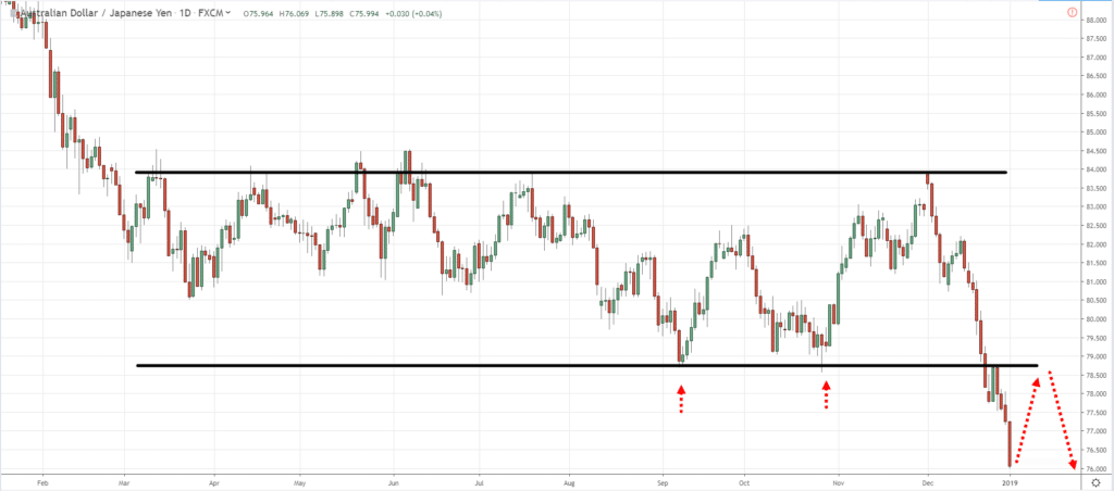
Another example is AUD/JPY where you can see the swing highs and lows…
If the market makes a retest and collapses lower at this point in time, then you have officially another new swing low and could possibly be the start of a downtrend over here…
This is how you read the direction or rather identify the trend of the market by just using basic technical analysis concepts.
Moving on…
How to Identify the Strength of the Move
I just want to share with you a couple of concepts…
- Trending move (larger bodied candles)
- Retracement move (smaller bodied candles)
Ok so let me explain…
As you know, we talked about uptrends and downtrends.
Now pay attention.
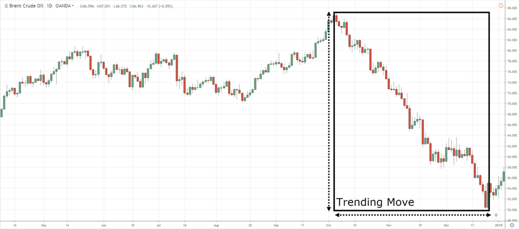
This is what I call the trending move…
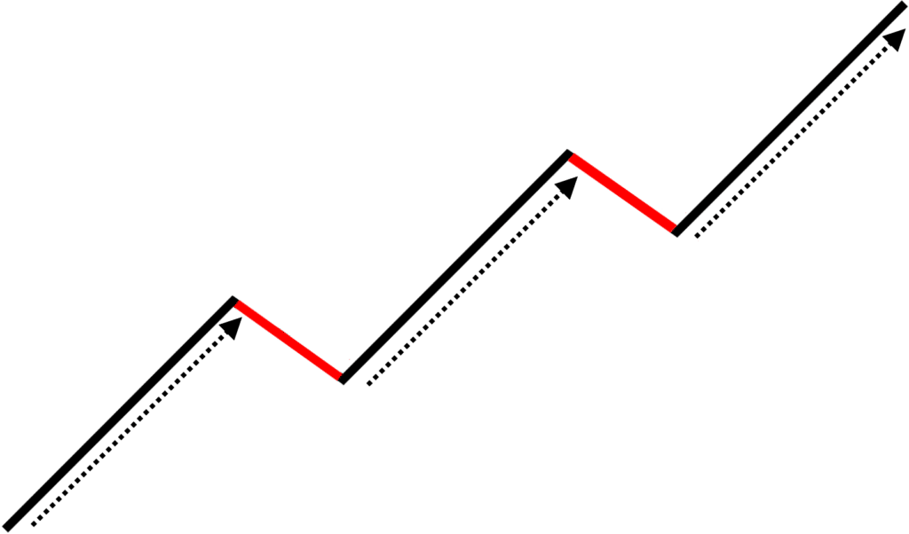
And this is what I call the retracement move…
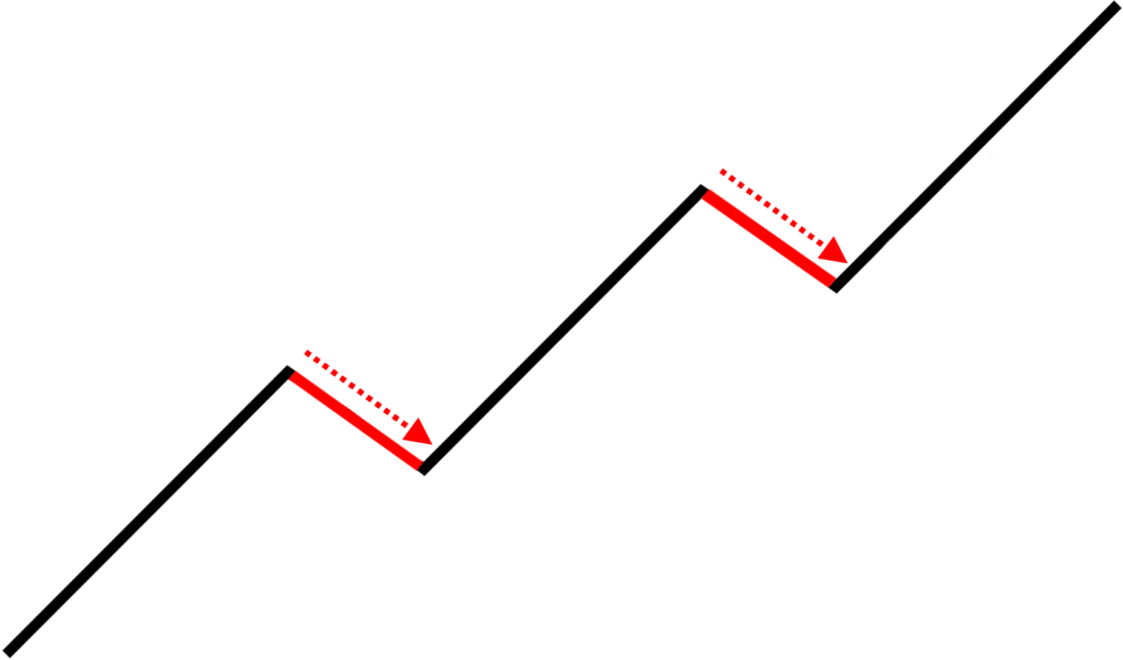
If you notice, trending moves are when the market is strong, and retracement moves have smaller bodied candles.
This is how a healthy good-looking trend would look like where the trending move has large bodied candles, and a retracement move has smaller bodied candles (vice-versa for a downtrend).
So let me share with you a few examples of this concept called the trending move and the retracement move.
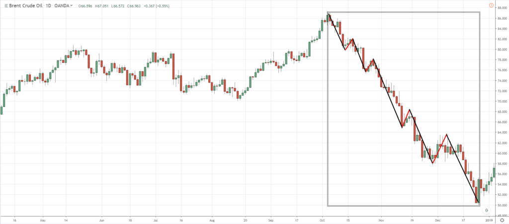
Okay so let's have a look at the WTI Crude Oil Daily…
Can you see the trending move and the retracement move?
It’s these portions over here…
Now, pay attention to the size of the candles.
When the market is making the trending move, there are large-bodied candles.
And on the retracement move, you have small bodied candles.
This tells you that the strength of the trend is strong towards the downside.
This is how we look at the strength of the move using the trending move and the retracement move concept.
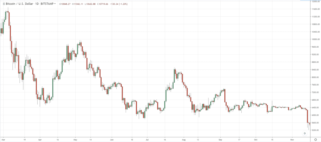
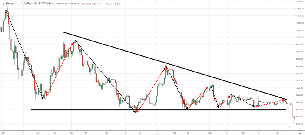
Here’s another example in BTC/USD (Bitcoin)…
Pay attention to the trending and retracement move…
If you’ve studied chart patterns, this is what we call a descending triangle.
The next thing that I want you to pay attention to is the trending and retracement move…
What do you notice about the retracements?
The retracement move is getting smaller and smaller!
This tells you that the buyers are starting to lose control.
As you can see…
Just observing the swing highs and lows, trending and retracement move will give you insight towards the strength and weakness of the market.
That is really all you need to read candlestick charts.
But of course, when you trade it in real-time, you will have losers as trading is all about probabilities.
This concept is not foolproof.
So you have to prepare yourself for this because there is no such thing as 100% or perfect in the real world of trading.
Moving on…
How to Find Trading Opportunities Using Candlestick Charts
I want to share with you a very simple formula.
I call it the…
T.A.E. Formula
T = stands for Trend
A = stands for Area of Value
E = stands for an Entry trigger
Trading with the trend speaks for itself.
But an Area of Value can be stuff like price coming into:
- Trend line dynamic support/resistance
- Moving average dynamic support/resistance
Though there are different ways to represent an area of value.
Lastly, the entry trigger is what gets you into a trade.
Entry trigger could be entering on the closing of:
- Hammer
- Shooting Star
- Bearish Engulfing
- Bullish Engulfing
- Double Top
- Breakout with Buildup
- Etc.
Again, there are a dozen ways on how to enter a trade, but I just want to share with you how you can use this formula.
This isn’t an exact strategy but more like a formula or framework, you can use to develop your own trading strategies.
Let's have a look at a few examples, shall we?
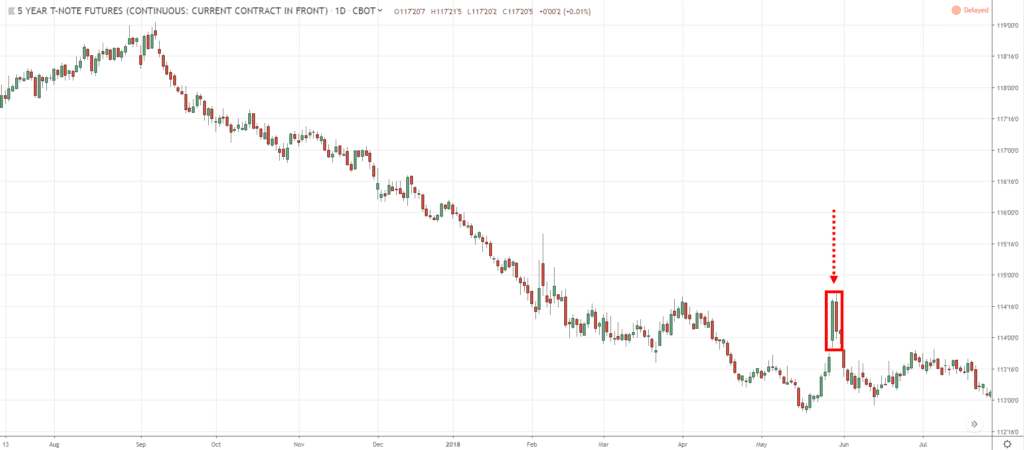
As you can see on the 5 Year T-Note Daily (ZF1!)…
If you were to draw resistance, the area of value is around here…
Now, how about the entry trigger?
In this case, we have a strong price rejection or a Dark Cloud Cover candlestick pattern from the resistance level…
The range of the rejection candles may not be as large as the prior one, but it's relatively larger if you look at the last series of 4-5 candles.
Which means, there is some conviction behind this move.
Next…
How to Identify Trend Reversals
Here are two things to pay attention to…
- You want the price to lean against higher timeframe structure
- Look for price action weakness on the lower timeframe
There are many variations to these concepts and it's not possible to cover everything.
But let me just walk you through these concepts by giving you examples…
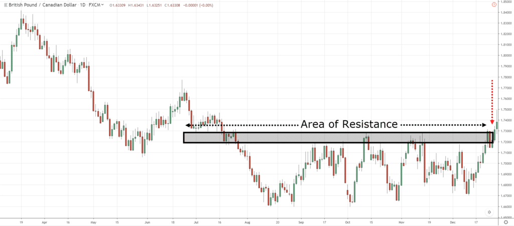
As you can see, GBP/CAD Daily is currently in an area of resistance…
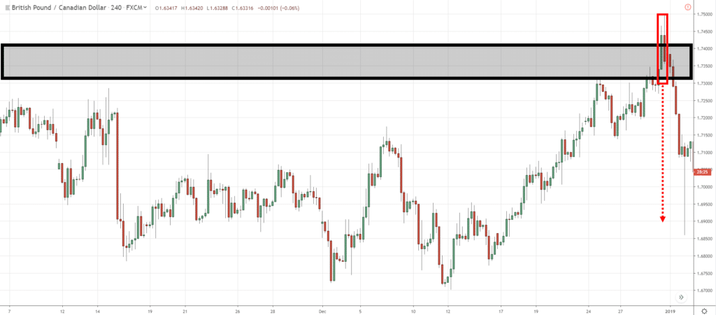
If you want to better time your entries, you can just go down to the 4-hour timeframe where you notice that the range of the candles on the rejection is getting larger…
Makes sense?
With that said, let’s do a Summary…
Summary
- Candlestick chart is made up of a series of candlesticks
- Swing highs/lows tell you the direction of the trend
- Trending and retracement move shows you the strength/weakness of the move
- T.A.E. Formula (Trend, Area of Value, Entry trigger)


