#4: MACD Indicator Secrets
Lesson 4
Hey hey, what's up my friends!
In today's video, I'm going to share with you MACD indicator trading secrets.
These are the stuff that I've not seen anyone shared on the internet before!
So, you're going to be in for a treat.
And no, I'm not going to talk about how the MACD line cross up you buy, or if it crosses down you sell.
Nothing of that sort!
In fact, what you learn right here is:
- How to use the MACD indicator to identify momentum reversal and even predict market turning points.
- How to use the MACD indicator to help you increase your winning rate.
- How you can use the MACD indicator, specifically the MACD histogram, to actually identify explosive breakout traits about to occur.
Let's begin…
What is the MACD Indicator
First thing’s first, I like to always talk about the indicator itself before talking about how to use it.
Because, if you do not understand how the numbers, the lines are derived on the indicator, it won't make much sense later on!
This is why we always go back to fundamentals.
What is a MACD?
The MACD indicator has three parts to it.
Let me explain to you what they are…
MACD Line
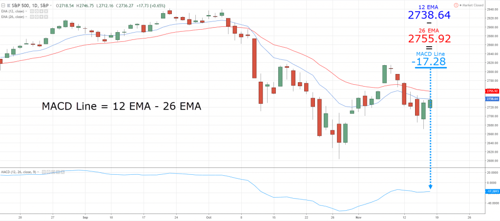
This line is derived right by taking the 12-day exponential moving average minus the 26-day exponential moving average!
This is where you get the MACD line based on this calculation!
Signal Line
The signal line is simply the 9-day exponential moving average of the MACD line.
And finally…
MACD Histogram
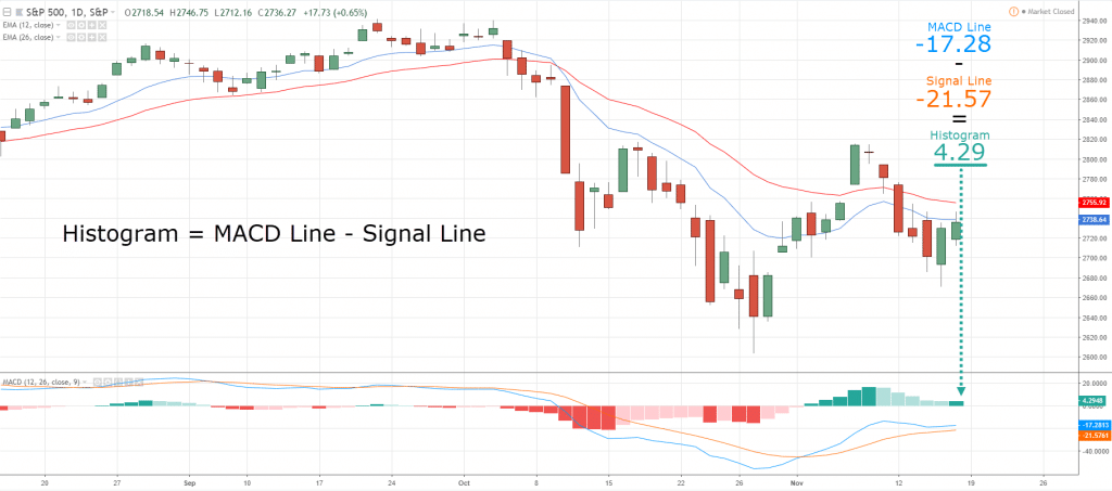
The MACD histogram is where you just take the MACD line minus the signal line.
So, that’s the math behind it, and if it sounds confusing, don't worry.
Because I'm going to illustrate it with a chart right now so everything will be crystal clear.
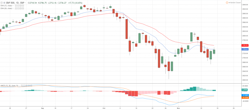
So over here, you can see that this is the MACD indicator:
I'm going to just walk you through what they are.
The orange line is the signal line and the blue line is the MACD line!
The red thing and the greenish thing that you see is called the MACD histogram.
Now…
Let's understand how the indicator goes up and down.
If you recall the MACD line, it's just the 12-day EMA minus the 26-day EMA.
So, if you want to see, I've got a 12-day EMA (blue line) and the 26-day EMA (red line) over here:
Right now the value of this blue line is the MACD line is about -17.28
How did I get that?
Very simple!
If you just take the blue line, find out what is its latest value minus the value of the red line.
That's how we get the MACD line.
What about the signal line?
Well, the signal line is quite straightforward.
Recall, the signal line is simply the 9-day EMA of the MACD line.
To put it simply, it's just simply the average of the nine values of the line!
So right now, we got 10 numbers, right?
5, 10, 20, 13, 14, 15, 7, 8, and 10.
What you'll do is that you calculate all these numbers, you add all of this up, and you divide by nine.
And the answer will be the value of your signal line.
Because the signal line is just simply the 9-period moving average of your MACD line.
Simple as it is right?
So, that's how you get the orange line.
And finally, how would you get the value of histogram.
The histogram, if you recall, is simply the MACD line minus the signal line:
One thing to share with you is that the histogram measures the momentum in the market.
You can see that the space between the MACD line and the signal line getting wider is why your histogram starts to slope up.
When the space between the MACD and the signal line starts to tighten, this is where you notice the histogram starts to slope down.
That’s pretty much all there is to the MACD indicator.
Now you know how the numbers are derived, right?
You can actually use the indicator for different purposes as to what I'm going to share with you right now, okay?
Now…
The basics are covered, so let's move on…
Momentum Reversal
Generally, the MACD histogram is a trend following indicator and a momentum indicator.
It can measure momentum using the histogram
So, let's talk about how you actually measure momentum and identify a reversal in the markets.
Just to share with you briefly.
Let's say, whenever you are trading support and resistance, the market is in a range.
And you know that you want to sell at resistance.
Whenever the price is at resistance, it doesn't mean you go short immediately.
Instead, you want to see how the price approaches resistance.
For me personally, I like to see a very strong bold and clean move coming into resistance.
I like to see strong momentum coming into resistance where you see large-bodied candles:
Why is that?
The reason is simple…
When you get a strong move up higher, the reversal can swiftly turn towards the downside.
What you don't want to see is that the market chops all the way up and hover around resistance:
This isn’t the type of price action that I don't want to short resistance because it shows that there is a sign of strength.
Market making a series of higher highs and higher lows!
I want to see a strong, bold, and clean move coming into resistance.
Now the question is…
How do you define this strong momentum move?
This is where the MACD comes into play:
- You want a move into the market structure like support and resistance, trend line, etc.
- You want the MACD histogram to show you strong momentum, an imbalance of buying or selling pressure.
- You can just look for a price rejection as an entry trigger.
Let me explain…
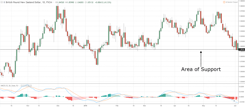
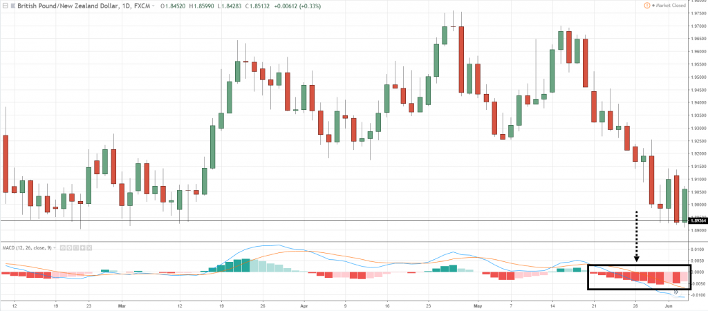
Okay so, first thing first, let's have a look at the GBP/NZD.
Note that this is an area of support:
How do I know it's a strong momentum move?
Pay attention to the MACD histogram.
When you see the MACD histogram showing a strong, bearish momentum where the histogram the bars are getting larger and larger.
It's telling you that there is strong momentum in this market:
And whenever you see a strong momentum coming into support, it's where you want to fade the move.
It's where you want to counter against the dominant move lower and not trade with the momentum.
This might sound counter-intuitive, but the market is more likely than not to reverse higher after making such a strong decline!
But there's no guarantee…
So, this is where you can use like basic candlestick patterns like a hammer, bullish engulfing, or price rejection patterns.
To sort of "confirm" that the market is about to reverse higher.
So, this is what you want to see...
A strong bearish momentum moves to support.
You don't want to see weak bearish momentum, you want to see strong bearish momentum telling you that there is an imbalance of selling pressure.
And this tells you that whenever there is a strong move lower, the market could just swiftly reverse back towards the upside.
So, this MACD histogram is a sign to tell you that there is a strong momentum move lower.
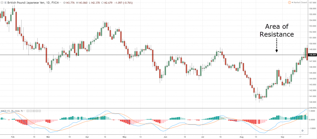
Let's look at another example in GBP/JPY…
Over here, the market comes into an area of resistance:
This resistance that I've drawn over here…
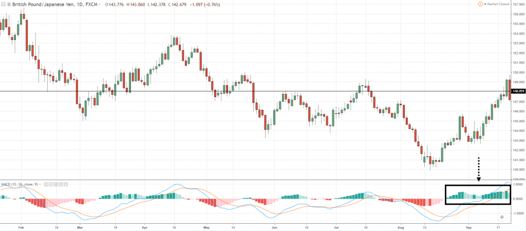
Notice that there is a strong bullish momentum on the MACD histogram, getting higher and higher:
This is a strong bullish momentum, this is what you want.
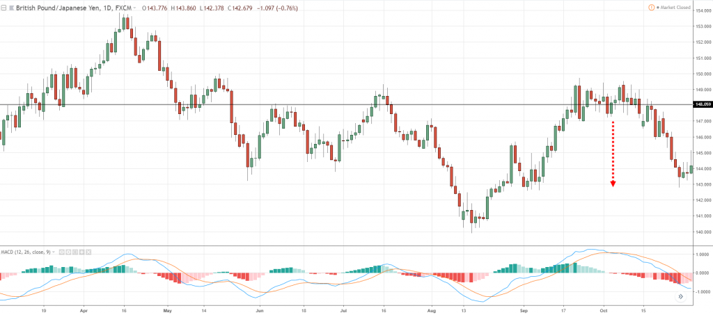
Then, the market hovered at the level before it came down lower:
The key takeaway is again...
Look for a market structure with a strong bullish momentum before you look for a short set up.
Let's have a look at one more example to nail home this point.
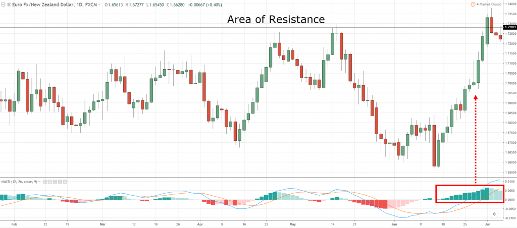
This one over here, notice that there is a strong bullish momentum coming into Resistance:
This is a type of move that you want to be shorting because there is strong momentum coming into a level.
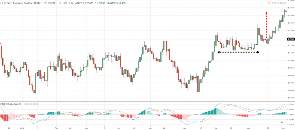
You can see that it did get somewhat of a price rejection before the market consolidates, and then it breaks out higher:
You might get stopped out, or it's a small win depending on how you manage the trade.
But I hope you understand this concept that I'm trying to bring across.
Again…
- You want a move into the market structure like support and resistance, trend line, etc.
- You want the MACD histogram to show you strong momentum, an imbalance of buying or selling pressure.
- You can just look for a price rejection as an entry trigger.
Using the MACD as a trend filter
You can use the MACD as a trend filter.
Here's how it works:
- If the higher timeframe MACD line crosses above the signal line, you look for a long bias only.
- If the higher timeframe MACD line crosses below the signal line, we look for a short bias.
- If you are trading off the daily timeframe, you can refer to the weekly timeframe as your higher timeframe.
- If you are trading on a 4-hour timeframe, you can refer to the daily timeframe as your higher timeframe.
- If you are trading on a 1-hour timeframe, then you can refer to the 4-hour timeframe as your higher timeframe.
You’re pretty much using between a factor of four to six.
So, what is the factor of four to six?
If you just take the 4 (H4 timeframe), divide it by 1, that is a factor of four.
The daily has 24 hours, divide by four, that's a factor of six.
Weekly has five daily candle bars, so that's a factor of five!
Anywhere between a factor of four to six right, would be your higher time frame!
So again, let me go through the charts and share with you a few examples.
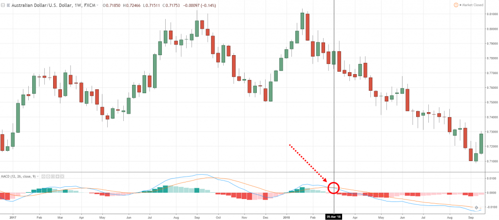
This time around AUD/USD, let's say we are trading off the daily time frame, our higher timeframe is the weekly timeframe!
If you look at the weekly timeframe:
You can see that over here the blue line, which is the MACD line, crossed below the signal line.
In this case, from 5th of March, 2018 onward, you want to have a short bias.
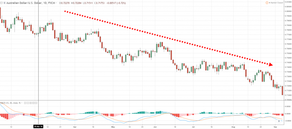
If you look at the daily timeframe 5th of March, 2018:
You can see that you have a short bias and you know you would be on the right side of the trend more often than not.
And it will likely increase your winning rate because you're trading on the right side of the trend!
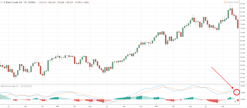
Another example on BCOUSD, let's say you are trading off the daily timeframe so your higher timeframe is the weekly timeframe.
So, just go to the weekly timeframe, and pay attention to the MACD signal line:
You can see over here that the blue line has crossed below the orange line.
Which means it's telling you that, on the daily timeframe, you want to have a short bias, staying on the short side.
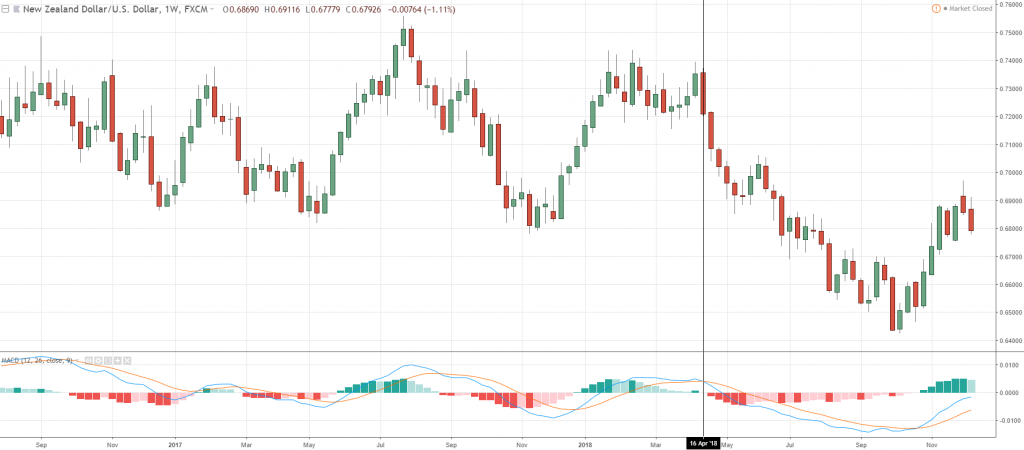
Let’s look at another example to hit home my point on NZD/USD.
On the weekly timeframe, you can see that the blue line which is the MACD line, crosses below the signal line:
So, you got to stay short from 16th April 2018 onward.
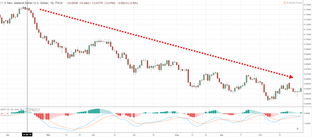
While on the daily time frame, 16th of April, 2018:
You now have short bias all the way down towards the downside.
Again, this keeps you on the right side of the trend more often than not.
This is how you actually use the trend filter to trade in direction of the trend with the MACD.
Finally…
How to identify high probability break out trades
You've seen earlier that when you trade breakouts...
I said earlier that you don't want to be trading when the MACD histogram’s momentum is very large.
Because that's when the move hasn't really occurred.
This should give you an idea on how you should be trading breakouts:
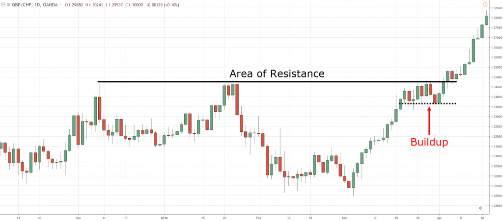
- Look for a buildup at the market structure. Again, the market structure could be support, resistance, trend line, moving averages etc.
- You want your MACD histogram to show low to normal momentum.
What you want to see from a price action perspective, is that if you want to trade let's say a break out of resistance.
What you're looking for is this tight build up over here:
But I do understand that sometimes, traders have difficulty identifying or defining what is a buildup and what is not.
Whether the consolidation is tight or not.
This is where your MACD histogram can help you!
What you want to see is low to no momentum, so your histogram should be very flat close to a straight line.
I'll explain…
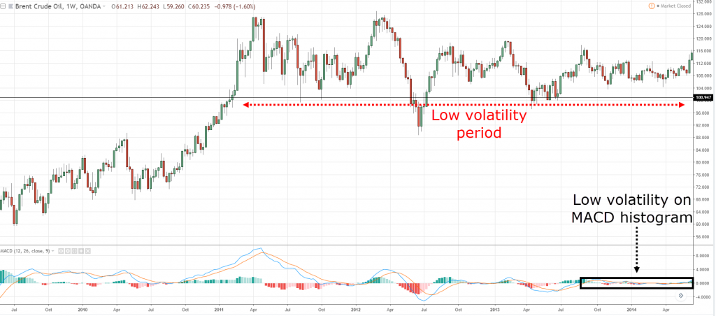
Let's have a look at BCOUSD:
Looking at the weekly timeframe back in 2014.
You can see that the market is pretty much in the low volatility period.
It has a series of high and lows but volatility has shrunk!
And if you look at the MACD histogram, notice that you can hardly see that histogram popping out at all because it's telling you that the volatility is low in the market.
This is where it's prime to be trading break outs.
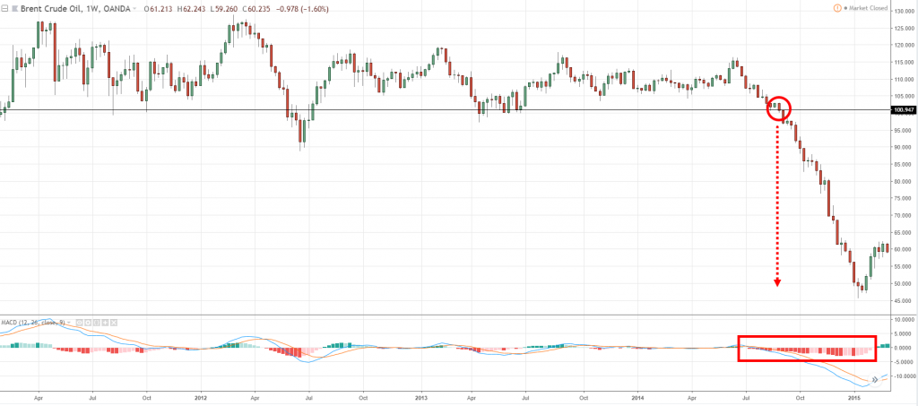
To be honest, I have no idea whether the market would break out higher or lower, so this is why you just let the market show you which direction it wants to trade.
And in this case, the market broke down lower:
And we have this strong collapse of oil in 2014.
You can see that the histogram is showing warning signs before the collapse that the market is about to make a big move.
Higher or lower, it's anyone's guess, but this is a clue that the market is about to make an explosive move.
Let me share with you another example.
I like to share a few examples because I understand that one example usually isn't enough, I have to look at a few examples usually to get a point because I'm a bit of a slow learner.
Look at this concept again:
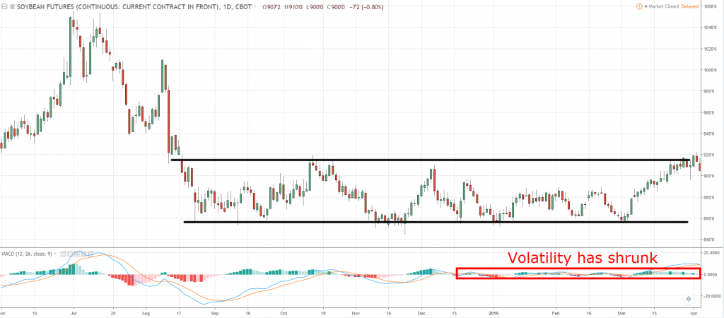
Over here we can see that you have this range over here.
Pay attention to the MACD histogram again, volatility here is shrinking, right?
It's not as small as the crude oil but it's still small relative to the earlier histogram peak and troughs.
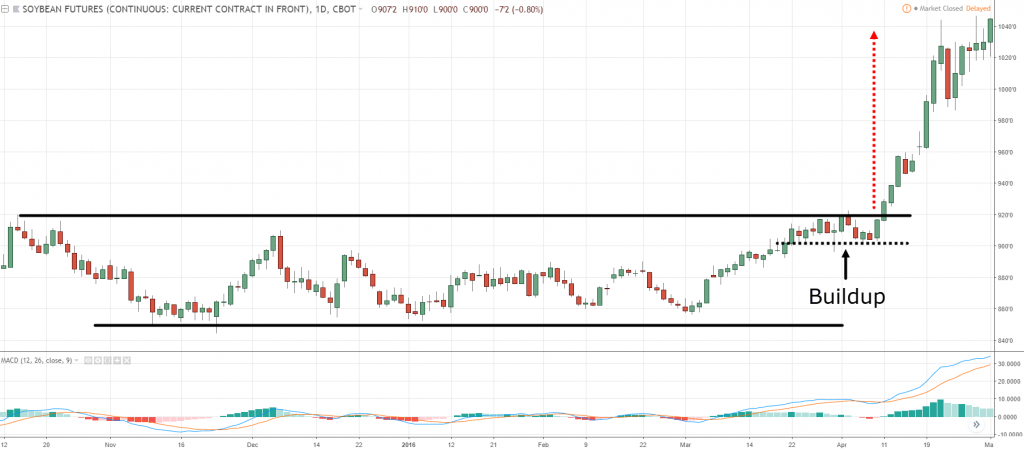
You can also see that there is a buildup formed at resistance before the price breaks out higher on Soybean:
Okay, let's have a look at one example now as well:
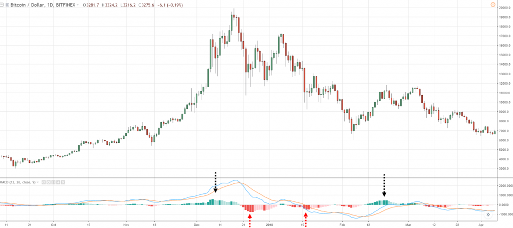
If you look at Bitcoin at the daily timeframe...
Notice right over here volatility is high.
That's why your histogram is showing such a strong peak and strong momentum followed by a bearish momentum.
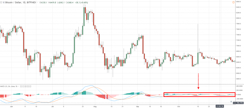
And if you look at it in recent times, this is where your histogram gets interesting as you notice that the market seems to kind of died out!
We can see over here that the volatility in Bitcoin market has died out based on this histogram that you see over here:
Whichever direction Bitcoin breaks out, you can expect volatility to pick up and to expect a big break out move here on Bitcoin.
And this is where your MACD histogram is giving you a heads up.
You can kind of treat this like a volatility indicator telling you whether the volatility is high or low in the markets.
That's it for this section!
With that said let's do a quick recap…
Recap
We've covered quite a bit:
- You can use MACD to identify momentum reversal in the markets.
- How you can actually trade on the right side of the trend using the signal line and the MACD line.
- How to identify high probability break out trades using the MACD indicator.

