#6: How To Analyze Stocks (Technical Analysis)
Lesson 6
In this section, I'll go into Technical analysis for stock trading.
One thing to point out is that there is a lot of information out there with regards to Technical analysis.
Things like…
- Pivot Points
- RSI
- MACD
- Moving Average
- Support and Resistance
- Trend Line
- Trend Channel
- Candlestick Patterns
- So much more...
My goal is not to teach you everything about Technical analysis, instead, what I'll do is to get you focused on the key areas of Technical analysis that matters.
That's all I'm going to do to give you a strong foundation into Technical analysis and from then on…
You can explore further as you already have the tools and knowledge on how to deal with other concepts.
Using Fundamentals are good as it helps you filter down the list of stocks that you want to trade as you focus on companies with strong or good fundamentals.
But when you're dealing with Technical analysis in stocks on the other hand…
It can help you time your entries telling you when to buy.
Moving on…
Technical Analysis
When you are dealing with Technical analysis there are 3 broad categories that I want you to know…
- Trend
- Area of Value
- Entry Trigger
Let's analyze them in detail…
Trend
You’ve probably already heard of a trend.
On your chart, it simply looks like…
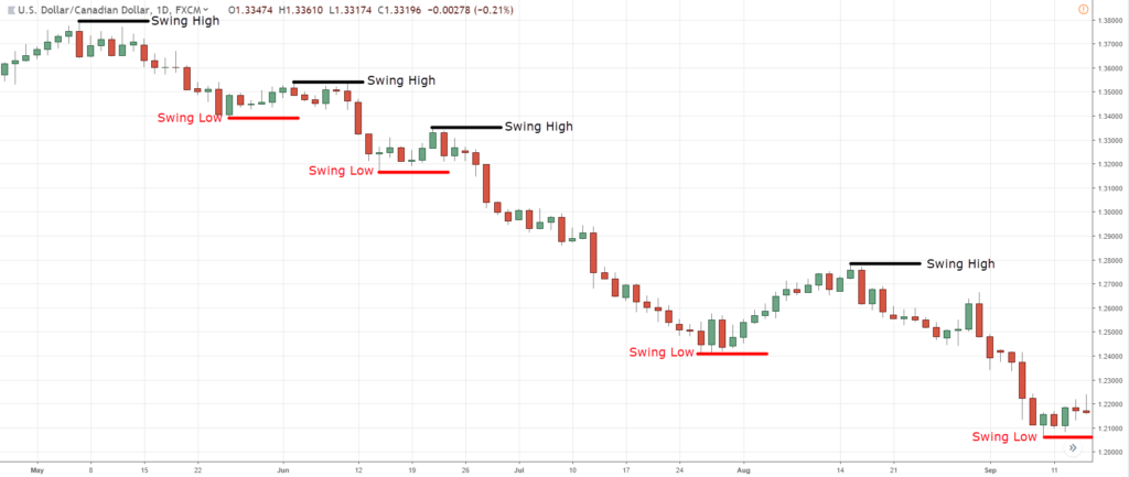
Higher Highs and Higher Lows (Uptrend)
When a stock is in an uptrend, we want to be a buyer.
Lower Highs and Lower Lows (Downtrend)
When a stock is in a downtrend, we want to be a seller.
One important thing to note is that you don't want to buy stocks in a downtrend and sell stocks in an uptrend.
This is not investing where you're going to hold on for years as you are trading and exit the markets in an out depending on your timeframe.
One thing to share with you that to define a trend…
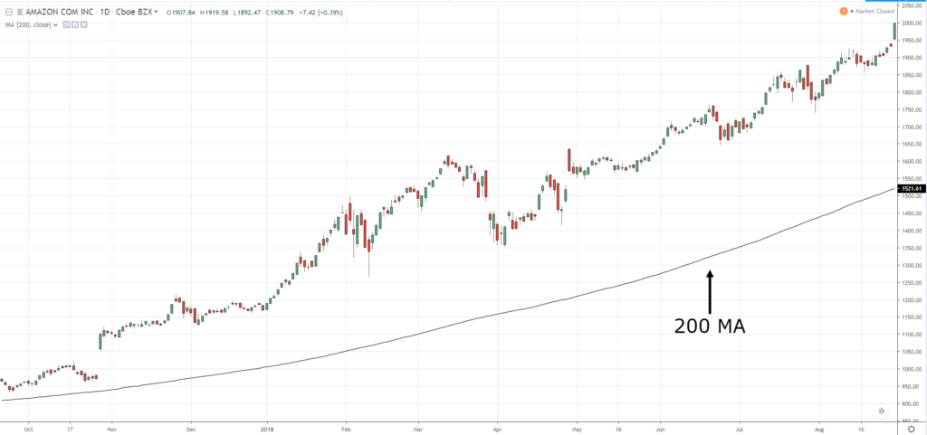
You can use the 200-period moving average.
200-Period Moving Average
It is an indicator you can get on most chatting platforms.
I've applied this to the daily timeframe on Amazon (AMZN)…
You can see that the price of Amazon right now is above the 200 MA.
So when you see prices above the 200 MA…
It systematically gives you a bias that you want to be buying only in this market because the market is in an uptrend!
Vice-versa for downtrends if the price is below the 200 MA.
You either want to be selling or holding on to cash.
Of course, there are exceptions especially traders who are more advanced in their trading methodologies.
But if you are still new to trading, then this rule will keep you on the side of the markets more often than not.
This is foolproof but it will keep you on the right side of the markets more often than not.
Next…
Area of value
Just because the 200 MA tells you whether the stock is moving higher or lower doesn't mean you buy immediately.
Just because you see oranges in a supermarket that's selling right now, you don't buy the oranges immediately.
Why?
Because maybe the oranges are overpriced because it’s not the right season or because you can buy even more oranges during a sale.
So you want to wait when the price is at an area of value for your oranges, and this is the same for trading.
You want to the price of the stock to come to an area of value before you consider buying.
How do you define what the area of value in trading is?
These are a few techniques that you can use…
- Support and Resistance
- Trend Line
- Moving Average
There are more, but I find that these 3 are pretty easy to understand and use.
So let me explain…
Support and Resistance
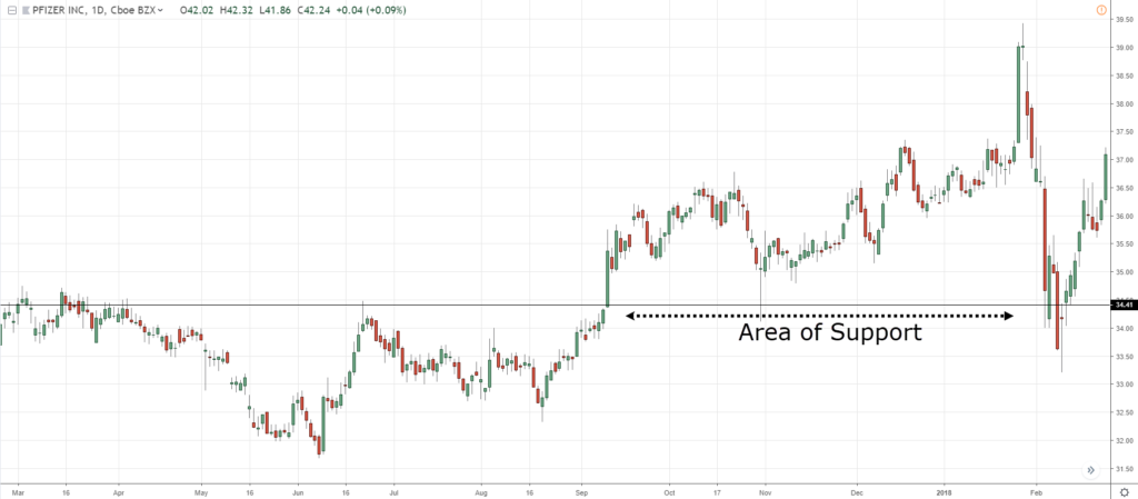
You can think of Support levels like a floor…
Support is where the price has difficulty breaking lower.
I want you to think of this floor as a wooden floor.
It can provide some support to push the price higher, but it's made of wood.
Wood can also break!
So don’t think just because the price is coming to an area of support, it will definitely bounce.
Also, you can see that support is an area and not a fine line on your chart.
The second thing that I want to share is the trend line…
Trend Line
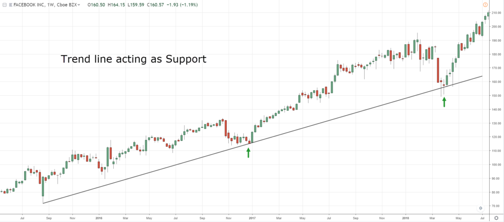
The trend line is like support and resistance, but the difference is that this is a diagonal trend line support…
You can see that it’s an area of support as well.
The last thing to share is a moving average…
Moving Average
You know that there are many types of moving averages out there.
Like for example the 200-period moving average and how it can help you define the long term trend.
However, you know that's not the only moving average you can use.
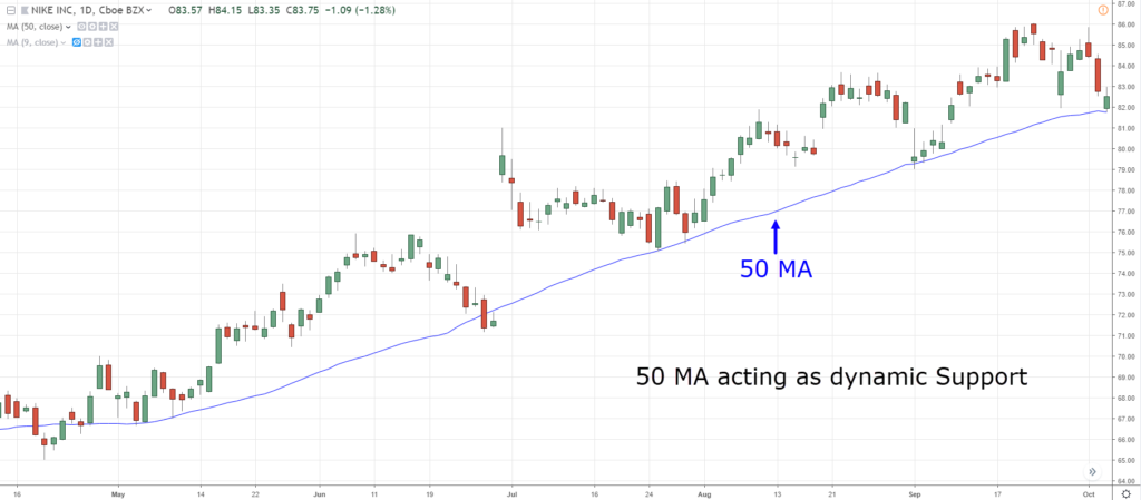
You can use the 20, 50, or 100 moving averages as well.
It could have different purposes just like the 50 MA which acts as dynamic support…
If the trend is very strong, it may not retrace back towards the 50 MA but might just bounce off the 10 MA or 20 MA.
Now the question is…
When do you enter the trade?
Let's say the market is in an uptrend and it's in an area of value.
Do you just buy immediately?
No.
Because you need something that I call an entry trigger to time your entries.
Entry Trigger
I find that candlestick patterns are very useful for this purpose.
You can use reversal candlestick patterns like…
- Shooting Star
- Hammer
- Bullish Engulfing
- Bearish Engulfing
If you don't understand, I'm just going to run you through quickly on candlestick how to read a candlestick…

As you can see, there are two types of candles.
It’s green and red.
If the candle is green, the price opens lower and the price closes higher.
If it’s red, the price opens higher and the price closes lower.
The upper and lower shadows (wick) represents the price’s highest high and the lowest low of the candle before it closes.
Moving on, there are many different types of candlestick patterns out there.
But I find these candlestick patterns are worth knowing…
Hammer
A Hammer candlestick looks something like this:

Let me walk you through how it works.
Basically, for a Hammer candlestick pattern, the price opens at a high level.
Then the sellers quickly came in and took control and you can see that the price is being pushed all the way down lower.
What happens is that the buyers (the bulls) came in and has taken control back from the sellers, pushing price all the way back up higher.
And finally, closing near the highs of the day.
This candlestick pattern is essentially telling you that there is a tug of war between the bulls and the bears.
And eventually the bulls have won, right?
So, essentially this candlestick pattern is a bullish reversal pattern.
Buyers are momentarily in control.
Ideally, the length of the wick is at least two times the body!
The longer the wick, the greater the price rejection.
So, how you want to define Hammer is that the body is small.
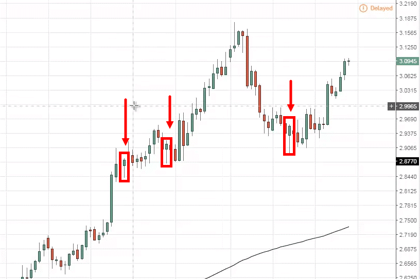
Let me point out to you few a Hammers that you can see on this chart over here:
One thing to clarify is that you might have come across in works or materials online that says that If you spot a Hammer in the uptrend...
It's a sign of weakness, that sellers are stepping in.
For this, I can't agree...
Because when you see a Hammer in an uptrend, to me that is a sign of strength.
Because it tells you that there are sellers coming in.
But, eventually the sellers are overrun by the buyers, and prices now close bullishly higher.
On the other hand…
Shooting star
So, the Shooting Star looks something like this:

It's basically the opposite of a hammer.
You can see that the buyers came in and pushed price all the way higher.
And then the sellers came in and reversed all the gains made by the buyers eventually closing near the lows.
Based on the visualization that you've seen...
It's quite straightforward to know that this Candlestick pattern is a bearish reversal pattern.
Sellers are momentarily in control.
The length of the wick, ideally, is at least two times the length of the body.
And the longer the wick, the greater the price rejection.
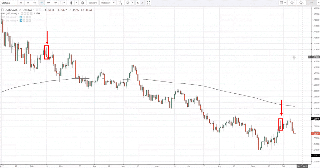
So, in this example, let me share with you what a Shooting Star looks like:
Another thing to note is that when you see a downtrend.
And then you spot somewhat of a Shooting star.
This only serves to reinforce that the sellers are still in control!
Don't think that it is a bullish pattern in a downtrend just because you see a long wick where it shows that the buyers have stepped in previously.
Because eventually, the buyers will exhaust themselves and the sellers came in and took control.
Another couple of candlestick patterns that you should know is what we call the bullish engulfing and bearish engulfing.
Bullish Engulfing
Let me share with you what it looks like:

Let me explain to you the concept behind it.
You can see that when the first candle opens, the sellers came in and took control and pushed price all the way down lower, closing near the lows.
What happened next, is that the subsequent candle opened near the lows.
The buyers stepped in and pushed price all the way back higher.
Even higher than the previous day highs.
And then finally closing near the highs.
You can see that this a Bullish Engulfing pattern.
Because it has “engulfed” the previous candle.
This is a bullish reversal pattern, a bullish engulfing pattern.
One thing to note is that, the larger the bullish engulfing pattern, the more significant it is!
Right now...
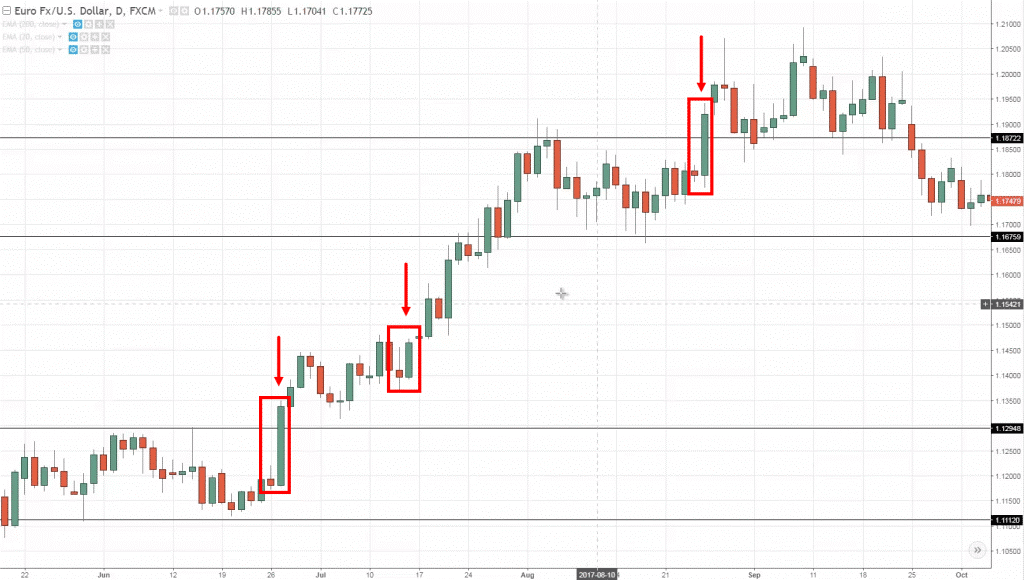
I'm just going to walk you through and share with you an example:
You can see over here, this is the EUR/USD Chart.
You can see that the candle opened near the lows, and then closed above the previous candle open.
To me, my definition of a bullish engulfing is that the candle has to be larger than the body of the previous candle.
I hope you have an idea of how it is.
Remember, never ever trade candlestick patterns in isolation.
This means that if you see a bullish engulfing pattern on your chart, don't just blindly go long.
This is not enough.
It doesn't give you an edge in the markets.
On the other hand…
Bearish engulfing
Here’s what it looks like:

In the first candle, you can see that price has opened near the lows.
The buyers stepped in and pushed prices all the way up and closed towards the highs.
Then, the subsequent candle that has opened where it closed previously...
The sellers came in and took price all the way down lower.
Finally closing near the lows!
This is a bearish engulfing pattern because the second candle has engulfed the previous green candle.
What it means is that it's a bearish reversal pattern.
The sellers are momentarily in control.
The key word is "momentary," I didn't say permanently.
The larger it is the more significant the pattern is.
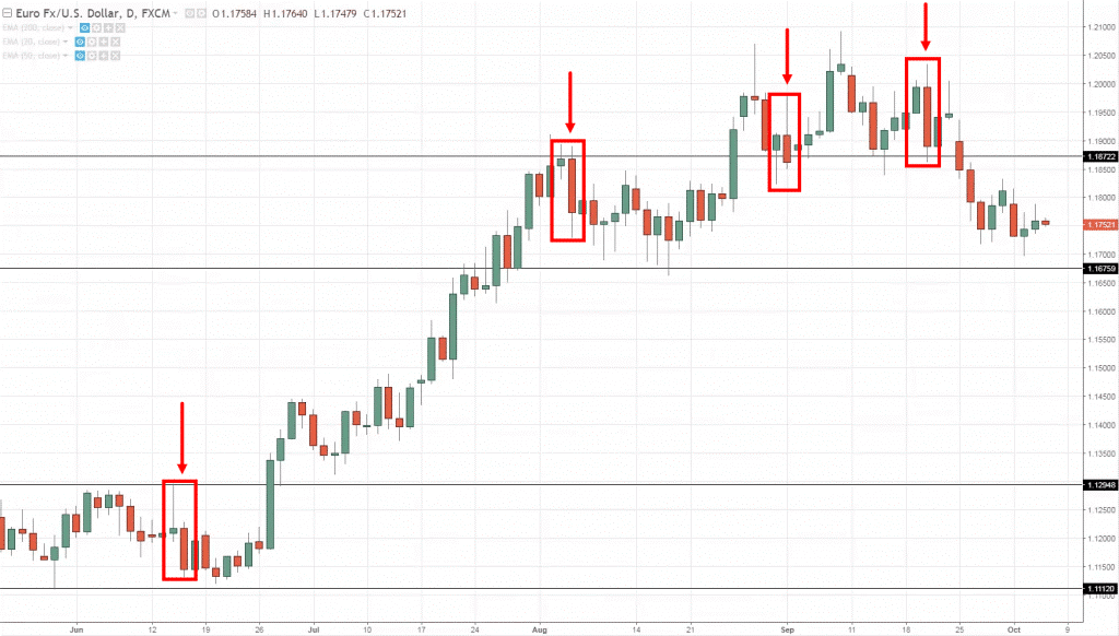
Just to walk you through a few examples:
You can see that there are three bearish engulfing, where it opened and then closes near the lows.
Then the body of the subsequent candle is definitely larger and overcome the body of the previous candle.
So, by now I hope you have a good idea of what a bearish engulfing pattern looks like!
Again, just because you see a bearish engulfing doesn't mean you short immediately.
You want to use a few Technical tools together to increase the odds of your trade working out which is what we're going to discuss now.
So I want to introduce to you what I call the T.A.E framework…
The T.A.E. Framework
This is a framework that I came up with.
So we're just going to combine what you've learned so far.
Here’s how it works…
Trend – Trade in the direction of the trend
Area of value – Trade from an area of value
Entry trigger – Identify an entry trigger
Let me explain…
1. Trade in the direction of the trend
If you trade in the direction of the trend, you increase the odds of your trade working out.
You might be thinking:
“How do I define the trend?”
Well, you can use a Moving Average Indicator to help you.
Here’s how…
- If the price is above the 200MA, then have a long bias
- If the price is below the 200MA, then have a short bias
Next…
2. Trade from an area of value (AOV)
AOV is an area on your chart where buying/selling pressure is lurking around (E.g. Support & Resistance, Trendline, Channel, etc.).
The key thing is to enter your trades close to an AOV.
Here’s why…
- A favorable risk to reward (as your stops are tighter)
- Potential buying/selling pressure to push the price in your favor
- Stop loss harder to get triggered it’s “protected” by market structure
3. Identify an entry trigger
The purpose of an entry trigger is to identify a repeatable pattern that gets you into a trade.
So, once the conditions of your trading setup are met, you’ll look for an entry trigger to enter a trade.
It can be a Hammer candlestick or any other bullish reversal candlestick patterns.
Now, this is important…
You don’t want to trade entry triggers in isolation.
It’s only AFTER the conditions of your trading setup are met, then you look for an entry trigger.
Does it make sense?
Great!
Now let’s look at a few examples to see the T.A.E Formula in action…
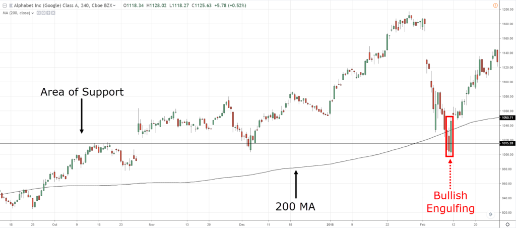
T.A.E. on Google 4-hour timeframe:
You can see that the price is above the 200 MA, so you should be buying.
At the same time, you can see the Area of Value on the Area of Support where previous Resistance turned Support
As for the Entry Trigger, you can see a bullish engulfing pattern at Support.
You can enter on the next candle’s open and your stop loss could go a distance below the lows.
We're not going to discuss too much about where to take profits and stuff like that.
Because this is really just an introduction to stock trading.
But I hope I gave you a good understanding of knowing when to buy a stock.
Here’s another example…
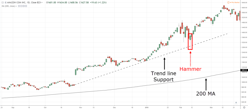
T.A.E. on Amazon Daily timeframe:
Again, the price is above the 200 MA, price is on an area of value of Trend line Support, and you can see a hammer candlestick pattern as an entry trigger.
Now, these are cherry picked charts.
I've purposely picked those charts that show see you winning trades because I find it it's easier to explain the concept.
But when you're trading in the live market, trust me, there will be losers no matter how good the Fundamentals or Technicals are.
So I want you to prepare for it.
With that said, here's what you've learned so far…
Summary
- We discussed Trends. You want to be buying in an uptrend and selling in a downtrend
- We also discussed the Area of value. It can be in a form of Support and Resistance, Moving Averages, and Trendline
- You can use Candlestick Patterns as Entry Triggers
- You can use the T.A.E. framework to find trading opportunities in the stock market


