#16: Candlestick Patterns Cheat Sheet
Lesson 16
In today's training, you will learn how to read candlestick patterns like a professional trader.
This is my promise to you, even if you have no experience with candlestick patterns and you're overwhelmed by the sheer number of patterns.
Don't worry.
Because in today's video, I will show you a simple method to read candlestick patterns like a pro without memorizing a single pattern.
Without getting confused by the sheer number of patterns and without getting overwhelmed.
It's very simple if you just follow my simple procedure.
First and foremost…
The Basics
Candlestick patterns are a way to show prices on your chart. It's not the only way, you have things like a bar chart, line chart, etc.
Candlestick patterns are one of the more popular approaches.
And when you are dealing with candlestick patterns you must be aware that there is a four-price point for every candle on the chart:
- The opening price.
- The high.
- The low.
- The close.
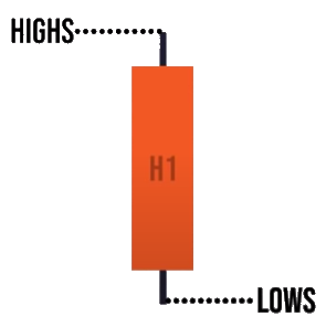
The high is the highest price point of the candle at a particular time.
The low is the lowest price point of the candle at a particular time depending on which time frame you are trading on.
Whether it’s a daily, weekly, or monthly.
Let me explain
Candlestick patterns usually have two popular colours, the green, and the red bar.
Sometimes it might be white and black, depending on the settings that you use.
But more commonly it's red and green.
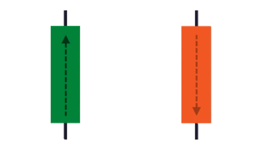
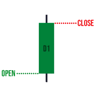
This is a green candle. What a green candle means is that the price has closed higher for the period.
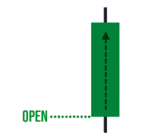
The opening price is always here for a green candle. This is the closing price.
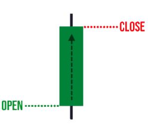
This is where the price closes within the period.
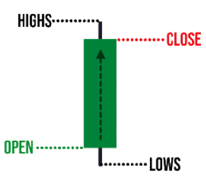
Over here is high and low, we call it the wicks. Some people call it an upper shadow, some call it lower shadow. But let’s just call it the wicks to make things simple.
The upper wick signifies the high of the period and the lower wick signifies the low of the period.
You might be wondering:
“Hey Rayner, what is the period?”
Here's the thing, the candlestick chart pattern can be shown on different timeframes.
The daily timeframe, weekly, monthly, 5 minutes, 15 minutes, 20 minutes, whatever you desire.
It can be shown in their respective timeframe.
Let's say you are looking at this green candle on a daily timeframe.
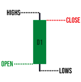
What this means is that this is the opening price of the day and the closing price of the day.
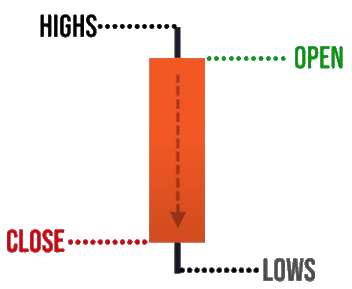
The highest price it went to within the day is known as the high.
The lowest price point within the day the price traded is called the lows.

This is what we mean by the high of the day and the low of the day.
Likewise, for the red candlestick bar, a very important feature is that the green and red bar, their opening, and closing prices are at a different location.
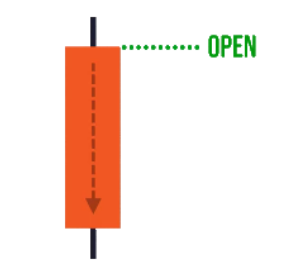
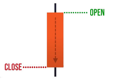
When you see a red bar, it means that the price has closed lower for a day. For the price to close lower for the day, where must the open price be?
The open must be here right here, this point opening price.
And this is the closing price.
Likewise, this is the high and low of the period.
Let's say you're looking at this on the H1 timeframe.
This is the highest and lowest price within the last hour if this is an H1 candle.
So this is the basics of the candlestick patterns and how to read it.
Now here’s the thing…
There are so many patterns out there:
- Three white Soldiers
- Bullish Engulfing
- Shooting star
- Hammer
- Harami
- Doji
If you memorize all these patterns, it's a matter of time before you get overwhelmed.
Memorizing patterns is not the way to trade the markets. This is a problem that I faced personally.
And I suppose many traders would encounter something similar too.
The solution to memorizing candlestick patterns
If you don't want to memorize candlestick patterns and at the same time you want to know the meaning behind it.
My suggestion is this, ask yourself these two questions, because you would gain clarity that you have never said before like an X-ray vision.
The power of these questions will tell you who's in control. Are the buyers, the sellers in control or nobody is in control?
Here's how it works…
If you look at this right now.
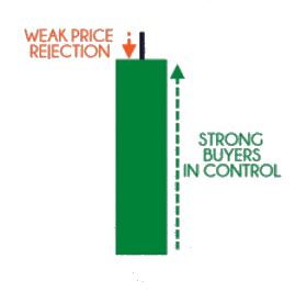
This green candlestick pattern tells you that the price has closed higher for the period. It opened over here and it closed here.
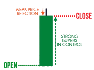
There’s no lower wick, the opening price is also the low of the day.
Let's say this is a daily candlestick pattern, then the opening price is also the low of the day. Notice that there is an upper wick.
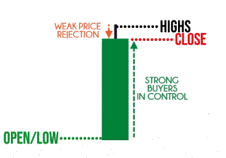
One thing you would notice is that the price close near the highs of the range.
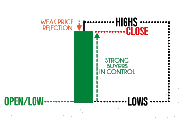
This includes the highs and all the way down to the lows. This is the entire range.
You notice that the price has closed near the highs of the range.
This tells you that the buyers are in control, and that's why they can close the price right near the highs of the range.
Example
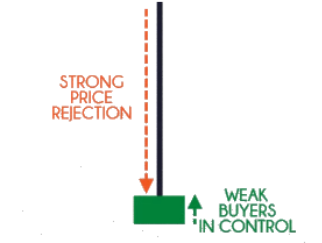
It’s still a green candle if the price is closed above the opening price. The price has closed above the opening price.
But is the buyer in control or the buyer still in control?
Again, just use this question.
1. Where did the price close relative to the range?
Where is the range?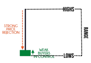
This is the entire range of the candle.
Now, where did the price close relative to the range?
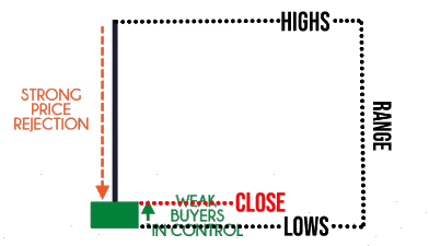
This is the closing price.
Now we are seeing a different picture than the previous one.
Why is that?
Because now you realize that the price only closes marginally higher relative to range.
What does it tell you?
It tells you that at one point in time, the buyers were trading near these highs.
From this high right to this close, it means that sellers at one point in time have to come in and push the price lower to the close over here.
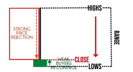
This tells you that in the background, there is a selling pressure and this is a sign of weakness.
Yes, the price did close higher within the period. But you can see that there is a strong price rejection and a strong selling pressure in the background.
This question tells you who's in control. At this point, you look at this candle, it tells me the sellers are the ones in control.
2. What’s the size of the pattern relative to the earlier ones?
This question gives you the conviction behind the move.
Is it a smokescreen or is this for real?
Let me explain what this means.
If you look at this chart:
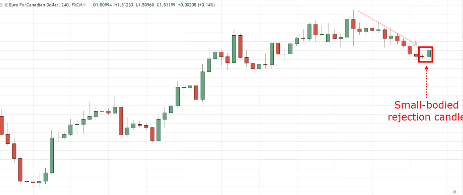
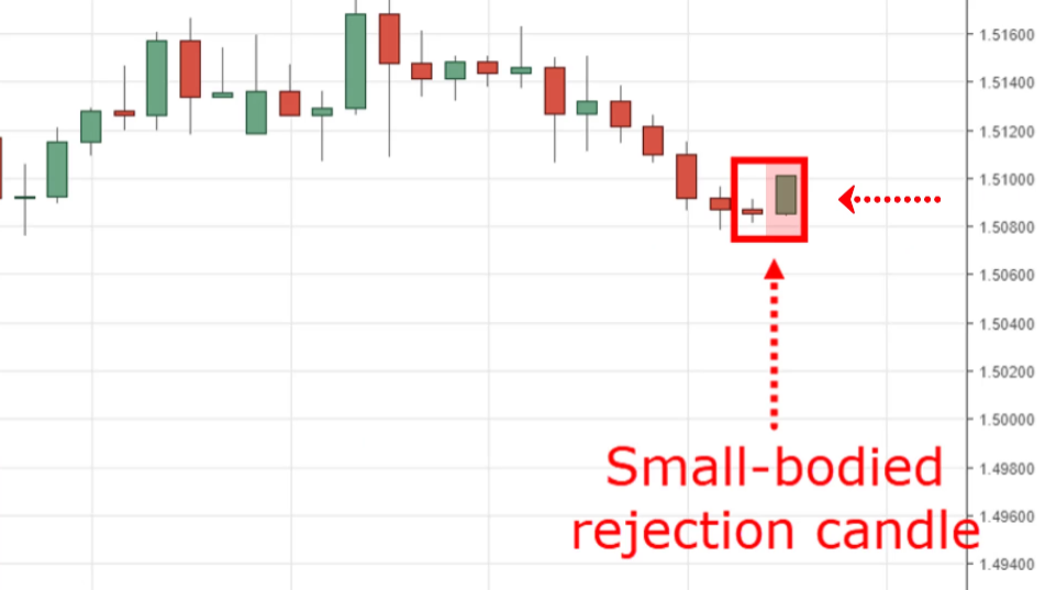
This is the retracement. But if you studied what I mentioned earlier, it tells you that the buyers are in control. The price closed near the highs.
But if you look at the range of this candle, the most recent candle over here relative to the earlier candle, you’ll notice that the range of this candle doesn't signify much.
It's not large compared to the earlier in terms of the range of the candles, In terms of size.
It's pretty much the same. This tells me that there isn't any strong by conviction behind this, this candlestick moves. There isn't anything at all.
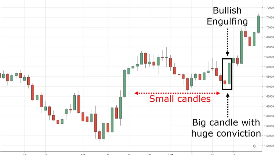
Compare that with this one over here:
Look at the size of this most recent candle relative to the earlier ones. This tells you now that there is a strong conviction behind the move.
Not only that the buyers are in control but there is also a strong conviction behind the move.
Can you see where I'm coming from?
When you look at this candle answering the second question It tells you the conviction behind the move whether it’s real or not.
This is what we are trying to understand over here.
Once you understand these two questions, you can read any candlestick patterns that you come across.
You just need to remember two questions:
- Where did the price close relative to the range? This tells you who's in control.
- What's the size of the pattern relative to the earlier ones?
Next…
Bonus: Combine candlestick patterns
One final bonus tip for you is that candlestick patterns are very versatile.
You can combine them across different timeframes and you can visualize what the pattern will be on the higher timeframe.
Does this make sense?
For example:
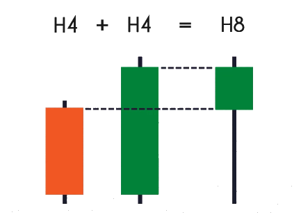
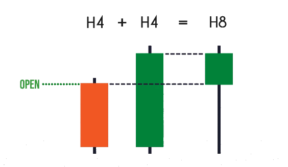
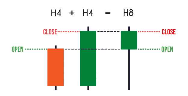
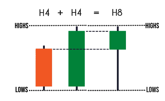
If you look at this pattern, let's say on the H4 timeframe. You have this bearish bar over here on the H4 timeframe and the next candle, you have this bullish bar.
When you go up to the H8 timeframe. You will realize that the candlestick pattern will look like the hammer over here.
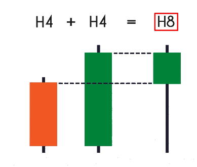
How do you get this picture of this hammer over here? Very simple.
You take the first candle, the opening price of the first candle, it will be the opening price of the hammer.
The closing price of this second candle, which is here, the closing price will be the closing price of the hammer.
And then the highs between this two-period will be shown on the H8 timeframe. The highs and the lows will be exactly the highs and the lows for the H8 timeframe.
Sometimes if you are looking at a chart, you don't quite understand what's going on, “Man! What’s going on? Who is in control? One candle is green and one is red!”
What you want to do is just combine these two candlestick patterns and you will have a clearer understanding of who's in control.
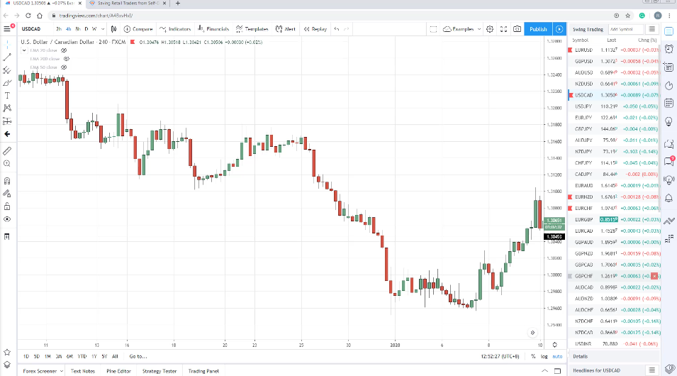
Let me give you an example of a real chart:
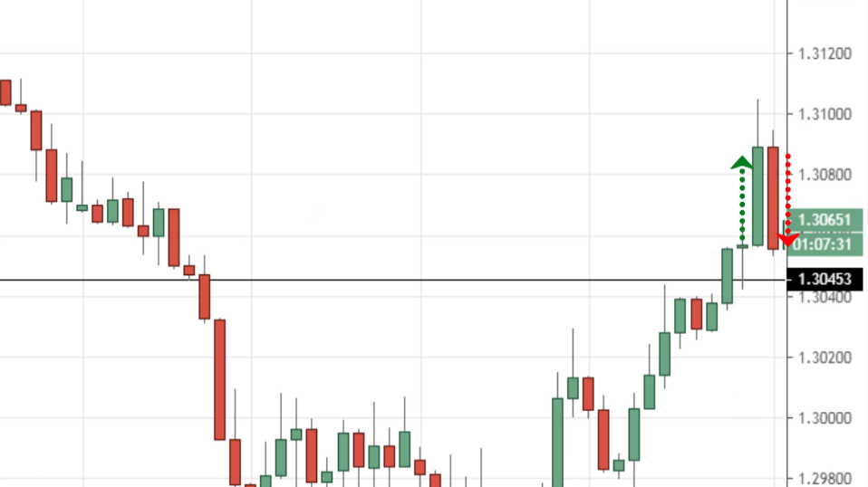
You wonder because this is confusing. One moment the candle is green and the next moment the candle is red.
Should I be buying or selling, what's going on?
Very simple.
Do what I just shared with you earlier.
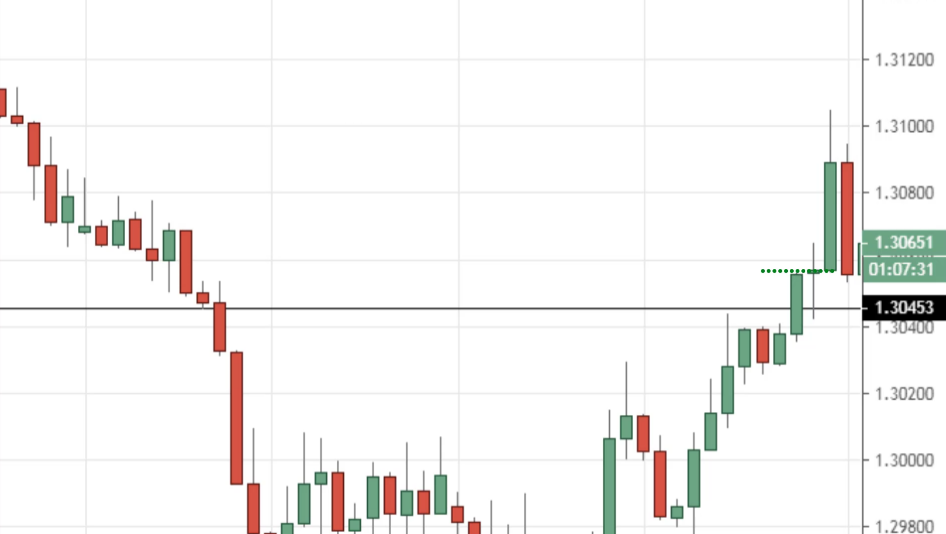
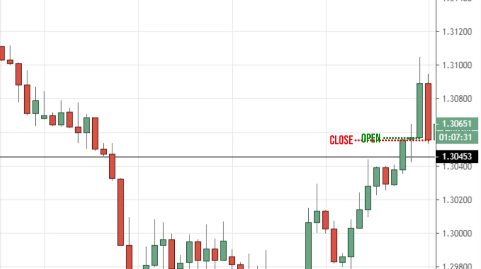
You just take the opening price of this candle, the first candle over here.
You notice that the price of the second candle is closed marginally lower.
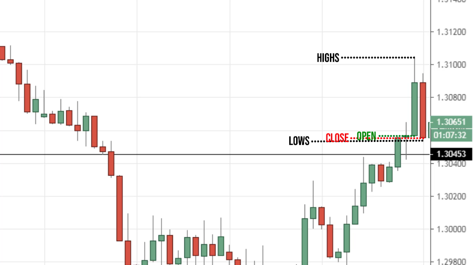
The opening price is here, the highs of the candle are here. The lows of the candle are here.
If you visualize this right, what does this give you?
It will give you something like this.
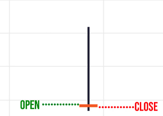
The price opened here, it closed marginally lower.
Let's say we imagine that this is a lower close. Then you notice that the highs of the candle is here.
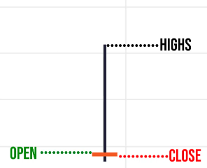
It’s a very long wick at the top showing you price rejection. And there's one very tiny wick at the bottom here.
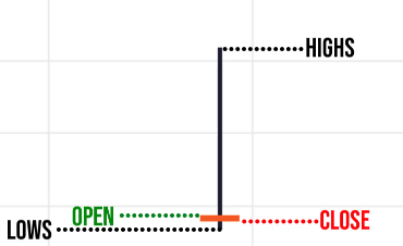
I’m guessing that the price action on the H8 timeframe would show me this price rejection.
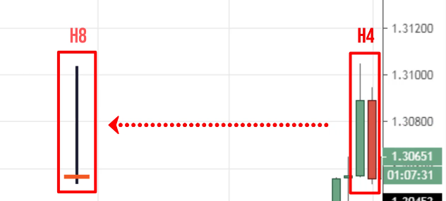
Going to the H8 timeframe this tells you there is a price rejection of higher prices over here:
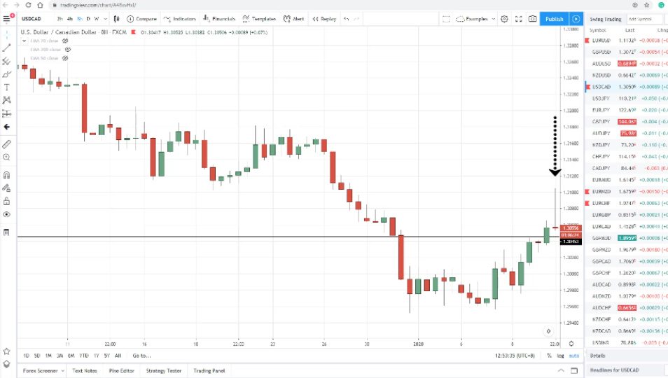
That's how we combined candlestick patterns to make sense out of something that you are not quite sure of.
This bonus tip could help you along the way with the two questions that we have covered earlier.
Recap
- Candlestick patterns show you the OHLC for a given time
- Two questions that matter: Where did the price close relative to the range and what’s the size of the pattern relative to the earlier ones
- You can combine candlestick patterns on the lower timeframe to form a higher timeframe candlestick pattern

