#11: How To Draw Trendlines Like A Pro
Lesson 11
In today's lesson, you'll learn how to draw Trendlines like a pro.
Now some of you might be wondering…
“But Rayner, why should I draw Trendlines?”
“What's the point of it?”
“What's the use?”
Why draw Trendlines
Here are a couple of reasons why:
- To adapt to context of the market
- To identify the long-term trend
- To better time your entries and exits
Let me explain…
1. To adapt to the context of the market
Sometimes the market may not respect the support/resistance that you've drawn.
It tends to respect Trendlines better.
So this is where the context of the market plays a part.
Because there are times when support/resistance are not as useful compared to Trendlines.
You’ll find that Trendlines are more accurate, given the context of the market that you’re trading.
It's better to know how to draw both Trendlines and support/resistance.
2. To identify the long-term trend
This is quite a no-brainer.
If you know that a long-term trend is up, you want to be a buyer.
Because it would naturally increase the probability of your trades working out.
So a Trendline helps you to identify both a long-term uptrend and a long-term downtrend.
3. To better time your entries and exits
If you identify the market respecting a long-term uptrend…
It makes sense to be buying as close to the Trendlines as possible.
This offers you a much more favourable risk to reward.
Because if you buy near the Trendlines your stop loss is much tighter.
But if you buy far from the Trendlines, your stop loss needs to be much larger.
And when the pullback comes, chances are you're going to be stopped out.
So buying near the Trendlines offers much more favourable risk to reward on your trades.
Now the question is:
How do you draw Trendlines?
But first, let’s talk about…
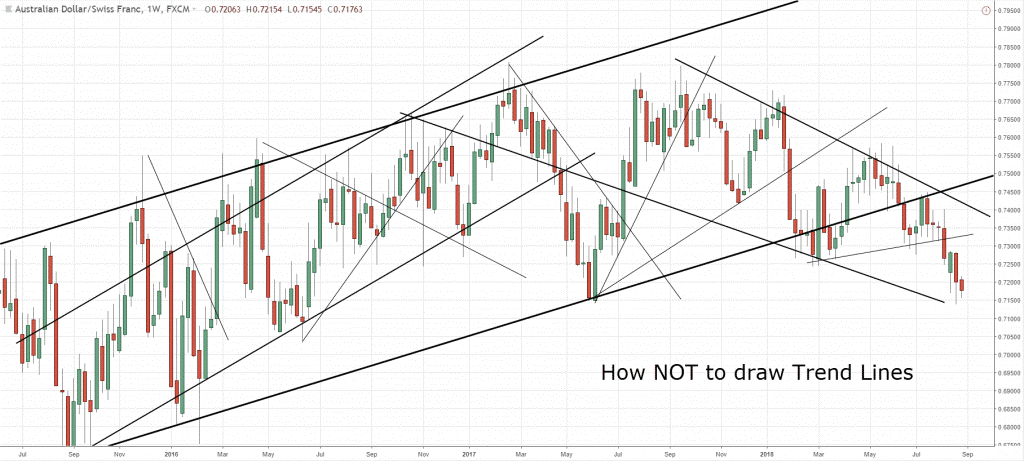
How NOT to draw Trendlines
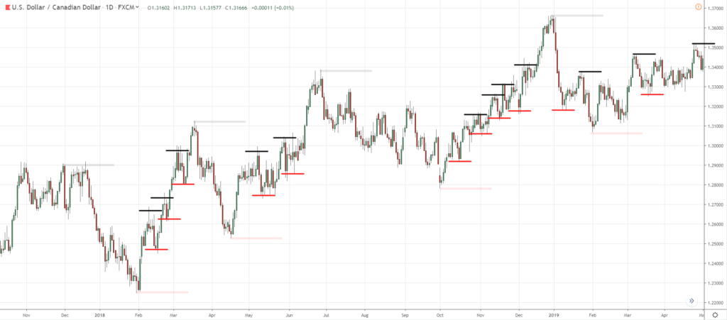
This is how NOT to draw Trendlines:
What is wrong with this?
Well, the reason being…
That there are just way too many Trendlines on this chart!
Which Trendlines should you pay attention to?
There's just way too many and it gives you analysis paralysis.
So it doesn't make sense to be drawing your Trendlines like this.
Instead, if you follow this simple framework that I'm about to share with you…
Trust me, your charts will look much cleaner.
How to draw Trendlines
Here's how you do it:
- Define your timeframe
- Zoom out (300 bars)
- Draw Trendlines that connect at least 2 major swing points
- Adjust to get as many touches as possible
1. Define your timeframe
For example, if you’re trading the daily timeframe then it makes sense to draw it on a daily timeframe.
It doesn't make sense to be drawing a Trendline on the 15-mins, 30-mins or 1-hour timeframe.
Because it's irrelevant to your trading needs.
Your trading needs are on a daily timeframe.
That’s your entry timeframe – you want to be drawing it on the daily timeframe.
If you want to draw a little bit more lines…
You can refer to the weekly timeframe, just one timeframe higher.
But you don't want to go down to a lower timeframe to draw your Trendlines.
Always define your timeframe first.
Then draw your Trendlines based on the timeframe that you’ve defined for yourself.
2. Zoom out (300 bars)
You want to zoom out your charts.
Because when you look at a chart, it's very easy to get caught up in the current price action now.
But if you take a step a step back, you’ll see that the price action is much more obvious.
So if you zoom out your charts, you’ll see the big picture and know where you are in the grand scheme of things.
Zooming out can be subjective, but my advice is to have at least 300 bars on your chart.
It also depends on the screen you're trading from.
A trader on the 20-inch screen and a trader on a 50-inch screen will zoom out differently.
To be objective here, I would say at least 300 bars on your chart.
3. Draw Trendlines that connect at least 2 major swing points
You want to draw Trendlines that connect at least two major swing points.
And the way I do it is to connect the two major swing points.
This means that I tend to not really pay much attention to minor swing points compared to the major swing points.
Because the Trendlines with major swing points are the ones that define the significant long-term trends.
Those are the ones that you want to be paying attention to because they’re obvious and they’re significant.
For the minor ones, they’ll be more obvious if you are trading the lower timeframe.
But on the timeframe that you're trading on, you can treat those minor swing points as secondary.
4. Adjust to get as many touches as possible
This is like making your Trendlines “curve-fit” the price data that you have.
You’ll adjust it to get as many touches as possible.
It can touch the body or the wick of the candles.
I'll walk you through a few examples, so you’ll see how this works.
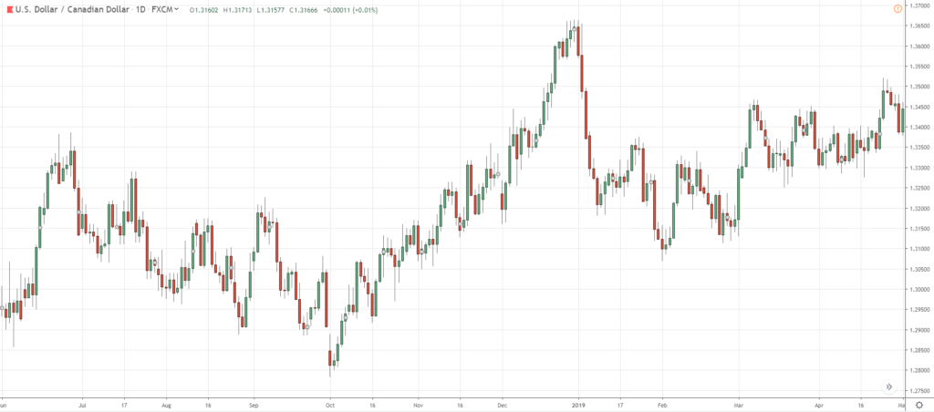
Example #1 (USD/CAD):
Let's assume that I'm going to define my timeframe as the daily timeframe.
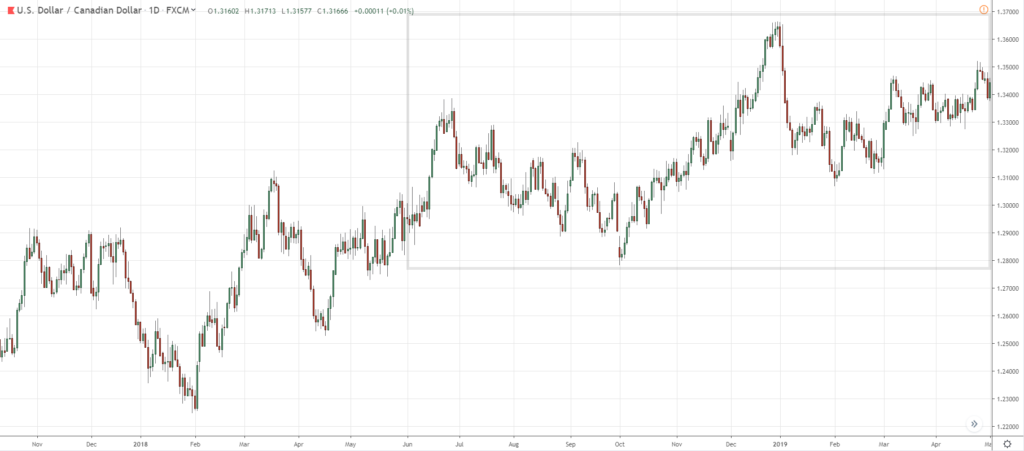
Remember to zoom out your chart.
I typically zoom out 5 times (roll the mouse wheel backwards by 5 clicks).
Now you can clearly see that the information presented to you is much more different.
It's clearer because you're looking at it from a bird’s-eye view.
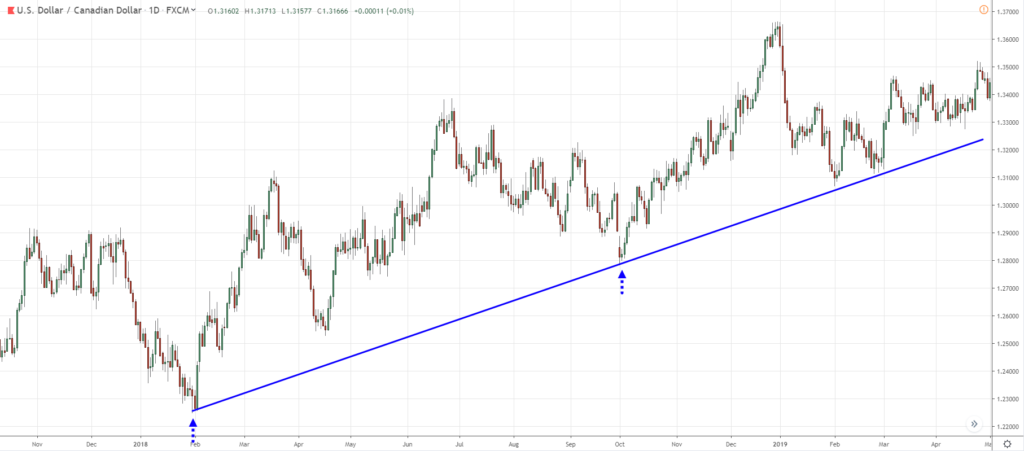
So next thing you’ll do is to draw your Trendlines.
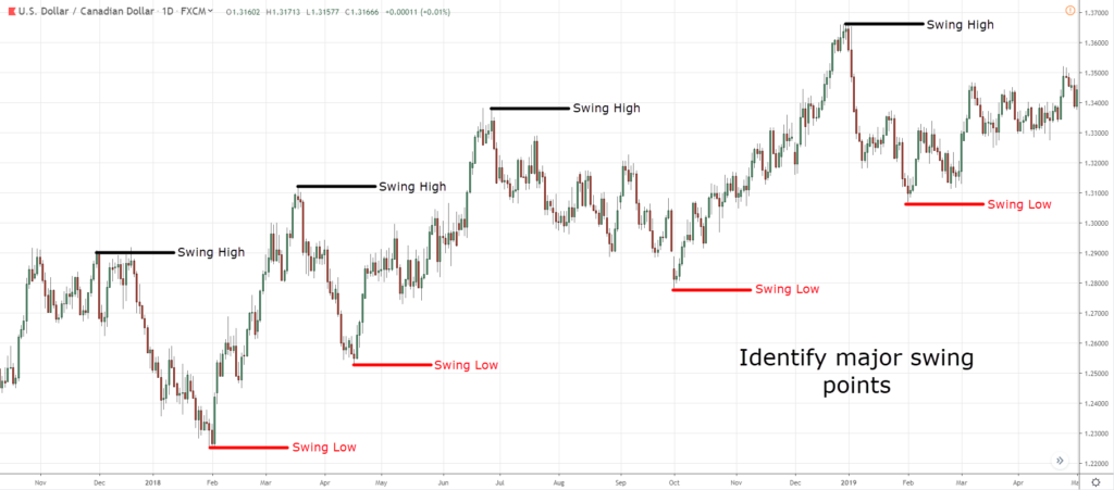
Remember, you want to connect the major swing points.
Major swing points are levels or areas on your chart that stand out straight in your face.
(If you have to hesitate, then it’s not in your face.)
I’m not interested in the minor swing points like these:
You only want to focus on – the major swing points.
I’ll draw in a way that best fits the current market context.
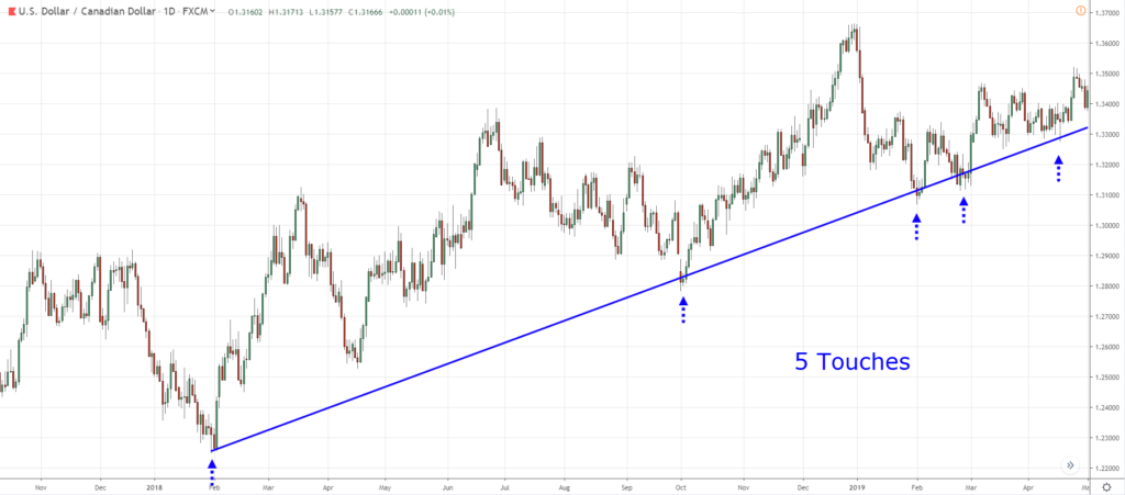
If you remembered, I said I’ll adjust my Trendlines to get the most number of touches.
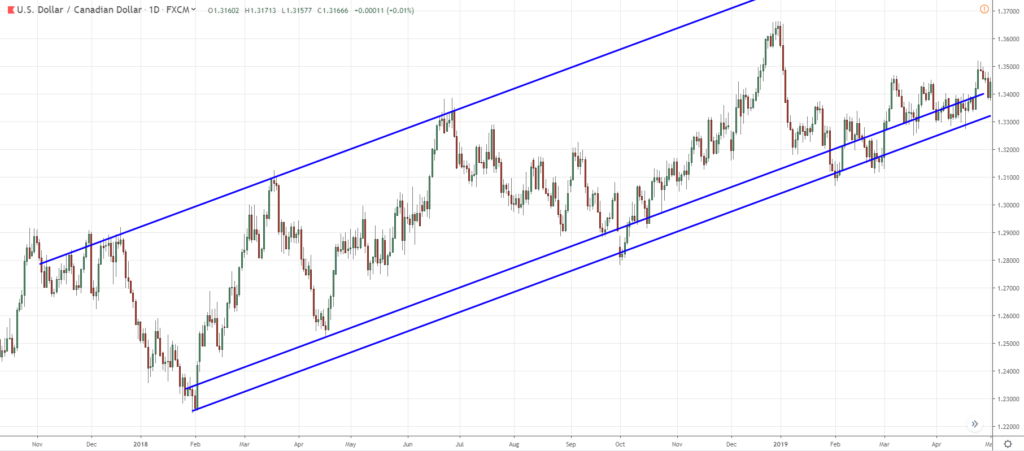
So I’ll adjust the Trendline slightly higher, to get this:
You’ll see that there are five touches now.
And this is how I would go about drawing the Trendline for the USD/CAD pair.
A tip to share with you is this:
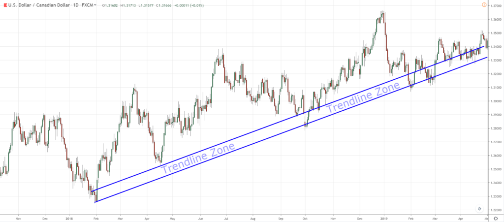
You can use just click on this Trendline and copy-paste to get another Trendline.
Push it up slightly higher and you’ll notice that you can now draw your Trendlines as a zone.
Now you can treat it as an area instead of just a line.
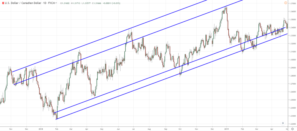
You can also copy-paste again and connect the swing highs.
Now you’ll have a trend channel:
For the trend channel, it’s the same thing.
I want to get as many touches as possible.
Remember you can treat this the upper channel as an area as well.
Now, if you zoom out a little bit you can see where the area of value on your chart is.
The lower portion of the Trendline is an area of value.
And when the price reaches the upper trend channel, those are price points that you don’t want to be buying.
As the market could possibly reverse from the upward trend channel.
So this is how you draw a Trendline.
Example #2 (AUD/USD):
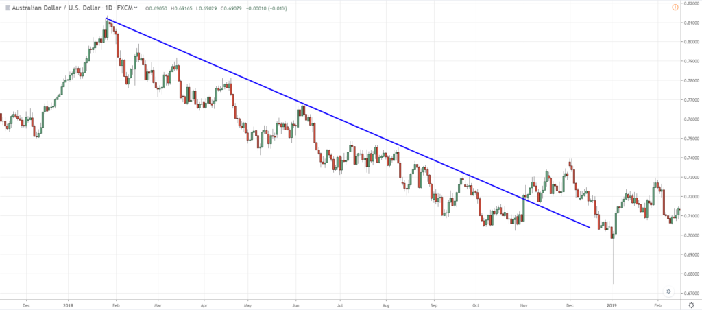
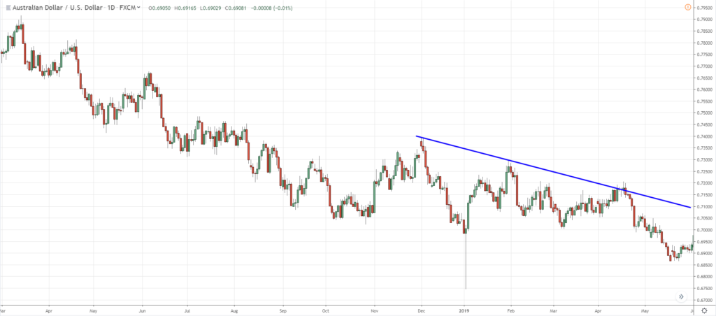
You might have drawn your Trendline like this:
But if you started off like this, you’ll miss out on touching 5 of the swing points.
So the thing is:
You don’t have to get so fixated by drawing from the absolute highs or lows.
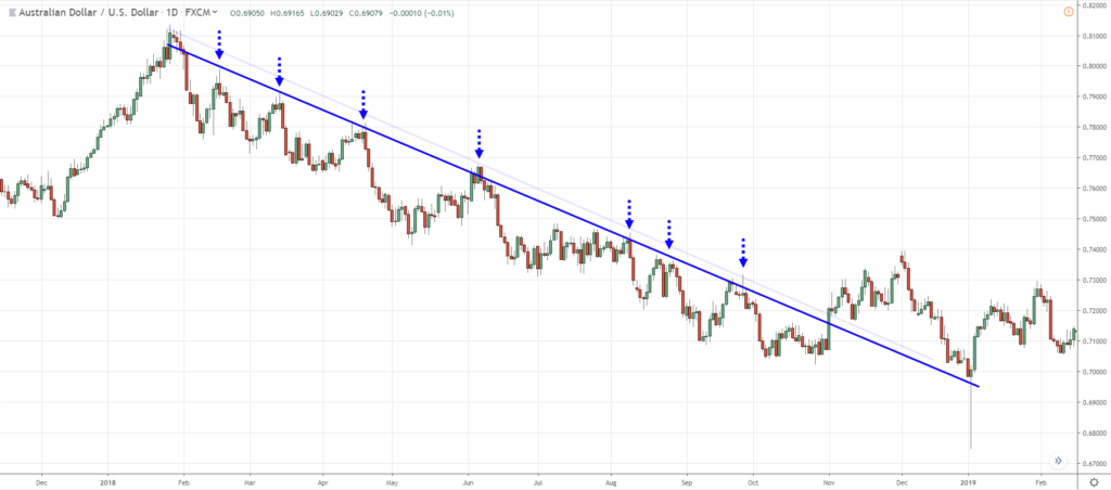
You can shift the Trendline lower and get as many touches as possible:
By shifting the Trendline, I get a better fit now.
I get 7 touches, including the retest at the lower end of the Trendline.
You’ll realize that the retest is more accurate as well.
But at this point, I’m not going to leave this Trendline here.
Because it’s clearly invalidated.
I’ll redraw the Trendline, but I want to show you how I adjust it as the price evolves.
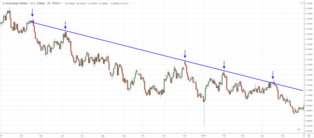
So here’s the new Trendline that I’ll draw:
And if I stretch it further back in time, I can touch more points.
And that will 4 touches.
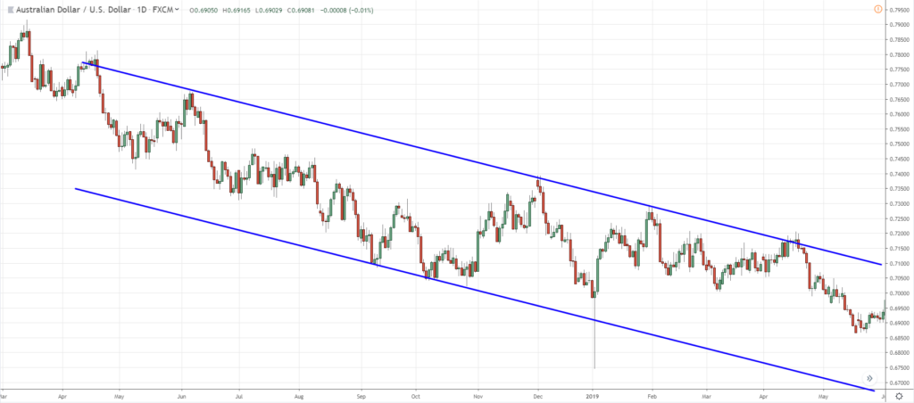
You can even copy and paste the Trendline to get a trend channel:
Now you can see where the area of value to trade is.
The upper Trendline is where you’ll be looking for selling opportunities.
But at the lower Trendline, you don’t want to be shorting.
Because there’s a good chance that price can spike up higher.
That’s why Trendlines are useful to help you identify:
- The long-term trend
- Predict market turning points
- Better time your entries, etc.
So this is the beauty and the power of Trendlines.
And I hope this gives you an insight into drawing Trendlines and getting good trading results from it.
With that said, here’s a quick summary…
Summary
- Define your timeframe
- Zoom out (300 bars)
- Draw Trendlines that connect at least 2 major swing points
- Adjust to get as many touches as possible
- Tip: “Copy-paste” Trendline to draw as a zone

