#1: The Ultimate Candlestick Patterns Trading Course
Lesson 1
Hey hey, what's up my friends!
Welcome to...
The Ultimate Candlestick Pattern Trading Course
In this course...
You'll learn how to identify high-probability trading setups, so you can profit in bull and bear markets.
Now, some of you might be thinking, "I'm new to trading. Will this help me? I have no idea about candlestick patterns. I don't know technical analysis."
Don't worry...
Because in this course I'll walk you through step-by-step from A to Z on how to trade candlestick patterns even if you have no trading experience.
By the end of this session, I can assure you that you will be able to trade candlestick patterns like a pro.
Sounds good?
Then let's begin!
What is a candlestick pattern
A candlestick pattern is, essentially, a method of reading a price chart.
It originated back in Japan, and the key component of a candlestick chart is that it shows you four things:
- The opening price
- The high of the session
- The low of the session
- The closing price
When I use the term session, it can mean different things.
If you're looking at candlestick charts on a daily timeframe, it means the high of the day.
If you're looking at candlestick charts on the 1-hour timeframe, it means the high of the 1-hour session.
Okay?
We'll cover that in more details later.
How do you read a candlestick pattern
Remember, there are only four things: the open, the high, the low, and the close.
If you take a look at this:
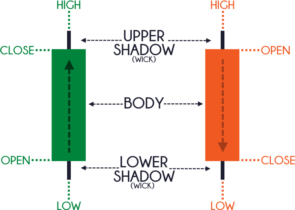
You can see that the candles are usually two colors, either green, red, or perhaps it can be black, white.
You can even change the color if you want, but, generally, the most common color is green and red.
When you see a green candlestick bar, it means that the price has closed higher for the session.
Likewise, when you see a red candlestick bar, on the other hand, it means that the price has closed lower for the session.
Now, let's try to understand these candlestick patterns more in-depth:
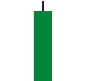
You'll notice that there are two main components to a candlestick pattern.
One is what we call the body, and the black shadow thing is what we call the wick.
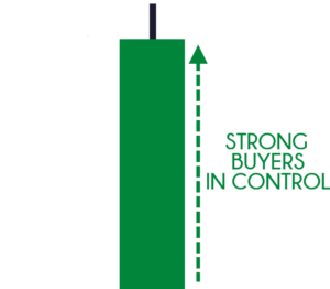
The body pretty much tells you who's in control, so in this case...
You can see that the buyers pushed price up all the way up higher, and finally closing in these highs of the session:
However...
You can't neglect this shadow as well because what is telling you is that there is price rejection:
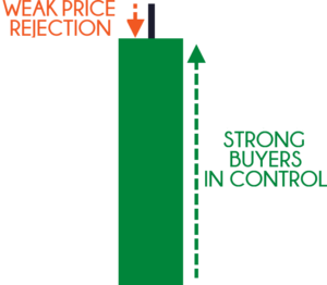
If you think about this, this was once the highs of the session.
What this tells you is that at one point in time the sellers actually pushed the price from these highs down lower until the price closed over here:
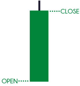
So, there are two components to a candlestick pattern: the body and the wick.
The third thing that I want you to know is this:
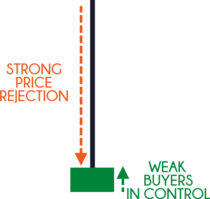
Again, you have a wick and a body, but this time around the message is completely different.
If you look at this candlestick pattern, it shows that the price did close higher:
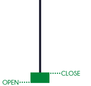
However, if you look at the wick, notice the price rejection.
Because at one point in time, the high of the session is over here:
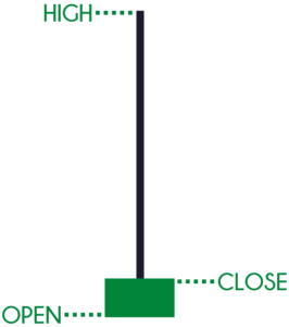
What does this tell you?
It tells you that there was an immense amount of selling pressure.
A strong price rejection that actually pushed the price lower during the session.
You can see that this isn't a very bullish pattern.
So, I also want you to pay attention to these three things:
- Body
- Wick
- The size of the body relative to the wick
Usually, if the wick is much longer than the body, it's a sign of price rejection.
Moving on...
Variations of the candlestick patterns
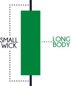
The first candle opened near the lows closed near the highs.
It's a sign of strength.
How about this candle?
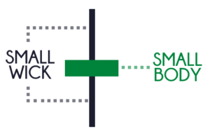
You can see that the price came down lower, the sellers were in control.
Then, the buyers took charge and pushed the price back towards the highs.
Finally, sellers came back in and the market closed at near the opening level.
Generally, the meaning behind it is that there is indecision in the markets.
If you look at this last candlestick pattern:
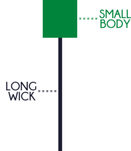
The price opened and came all the way down lower, sellers are in control.
Then, the buyers took charge and reversed back, finally closing near the highs.
The meaning of this pattern is the rejection of lower prices, which means that the buyers are clearly in control.
Now...
This is just the opposite variation:
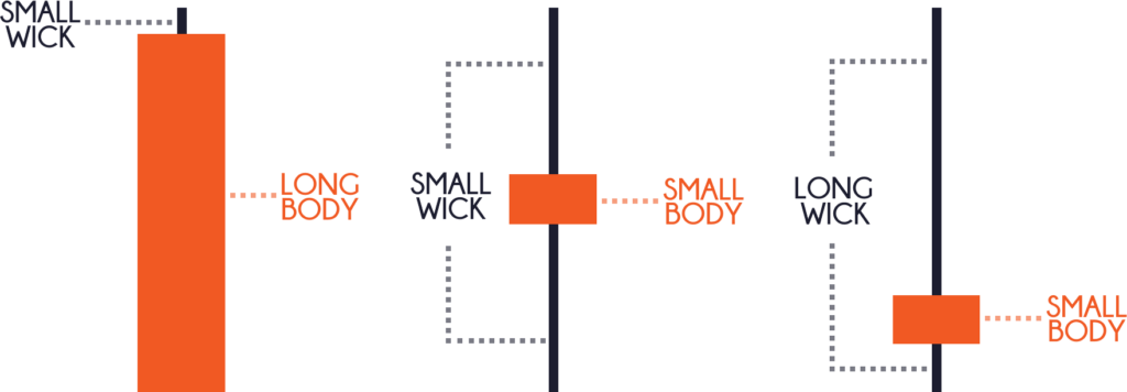
I don't think there's much to go through.
It's just the opposite of what we have just shared earlier.
With that said, let's do a quick recap...
Quick Recap
- A candlestick chart shows you who's in control
- Pay attention to the body, the wick, and the body relative to the wick
Moving on...
Candlesticks on different timeframes
If you recall, I said that the candlestick chart can appear on different time frames.
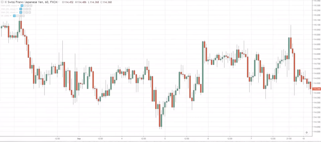
If you look at this candlestick chart on the 60-minute timeframe:
You can see that this means that every hour, one of this bar will be painted.
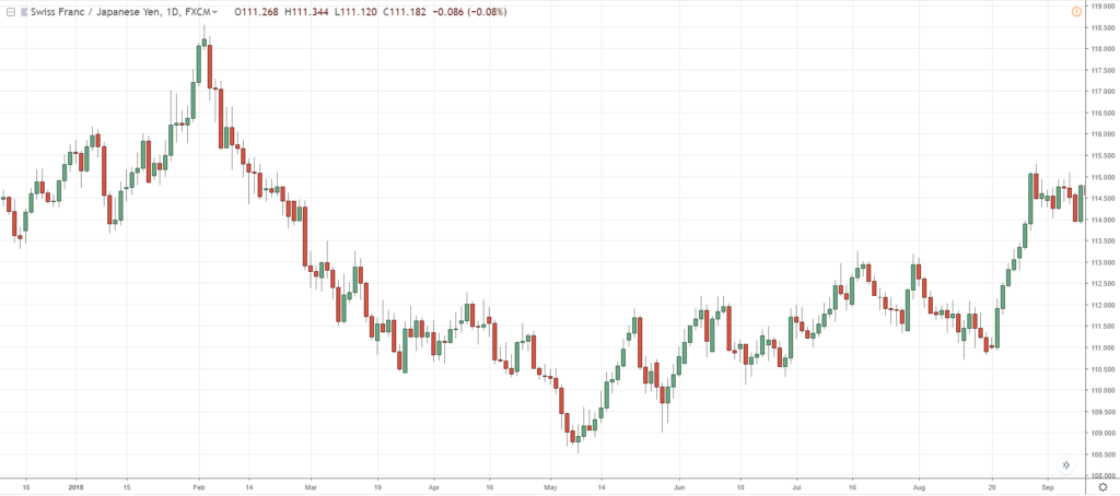
If you look at the daily timeframe (D1):
This means that every single bar is painted after a day.
Monday there'll be a bar.
Tuesday there is one bar.
Wednesday there is one bar, and etc.
This is how candlestick patterns can form in different time frames.
Next...
How to combine candlestick patterns
I'm going to walk you through something that we call combining candlestick patterns.
Because candlestick patterns are just showing you the price of the different sessions.
If you think about this, these can be combined!
For example, if you look at this one:
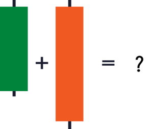
Let's say that the first green and red bars are both in the 1-hour timeframe.
Now, when you combine these two candlestick patterns, on the 2-hour timeframe, it shows a bearish pin bar:
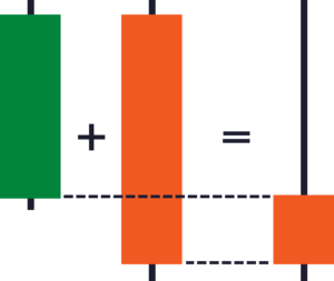
You can see that we got the open of the bearish pin bar from the first candle.
The highs from the two candles.
The lows from the second candle.
The close from the second candle.
Does that make sense?
Let's have a look at some real examples:
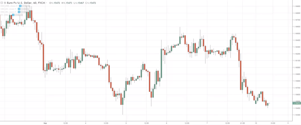
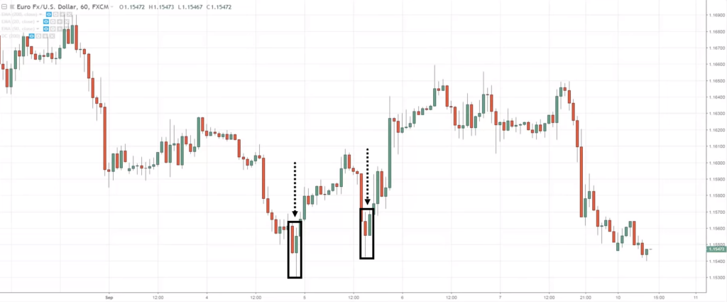
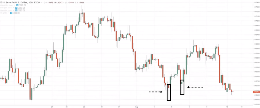
This is the chart of the 1-hour timeframe.
I want you to pay attention to these two areas:
Briefly visualize in your head.
If I'm going to move to a 2-hour time frame right now, how will these patterns change?
Let's have a look:
Can you see what happened?
The two 1-hour candles simply combined to form the pattern that you're seeing right now.
Why did it turn to a green candle on the 2-hour timeframe?
Because the second candle closed higher above the first.
I hope you kind of understand how candlestick patterns can be combined.
This is very useful when you're looking at a price chart like the 1-hour time frame.
Such as if you can't make sense out of the price action and you want to see clearly...
What you can do is go on to the 2-hour timeframe and you might get a clearer view of what's happening.
Similarly, if you're on a four-hour timeframe and you can't make sense out of it...
Go up to the 8-hour timeframe, and things might be clearer for you.
The next thing we'll talk about is...
How not to trade candlestick patterns
Now you know how to read candlestick patterns.
You even know how to combine them.
But how would you not trade candlestick patterns?
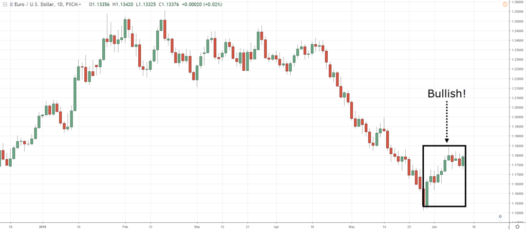
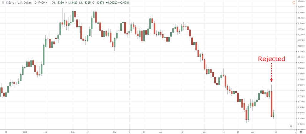
As I've said earlier, if the candle is green it means bullish if the candle is red, it means bearish.
What traders will do is that they'll look at a chart and they find a series of green candles and they go long.
For example, they see over here:
"Wow man, the candle is green over here. Bullish! Bullish! Let me buy it's so bullish!"
They go long, and bam!
The market reverses...
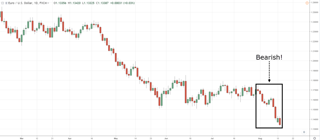
Similarly, they look at this part of the chart:
"Oh, it's so bearish! Rayner says sellers are in control, I should go short!"
Bam! the market reverses.
What's going on?
The message I'm trying to bring over here is that you don't want to trade candlestick patterns in isolation.
What is in isolation?
It means you don't want to trade candlestick patterns by and itself.
Just because the candlestick is green, it doesn't mean you go long.
Just because it's red, it doesn't mean you go short.
That's what I mean by isolation, so don't trade candlestick patterns in this manner.
Just a quick recap...
Quick Recap
- Candlestick charts can be combined as I've shared with you earlier
- You don't want to trade candlestick patterns in isolation
Now, you might be wondering, "Okay, Rayner, so how should I trade candlestick patterns?"
Let's talk about that right now...
How to use candlestick patterns as an entry trigger
Let me share with you five powerful candlestick patterns that can serve as an entry trigger.
Once we've learned that, we can look at this framework and see how we can actually find high probability trading setups in the markets.
The first candlestick pattern that I want you to know is the engulfing pattern.
Bullish engulfing candlestick pattern

The green candle we see is what we call the Bullish Engulfing pattern.
Why is that?
Because if you look at the first green candle, the second red candle has engulfed the body of the previous candle.
This is why we call it the Bullish Engulfing pattern.
The other pattern is what we call the Bearish Engulfing pattern
Bearish engulfing candlestick pattern

This is just the opposite of the Bullish Engulfing.
You can see that the first candle over is bullish, buyers are in control.
But the next candle, sellers took charge and smashed the price lower, closing and engulfing the below the previous candle.
So...
These are the first patterns that I want to share with you and it's very useful to identify market reversals.
The next one...
Hammer and shooting star
Let's just have a look at the hammer first:

The hammer is something that you might be familiar with because you saw it in the earlier examples.
The hammer is a bullish reversal pattern because it's actually showing you price rejection in the market.
In fact, it's the rejection of lower prices.
If you look at this, the price opened here:
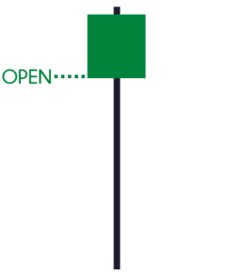
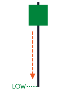
At one point in time, the sellers were actually in control pushing price lower near the lows of this session:
Then, the buyers came in and took charge saying, "Hey, hey, this is enough, man. I'm coming in!"
So, they pushed the price all the way up higher, and finally closing near the highs:
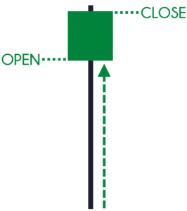
This is a sign of strength, a rejection of lower prices.
This is what a hammer means.
On the other hand, the shooting star is just the opposite:

It's showing you rejection of higher prices.
These two patterns, again, are used to help you identify market reversals.
Next...
Dragonfly and the gravestone doji
That sounds a handful, but the pattern is very similar to the hammer and shooting star:
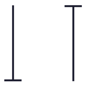
A Doji simply means indecision in the markets.
But for dragonfly and gravestone Doji, it's a sign of price rejection.
Because if you look at it, it's very similar to the hammer and shooting star that you've seen earlier.
The only difference is the Doji doesn't have a body.
What it just shows you are just the price rejection.
If you think about this...
Even though the price has opened and closed at the same level, it doesn't mean that the market is undecided.
Because the market has actually tilted its hand!
Because at one point...
The sellers were in control pushing price down lower, and then the buyers came in and took charge and finally pushed up all the way up higher and closing near where it opened.
Morning and evening star

The example shown above is a morning star.
We can see that this is somewhat similar to the engulfing pattern, but we have a slight variation to it.
The first candle, sellers are in control.
The second candle is an indecision Doji candle.
Because the market opened and closed at the same level.
Finally, the third candle, the buyers are in control as the price closed near the highs.
So, that's the meaning behind the morning star, it's a bullish reversal pattern.
The evening star is just the opposite:

The first candle, buyers are in control.
Second candle, indecision.
The third candle, bears came in and pushed price lower.
Finally...
Tweezer top and bottom
A tweezer bottom is this one over here:

It's quite a powerful pattern because it's actually showing you rejection of lower prices two times.
If you look at the price action...
At one point in time, the sellers came all the way down and buyers stepped in, pushed price higher, and closing lower.
Then the next candle, the price opened at the lows, sellers tried to push price lower once again, then the buyers stepped in finally closing at the highs.
This is a sign of strength: rejection of lower prices.
On the other hand, this is a tweezer top:

Again, just the opposite.
Now, that you have understood the five powerful candlestick patterns...
How does this fit into the T.A.E. Framework?
Keep reading...
How to trade with candlestick patterns using the T.A.E. framework
What is T.A.E.?
It's none other than:
- Trend
- Area of value
- Entry trigger
Now, we have already settled the entry trigger portion!
Because the reversal patterns that you've seen earlier are entry triggers that you can use to enter the trade.
But remember, don't trade it in isolation.
This means that we have to look for other factors for before we wait for our entry trigger.
Trend
Here's what we are looking for:
If the price is above the 200 MA, have a long bias
If the price is below the 200 MA, have a short bias
Understand that when I define the trend, it doesn't mean that just because the price is above the 200 periods moving average, you go long immediately.
No, this is just to give you a bias, permission that, "Hey, now it's time to be buying. Now it's time to be looking for buying opportunities."
Okay?
Area of value
When you want to buy, trade from a value of value.
An area of value could be:
- Support and resistance
- Moving average
- Trendline
- Channels
- Etc.
The third thing is where we look for is the entry trigger to enter the trade.
Entry trigger
These candlestick patterns you've seen earlier:
- Engulfing pattern
- Tweezer tops and bottoms
- Dragonfly and Gravestone Doji
- Morning Star and Evening Star
- Hammer and Shooting Star
Does that make sense?
Now, using this framework, we can then formulate trading strategies to profit in bull and bear markets.
Let's have a look at a few examples to bring all these concepts together:
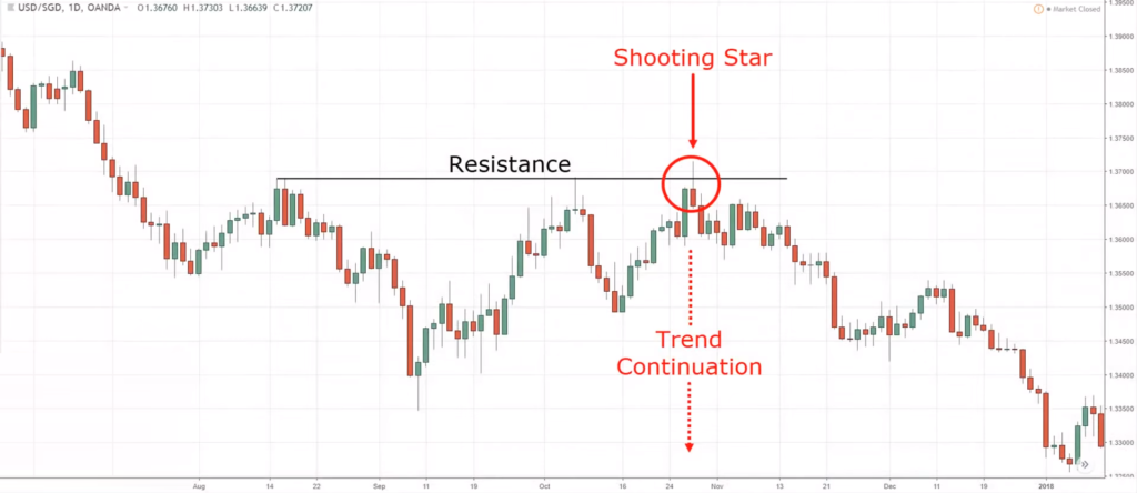
I don't have the 200 MA on the chart, but needless to say, the trend is down.
Then, the price came into an area of resistance where the price got rejected three times.
On the third touch, you got an entry trigger.
Here are the factors in play right now:
- The trend is down
- You have an area of value (resistance)
- You have a shooting star entry trigger setup
Can you see now that you're not trading candlestick patterns in isolation?
Now, you're trading candlestick patterns in the context of the market.
Meaning, you're trading candlestick patterns based on market structure and trend!
One thing to point out is that the examples I showed you are all winning trades.
But in reality, you won't get all winning trades.
You will probably get 50% winners, 50% losers.
The reason why I share winning trades is that it's easier to illustrate the concept.
But, again, the charts you're seeing right now, these are cherry picked.
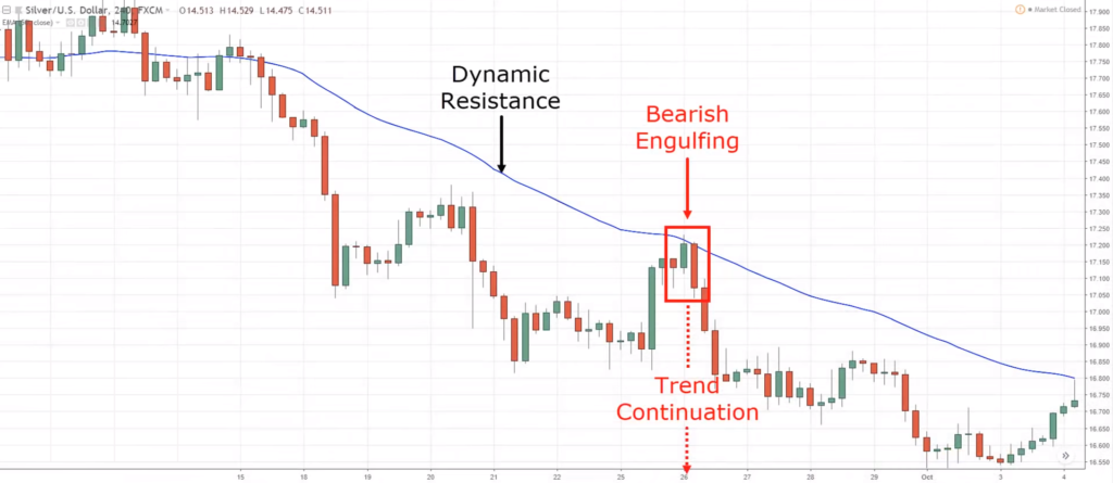
Moving onto the second example:
What is the trend?
The trend is down.
Where is the area of value?
This time, the area of value is the 50-period moving average, it's acting as dynamic resistance.
What is your entry trigger?
This time, we have this Bearish Engulfing pattern.
With all things in check, we can go short having our stops above the highs of the bearish engulfing.
Now you can see that we're all trading with something that makes sense based on what the market is telling you, and not just trading candlestick patterns blindly in isolation.
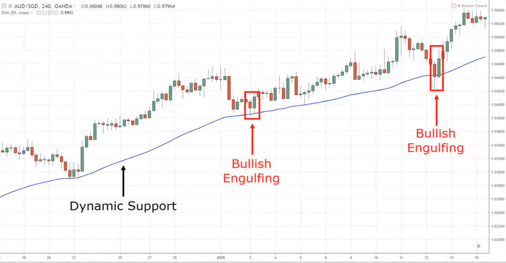
Next example...
If you look at this chart:
Ask yourself again, "What is the trend?"
Well, it's in an uptrend with a series of higher highs and higher lows.
If you can't see these, just pull out your 200 MA, and chances are the price is above the 200 MA.
Next, the area of value.
Do we have an area of value to trade from?
Well, it seems like it because the price has been respecting the 50 MA.
The last one is an entry trigger.
Do we have an entry trigger?
We have a Bullish Engulfing pattern, a sign of reversal.
Moving on...
Let's have a look at another example:
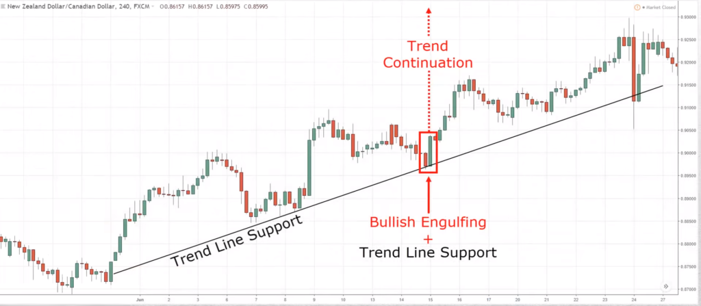
This time around, what is the trend?
One look, it's an uptrend.
If you look at the area of value, we have the trendline support.
This time around it's not a moving average or support; it's an upward trendline.
As for the entry trigger, we have a Bullish Engulfing pattern.
Again, the T.A.E. Framework is met: uptrend, an area of value, entry trigger.
Another example, to really hammer down this concept.
Once you can apply this framework...
You can start finding much higher probability trading setups instead of just blindly trading these patterns.
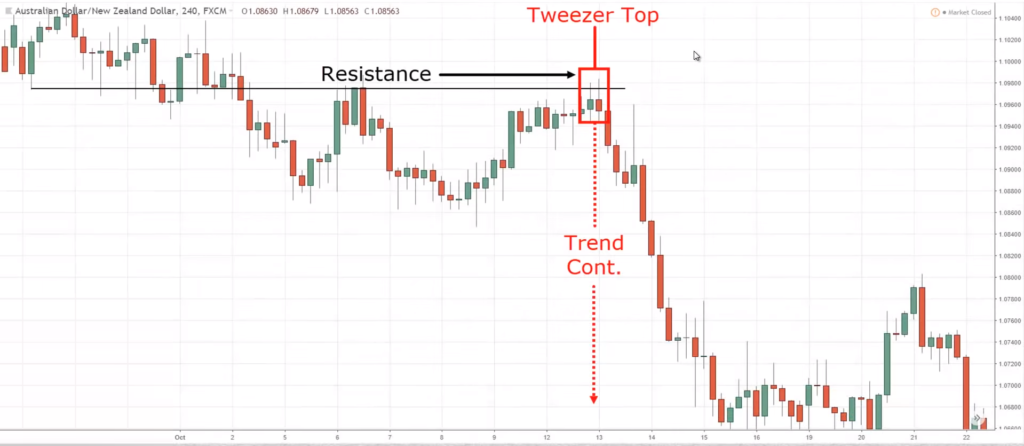
Let's have a look at the next example:
Again, what is the trend?
Downtrend.
Where is the area of value?
Previous support now acting as resistance.
What is the entry trigger?
A tweezer top.
As for stop loss...
I typically set it a distance away from the highs.
I don't want to set it barely above the highs because the market can just spike up higher and then reverse lower.
If you notice...
I've not talked about target profits yet because this entire course is about candlestick patterns.
I don't want to go into trade management and target profits.
But if you are a swing trader, what you can do is to capture a swing.
Look to take profits before the buying pressure comes in.
For position trading, what you can do is just trail your stop loss.
You can also use a moving average like the 20-period moving average to trail your stop loss.
If the price closes above the 20 MA, you exit the trade.
Let's do a quick recap, shall we?
Quick Recap
- The T.A.E. Framework
- Powerful candlestick patterns: Engulfing, Hammer & Shooting Star, Doji, Tweezer, Morning & Evening Star
And that's it!
Now you know how to trade with candlesticks like a Pro.
With that said, let's do a summary of what you've learned in this lesson...
Summary
- A candlestick has an open, high, low, and close
- Pay attention to the body, wick, and the body relative to the wick to determine who is in control
- Don't trade candlestick patterns in isolation
- You can trade candlestick patterns through the T.A.E. framework: Identify the Trend, Area of Value, then Entry Trigger.

